Not before time. Thanks to Jay for the tip.
FOR IMMEDIATE RELEASE:
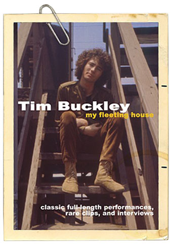
TIM BUCKLEY
My Fleeting House
Documentary featuring rare performance and interview footage spanning his entire career
My Fleeting House is first-ever DVD collection of performances of Tim Buckley. This essential DVD features rare live performances from various television shows and interview footage spanning his entire career.
The DVD has eleven full-length songs, and three partial performances. This DVD also features insightful interviews with Larry Beckett (co-writer of many songs with Buckley), Lee Underwood (Buckley’s guitarist) and David Browne (author of Dream Brother: The Lives of Jeff and Tim Buckley).
The footage spans his entire career, from 1967 to 1974, and includes unreleased video of interaction with Buckley on The Steve Allen Show (1969) and on WITF’s The Show (1970). The footage is taken from various television programs from 1967 to 1974 right up to the time of his death in 1975. All but two of the musical clips are unreleased. As an additional oddity, the clip of Buckley being interviewed on The Steve Allen Show includes Jayne Meadows complimenting Buckley on his hair.
Despite having produced nine studio albums, three live albums, and many “best of” compilations—My Fleeting House is the first-ever authorized collection of Buckley’s visual performances. Several segments on this new collection have not been seen for over thirty years. MVD Visual has secured the best possible, first-generation video sources for the compilation, including footage from American, British, and Dutch television, and also a forgotten feature film. This DVD has the full approval of the Estate of Tim Buckley.
Buckley was an experimental vocalist and performer who incorporated jazz, psychedelia, funk, soul, and avant-garde rock in a short career spanning the late 1960s and early 1970s. He often regarded his voice as an instrument, a talent most exploited on his albums Goodbye and Hello, Lorca, and Starsailor. He was the father of musician and singer Jeff Buckley, also known for his three-and-a-half octave voice, who died in 1997. Buckley released his debut album Tim Buckley on Elektra in 1966. A folk-rock album, it contained psychedelic melodies written with input from Beckett. He went on to release Goodbye and Hello (1967), Happy Sad (1969), Blue Afternoon (1969), Lorca (1970), Starsailor (1970), Greetings from L.A. (1972), Sefronia (1973), and Look at the Fool (1974).
Born in Washington DC, Tim Buckley lived for 10 years in New York before moving to southern California. During his childhood, he was a fan of Johnny Cash, Hank Williams, Nat King Cole, and Miles Davis, although country music was his foremost passion. He left school at 18 with twenty songs written with Larry Beckett under his belt—many of which later featured on his debut album. Mothers of Invention drummer Jimmy Carl Black introduced Buckley to Herb Cohen, and he quickly got him signed to Elektra record company. He also met guitarist Lee Underwood around this time, who became a big part of nearly all of Buckley’s artistic endeavors.
On June 28, 1975 after returning from the last show of a tour in Dallas, Buckley snorted heroin at a friend’s house. Having diligently controlled his habit while on the road, his tolerance was lowered, and the combination of a small amount of drugs mixed with the amount of alcohol he’d been consuming all day to celebrate the tour’s end was too much. His friend took him home thinking he was merely drunk. He was put to bed by his friends, who told his wife that he’d also used some barbiturates. As she watched TV in bed beside him, Buckley turned blue. Attempts by friends and paramedics to revive him were unsuccessful. Reportedly, Buckley’s last words were “Bye Bye Baby,” delivered in a way reminiscent of the line in Ray Charles’ Driftin’ Blues. Buckley was just 28 years of age.
Arranged in chronological order, My Fleeting House traces the evolution of Buckley’s music, voice, songwriting, and backup bands.
DVD extras:
A 12-page booklet of unreleased Buckley photos
An album-by-album review by Underwood, Beckett, and Browne
Beckett (also a poet) reciting ‘Song to the Siren’
Tracklist:
Inside Pop—’No Man Can Find the War’
Late Night Line Up—’Happy Time’
Late Night Line Up—’Morning Glory’
Old Grey Whistle Test—’The Dolphins’
The Monkees Show—’Song to the Siren’
Greenwich Village—’Who Do You Love’
Dutch TV—’Happy Time’
Dutch TV—’Sing a Song for You’
Music Video Live—’Sally Go Round the Roses’
Boboquivari—’Blue Melody’
Boboquivari—’Venice Beach (Music Boats by the Bay)’
The Show—’I Woke Up’
The Show—’Come Here Woman’
The Christian Licorice Store—’Pleasant Street’
• Official Website: http://www.timbuckleydvd.com/
• Trailer: http://www.youtube.com/watch?v=AHCccGEUMr0
Selection #: DR-4566
UPC: 022891456698
Street Date: 5/15/2007
List Price: $19.95
Running Time: 105 minutes