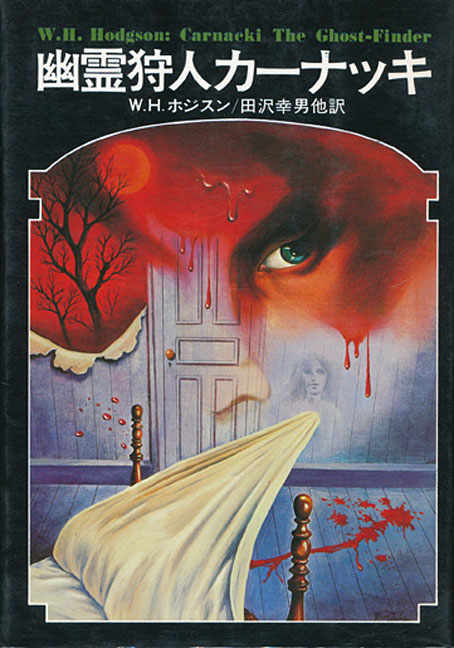
It’s William Hope Hodgson’s occult detective again. Late last year I was looking for Hodgson illustrations after reading Timothy S. Murphy’s William Hope Hodgson and the Rise of the Weird: Possibilities of the Dark but couldn’t find much of interest apart from book covers I’d seen many times before. Tadami Yamada’s illustrations for a Japanese edition of Carnacki, The Ghost-Finder have yet to be catalogued at ISFDB, and don’t seem to have been disseminated much at all. Once again, I’m indebted to 70sscifiart for turning up art that I might not otherwise have seen.
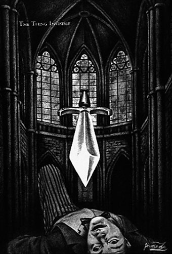
The Thing Invisible.
Information about the Japanese collection was difficult to find in general, a common problem with older Japanese books when most of the online documentation hasn’t been translated. The book was published by Kokusho Kankōkai in 1977 as part of a series of weird fiction reprints along with collections by HP Lovecraft, Algernon Blackwood and others. The Hodgson volume contains the expanded collection of Carnacki stories, with the three posthumously published tales–The Haunted “Jarvee”, The Find and The Hog–appended to the original 1913 edition.
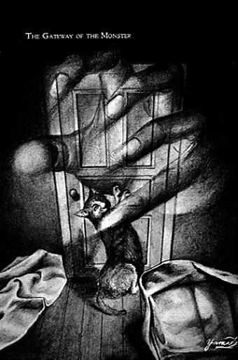
The Gateway of the Monster.
As to the illustrations, these were early works by Tamada, an artist with a lengthy career as an illustrator and painter. The copies of the illustrations don’t reveal much about their medium but they all appear to be paintings; the ones for The Find and The Hog (whose Japanese title translates as The Witch Pig) both show signs of the patterning you get with the decalcomania process, something you can’t easily create in other media. If this book was part of a series then I don’t imagine it was the sole illustrated edition, which raises the possibility that the Lovecraft, Blackwood and other titles were fully illustrated as well. Once again, further research is required.
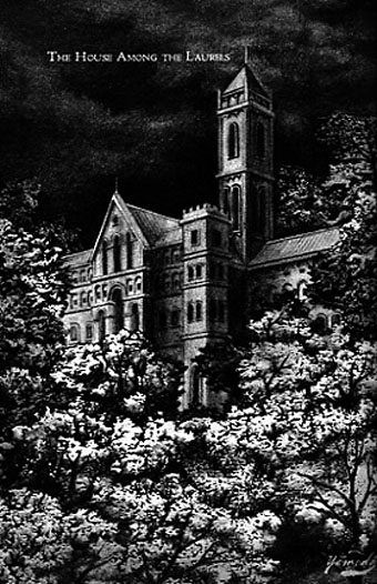
The House Among the Laurels.
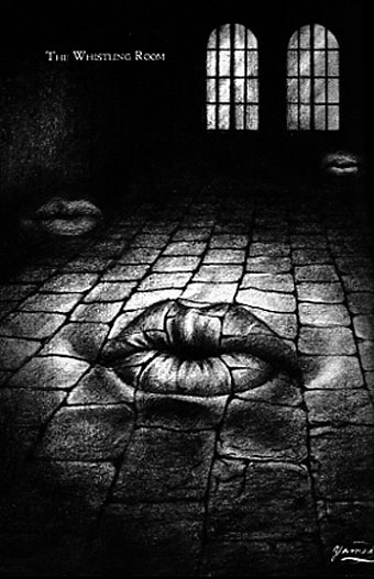
The Whistling Room.