Athanasius Kircher’s Tower of Babel

babel1.jpg

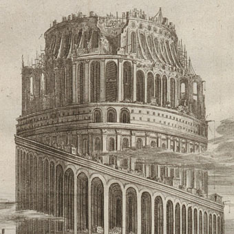
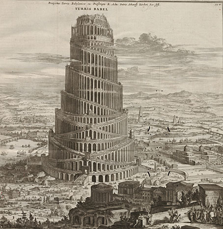
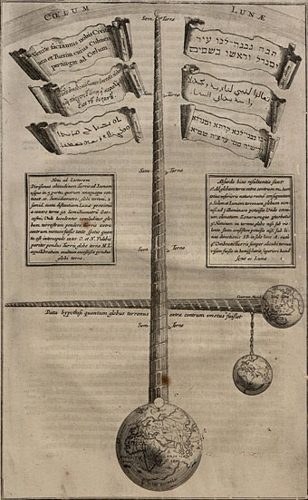
Here’s a picture whose myriad details I’ve wanted to scrutinise for many years. Lieven Cruyl was the draughtsman and Coenraet Decker the etcher while the picture itself appears as an illustration in Athanasius Kircher’s (deep breath) Turris Babel, Sive Archontologia Qua Primo Priscorum post diluvium hominum vita, mores rerumque gestarum magnitudo, Secundo Turris fabrica civitatumque exstructio, confusio linguarum, & inde gentium transmigrationis, cum principalium inde enatorum idiomatum historia, multiplici eruditione describuntur & explicantur. The book was published in 1679 and, among other speculations, features Kircher’s eye-popping illustration (below) showing how tall the Tower of Babel would have to be in order to reach the Moon. I used part of the big illustration in a cover design for metal band Melechesh in 2006.

babel6.jpg

The copies here are from a scanned volume at the University of Heidelberg where the pages have suffered slightly from bookworm. But the resolution is high enough to explore a picture crawling with tiny details, from the bristling scaffolding at the top of the structure, and the houses (for the workers?) built on the ramps lower down, to a procession of camels and other beasts being led towards the main entrance. In the background there are smaller towers and a few pyramids (Kircher explored the latter elsewhere in the book), and also a harbour with beast-headed sailing ships. The full-size picture may be explored here.

babel2.jpg

Continue reading “Athanasius Kircher’s Tower of Babel”

The Courts of the Feyre

shevdon1.jpg

Three new cover designs of mine for Angry Robot which were made public a few hours ago. The Courts of the Feyre is a fantasy series by British author Mike Shevdon set in present-day Britain and involving “a world of dark magic and strange creatures hidden in plain sight.” Two of these titles are reprints, Strangeness and Charm is a new addition to the series, and there are plans for a fourth title later on.

shevdon2.jpg

Marc at Angry Robot wanted a distinctive, uniform look for the series, and I’m very pleased with the way the designs turned out. Since the plan was to use a decorative frame printed on black I decided to have a tilted square in the centre of each cover to make a shape that would catch the eye on a shelf or when seen as a thumbnail image. It’s also possible to interpret the squares as a kind of “court” within each design, with each court containing articles relevant to that story.

All three books are due to be published in June 2012.

shevdon3.jpg

Elsewhere on { feuilleton }
The book covers archive

Previously on { feuilleton }
Steampunk overloaded!

Tom Phillips album covers

phillips00.jpg

Words and Music (1975) by Tom Phillips.

Two related posts is coincidence, three is a series. Earlier posts from the past couple of weeks looked at album covers created by designers better known for their work in other areas. Tom Phillips is a British artist, writer and composer who I continue to insist is one of our greatest living artists, a figure of singular intelligence, invention and versatility whose lack of grandstanding has never raised his profile to, say, the Hockney level. Phillips’ involvement with the music world, both as composer/librettist, and his oft-cited position as Brian Eno’s art teacher in the 1960s, have led to the creation of a handful of record and CD covers from the mid-70s on. Before we get onto those I’ll note that Phillips has a piece in the latest edition of Eye magazine where he reviews a book of postcards from the Wiener Werkstätte. I happen to have a review in the same issue looking at a republished Kenneth Anger study.

Words and Music above has a January 1975 release date although the cover clearly states “LXXIV” in Phillips’ customary stencil lettering. The pressing was limited to 500 copies and doesn’t seem to have been reissued since which means that copies for sale command excessive prices. Side A comprises recordings of Phillips’ compositions while on the flip the artist/author reads extracts from A Humument, the treated book/experimental novel which is not only his most celebrated work but a project whose influence permeates all of the Phillips oeuvre, including the sleeve art.

phillips01.jpg

Starless and Bible Black (1974) by King Crimson.

phillips02.jpg

A year before Words and Music, Phillips created the cover art for this King Crimson album, and he’s also credited with the design. The fractured stencil lettering on the gatefold interior resembles similar effects in some of Phillips’ paintings while on the back cover there’s a tiny extract from A Humument bearing the enigmatic phrase “this night wounds time”. I’ve wondered for years how this cover came about: Robert Fripp often selects the art for King Crimson’s covers so was Phillips his choice as artist/designer? Or was it a result of the Fripp and Eno connection? If anyone knows the answer, please leave a comment.

Continue reading “Tom Phillips album covers”

Cthulhu God

cthulhugod.jpg

Happy Cthulhumas. I found the time over the past couple of weeks to finish a piece of art begun in September 2008, something I’d half-completed then abandoned due to pressure of other work. I’d quite forgotten about this until I discovered the files when going through some archive discs. What began as a pencil outline is now a lavish piece of vector art which I’ll shortly be making available as a poster design.

cthulhugod2.jpg

I’ve enjoyed creating vector pictures recently, it’s a different discipline to using Photoshop (although the initial art often starts in the sister application), and the hard lines and flat shapes remind me of the similar effects I used to get when I was painting with gouache. Some areas of this piece remain a little too flat but I didn’t want to start shading everything using gradient meshes; if you start down that road you may as well do the whole thing as a Photoshop painting—or a real painting, for that matter. That said, I wouldn’t mind giving this the hyper-realist treatment at a later date.

cthulhugod3.jpg

The original idea was to do a kind of “Cthulhu Buddha”, something like the above variation only coloured with more finesse. I kept thinking this was an original idea only to belatedly realise when I set the figure against a temple background that I’d been imitating the kind of massive Lovecraftian idols that populate the comic strips of Philippe Druillet. The one below is a good example.

Continue reading “Cthulhu God”

Meeting Harry Smith by Drew Christie

christie.jpg

A short anecdotal film by artist and animator Drew Christie in which musicologist John Cohen relates his first encounter with mercurial polymath Harry Smith, a man small in stature but large in interests and influence. Christie is something of a polymath himself since he also provides the banjo soundtrack. There’s more art and animation at his blog, while Ubuweb (of course) has a small selection of Smith’s own films. Thanks to Caspar for the tip.

Previously on { feuilleton }
Heaven and Earth Magic by Harry Smith
Harry Smith revisited
The art of Harry Smith, 1923–1991