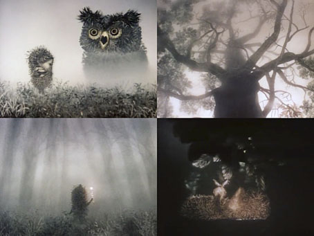
Hedgehog in the Fog (1975).
One more animation post before I move onto other things. Since the 1970s Russian animator Yuri Norstein has been regarded as one of the greatest living practitioners of the medium despite having only made a handful of films. Hedgehog in the Fog is a 10-minute piece with a self-explanatory title: a hedgehog sets out one evening to visit his friend, the bear, but before he can reach the bear’s house he has to cross a fog-filled field. Norstein’s animation style involves the skillful manipulation of hand-drawn paper shapes which in this film and the later Tale of Tales achieve a remarkable sense of depth and solidity. The fog effects in Hedgehog are especially striking, created using layers of translucent paper.
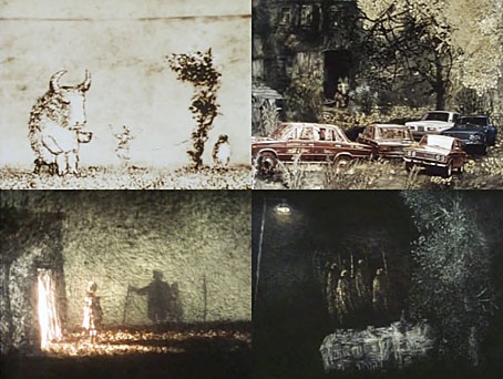
Tale of Tales (1979).
The 29-minute Tale of Tales takes the same technique but lifts the animation into a different league, an elusive and (for want of a better term) poetic meditation on life and memory whose central figure is a small grey wolf borrowed from the Russian lullaby sung in the opening scene. The film’s Wikipedia note compares Tale of Tales to Andrei Tarkovsky’s Mirror (1975), and for once the hyperbole feels justified. There’s the same concentration on natural elements such as fire, wind and water, while the recurrent wordless tableaux of a family whose members comprise a poet, a bull with a skipping-rope, and a talking cat might be compared with Tarkovsky’s dream sequences. If meaning here seems reluctant to disclose itself (and why does everything have to mean something anyway?) then that’s all the more reason to watch it again.
Since 1979 Norstein has been working sporadically on a feature-length adaptation of Gogol’s The Overcoat, work on which has been endlessly delayed due to lack of resources and the animator’s painstaking production methods. A few clips can be found on YouTube if you hunt around. Here’s hoping we get to see the finished film soon.
Previously on { feuilleton }
• Barta’s Golem