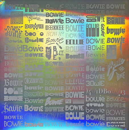
MC Escher album covers

scaffold.jpg

L The P (1969) by Scaffold. Art: Ascending and Descending (1960).

A follow-up to yesterday’s post. MC Escher lived long enough to see his work move from curiosities appealing to a small circle of print collectors, through enthusiasm among scientists and mathematicians, to mass acceptance in the late 1960s thanks, in part, to the general vogue for any art that looked weird or far out. New Worlds magazine used Relativity on a cover in 1967, while Thomas Albright writing for Rolling Stone in 1970 introduced a generation of American heads to Escher’s work. A year earlier, another Rolling Stone, Mick Jagger, had tried to persuade Escher to create something for the cover of Let It Bleed; the artist declined but that didn’t stop others using his prints for cover art.

mott.jpg

Mott The Hoople (1969) by Mott The Hoople. Art: Reptiles (1943).

Escher’s work is so well-suited to a vinyl sleeve that I’m surprised his lithographs and woodcuts haven’t seen more use. Liverpool group Scaffold beat Mott the Hoople to the first usage by a few months in 1969 (unless there’s an earlier example I don’t know about); L The P is a play on the Scaffold’s big hit, Lily The Pink. As is often the case with these music design histories, things start off well with sympathetic treatments of the artwork then degrade when hamfisted amateur designers take over. I can’t imagine Escher being flattered by some of the later examples. If you know of any others, good or bad, then please leave a comment.

beaverkrause.jpg

In A Wild Sanctuary (1970) by Beaver and Krause. Art: Three Worlds (1955).

mandrake.jpg

Puzzle (1970) by The Mandrake Memorial. A gatefold sleeve which opened out to reveal the whole of Escher’s House of Stairs I (1951). Inside the gatefold was Curl-up (1951). Design by Milton Glaser who also designed the group’s second album, Medium.

Continue reading “MC Escher album covers”

Escher and Schrofer

schrofer5.jpg

Design by Jurriaan Schrofer.

That’s Maurits Cornelis Escher (1898–1972), the Dutch artist, and Jurriaan Schrofer (1926–90), the Dutch typographer and graphic designer. Aside from a shared nationality the pair had a similar interest in periodicity and incremental metamorphosis, something that’s strikingly apparent when you compare their works. I don’t know much about Schrofer so I can’t say whether he was consciously following Escher’s example or whether this is coincidence. Some of the gradations and distortions also bear comparison with the Op Art paintings of Bridget Riley, Victor Vasarely and others.

escher8.jpg

MC Escher signed most of his works with three square “MCE” letters which are remarkably similar to Schrofer’s type designs.

There’s an opportunity to find out more about Schrofer’s distinctive approach to graphic design in a forthcoming book from Unit Editions (currently available at a reduced pre-order price). More of his work can be seen at But Does It Float and scattered around Tumblr. MC Escher is well-represented on the web; I’d suggest starting at WikiPaintings.

escher1.jpg

Circle Limit I (1958) by MC Escher.

schrofer1.jpg

Design by Jurriaan Schrofer.

escher2.jpg

Square Limit (colour, 1964) by MC Escher.

Continue reading “Escher and Schrofer”

Nothing Is

sunra.jpg

1: Nothing Is… (1966), an album of science fiction jazz by Sun Ra.

What does the empty space of that ellipsis imply?

beatles.jpg

2: Strawberry Fields Forever (1967), a single by The Beatles.

“Strawberry Fields / Nothing is real”

harrison1.jpg

Cover art by Sam Green.

3: Empty Space (2012), a science fiction novel by M. John Harrison.

Chapter 1: “Nothing is real,” he said.

harrison2.jpg

mbv.jpg

4: MBV (2013), an album by My Bloody Valentine which emerged from empty space at the weekend.

Track 8: Nothing Is.

Previously on { feuilleton }
Golden apples and silver apples

Covering Joyce

joyce1.jpg

First editions of Ulysses (1922) and Finnegans Wake (1939).

I like Peter Mendelsund’s book cover designs so it’s good to find the designer given the opportunity to provide new covers for James Joyce. Mendelsund’s blog post announcing the news mentions nothing about his intentions, instead we have a reminiscence about Ireland à la Molly Bloom, and pictures of the three covers below.

joyce2.jpg

I’ve never felt a pictorial treatment works with Joyce; his books, especially the Big Two, concentrate so much on words and the labyrinths made by language that anything other than a purely typographic treatment seems superfluous. Art directors going the pictorial route generally end up using familiar photos of the author or views of Dublin circa 1900. The first editions of Ulysses and Finnegans Wake set the pattern for many later editions, and I’ll guess it’s that pattern which Peter Mendelsund has followed here. The typeface used is Poetica, a Robert Slimbach design from 1992, completed by what may be Joyce’s own hand (I’m guessing again) in the manner of the author’s corrected typescripts. The amendments for Dubliners and Portrait of the Artist don’t require explanation but what about the title of Ulysses? I’d read this (so to speak) as representing the novel’s two main characters—Stephen Dedalus: the cold and precise man of letters, and Leopold Bloom: the all-too-human Everyman—who in their circumambulation and eventual meeting comprise the twin poles of the story. There’s also a subtle and clever allusion to Molly Bloom but I’ll let you find that…

The three new books will be published by Vintage but I’ve not managed to find a publication date.

joyce3.jpg

In other Joyce news, the first Chinese translation of Finnegans Wake has proved to be a surprising bestseller. And I ought to mention that Lord Horror: Reverbstorm, my own Joycean excursion (among other things) with David Britton, is now available at Amazon. You can, of course, still buy the book direct from the publishers.

joyce4.jpg

Elsewhere on { feuilleton }
The book covers archive

Previously on { feuilleton }
James Joyce in Reverbstorm
Joyce in Time
Happy Bloomsday
Passages from James Joyce’s Finnegans Wake
Books for Bloomsday

Weekend links 145

brundage.jpg

Weird Tales, October 1933. Cover art by Margaret Brundage.

• Michael Moorcock’s novels are being republished this year by Gollancz in a range of print and digital editions. Publishing Perspectives asks Is Now a Perfect Time for a Michael Moorcock Revival? • Related: Dangerous Minds posted The Chronicle of the Black Sword: A Sword & Sorcery Concert from Hawkwind and Michael Moorcock. My sleeve for that album was the last I did for the band. • Obliquely related: Kensington Roof Gardens appear as a location in several Moorcock novels, and also provided a venue for the author’s 50th birthday party. If you have a spare £200m you may be interested in buying them once Richard Branson’s lease expires.

• One of my favourite things in Mojo magazine was a list by Jon Savage of 100 great psychedelic singles (50 from the UK, 50 from the US). This week he presented a list of the 20 best glam-rock songs of all time. For the record, Blockbuster by The Sweet was the first single I bought so I’ve always favoured that song over Ballroom Blitz.

The Alluring Art of Margaret Brundage is a forthcoming book by J. David Spurlock about the Weird Tales cover artist. Steven Heller looks at her life (I’d no idea she knew Djuna Barnes) while io9 has some of her paintings. Related: Illustrations for Weird Tales by Virgil Finlay.

The masterpiece of Mann’s Hollywood period is, of course, Paracelsus (1937), with Charles Laughton. Laughton’s great bulk swims into pools of scalding light out of greater or lesser shoals of darkness like a vast monster of the deep, a great black whale. The movie haunts you like a bad dream. Mann did not try to give you a sense of the past; instead, Paracelsus looks as if it had been made in the Middle Ages – the gargoyle faces, bodies warped with ague, gaunt with famine, a claustrophobic sense of a limited world, of chronic, cramped unfreedom.

The Merchant of Shadows (1989) by Angela Carter. There’s more of her writing in the LRB Archive.

• Television essayist Jonathan Meades was back on our screens this week. The MeadesShrine at YouTube gathers some of his earlier disquisitions on culture, place, buildings and related esoterica.

• Sometimes snark is the only worthwhile response: An A-Z Guide to Music Journalist Bullshit.

• London venue the Horse Hospital celebrates 20 years of unusual events.

The Politics of Dread: An Interview with China Miéville.

How Giallo Can You Go? Antoni Maiovvi Interviewed.

A guide to Terry Riley’s music.

• Three more for the glam list: Coz I Love You (1971) by Slade | Get It On (1971) by T. Rex | Starman (40th Anniversary Mix) (1972) by David Bowie