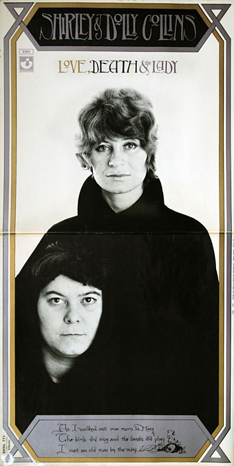
Gatefold sleeve for Love, Death and the Lady (1970) by Shirley & Dolly Collins. Photo by Allan Willmoth. No designer credited.
• “When you look at a lot of modern album covers, the art school obsession with the Helvetica kind of undermines it. So instead of looking at an artefact that comes from another place entirely, you are looking at an artefact that has been caught and tamed and made corporate.” Roger Dean talking to Liv Siddall about cover design in the 1970s.
• Erik Davis talks to Stephen Finley, author of Esotericism in African American Religious Experience, about hoodoo and metaphysical blackness. Related: Sun Ra’s Afrofuturist masterwork, Space Is The Place, has been reissued by Harte Recordings as a limited DVD, CD and hardcover book.
• “…she has managed to unearth a coal-seam of neglected songs and stories, incantations of the working people from across the English-speaking planet with their edge of discord left intact, the harmonies frayed by hard-won experience.” Alan Moore on the great Shirley Collins.
[MR] James’s influence, or his example, has rarely been more strongly with us than now. For there is presently apparent, across what might broadly be called landscape culture, a fascination with these Jamesian ideas of unsettlement and displacement. In music, literature, art, film and photography, as well as in new and hybrid forms and media, the English eerie is on the rise. A loose but substantial body of work is emerging that explores the English landscape in terms of its anomalies rather than its continuities, that is sceptical of comfortable notions of “dwelling” and “belonging”, and of the packagings of the past as “heritage”, and that locates itself within a spectred rather than a sceptred isle.
Such concerns are not new, but there is a distinctive intensity and variety to their contemporary address. This eerie counter-culture—this occulture—is drawing in experimental film-makers, folk singers, folklorists, academics, avant-garde antiquaries, landscape historians, utopians, collectives, mainstreamers and Arch-Droods alike, in a magnificent mash-up of hauntology, geological sentience and political activism. The hedgerows, fields, ruins, hills and saltings of England have been set seething.
Robert Macfarlane on the eerieness of the English countryside
• Lots of mixes to choose from this week: Songs from a Railway Station at Dusk by Abigail Ward; mix series The Ivy-Strangled Path by David Colohan is now up to Volume IV; a trove of occult psychedelia from The Ghost of the Weed Garden.
• “Blood Meridian was released on April 28, 1985 to little initial acclaim, but would later gain recognition as one of the most significant novels of the late 20th century.” Ted Gioia on the rise and fall of the Western.
• From the past week’s zones of research: the Gregory Pendennis Library Of Black Sorcery, and Vault Of Evil: Brit Horror Pulp Plus!
• At Dangerous Minds: Zappa meets claymation in the wonderful VHS rarity The Amazing Mr. Bickford.
• Synthesizer manuals at the Internet Archive.
• Pages from The Graphic Canon at Pinterest.
• Sabbath, a new song by Jenny Hval
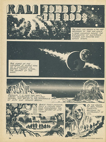
• French book covers
• The Cruel Mother (1967) by Shirley Collins | The Unquiet Grave (1968) by Shirley Collins | Go From My Window (1970) by Shirley & Dolly Collins