Lettres et Enseignes Art Nouveau

mulier1.jpg

These lettering designs were posted at Wikimedia Commons in the summer but I’ve only just noticed them this week. I’d been searching for Étienne Mulier’s designs while working on the six-part story about Miss Adeline Carr, aka “The Soul”, in the Bumper Book of Magic, the idea being to have each chapter open with the character’s name in a different Art Nouveau lettering style. If you look at enough bookselling sites you can eventually find one or two large photos of Mulier’s pages which is what I used when creating the heading for the second chapter of the story; but I still would have preferred to have had access to the whole collection. As it happens, most of the Wikimedia plates have also come from bookselling sites but they’re a slightly better collection than the ones I found.

soul.jpg

Mulier’s plates were published in 1901, presented not in book form but as a collection of loose lithographs in a card portfolio; the “Enseignes” in the title are suggestions for shop signs. Mulier also throws in a couple of less practical designs showing alphabets created by posing flamingos. The loose-leaf format is a useful one for something intended to be consulted by artists and craftspeople. Books could be awkward things in the days before digital scanning and photography if you wanted to trace something from a page which wouldn’t lie flat. The Mulier design I used for The Soul isn’t a perfect alphabet—the letters K and M could do with improving—but it’s a good example of the French approach to Art Nouveau lettering (and Art Nouveau design in general) which tends to be more loose and plant-like than equivalents from Germany or the Netherlands. The organic appearance of the letterforms suited the chapter I was illustrating which opens with a hunt for magic mushrooms.

mulier2.jpg

Mulier’s plates don’t appear to have been turned into printable fonts until the 1960s when the revival of interest in Art Nouveau prompted the creation of filmtype adaptations. Fontsinuse shows a rare print example on the cover of an album by Scottish prog band Beggar’s Opera, a version of the typeface which filled in the bi-chromatic letters and slightly altered their forms. “One of the ugliest typefaces ever created,” says Mr Hardwig. I can think of worse. More recently we have the inevitable digitisations, with Art Nouveau Caps being the closest to Mulier’s original. I was tempted to use a digitised version for the story but I find that many amateur (or semi-professional) digitisations of old typefaces are often crude things compared to the originals. I also liked the bi-chromatic effect so I ended up drawing my own copies of the letters I needed.

Previously on { feuilleton }
• Bergling’s Art Alphabets
• Typefaces of the occult revival

Another view over Yuggoth

yuggoth1.jpg
The original Yuggoth collage, 1994.

Three years ago I resurrected my panorama of R’lyeh from The Call of Cthulhu, a process that took five months from start to finish as I redrew a large and very detailed picture. Last month I spent a much shorter time doing the same for one of the other pieces of art that went missing after being printed in 1994, the Haeckel collage that I titled Yuggoth. I don’t think I’ve mentioned before that this was originally created as a potential cover for the first edition of the Starry Wisdom collection published by Creation Books. My Cthulhu strip had already been accepted for the book when I was asked to create something for the cover. The painting I eventually submitted was rather mediocre, not terrible but I’d only been painting with acrylics for a year or so and was still getting used to the medium. By the time Creation rejected the cover the print deadline was approaching so I had little time to create anything new. Having recently bought a copy of the Dover edition of Ernst Haeckel’s Art Forms in Nature I decided to try and make a suitably Lovecraftian collage using Haeckel’s prints.

yuggoth4.jpg
The original collage as it appeared on the cover of HP Lovecraft: Tales of Horror in 2022. Cover design by Jo Obaroswki.

Yuggoth was the result, created in a day or so after I’d rushed to the local copy shop and returned with a large quantity of paper which I chopped up then tried to assemble into a coherent form. I duly posted the result to Creation unaware that they’d already decided to use some of Peter Smith’s Lovecraft art on the cover. I was okay with this, I liked Smith’s drawings and Yuggoth ended up appearing inside the book. Despite the hasty production process I’d taken the precaution of photocopying the collage before it went into the post, something I did with the rest of the artwork, so even though the original Yuggoth was lost (or stolen or whatever actually happened to all that artwork) I’ve still had something which was usable years later. It was this photocopied version that appeared a few years later in my Haunter of the Dark book, as well as on the cover of the Fall River Lovecraft collection, Tales of Horror, in 2022.

yuggoth2.jpg

The reworked Yuggoth collage, 2024.

The photocopied version was usable, then, but not ideal. The original collage had been made with photocopies produced by a machine which didn’t deal very well with the halftones in Haeckel’s plates. This gave the final piece a rough, posterised quality, the roughness being intensified once the whole thing was copied again. The resurrected version has been pieced together from scans of the original Haeckel book with everything in the same size and (almost) the same placement as before, only now all of the halftones and other fine detail are intact. And while I was going to all this trouble I decided to change the architectural details in the original to something more in keeping with the rest of the picture. The planet Yuggoth (or Pluto as human beings know it) is more alluded to than actually described in Lovecraft’s fiction, but we do know that the place is inhabited by a race of fungoid aliens. I’ve always thought of Yuggoth as being architecturally rich as well as inhabited, rather like the alien worlds that Frank R. Paul used to paint for the back covers of Fantastic Adventures magazine, but in my haste to create the collage I’d resorted to copying Cambodian and Thai temples from a book of architectural engravings. These have now been replaced by structures that are more in keeping with the other elements. Using Haeckel for architectural inspiration has a minor history, as I’ve noted before. The French architect and designer René Binet had been looking at Haeckel’s plates in 1900 when he designed the arched gateway for the Exposition Universelle in Paris. Binet later expanded on this design with Esquisses Décoratives, a book of proposals for more Haeckel-derived architecture produced in collaboration with Gustave Geffroy.

yuggoth3.jpg

The tinted version you see here is now available as prints and other products at Redbubble. My shop there is still a little understocked but I intend to keep adding to it in the coming months. As before, I’ll mainly be doing prints at Redbubble, all my T-shirt sales are now being handled by Skull Print. The latter emailed their final dates for pre-Xmas orders today: 6th December for overseas and 18th December for the UK. Skull Print will also be taking a break at the beginning of January so they won’t be dealing with any new orders until the 15th of that month. Thanks.

Elsewhere on { feuilleton }
• The Lovecraft archive

Previously on { feuilleton }
• Ghost Box and The Infinity Box

Weekend links 753

brewer.jpg

Grow (1970) by Linda Brewer.Via.

• The week in work-related reviews: Raymond Tyler reviewed the Bumper Book of Magic at Religious Socialism, while James Palmer did the same at Foreign Policy. Meanwhile, Rob Latham at the Los Angeles Review of Books examined the legacy of the New Wave of science fiction with reviews of New Worlds 224, and The Last Dangerous Visions, Harlan Ellison’s long-delayed story collection.

• “Incline Press is a private fine press publisher in the UK, stubbornly printing with hand set, metal type on a collection of vintage machines, working with poets and artists to make limited edition books and ephemera.”

• New music: Horses In Your Blood, another dose of unhinged weirdness from Moon Wiring Club; The Source by Jon Palmer; and Ekkorääg by Tarotplane.

• At Dennis Cooper’s: Spotlight on…Rikki Ducornet The Fan-Maker’s Inquisition: A Novel of the Marquis de Sade (1999).

• At Smithsonian Magazine: “Rare atlas of astronomy from the Dutch Golden Age goes on display in England“.

• Old music: Jon Savage’s Space, a space-themed compilation on Caroline True Records.

• At The Daily Heller: Berman’s Book Boom is a boon to graphic design’s legacy.

• At Public Domain Review: Christoph Jamnitzer’s Neuw Grotteßken Buch (1610).

• Mix of the week: A Dungeon Synth mix by Flickers From The Fen for The Wire.

• At Heavy Metal Magazine: The HP Lovecraft Art of John Holmes.

• At The Quietus: The Strange World of…Laurie Anderson.

• I Can Hear The Grass Grow (1967) by The Move | Grow Fins (1972) by Captain Beefheart | The Growing (2011) by The Haxan Cloak

Weekend links 752

nemo.jpg

Captain Nemo by Alphonse de Neuville, from Twenty Thousand Leagues Under the Seas (1875) by Jules Verne.

• “…physical remoteness is a category of its own. It is an enhancer: It can make the glorious better and the terrible worse. The oceanic pole of inaccessibility distills physical remoteness on our planet into a pure and absolute form. […] Point Nemo is nearly impossible to get to and offers nothing when you arrive, not even a place to stand. It is the anti-Everest: It beckons because nothing is there.” Cullen Murphy explores the remotest place on Earth. A long and fascinating read, but no mention of Point Nemo’s dreaming tenant.

• More Bumper Book business: Smoky Man has posted the second part of his analysis of the book for (Quasi) (in Italian) which includes some comments from myself about the origin of the Moon and Serpent Magical Alphabet, and why the letter Q in the alphabet is assigned to Cthulhu. Elsewhere, Panini have announced an Italian edition of the Bumper Book for May next year, while at The Beat Steve Baxi reviewed the book from a philosophical perspective.

• At the BFI: David Parkinson on where to begin with Louis Feuillade. I’d suggest starting with Fantômas rather than Les Vampires but then I’m biased.

The combination of magic(k)al, ceremonial action, vivid colour and paradoxically serious camp in Jarman’s Super 8 films of the ’70s bears the influence of Kenneth Anger, but the differences between Jarman’s sensibility and Anger’s are more striking than the resemblances. Jarman’s vision is more materialist, austere and hermetic, and less sociological; where Anger identifies the glamour of American popular culture with the Will of the Crowleyan magician, Jarman situates the discovery of the cinematographic mechanism imaginatively within the history of alchemy. Anger cast rock stars as gods and adepts with the intention of harnessing the energy of their recognition; Jarman casts Fire Island, then in its heyday as a gay resort, as a desert defined by sculptural details and occupied by a single masked figure, in scenes that both recall his landscape paintings of the ’60s and ’70s and anticipate the design of his garden at Dungeness.

Luke Aspell on Derek Jarman’s hermetic film/painting, In the Shadow of the Sun

• At Smithsonian Magazine: “Visions of nuclear-powered cars captivated Cold War America, but the technology never really worked”.

• At The Spectator podcast: host Sam Leith talks to Michael Moorcock about 60 years of New Worlds magazine.

• At Public Domain Review: “Light from the Darkness” — Paul Nash’s Genesis (1924).

• At Bandcamp: “Disco godfather Cerrone’s enduring influence on dance music”.

• At Unquiet Things: The Art of Survival: Eyeball Fodder in Dark Times.

• Mix of the week: DreamScenes – November 2024 at Ambientblog.

• New music: The Laugh Is In The Eyes by Julia Holter.

• At The Daily Heller: The College of Collage.

• RIP jazz drummer Roy Haynes.

• Thermonuclear Sweat (1980) by Defunkt | Nuclear Drive (1982) by Hawkwind | Nuclear Substation (2005) by The Advisory Circle

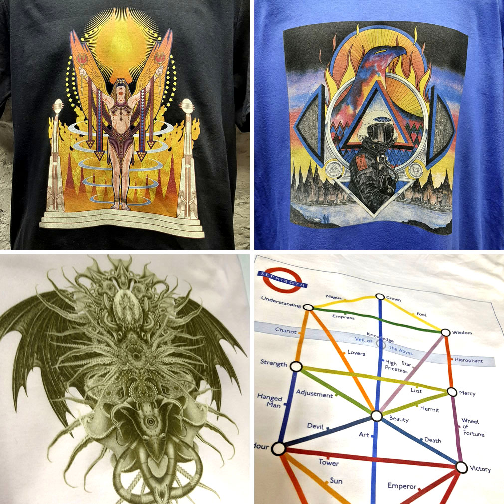
November shirts

skullprint-shirts.jpg

Skull Print shirts.

November weather isn’t exactly suitable for T-shirt wearing when you live this far north (although it’s unseasonably mild just now) but I’ve recently added four more shirt designs to my Skull Print page. As I was saying last month, now that I’ve quit CafePress all shirts featuring my art and design will be done through Skull Print, a small business who specialise in shirt-printing, and do so with very reasonable prices: £22 (inc. postage) for the UK, £32 (inc. postage) for the rest of the world. Long sleeves, sizes 3XL and over, and tie-dye colours add a little more to the cost.

skullprint-magus.jpg

It’s always the case when creating spin-off products that I’m guessing what people may want. Three of the four new designs have been extracted from popular works of the past (the Tarot designs have been given a boost now that they’re featured in the Bumper Book of Magic). I’m always open to suggestions for new designs so long as they don’t infringe on any trademarks or copyright agreements.

skullprint-priestess.jpg

skullprint-chaos.jpg

The Chaos symbol is a new creation based on a shirt I designed for Hawkwind’s Chronicle Of The Black Sword tour in 1985 (see this post). The symbol isn’t exclusive to Hawkwind, of course. Michael Moorcock invented it for the original Elric stories in the 1960s after which it was picked up by the practitioners of Chaos magic in the 1980s.

skullprint-alice.jpg

And this is one of my popular Alice in Wonderland designs which I amended for The Graphic Canon in 2012, extending the square composition into a rectangle. I may add one or two more from this series in future although this was one was easier to adapt than some of the others.