
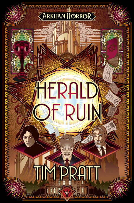
New year, new book cover. Herald of Ruin is my latest for Aconyte, a sequel to Tim Pratt’s The Ravening Deep, which featured my last cover in this series of novels spun from the Arkham Horror games:
Chaos is coming to Arkham, and its herald is Randall Tillinghast. The dapper older gentleman has recently arrived in the city and his establishment of a new occult bookshop draws the ire of Carl Sanford, the head of Arkham’s secret, esoteric order, the Silver Twilight Lodge.
Sanford expects to crush the newcomer like an ant and take what he wants from the wreckage… but Randall Tillinghast isn’t quite as humble and harmless as he seems. In possession of an array of magical artifacts, Tillinghast begins to consolidate his dreams of power before turning his sights on the Lodge.
All six covers to date have followed a similar style, combining Art Deco graphics with various kinds of Lovecraftian weirdness, views of significant architecture and pictures of the main characters. With the new book being a sequel the cover was designed as an inverse companion to The Ravening Deep. The general structure is the same but with earth tones replacing the aquarian colours, and with the character shots and interlaced septagram flipped around.
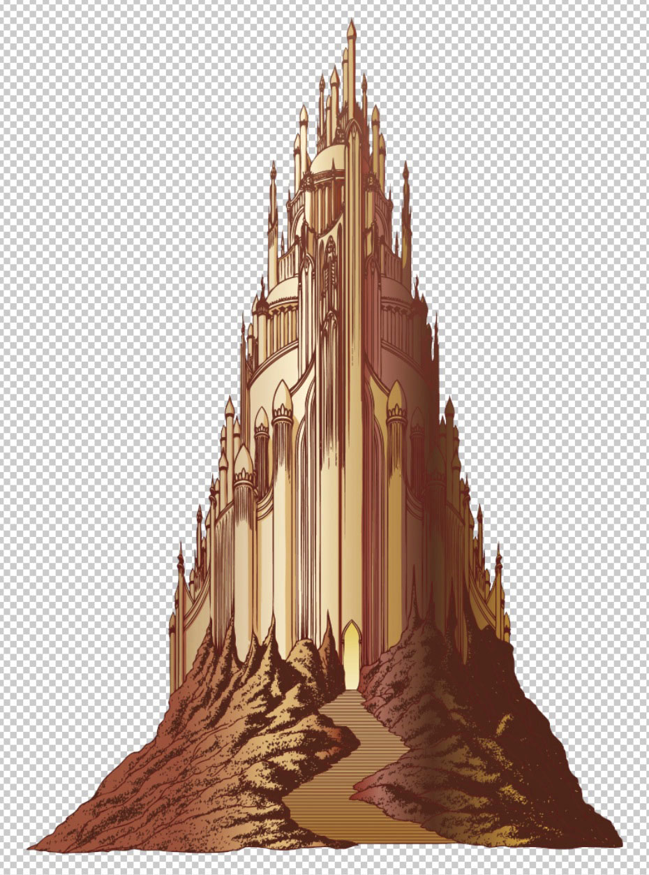
That towering edifice in the background is supposed to be the city of Sarnath which I spent some time drawing even though I knew most of it was going to be covered over. The way I work I often have to do this since I like to create all the different elements with only a vague composition in mind, after which I can shuffle things around until they assume a satisfying appearance. I also like to keep my options open in the early stages. This is something you can do more easily in Illustrator than in Photoshop, the Illustrator interface being an artboard upon which you assemble the various components of your design. Vector graphics aren’t always ideal when you’re trying to create something this complex, but the hard edges suit the Deco style and the general appearance which is more of a poster design than a picture window.
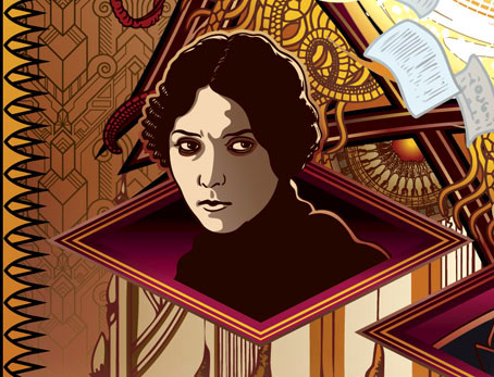
Among the other details, the eye-in-a-triangle, a device I’ve used a lot in the past, was prompted by the source material for a change. And the woman’s face is based on a photo of Musidora, one of the stars of early silent cinema in her role as Irma Vep from Feuillade’s Les Vampires (1915–16). The visual source for this character wasn’t very informative but she’s a cat burglar, and Feulliade’s serial happens to concern a group of Parisian cat burglars. I think Irma Vep may have been the first cat-burgling woman in cinema history so Musidora was a good choice with the right look for the cover.
Herald of Ruin will be published in July.
Elsewhere on { feuilleton }
• The Lovecraft archive
Previously on { feuilleton }
• The Ravening Deep
• Diamonds
• The Devourer Below
• Litany of Dreams
• The Last Ritual
Interesting insight into the creative process. The border has a bit of a folding bills currency look. And did you sneak a bit of sexual symbolism into the architecture? Or is this a case of sometimes a tower is just a tower?
One minor detail I might have reversed is the headshot of the man on the right; he might be turned so that his right side is shown, to mirror more perfectly the left side exposure of Musidora. But then, I have (more than) a bit of OCD. Congratulations on another book cover!
Thanks, Jim. Musidora was added last so I’d already done the figure on the right. I wouldn’t have wanted them to reflect each other in any case, this would have made the heads look too much like portraits of a superhero team or something, rather than separate characters. And sometimes I just want to avoid too much symmetry as well.
The towers were based on those you see in a lot of Franklin Booth’s fantasy illustrations which are often very tall, quasi-Arabian things. Those onion domes are a common feature in early 20th-century illustration, they look exotic without being too specifically connected to a single culture. And I needed a collection of tall structures to fill the available space. Ideally the city would be more horizontal.
That’s a damned good point about the “superhero” look you were avoiding with the character heads. I can absolutely see that now. I love how subtle design details can start setting story expectations in the reader before they ever get to the first page.