On self-imitation

divinecomp.jpg

Or where Angry Robot leads, HarperCollins follows… The Law of Divine Compensation by Marianne Williamson is published today in the US by HarperOne, an imprint of HarperCollins, and if the cover looks similar to Mike Shevdon‘s recent edition of Sixty-One Nails it’s because I designed both of them. Harper’s contacted me earlier this year asking if I could adapt the Sixty-One Nails design for their new Marianne Williamson title. I was a bit unsure about accepting this at first but Ms Williamson isn’t a novelist so the books wouldn’t be appearing on the same shelves; I also said I’d prefer to create new decorative elements so there was enough difference between the new design and the earlier one. In the end the design was pared back considerably during the usual to and fro between art department and marketing people. Harper’s previous titles in this series have quasi-Victorian border designs on plain backgrounds so there needed to be some continuity. I haven’t seen a copy of the book itself yet but the last I heard the design was going to be given a foil treatment on textured paper.

shevdon1.jpg

It’s always an odd feeling being asked to imitate something you’ve done before. The new work often lacks the sense of accomplishment and exploration you felt earlier because you know exactly how it’s going to end up. When I started work on Mike Shevdon’s covers all I had in mind was that basic frame shape; everything else was improvised. I still prefer those earlier designs, I like the way all the details came together, and the way they look against a black background. Mike told me recently that someone picked up one of the books in a shop to look at the cover then bought the book; that’s exactly the kind of thing a cover designer (and author!) likes to hear.

Elsewhere on { feuilleton }
The book covers archive

Previously on { feuilleton }
Book talk
The Courts of the Feyre

Picturing Dorian Gray

dorian1.jpg

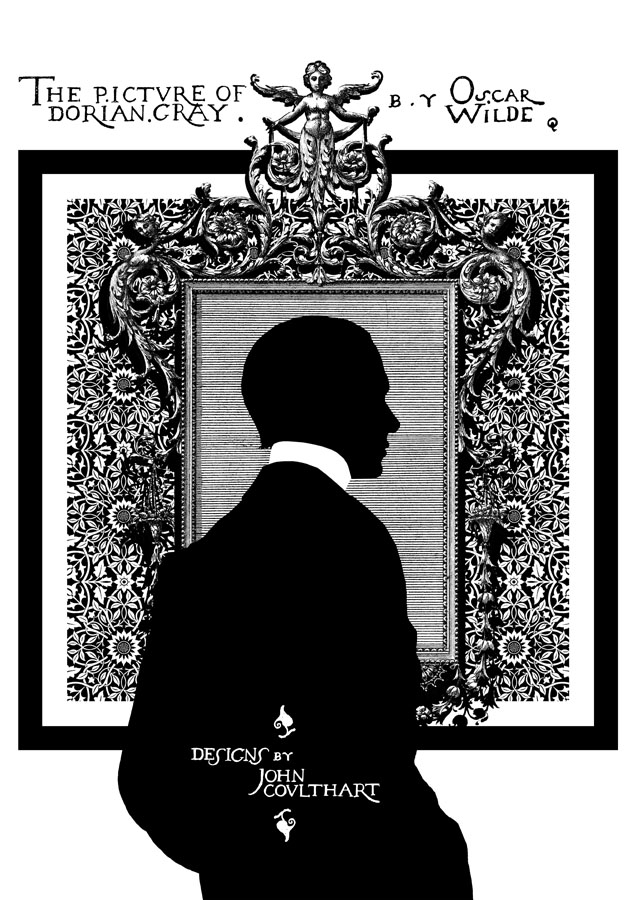
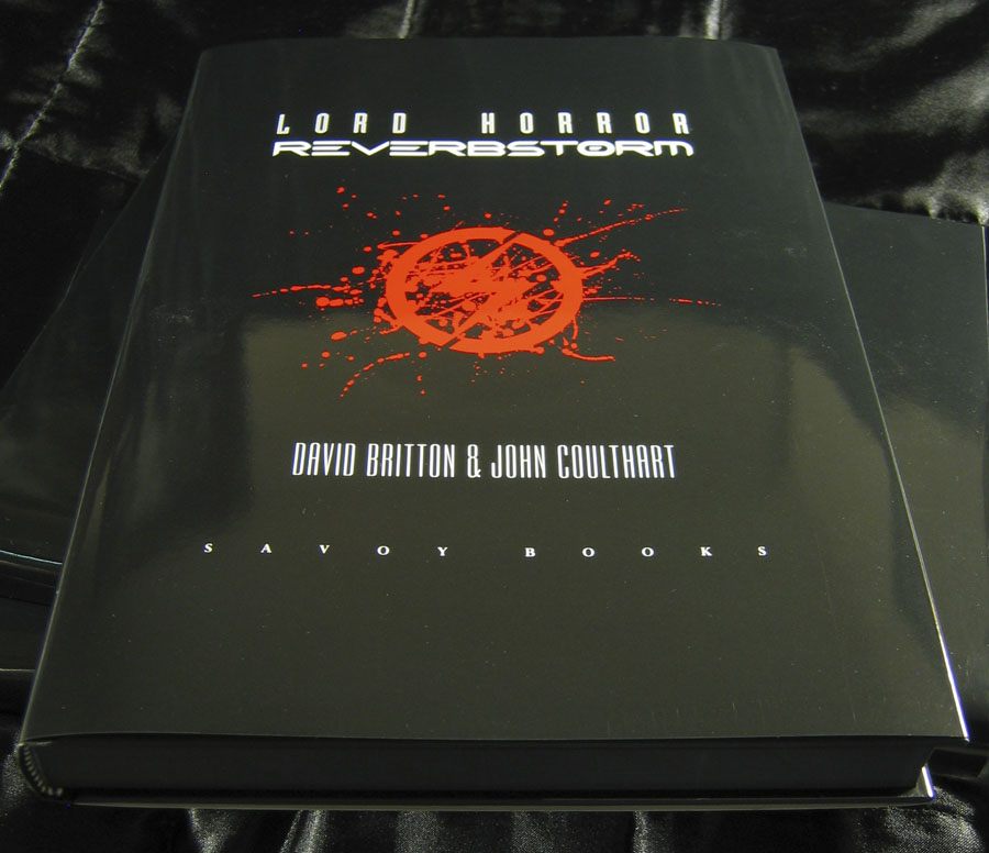
It’s taken a while but here at last are some of the pages from my series of illustrations based on The Picture of Dorian Gray, as featured in volume 2 of The Graphic Canon (“The World’s Great Literature as Comics and Visuals”) edited by Russ Kick. I agreed with Russ not to run everything so there’s some incentive to buy the book (or books…there are three volumes altogether). Now I’ve seen the printed edition the whole project seems even more remarkable: 500 large illustrated pages in a variety of media and art styles. Volume 2 runs through the 19th century and ends with my contribution; I opted to do this story in black-and-white but there’s colour used throughout the books. I especially like the Moby-Dick sequence by Matt Kish, a very different take on a very familiar tale.

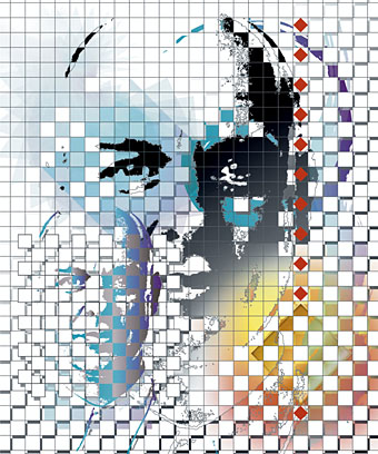
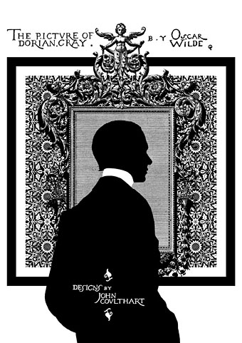
As with many of the things I’ve been doing recently I opted for adapting materials of the period. Since I have a lot of Oscar Wilde-related reference material I was able to go further and incorporate details that relate directly to the book and Wilde’s life. All the text is taken from a scan of the first printing of the novel at the Internet Archive, the title lettering being drawn originally by Wilde’s friend, publisher and illustrator Charles Ricketts. A heavy black square on each page provides some continuity as well as resembling the frames of comic pages. (Or a picture frame.) The silhouette on the opening page is another of Wilde’s friends, the writer Max Beerbohm, taken from a drawing by William Rothenstein. The pair were dandyish Café Royal regulars throughout the 1890s.

dorian2.jpg

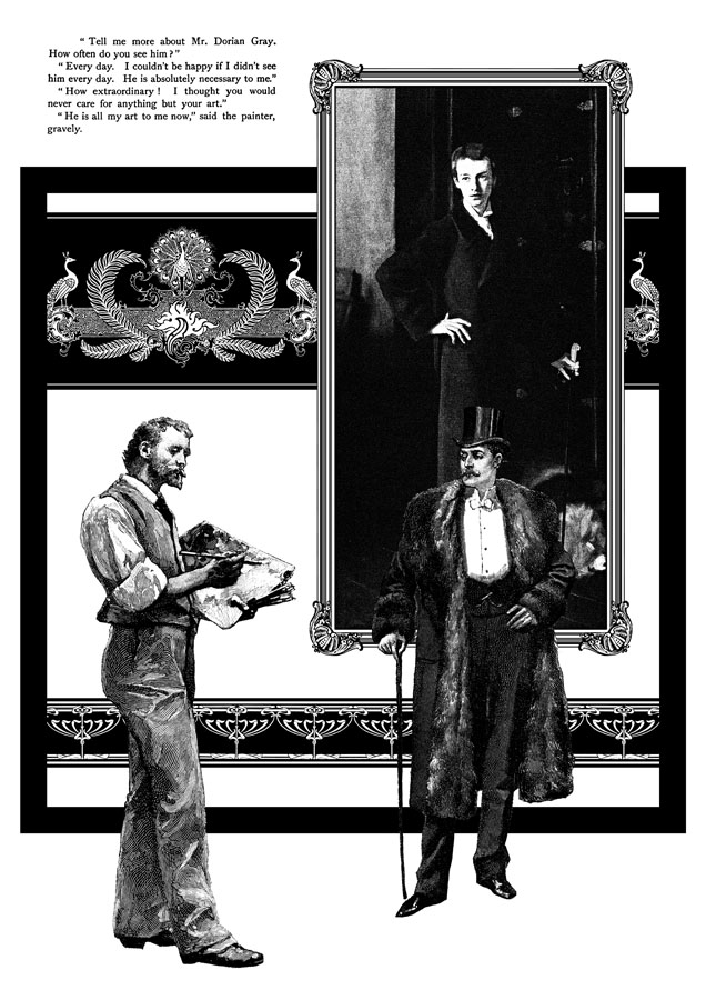
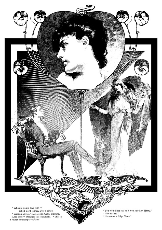
This is my favourite page. I liked the way the composition came together and also enjoyed being able to use John Singer Sargent’s portrait of W. Graham Robertson as the picture of Dorian. I’ve noted in an earlier post the similarity between this painting and the portrait seen in the BBC’s adaptation of the novel by John Osborne. Robertson was a theatre designer and illustrator who Wilde consulted when planning stage designs for what would have been the London debut of Salomé. Robertson was also (so far as we know) homosexual which adds an extra resonance.

dorian3.jpg

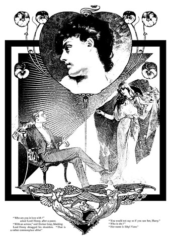
The Sibyl Vane page: a combination of details from The Studio, The Strand and The Magazine of Art. The motif at the foot of the page is by Walter Crane. Nothing of Wilde’s appeared in The Strand but that magazine’s most popular writer, Arthur Conan Doyle, had his second Sherlock Holmes adventure, The Sign of Four, commissioned at the same dinner that saw the commissioning of Dorian Gray, both novels being published by Lippincott’s Monthly Magazine in 1890.

dorian4.jpg

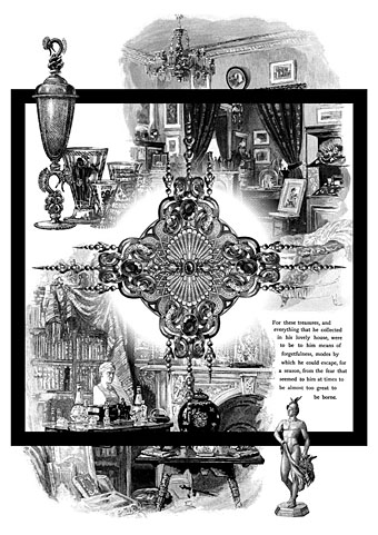
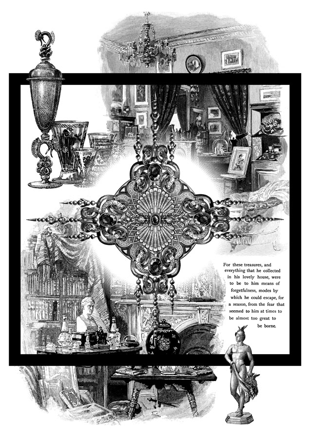
A page depicting Dorian’s distracting obsession with jewels and luxurious goods. This chapter can seem somewhat superfluous unless seen in the light of Wilde’s intention to write something like Huysmans’ À rebours (1884).

dorian5.jpg

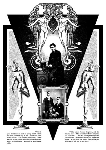
The “Love that dare not speak its name” page. This makes explicit the subtext of the book although if you read the two paragraphs I selected it’s evident enough why Dorian is causing a problem for so many young men. The blindfolded Eros was a drawing by Walter Crane which I doubled then re-drew slightly so the pair were holding hands. The boy below is a picture from The Strand of the young Edward VII, a robust heterosexual in later years but with a son, Prince Albert Victoria, who became linked to the notorious Cleveland Street Scandal which involved a male brothel catering to aristocrats. The two young men in the picture frame are described as a pair of “panthers” in Neil McKenna’s The Secret Life of Oscar Wilde (2003), by which he means that they were fin de siècle rent boys (as in Oscar’s remark about “feasting with panthers”); McKenna doesn’t give any further details about the photo but it suited the picture.

In addition to this series of illustrations, volume 2 of The Graphic Canon includes two of my Lewis Carroll illustrations in a section by different artists based on the Alice books. I’d be recommending The Graphic Canon even if I wasn’t a contributor, as I said above it’s a remarkable achievement. Watch out for it.

Elsewhere on { feuilleton }
The Oscar Wilde archive

Milbury souvenirs

milbury.jpg

A little something I ran up this weekend inspired by a certain TV serial which has been the subject of discussion recently. This is now a new design at CafePress. The idea was to do a travel poster in the style of those produced by London Transport in the 1920s promoting their destinations outside the city. I’ve always liked the colours and bold design of those prints so this piece is based on posters by artist Noel Rooke (1881–1953).

rooke.jpg

Betchworth by Noel Rooke.

The picture of the stones was adapted from a photo by Jim Champion which is made available under the Creative Commons licence. I took the liberty of enlarging the stone on the left to give it more presence. I couldn’t find a font that was a good match for Noel Rooke’s pen lettering so I scanned an alphabet from a lettering book my mother used to use when she was at art school (thanks, Mum!). The snake design is based on a postcard seen in the TV serial; nothing else looked as effective, and the combination of the snake with the slogan adds the requisite sinister touch.

Previously on { feuilleton }
A Journey to Avebury by Derek Jarman
Children of the Stones
Avebury panoramas

Arthur Rising

arthurrising.jpg

In which the sorely missed Arthur magazine returns to the world of print after a four-year slumber in Avalon. I was involved with the magazine from the outset so regular readers may recall many earlier posts about America’s most vital cultural bulletin:

After a four-year sabbatical (faked death?), your beloved revolutionary sweetheart Arthur returns to print, renewed, refreshed, reinvigorated and in a bold new format: pages as tall and wide as a daily newspaper, printed in color and black and white on compostable newsprint, with ads only on the back cover(s). Amazing!

In partnership with Portland, Oregon’s Floating World Comics, Arthur’s gang of goofs, know-it-alls and village explainers are back, from Bull Tonguers Byron Coley and Thurston Moore to radical ecologist Nance Klehm to trickster activists Center for Tactical Magic to Defend Brooklyn‘s socio-political commentator Dave Reeves to a host of new, fresh-faced troublemakers, edited by ol’ fool Jay Babcock and art directed by Yasmin Khan. You want a peek at the contents? Sorry, compadre. That would be saying too much, too soon. Wait ’til Dec. 22, 2012: that’s right—THE DAY AFTER THE NON-END OF THE WORLD!

Please keep in mind… Arthur is no longer distributed for free anywhere. Those days are (sadly) long gone. Now you gotta buy Arthur or you won’t see it. Our price: Five bucks cheeeeeep!

Arthur No. 33
Broadsheet newspaper, 15″ x 22.75″
Available Dec. 22, 2012
NOW YOU MAY PRE-ORDER ARTHUR NO. 33 HERE.

The NYT picked up on the news on Thursday. Is re-launching a paper magazine in 2012 a crazy idea? We’re about to find out. A selection of my illustrations for previous issues follows.

mbvarkestra.jpg

MBV Arkestra (2003).

crowley.jpg

The Aeon of Horus (2004).

pentagon.jpg

Out, Demons, Out! (2004).

eno.jpg

Brian Eno (2005).

richardbishop.jpg

Sir Richard Bishop (2007).

Reverbstorm in print

rev1.jpg

A couple of months ago I was starting to wonder whether I’d ever see this book printed, the production process became so tortuously drawn out. But Reverbstorm is finally in print and looking exactly the way I intended with black boards, black endpapers and black ink on the page edges. The latter proved to be a costly extra which explains why it’s an uncommon effect.

rev2.jpg

More important than the book design is that the printing of the artwork is excellent, with rich blacks and pin-sharp detail throughout. You’d think that printing black-and-white pages was a fairly straightforward business but the first set of proofs were pretty disastrous, the ink bleeding over the edges of many panels and detail elsewhere being blacked in. A combination of copious cross-hatching, spattered ink and—on later pages—brush shading and monochrome painting proved to be too much when the A3 artwork was reduced to half its size. This was particularly galling since these pages had never been properly printed since they were drawn: the original comics looked glossy enough but were all produced by back-street printers who didn’t bother too much about quality, and even made mistakes. They were a necessary evil at a time when other Savoy books had been refused by printers who objected to the material they contained. The relief at finally seeing the series completed and printed to this standard is considerable.

rev3.jpg

However, I’m afraid would-be purchasers still have a slight wait before they can buy a copy. The official publication date will now be early February but copies will be available to buy from the first week in January after distribution details have been finalised. I tried to persuade Savoy to relent on this and let a few copies go out prematurely but that won’t be happening. Sorry to anyone who’s been waiting since April (!) for the book but the decision is out of my hands. I believe it’ll be worth the wait. This is a better book than The Haunter of the Dark, and the best (and last) thing I’ll do in the comics medium. Next up is Axiom, a different world entirely. More about that later.

rev4.jpg

Previously on { feuilleton }
Reverbstorm update
James Joyce in Reverbstorm
A Reverbstorm jukebox
Reverbstorm: Bauhaus Horror
Reverbstorm: an introduction and preview