Milbury souvenirs

milbury.jpg

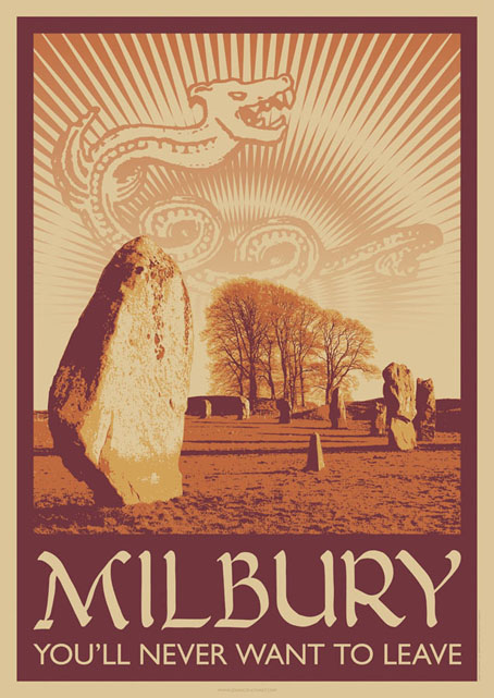
A little something I ran up this weekend inspired by a certain TV serial which has been the subject of discussion recently. This is now a new design at CafePress. The idea was to do a travel poster in the style of those produced by London Transport in the 1920s promoting their destinations outside the city. I’ve always liked the colours and bold design of those prints so this piece is based on posters by artist Noel Rooke (1881–1953).

rooke.jpg

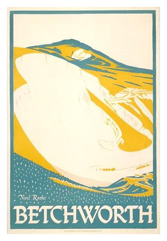
Betchworth by Noel Rooke.

The picture of the stones was adapted from a photo by Jim Champion which is made available under the Creative Commons licence. I took the liberty of enlarging the stone on the left to give it more presence. I couldn’t find a font that was a good match for Noel Rooke’s pen lettering so I scanned an alphabet from a lettering book my mother used to use when she was at art school (thanks, Mum!). The snake design is based on a postcard seen in the TV serial; nothing else looked as effective, and the combination of the snake with the slogan adds the requisite sinister touch.

Previously on { feuilleton }
A Journey to Avebury by Derek Jarman
Children of the Stones
Avebury panoramas

Arthur Rising

arthurrising.jpg

In which the sorely missed Arthur magazine returns to the world of print after a four-year slumber in Avalon. I was involved with the magazine from the outset so regular readers may recall many earlier posts about America’s most vital cultural bulletin:

After a four-year sabbatical (faked death?), your beloved revolutionary sweetheart Arthur returns to print, renewed, refreshed, reinvigorated and in a bold new format: pages as tall and wide as a daily newspaper, printed in color and black and white on compostable newsprint, with ads only on the back cover(s). Amazing!

In partnership with Portland, Oregon’s Floating World Comics, Arthur’s gang of goofs, know-it-alls and village explainers are back, from Bull Tonguers Byron Coley and Thurston Moore to radical ecologist Nance Klehm to trickster activists Center for Tactical Magic to Defend Brooklyn‘s socio-political commentator Dave Reeves to a host of new, fresh-faced troublemakers, edited by ol’ fool Jay Babcock and art directed by Yasmin Khan. You want a peek at the contents? Sorry, compadre. That would be saying too much, too soon. Wait ’til Dec. 22, 2012: that’s right—THE DAY AFTER THE NON-END OF THE WORLD!

Please keep in mind… Arthur is no longer distributed for free anywhere. Those days are (sadly) long gone. Now you gotta buy Arthur or you won’t see it. Our price: Five bucks cheeeeeep!

Arthur No. 33
Broadsheet newspaper, 15″ x 22.75″
Available Dec. 22, 2012
NOW YOU MAY PRE-ORDER ARTHUR NO. 33 HERE.

The NYT picked up on the news on Thursday. Is re-launching a paper magazine in 2012 a crazy idea? We’re about to find out. A selection of my illustrations for previous issues follows.

mbvarkestra.jpg

MBV Arkestra (2003).

crowley.jpg

The Aeon of Horus (2004).

pentagon.jpg

Out, Demons, Out! (2004).

eno.jpg

Brian Eno (2005).

richardbishop.jpg

Sir Richard Bishop (2007).

Reverbstorm in print

rev1.jpg

A couple of months ago I was starting to wonder whether I’d ever see this book printed, the production process became so tortuously drawn out. But Reverbstorm is finally in print and looking exactly the way I intended with black boards, black endpapers and black ink on the page edges. The latter proved to be a costly extra which explains why it’s an uncommon effect.

rev2.jpg

More important than the book design is that the printing of the artwork is excellent, with rich blacks and pin-sharp detail throughout. You’d think that printing black-and-white pages was a fairly straightforward business but the first set of proofs were pretty disastrous, the ink bleeding over the edges of many panels and detail elsewhere being blacked in. A combination of copious cross-hatching, spattered ink and—on later pages—brush shading and monochrome painting proved to be too much when the A3 artwork was reduced to half its size. This was particularly galling since these pages had never been properly printed since they were drawn: the original comics looked glossy enough but were all produced by back-street printers who didn’t bother too much about quality, and even made mistakes. They were a necessary evil at a time when other Savoy books had been refused by printers who objected to the material they contained. The relief at finally seeing the series completed and printed to this standard is considerable.

rev3.jpg

However, I’m afraid would-be purchasers still have a slight wait before they can buy a copy. The official publication date will now be early February but copies will be available to buy from the first week in January after distribution details have been finalised. I tried to persuade Savoy to relent on this and let a few copies go out prematurely but that won’t be happening. Sorry to anyone who’s been waiting since April (!) for the book but the decision is out of my hands. I believe it’ll be worth the wait. This is a better book than The Haunter of the Dark, and the best (and last) thing I’ll do in the comics medium. Next up is Axiom, a different world entirely. More about that later.

rev4.jpg

Previously on { feuilleton }
Reverbstorm update
James Joyce in Reverbstorm
A Reverbstorm jukebox
Reverbstorm: Bauhaus Horror
Reverbstorm: an introduction and preview

World Fantasy Awards

infernal.jpg

Presenting some of the cover art and interior illustration from 2011 which won me the World Fantasy Award for best artist in Toronto on Sunday. (The complete awards list is here.) It was a surprise to be nominated, and even more of a surprise to win since working in different areas—book, music, comics—is never a good way to get noticed for doing one particular thing. It’s also the case that sf/fantasy art awards tend to favour painters or virtuoso digital artists over people such as myself who I suppose are more illustrator-designers; that’s not a criticism, just an acknowledgement of the strength and popularity of highly-refined pictorial art in this area of the literary world. The recognition hazard works in the opposite direction: the design world often gives the most attention to graphic design alone, with the illustration quotient being regarded as secondary content.

I’m not exactly sure what the judges were looking at of my work so these examples have been chosen for being published during the year under examination. They’re also covers that people seemed to like a lot, especially KW Jeter‘s Morlock Night (even though I still prefer Infernal Devices!), and those for Mike Shevdon‘s books. The Jeter and Shevdon volumes are all published by Angry Robot who will also be publishing Lavie Tidhar‘s The Bookman Histories early next year sporting another of my covers. Lavie’s novel Osama won best novel in Toronto while Ann and Jeff VanderMeer (editors of the Lambshead book below) picked up a best anthology award for their monumental The Weird. And to add to the good company, my regular publishers Tachyon saw one of their authors, Tim Powers, gaining best story collection. Congratulations to everyone, and a big thanks to Ann for collecting my award.

I’m always using these posts to point to other artists so it’s only right that I encourage everyone to go and look at the work of the other nominees. Here they are (although Jon Foster’s site appears down at the moment):

Julie Dillon
Jon Foster
Kathleen Jennings
John Picacio

John Picacio has a rather gorgeous calendar due out soon, details here.

morlock.jpg

lambshead.jpg

Title page for The Thackery T. Lambshead Cabinet of Curiosities edited by Ann & Jeff VanderMeer (Harper Voyager).

shevdon1.jpg

Continue reading “World Fantasy Awards”

More CthulhuPress

cthulhoid.jpg

Cthulhoid (2012).

I finally found time this weekend to add these recent works to my CafePress shops so they’re now available as prints. I’ll add a few more products later on although not everything at CafePress suits either square images or work with large amounts of detail. Click on the pictures for the links.I don’t think I’ve mentioned before that Cthulhoid will soon be appearing soon on the cover of a Lovecraftian fiction collection edited by ST Joshi. The book is A Mountain Walked: Great Tales of the Cthulhu Mythos from Centipede Press. I haven’t been given a publication date yet but it’ll probably be out early next year.

And do I need to say for the fifth or sixth time that these pictures are also a part of this year’s Cthulhu Calendar? They are. Thanks to everyone who’s bought a copy so far.

deprofundis.jpg

De Profundis (2012).

tentaclelatitudes.jpg

S. Latitude 47°9?, W. Longitude 126°43? (2012).

Previously on { feuilleton }
Cthulhu Calendar
S. Latitude 47°9′, W. Longitude 126°43′
Resurgam variations
De Profundis
Cthulhoid and Artflakes
Cthulhu for sale
Cthulhu God
Cthulhu under glass
CthulhuPress
Cubist Cthulhu