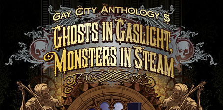
Ghosts in Gaslight, Monsters in Steam

ghosts.jpg

Ghosts in Gaslight, Monsters in Steam is a forthcoming anthology in the Gay City Anthology series from Seattle’s Gay City Health Project and Minor Arcana Press. The publishers describe it as “a multidisciplinary anthology of amazing queer monster and ghost fiction, poetry and art.” I’ve created a cover design for the book, and also have a work-in-progress extract from the never-ending novel I’ve been immersed in since August 2006, a self-contained piece which I call Study in Blue, Green, and Gold. As the anthology title implies, the general (although not exclusive) tenor is spooky steampunk business with a queer inclination; my piece features copious quantities of sex, hallucinogenic drugs, steam locomotives and a fractal cat. Anyone wishing to know more is encouraged to give a push to the Kickstarter donation fund which has been launched to help with promotional costs. I’m very pleased to be involved with this, not least because some of the fiction I’ve been working on for over a decade will receive an airing. I’ve resolved recently to start pushing the writing side of things a bit more so this is a start. When the final anthology contents are announced next month I’ll post an update here.

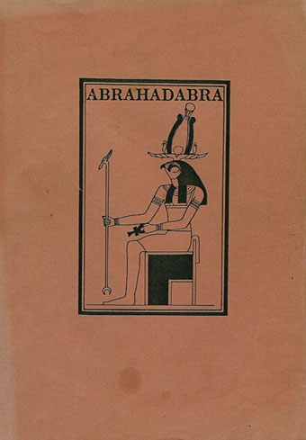
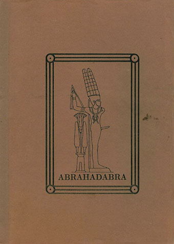
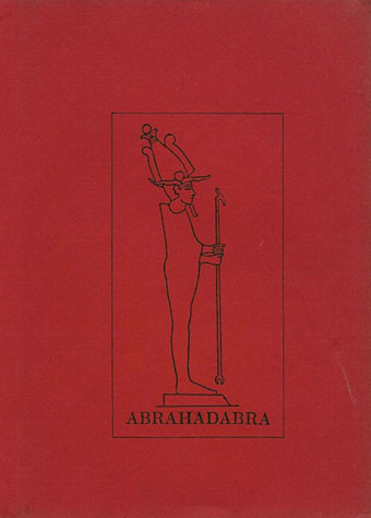
Abrahadabra

abrahadabra01.jpg

01 First (1985).

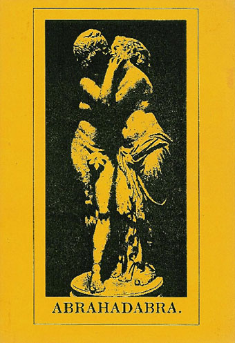
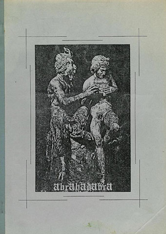
I’ve linked to so many publications at the Internet Archive I’m a little surprised it’s taken me this long to find something featuring my own work. Abrahadabra was a Dutch periodical covering subjects familiar to readers of the esoteric magazines of the 1980s (RE/Search, Rapid Eye, etc): Industrial music of the TG/Psychic TV/Coil variety, transgressive writers such as Burroughs, Ballard and Bataille, weird fiction of the Lovecraft/Machen school, and a heavy emphasis on occultism. My friend Ed was one of the contributors which is how my Pan drawing ended up in the Witches issue in 1987.

For a publication with minimal resources the production was often impressive, the drawing on the cover of the Austin Spare issue, for instance, being printed in silver ink on black paper. The contents were mostly in Dutch but each issue featured interesting and often original graphics. I also drew a small Horus head for issue 11 (which I’d forgotten about until I saw it again), whose title design was used on the cover of issue 12. Some of the other issues I hadn’t seen before so it’s good to find them scanned and easily available. The 1980s was the last time print was used as the primary medium for underground culture to talk to and disseminate itself. By the end of the decade many of the small magazines had either evolved—both RE/Search and Rapid Eye turned into books—or expired. The final Abrahadabra is dated 1990.

abrahadabra02.jpg

02 Second (1985).

abrahadabra03.jpg

03 Third (1985).

abrahadabra04.jpg

04 Sex (1985).

abrahadabra05.jpg

05 Derangement (1985).

Continue reading “Abrahadabra”

Reverbstorm at Supervert

reverbstorm.jpg

Keith Seward’s Horror Panegyric was a concise examination of David Britton’s multimedia Lord Horror project which Savoy Books published in 2007. I designed the book, the cover of which was my Arcimboldo pastiche of Lord Horror’s profile which appeared on the cover of issue 3 of Reverbstorm. The Supervert site which hosts an online copy of Horror Panegyric has this month posted my answers to some questions about Reverbstorm, the series having grown out of the first Lord Horror novel and the earlier comics:

The graphics in Reverbstorm sometimes seem more narrative than the words. How did you and David work out a scenario?

I don’t have objections per se to the usual story structures but in this series we both wanted to create something that wasn’t following familiar adventure narrative lines. The precedents for me were the European comic artists from Métal Hurlant who often favoured art over story; also Burne Hogarth whose work was a great influence on the style I used to draw Lord Horror. Hogarth’s Tarzan strips are adventure narratives but in his later books it’s the art that’s paramount. James Joyce is one of the characters in Reverbstorm, and you can also find a precedent in Ulysses where the story is overwhelmed by the surface detail.

Reverbstorm began with Paul Temple’s lyrics for the Reverbstorm song and a brief Lord Horror film treatment that Dave and Mike had put together for a production company. I don’t recall much about the treatment — I only looked at it once in the office — but it concerned Horror and Jessie Matthews in New York City, opening with a sequence where his Lordship kills some policemen in an alleyway. That vague outline can be seen in the first few pages of Reverbstorm with NYC changed to Torenbürgen. Other elements taken from the film treatment included the name Blue Blaze Laudanum — the actual robotic character came later — and the Souls which likewise became more substantially developed as the comic progressed.

Once we’d introduced all the characters things developed along thematic lines rather than strictly narrative ones. So the second part introduces the Ether Jumpers, the third part has the Apes, the fourth part the Ononoes, the fifth part Picasso and T.S. Eliot, and so on. Musical structure is an obvious parallel, and I consider some of the recurring background material to be visual leifmotifs which can indicate or imply one of the three main characters even if they aren’t present on the page. This musical analogy is an important one for appreciating the series as a whole. The entwined themes and references work in a manner that’s a lot closer to musical works than to the mechanics of an adventure narrative. (more)

Previously on { feuilleton }
Reverbstorm in print
Reverbstorm update
James Joyce in Reverbstorm
A Reverbstorm jukebox
Reverbstorm: Bauhaus Horror
Reverbstorm: an introduction and preview

Weekend links 150

feanne.jpg

One of A Pair of Peacocks (2012) by Feanne.

Jonathan Barnbrook reveals his package design for the new David Bowie CD. The Barnbrook studio has also designed the catalogue for the forthcoming V&A Bowie exhibition. And there’s more (don’t worry, it’ll be over soon): Jon Savage on When Bowie met Burroughs.

• “Witches have a fashion moment,” says the NYT. Nice clothes but the writing trots out too many of the usual lazy clichés. Related: A Tale of Witches, Woodland and Half-remembered Melodies…, a new mix by Melmoth the Wanderer.

Calidostópia! is a free album (FLAC & mp3) from Marcus Popp aka Oval: “an enticing 16-track collaboration…with seven wonderful singers/musicians from all over South America”.

Before meeting Moorcock in person, [Hari] Kunzru went on to say, ‘I didn’t realise the role he’d played in connecting so many different scenes and undergrounds together – the psychedelic music scene, the science fiction scene, the hip experimental literature scene around people like William Burroughs, pop art’.

Brave New Worlds: A Michael Moorcock Retrospective by Carol Huston. Moorcock’s Elric novels will be published by Glénat in new bande dessinée adaptations later this year.

• More art by Michael W. Kaluta at The Golden Age. And more fantastic comics/illustration by Philippe Caza at 50 Watts. There’s more Caza here.

• Mine and David Britton’s new book, Lord Horror: Reverbstorm, was reviewed at The Spectator.

Google Street Scene: “Moments of cinema captured by Google Street View cameras”.

Cosmic Sentinels and Spiral Jetties: JG Ballard, Robert Smithson & Tacita Dean

• Strange Flowers showcases the heads of Pavel Tchelitchew, 1949–1952.

Setting in the East: Diamanda Galás on Women and Real Horror

Little Joe: “A magazine about queers and cinema, mostly.”

Nanoparticles loaded with bee venom kill HIV.

Treatises on Dust: Antic Found Texts

The Wizard Blew His Horn (1975) by Hawkwind (with Michael Moorcock) | Brothel In Rosenstrasse (1982) by Michael Moorcock’s Deep Fix | Running Through The Back Brain (1983) by Hawkwind (with Michael Moorcock)

Intuosity

intuos.jpg

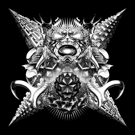
I never used a graphics tablet for drawing, in the past if I needed to draw something I’d use pencil and paper then scan the results. In recent years, however, I’ve grown dissatisfied with this process, especially after I rearranged my work area and packed away the space-hogging Ikea table I used to use as a drawing surface. This left me without a decent drawing area so this week I’ve finally capitulated and bought an Wacom Intuos tablet. The Giger-esque mess above is the result of playing around in Photoshop for a couple of hours. Having spent years using the blunt instrument of a mouse for Photoshop painting the combination of pen and tablet had immediate benefits, and I’ve found them both very easy to use. The sensitivity of the pen is impressive, something I was always dubious about. With the right brush selection it’s almost exactly like using a pencil or pen. Almost. I’m still not feeling as entirely in control of the end result as you do when drawing on paper, but I’ve not even used the thing for a whole day yet so I imagine that will change. I’m also surprised by how quickly the nib wears down; fortunately the pen comes supplied with a small stock of fresh nibs. The next week or so will be spent in further experimentation so if any interesting results materialise I’ll post them here.