In the hands of FATE

fate.jpg

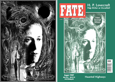
One of my works graces the cover of an American institution this month with the appearance of my HP Lovecraft portrait on the August issue of FATE magazine (volume 60, number 8, issue 688, if you must know). This is for an article about Lovecraft’s occult connections and I believe they’ve also used one of my views of R’lyeh for the article itself although I can’t confirm this just now.

predators.jpg

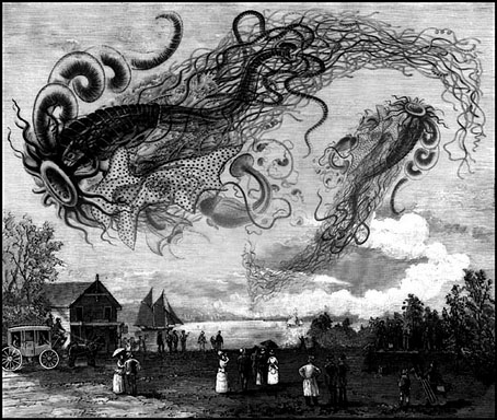
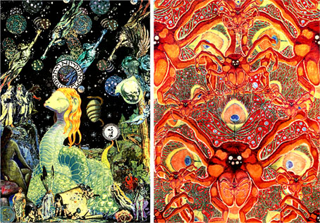
This is the third time my work has appeared in FATE (like TIME, the magazine prefers to see its name in caps). The first occasion was for another Lovecraft feature about Cthulhu in (I think) 1999. Then in 2000 I was commissioned to produce the illustration above for an article on “sky predators” which led me to plunder once again Ernst Haeckel’s Art Forms in Nature, a wonderful book I’ve frequently swiped from when in need of organic weirdness.

A couple of years later this picture was featured in a Fox TV documentary of all things, part of a post X-Files series called Conspiracy Theory. The subject was “flying rods”, one of the less convincing manifestations of cryptozoological phenomena, and the program needed some antique pictures to back up their thin veneer of evidence. They rather scurrilously used my picture to illustrate flying rod history as though this was a Victorian illustration, not a piece of Photoshop work. Fox documentaries, like their news channel, seem to have a flexible approach to the truth.

Previously on { feuilleton }
New things for June
Le horreur cosmique

Impressions de la Haute Mongolie revisited

impressions.jpg

Impressions de la Haute Mongolie – Hommage á Raymond Roussel (1974-75).

When I wrote a short reminiscence about Impressions de la Haute Mongolie last March I really didn’t expect I’d be watching it again just over a year later having waited thirty years for the opportunity. But now we can all see José Montes-Baquer’s collaboration with Salvador Dalí, thanks to the indispensable Ubuweb. The copy there doesn’t have English subtitles, unfortunately, but the visuals are still beguiling and not too difficult to follow if you can understand some French and Spanish. It was a curious experience seeing this again, some parts I remembered very well, others I’d completely forgotten about. Most surprising was the soundtrack of electronic music, much of it taken from recordings by Wendy Carlos, including a part of her ambient Sonic Seasonings suite and portions of her complete score for A Clockwork Orange. There’s more about this deeply strange film in Tate Etc.

And speaking of surreal landscapes, it’s worth mentioning that I’ve spent the past few weeks working on a new piece of Lovecraft-themed artwork for an exhibition at Maison d’Ailleurs, the Museum of science fiction, utopia and extraordinary journeys in Yverdon-les-Bains, Switzerland. The exhibition of newly-commissioned work based on themes from HP Lovecraft’s Commonplace Book will be launched in October 2007. More details about the event, and my contribution, closer to that date. In the meantime, the European edition of TIME magazine has a short feature about the gallery and its ethos.

Previously on { feuilleton }
Dalí and Film
Ballard on Dalí
Fantastic art from Pan Books
Penguin Surrealism
The Surrealist Revolution
The persistence of DNA
Salvador Dalí’s apocalyptic happening
The music of Igor Wakhévitch
Dalí Atomicus
Las Pozas and Edward James
Impressions de la Haute Mongolie

The Demon Regent Asmodeus

demon_regent.jpg

The Demon Regent Asmodeus (2006).

Alan Moore readers have finally discovered my little easter egg on the Mindscape of Alan Moore DVD so I can now talk about the creation of this miniature work. Director Dez Vylenz and I thought it would be nice to have a hidden extra somewhere on the main disc and this was the result.

am.jpg

Glykon and Asmodeus by Alan Moore (1994).

I’d always liked the Asmodeus section that Alan reads on the first Moon & Serpent CD and had the idea for some kind of animation based around the reading using his 1994 portrait of Asmodeus for the visuals. I used Apple’s Motion application for the animation of the DVD menus and it was this application that also animated the three-minute film. Alan’s picture was the sole source for all the visuals even though for most of the running time these are a kaleidoscopic mesh of circles and hexagons. The reading (with sound effects by Tim Perkins) works symmetrically, building to a central point then reversing itself so that the words from the first half are read in reverse order. I followed this scheme with the animation; the film begins in abstraction, evolves into the Asmodeus portrait then devolves back into abstraction. There’s also a symmetrical split to the visuals which are matched along a vertical axis in the centre of the screen. I had James Whitney’s Lapis in mind when creating these circular patterns although Whitney’s forty-year-old film remains abstract throughout. Whitney’s film was also done the hard way, one frame at a time, without the luxury of computer filters.

The Mindscape of Alan Moore is available via mail order from Shadowsnake Films.

Previously on { feuilleton }
Alan Moore in Arthur magazine
Of Moons and Serpents
Lapis by James Whitney

Weel done, Cutty-sark!

faed.jpg

Brad David wrote last week asking about the picture I used on the recent Jack Rose poster design. I’d seen this engraving for years in various books but was unsure of its provenance so the enquiry made me curious as well. The picture in question is an illustration for the poem Tam O’Shanter by Robert Burns and since it’s a depiction of cavorting witches and warlocks it turns up frequently in occult encyclopedias.

After a bit of searching it transpires that the engraving is based on a series of six paintings illustrating the poem by Scottish artist John Faed (1819–1902). Here we’re seeing the moment just before drunken Tam (his face visible at the window) shouts “Weel done, Cutty-sark!” to the young witch in the centre, whereupon the lights go out and a shrieking horde of angry witches chase him home.

Elsewhere on { feuilleton }
The etching and engraving archive

Design as virus 1: Victorian borders

bookplate.jpg

There’s nothing new about drawing attention to the viral nature of design, whether in the repeated use of motifs and styles or the way in which typefaces breed and proliferate; Jonathan Barnbrook alludes to this process directly by calling his font house Virus.

The plate above comes from a Victorian book I bought several years ago, The Pictorial Cabinet of Marvels, a reasonably lavish volume for children concerning places and things of interest around the world. Since I like playing with excessive Victorian flourishes now and then I’m always on the look out for new examples and the border here immediately caught my eye. I have a decent selection of clip art books from Dover and Pepin containing this kind of thing but nothing quite like this particular design. When I was putting the Damnation and A Day album together for Cradle of Filth I took one of the corner pieces as a starting point for a border design I used on the front and back of the booklet and the tray.

damncov.jpg

The poor old Xaverian Brothers of Manchester’s Catholic Collegiate Institute would no doubt be mortified to see part of their prize bookplate being used to decorate such a blasphemous artefact. The album was released by Sony Music in 2003 so this little border motif has travelled the world by now. I seem to recall sending the record company the border design separated from the artwork so they could make up some posters.

And so we come to what I’m assuming is its latest manifestation, a poster design for Manifest Destiny, a Los Angeles music event organised by Tee Pee Records.

tee-pee.jpg

I say “assuming” since I’ve no idea whether this example is from my design or not. But it seems a safe bet seeing as the original is from such an obscure source. Not that I mind if it is, of course. I can’t very well complain when I swiped the thing in the first place, now can I?

Update: Tee Pee designer Sarah MacKinnon writes to say her Victorian motif is from one of Dover’s clip art books. Now I know that I wouldn’t mind finding the book for my own collection. This makes the occurrence of the original more unusual, at least from my point of view, since it’s the only time I’ve spotted one of these reprinted elements in its period setting.

Previously on { feuilleton }
Masonic fonts and the designer’s dark materials