Fuzz Against Junk & The Hero Maker

rubington1.jpg

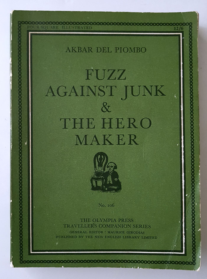
This is another of those posts in which I brag about finding an old book in a charity shop for a lot less than you’d have to pay for it online. But it does give me the opportunity to say something about American writer/artist Norman Rubington and his alter ego Akbar Del Piombo, something I was sure I’d done already. One of the weekend posts linked to an article about Rubington’s work but my discussion of his collages is in the essay I wrote about Wilfried Sätty for the Strange Attractor Journal, a piece which isn’t available here.

rubington8.jpg

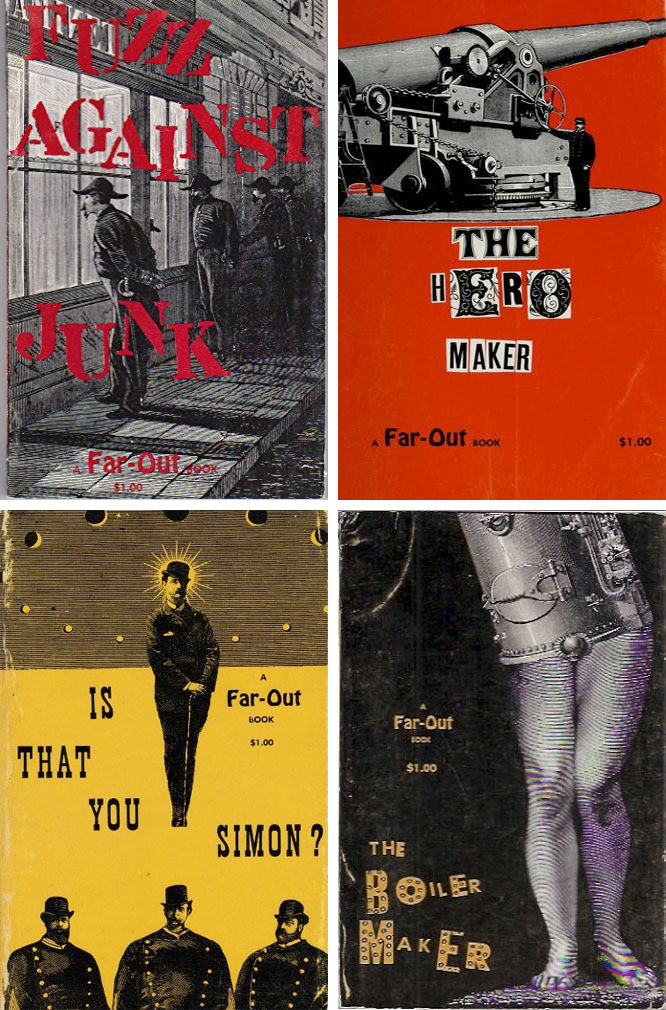
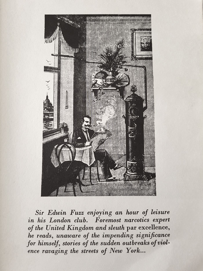
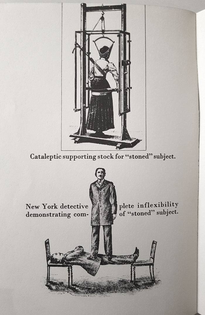
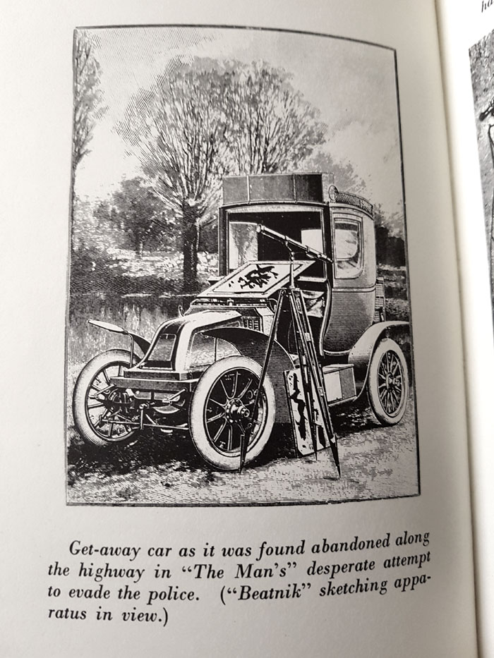
The engraving collages of Norman Rubington (1921–1991) were probably the first to use the form developed by Max Ernst for explicitly humorous purposes. They’re certainly among the earliest to take the lead from Ernst while aiming themselves at an audience outside the art world. There is humour in some of Ernst’s collages, of course, but it tends to be the black variety favoured by the Surrealists (and actually defined by them; André Breton’s 1940 Anthology of Black Humour was a pioneering study). Rubington’s small books exploit the comic potential of antique illustrations by repurposing them as the primary content in a series of absurd narratives; these aren’t “graphic novels”, they’re more like heavily-illustrated comedy routines. There were four books in the original series—Fuzz Against Junk (1959), The Hero Maker (1959), Is That You Simon? (1961) and The Boiler Maker (1961)—with a fifth title, Moonglow, appearing in 1969. Olympia Press published the books in France, with US editions appearing around the same time under the Far-Out imprint used by Citadel Press. My charity purchase is the 1966 New English Library reprint of an Olympia Press collection of the first two volumes. The olive-green Olympia covers always provoke a Pavlovian grab response when I see one on a shelf although I’ve yet to find a copy that wasn’t an NEL reprint.

rubington2.jpg

rubington3.jpg

rubington4.jpg

Continue reading “Fuzz Against Junk & The Hero Maker”

Art on film: Je t’aime, Je t’aime

resnais1.jpg

Design by René Ferracci.

Continuing an occasional series about artworks in feature films with a return to Alain Resnais. This one is less substantial than the Providence post, but 2022 happens to be the director’s centenary year, and this particular film, like Providence, is worthy of greater attention.

Last Year at Marienbad is occasionally proposed as science fiction of a very rarified sort (JG Ballard thought it was) but there’s no question about the SF credentials of Je t’aime, Je t’aime (1968), a drama that uses time travel to explore a troubled romantic relationship. Claude Ridder (Claude Rich), an unattached, suicidal man, is persuaded by scientists to assist with a potentially hazardous experiment. He agrees to a one-minute excursion into his past but the experiment doesn’t work as intended, causing him to be caught between the present—in which he can’t escape from a womb-like time machine—and his recent past, in which he relives brief moments without any awareness during the return period of their being a part of the experiment. The flashbacks that comprise most of the film’s running time show us a random sequence of the events leading to Claude’s suicide attempt, the end result of his relationship with his terminally ill partner, Catrine (Olga Georges-Picot).

resnais2.jpg

The time machine.

Despite the presence of a time machine and a script by Jacques Sternberg, a Belgian science-fiction writer, Resnais was adamant that Je t’aime, Je t’aime wasn’t a science-fiction film. This is the kind of comment guaranteed to annoy the more zealous SF reader but it’s true in the sense that the film isn’t about time travel or time machines per se; the temporal experiment is a device to allow the non-linear exploration of a human drama that’s the real concern of director and writer. Previous Resnais films had dealt with remembrance of one sort or another, often using flash cuts to juxtapose different moments or scenes remembered or imagined. Je t’aime, Je t’aime pushes these techniques to an extreme, showing us every facet of the Claude/Catrine relationship, from initial meeting to tragic end. The narrative fragmentation isn’t so surprising today but it was a radical step in 1968, one that proved commercially unsuccessful.

In addition to having a Belgian writer, Je t’aime, Je t’aime is mostly set in Brussels, so the art this time is a famous Belgian painting, one of the many versions of The Empire of Light by René Magritte, which appears in the scenes in Claude’s apartment.

resnais3.jpg

In other hands this might be an incidental decoration but, as Providence demonstrates, Resnais was a director who enjoyed significant details, even if the signification isn’t always obvious. The Magritte painting serves two functions: its slow migration from one side of Claude’s apartment to the other (and the appearance of other pictures around it) shows the passage of time from one flashback to the next.

Continue reading “Art on film: Je t’aime, Je t’aime”

Metropolis Magazine, 1927

metropolis1.jpg

When Fritz Lang’s Metropolis was released in Britain the distributors, Wardour Films Ltd, produced a 32-page guide to the film filled with production stills and brief pieces written by the cast and crew. I have a facsimile copy of this publication, a limited reprint by Phantasm Press, but the original document is also available for reading or downloading at the Internet Archive. Publications like this were the standalone equivalent of promotional pieces created for the readers of film magazines; Metropolis was Ufa’s most expensive production to date so there would have been a need for serious promotion.

metropolis2.jpg

None of this effort helped make the film a success, however. Lang’s epic is a masterpiece of direction and production design but Thea von Harbou’s script was the kind of absurd and naive fare you often get from writers incapable of projecting the complexities of the present day into their visions of the future. (HG Wells was unsparing in his review of “the silliest film”.) A lack of audience enthusiasm prompted foreign distributors to take out their editing scissors, but cutting a quarter of the footage didn’t help either, especially when the cuts made nonsense of the motivations of Rotwang the inventor. One thing you can see in the programme is shots from sequences like the race-track scene which were subsequently removed and wouldn’t be seen in anything other than still form for many decades.

Previously on { feuilleton }
Blade Runner vs Metropolis
The Metropolis of Tomorrow by Hugh Ferriss
Metropolis!
Metropolis posters

Weekend links 634

chaffee.jpg

Cover for Amazing Stories, October 1992, by Douglas Chaffee. A delightfully strange painting that suggests a no doubt unintentional homoerotic scenario when divorced from its original context. Via.

• “The most curious aspect of Buckminster Fuller’s arc is that he became a counterculture icon while entrenched in the very things that betrayed its spirit.” Pradeep Niroula on Buckminster Fuller (again) whose self-importance is deflated in a new biography, Inventor of the Future: The Visionary Life of Buckminster Fuller by Alec Nevala-Lee.

• “I love both King Diamond and Weird Al. Lana del Rey and Anna von Hausswolff. Golden age illustrations of elegantly levitating fairies in a lush vibrant summer garden and the gothic charcoal rendering of melancholy moth singed by a candle’s flame.” S. Elizabeth talking to Luna Luna Magazine about inspirations and The Art of Darkness.

• “I’m writing this from my office which has a record player, currently about eight thousand records, and just one CD.” Vinyl-head Jonny Trunk talking to Norman Records about the finding and releasing of rare music.

A painter’s brilliant achievements, the unique traits of his particular style, rest on an abiding substratum of coordinated specialized crafts, a body of knowledge and practice safeguarded by a tradition upheld by the guilds. Beneath the glimmer and foreground of art history, like a powerful underground river, flow the patterns of training and production developed in the crafts. Art history is centred on individual talents romantically bringing forth their creations on their own, out of nothing. Craft is collective and anonymous. Someone had to weave the pieces of cloth that form the giant canvas of Las Meninas. Someone had to sew them together so that the stitching would show as little as possible. Someone had to cut and to assemble the struts for its support and then nail to them a canvas which in fact is not of the highest quality. It seems that Velázquez enjoyed the roughness of a surface that favoured his subtle veils and ambiguities. The loose manner of painting developed in Venice is linked to the quality of the pigments that could be purchased there, as well as to the oil medium and the thick, porous quality of a cloth that allowed subtle veils and ambiguities that are impossible to achieve on the surface of a wood panel.

Antonio Muñoz Molina on the materiality of painting, and its highest expression in the art of Diego Velázquez

• The films of Japanese director Kinuyo Tanaka are criminally overlooked, says James Balmont.

Winners of the Nature TTL Photographer of the Year 2022.

• From 2012: The Disappeared by Salman Rushdie.

• At Dennis Cooper’s: Standish Lawder Day.

• New music: Octopus by Sunfear.

Come Sta, La Luna (1974) by Can | Fontana Di Luna (1978) by Michael Rother | La Luna En Tu Mirada (2003) by Ry Cooder & Manuel Galbán

Corgi SF Collector’s Library

corgi02.jpg

Cover artist unknown.

“Here, for the connoisseur, for the devotee of the SF genre, and for those who like their reading to combine excitement with good writing, is the Corgi SF Collector’s Library – a series that brings, in a uniform edition, many of the Greats of SF – standard classics, contemporary prizewinners, and controversial fiction, fantasy, and fact…”

Only in the 1970s would you find a line of SF paperbacks with all the titles set in Thalia, a Victorian typeface revived by the post-psychedelia predilection for any design that was florid and ornate. Corgi’s SF Collector’s Library was published from 1973 to 1976, arriving just as my reading was moving from child-friendly SF to adult fiction. Consequently, I bought quite a few of these books, and still own a couple of them. The design was uniform but with a surprising amount of variation for such a short-lived series. The background colours ranged from deep blue to purple, while the card used for the covers was regular paperback stock for some of the titles with the majority using textured card, a treatment that further distinguished the series from its rivals on the bookshelves.

corgi12.jpg

Art by Joe Petagno.

Looking at these covers again I’ve been wondering if the idea of framing the artwork in a circle was borrowed from Penguin’s run of HG Wells reprints from 1967. Corgi had done something similar the same year with their Ray Bradbury series (all with art by Bruce Pennington) but the Wells editions went through several reprints, and the SF Collector’s Library follows their form even down to allowing the artwork to break the frame.

corgi03.jpg

Art by Bruce Pennington.

The samples here are a small selection of the series which featured a fair representation of British SF illustrators of the time. None of the artists were credited on the covers, however—a poor showing on the part of Corgi—so a few of them remain unidentified.

corgi01.jpg

Art by Tony Roberts.

corgi05.jpg

Cover artist unknown.

Continue reading “Corgi SF Collector’s Library”