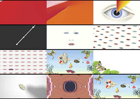
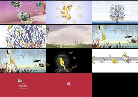
In which artist James Marsh animates the paintings of his which appear on Talk Talk’s album covers. This is a promo film for Spirit Of Talk Talk, a cover version collection released last year on Fierce Panda. Thanks to Thom for the tip!
A journal by artist and designer John Coulthart.

Painting
In which artist James Marsh animates the paintings of his which appear on Talk Talk’s album covers. This is a promo film for Spirit Of Talk Talk, a cover version collection released last year on Fierce Panda. Thanks to Thom for the tip!
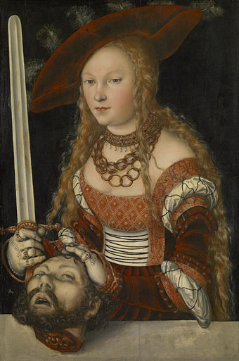
Judith with the Head of Holofernes (1520–1540) by Lucas Cranach the Elder.
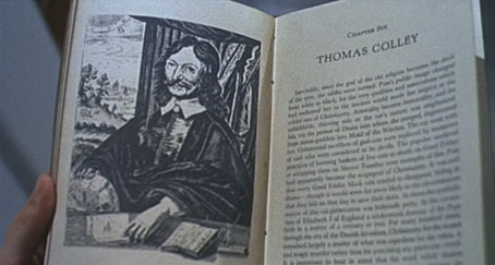
It doesn’t take much effort to refute the jeremiads of those who complain that popular culture is exclusively violent, all that’s usually required is to direct attention to Titus Andronicus or The Revenger’s Tragedy. Compared to the stage, the art world seems at first to be more circumspect, especially in the 19th century when the battles scenes of history painters sprawled across acres of canvas, all of them devoid of the physical trauma of warfare.
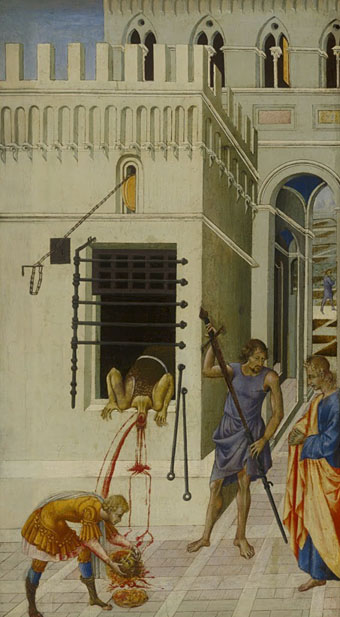
The Beheading of Saint John the Baptist (1455–60) by Giovanni di Paolo.
There are exceptions, however, and the nearer you move to Shakespeare’s time the more examples you’ll find. Paintings produced in an age when violent street executions were still a common sight would have seemed less surprising to their intended audience than they do to our eyes. Several of the paintings here provide a useful contrast with the many sanitised depictions of John the Baptist’s severed head in the Salomé archive.
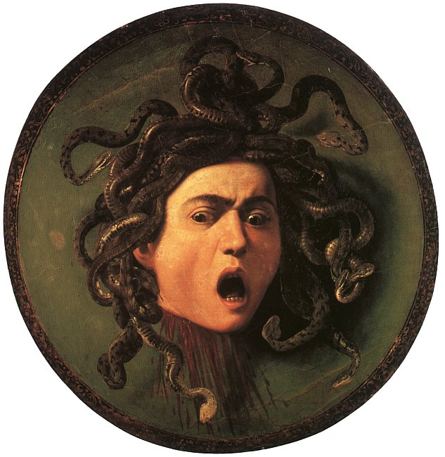
Medusa (c. 1590) by Caravaggio.
Of all the paintings of Medusa’s head the one by Caravaggio is the sole example with a gout of spurting blood. It’s also unusual for being painted on a convex panel intended to resemble the reflecting shield of the Gorgon’s killer, Perseus. Given the violent life of the artist the gore isn’t so surprising although the jet of red in his painting of Judith beheading Holofernes still seems shocking if you’ve never seen it before.

Judith Beheading Holofernes (1598–99) by Caravaggio.
The Biblical story of Judith and Holofernes may be the poor cousin to the more popular story of Salomé but depictions of the crucial event make an impression by being consistently gruesome. I suspect the reason is less to do with the story itself than with the success of Caravaggio’s paintings among cultured Europeans. The copying or imitation of celebrated works became a thriving industry in the days of the Grand Tour with the result that 17th- and 18th-century art is overburdened with variations on earlier paintings.

Gratifying this week to see album cover art under discussion even if the heat-to-light ratio was as unbalanced as it usually is when pop culture is the subject. Jonathan Barnbrook, who also designed the Heathen (2002) and Reality (2003) packaging for David Bowie, wrote about the thinking behind the new cover on his blog. (And for the time being let’s note that this is still only a cover design, we don’t know what else is on its way.)
For my part I’ll point out that the artist-as-cover-image is the great cliché of album design, and the bigger the name the more the rule applies; Neville Brody complains about this in the first book of his work, as does Storm Thorgerson in the Hipgnosis books. In Bowie’s case the rule has been applied almost universally since his debut album in 1967, the only variations being illustrational ones or slight dodges like having his feet appear on the front of Lodger and his back facing the viewer on Earthling. Consequently the new design is a radical gesture from an artist who could have got away with a photo of himself du jour. By way of contrast, consider that Rod Stewart is a year older than David Bowie and presented the world with this artefact in October 2012.
Related: Hard Format responds to the cover, Chris Roberts on “Picasso resurrected in a Rolf Harris era“, and Alexis Petridis on The inside story of how David Bowie made The Next Day.
• The Quicksilver typeface, designed by Dean Morris when he was only 16, bought by Letraset and now an indelible feature of pop design from the 1970s. Morris describes his experience here (“they shunned rapidographs!”) and collects examples of the print history here.
When the days are short, we are closest to the medieval world. To the avoidance of mirrors where death improves our portraits every morning with a few more lines and shadows. What would once have been a sermon, a conjuring of hellfire, a phantom slide show, is now an entertainment. But before we can begin again, we have to kick free of the embrace of our inconvenient predecessors, that compost legion of the anonymous dead. They come uninvited, requiring us to sign up for what the late Derek Raymond called the general contract: a brief turn in the light, then extinction. Eternal darkness. How to live with such knowledge? William Burroughs admired the unswerving bleakness of Beckett’s gaze, the way he reduced compensatory illusions to zero. Nowhere left to crawl. And nothing to crawl on. Last breath is last breath. Stare into the abyss and the abyss will stare right back.
Iain Sinclair reviews The Undiscovered Country: Journeys Among the Dead by Carl Watkins
• Broadcast’s James Cargill on Morricone, Minidiscs and Scoring Berberian Sound Studio. Related: Melmoth the Wanderer posts a new mix, The Curious Episode of the Wizard’s Skull, and more spooky sounds are on their way from The Haxan Cloak.
• A Firm Turn Toward the Objective: Joanne Meister on meeting the great Swiss designer Josef Müller-Brockmann.
Twitter user @thisnorthernboy reworked Paul Emsley’s portrait of Kate Middleton. @barnbrook approved.
• The Beatles of Comedy: David Free on the Monty Python team.
• The history of the London Underground poster.
• Impossible Architecture by Filip Dujardin.
• At Pinterest: Art Dolls & Sculpture
• Grace Jones’ Nightclubbing album has been on repeat play this week: Warm Leatherette/Walking In The Rain | I’ve Seen That Face Before (Libertango) | Demolition Man
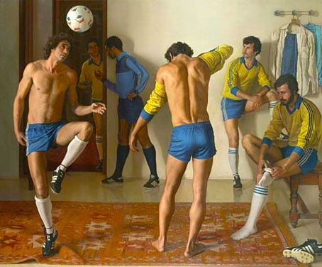
Before the Game.
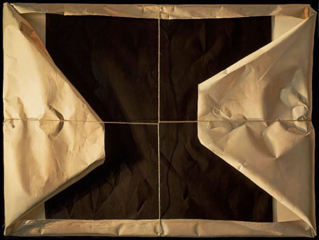
(Sorry, but that pun was unavoidable.) Claudio Bravo was a Chilean hyperrealist painter who died last year. I don’t recall having come across him before but it’s a hazard of a photographic style that your work may superficially be taken for the output of other artists. Looked at more closely his painting went through distinct phases with an increasing interest in the study of wrapped-paper packages. These trompe l’oeil paintings allow the meticulous detail to remain while giving an impression at a distance of colour field abstraction. I’m rather taken with the later pictures but then I’ve always been partial to hyperreal techniques.
Another recurrent theme is the male body in various states of dress or undress, and rendered with as much presence as the paintings and drawings of British artist Michael Leonard. One of the drawings below could almost be one of Leonard’s. Bravo painted woman as well so we can’t read too much into this, but he did live in Morocco for many years, and one of his paintings from the 1970s depicts a swimming pool at Fire Island. Make of that what you will. (Thanks to Paul for the tip!)
Homage to St Theresa.
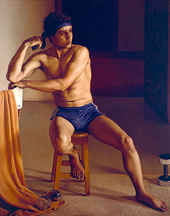
Noureddine.

Blue and Beige Package.
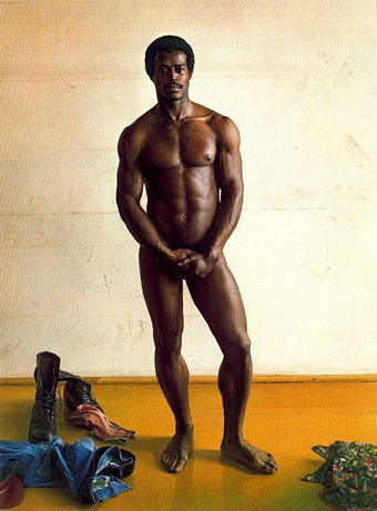
Nude (Portrait of Mr Couchez).
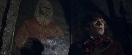
Roman Polanski as Alfred in Dance of the Vampires (1967).
I’ve always admired the attention to detail in Roman Polanski’s films, a quality evident not only in his careful adaptations but also in areas that lesser filmmakers might ignore. Dance of the Vampires (1967) is a good example (sorry, I refuse to call it by the title MGM used for its edited US release): the sets and decor are remarkable, and the editing and camera work so skilfully blends studio constructions with location shots that for years I was convinced the film was made in a genuine European castle. The atmosphere is so carefully sustained that I found the whole thing as terrifying on first viewing as any Hammer film, despite the broad humour. In the set-piece moments Polanski (and soundtrack composer Krzysztof Komeda) put many of the later Hammer vampire films to shame.
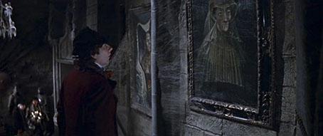
The Vampire Portraits
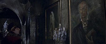
The production design and art direction for Dance of the Vampires was created by Wilfred Shingleton and Fred Carter, both of whom later worked on Polanski’s Macbeth, and who fill the rooms with mouldering furnishings and rotting decoration. One striking sequence concerns a walk through a gallery of vampire portraits that are the creepiest paintings seen on film since Ivan Albright’s portrait of a decrepit Dorian Gray. Film credits in the 1960s were sparse so there’s no indication of the artist responsible. However, one portrait glimpsed at the end of the gallery (below) is a copy of the “Ugly Duchess” painting by Quinten Matsys.
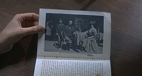
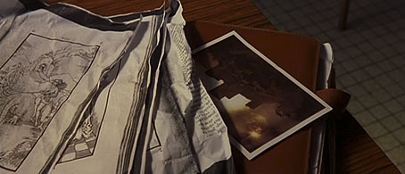
Rosemary’s Book
A sign that filmmakers care about detail is when they make their fictional books look like the genuine article. The history of witchcraft in Rosemary’s Baby (1968) could easily have been glimpsed very briefly but Polanski shows Rosemary leafing through its pages in a sequence of Hitchcock-like view-reaction-view shots that make it appear as convincing as possible. The shots also make the viewer examine the book through Rosemary’s eyes, something Polanski does throughout the film.
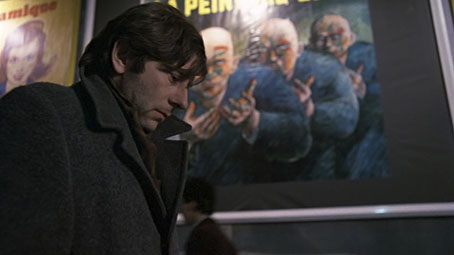
Trelkovsky’s Paintings
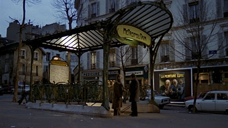
The Tenant (1976) is Polanski’s third study of apartment-dwelling paranoia, a superb adaptation of Roland Topor’s novel, Le Locataire chimérique (1964). The screenplay removes some of Topor’s ambiguity—and the film is spoiled by unsympathetic dubbing of the French actors—but in every other respect it’s as good as Repulsion for its portrait of an isolated individual (here portrayed by Polanski himself) surrendering to madness.
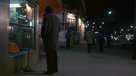
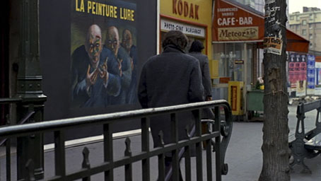
Among the many visual details which add to the unease is the appearance halfway through the film of billboards advertising…what? A painting exhibition? Or something more sinister? We never find out. The presence of these figures and their slogan—”La Peinture Lure”—remains as cryptic as many of the other unresolved questions which prey upon the beleaguered Trelkovsky.
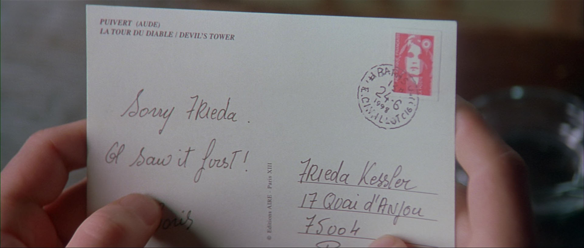
Corso’s Postcard
I’m in the minority of people who like The Ninth Gate (1999) a great deal even though it takes some liberties with Arturo Pérez-Reverte’s wonderful novel The Dumas Club. Once again, the bibliographic details are perfectly done, a crucial matter in a film about the antiquarian book trade. Near the end of the film Dean Corso (played by Johnny Depp) finds a postcard that leads him to the final location. On the back of the card there’s a blink-and-you-miss-it detail. Polanski’s wife, Emmanuelle Seigner, plays the mysterious and nameless woman who follows Corso throughout the film. By this point we already know she possesses occult powers so it’s not really surprising to see her face in the postage stamp, something that Corso doesn’t seem to notice.
Previously on { feuilleton }
• Repulsion posters
• Atalanta Fugiens
• Le Grand Macabre
• Les Temps Morts by René Laloux
• The writhing on the wall