Max (The Birdman) Ernst

birdman.jpg

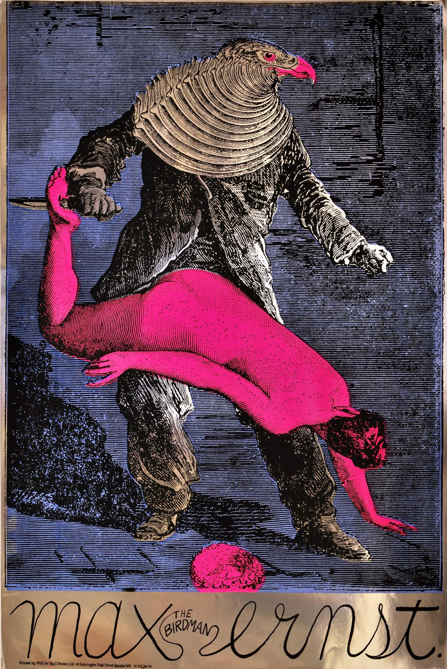
Max (The Birdman) Ernst (1967).

Psychedelia is never far away here at { feuilleton }. Yesterday’s film poster reminded me of this work from the psychedelic era by Martin Sharp, an Australian artist who moved to London and became closely-associated with Oz magazine and London’s other leading psych poster designers, Michael English and Nigel Waymouth, aka Hapshash & the Coloured Coat. Sharp’s homage to the great Max was one of a number of his designs produced on metallic foil sheets, the reflective nature of which often presents difficulties for reproduction in other media.

performance.jpg

Performance (1970).

I wonder how many people who admired Sharp’s poster puzzled over the meaning of the image, one of twenty-eight similar collages from the fourth chapter of Ernst’s 1934 “collage novel” Une Semaine de Bonté. Chapter four—Wednesday; Blood—concerns the criminal travails of a series of bird-headed individuals (or possibly the same individual in different guises) which end in abduction, possible rape/murder, and suicide. This picture of Ernst’s has always struck me as a very obvious rape metaphor with the woman stretched over the birdman’s lap and the knife piercing her foot. Ernst’s dark imagination—informed by Freudian concerns, as were most of his fellow Surrealists—separates the picture from the more lightweight Art Nouveau/Beardsleyesque stylings of the other London artists. Martin Sharp was producing collages of his own during this period so it’s easy to see why he was attracted to Ernst. And the popularity of his poster may explain why the birdman turns up in a painted version in Donald Cammell & Nicolas Roeg’s Performance, seen when Pherber (Anita Pallenberg) goes to pick mushrooms in the greenhouse. Ernst’s sinister birdman suits Performance very well, a token of the film’s atmosphere of weirdness and violence. (“A heavy evil film, don’t see it on acid” warned underground newspaper International Times.)

sharp_dylan.jpg

Bob Dylan: Blowing in the Mind (1967).

And to compound the connections a little more, Sharp’s famous Bob Dylan collage portrait (another foil sheet production) also turns up in Performance as part of the collage-covered screen in one of Turner’s rooms. Unlike his fellow Hapshash artists, Sharp’s work is under-documented on the web beyond pages such as this one. The same goes for Ernst’s collage novel but then the best way to experience that is to buy the Dover book edition.

Previously on { feuilleton }
The Robing of The Birds
Gandharva by Beaver & Krause
The Look presents Nigel Waymouth
The New Love Poetry
Judex, from Feuillade to Franju
Further back and faster
Quite a performance
Borges in Performance

Alice in Wonderland by Jonathan Miller

miller1.jpg

I said, “Girl, you drank a lot of Drink Me,
But you ain’t in a Wonderland
You know I might-a be there to greet you, child,
When your trippin’ ship touches sand.”

Donovan, The Trip (1966)

Most of the key texts of the psychedelic period tend to be either non-fiction—Aldous Huxley’s Doors of Perception, Timothy Leary’s The Psychedelic Experience—or spiritual works such as The Tibetan Book of the Dead, the volume upon which Leary’s book is based and which subsequently provided John Lennon with lines for Tomorrow Never Knows. The key fictional work of the era has to be Lewis Carroll’s Alice in Wonderland, a fact that would no doubt have surprised the book’s legions of enthusiastic Victorian readers, never mind its author. Grace Slick created the definitive Alice song with White Rabbit in 1965, written while she was with the Great Society but only recorded properly in 1967 after she’d joined Jefferson Airplane. But Alice’s adventures run a rich seam of Victorian whimsy through the music of 1966 to ’69, especially among the British bands whose lyrics tend to be far more childish and frivolous than their American counterparts. Donovan probably got there first among the Brits with The Trip on his Sunshine Superman album. Among the profusion of later references can be found one-off singles such as Alice in Wonderland (1967) by the Dave Heenan Set (who recorded songs for the Barbarella soundtrack as The Glitterhouse) and Jabberwock/Which Dreamed It? (1968) by Boeing Duveen & The Beautiful Soup, a band whose songwriter is better known today as Hank Wangford.

Continue reading “Alice in Wonderland by Jonathan Miller”

Gandharva by Beaver & Krause

gandharva.jpg

I mentioned Wilfried Sätty’s collage work last week and this album sports one of his few cover designs. A cult object for several reasons, not least Sätty’s involvement. The title lettering was by fellow psychedelic artist David Singer who I had the good fortune to meet in California in 2005 whilst researching Sätty’s career. That chunky Seventies lettering style now looks distinctly contemporary having come back into fashion over the past couple of years.

Beaver & Krause were among the pioneers of Moog-based electronic music in the 1960s and notably provided the throbs and drones which Jack Nitzsche mixed into the soundtrack for Donald Cammell & Nicolas Roeg’s Performance. Gandharva was released in 1971 and one of the few all-electronic pieces on the album, Nine Moons in Alaska, is an outtake from those sessions. The first side is very uneven, with a blues jam and a gospel piece that don’t sit well with each other, never mind with the Moog tracks. Side two, however, is a far more successful suite of improvisations with organ, electronics, guitar, harp and saxophone (played by Gerry Mulligan) recorded live in Grace Cathedral, San Francisco.

Cover photo from the Psychedelic Music Flickr pool which features many fine examples of cover design from the late Sixties on.

Elsewhere on { feuilleton }
The illustrators archive

Elsewhere on { feuilleton }
The album covers archive

Previously on { feuilleton }
Ginsberg’s Howl and the view from the street
Further back and faster
Quite a performance
Borges in Performance

Das Haus zur letzten Latern

sands.jpg

From HP Lovecraft to another writer of weird fiction, Gustav Meyrink. Das Haus zur letzten Latern is a tribute to Meyrink by Silence & Strength and the package I designed late last year for Horus CyclicDaemon has just been released. I’ve mentioned before that Horus make a particular effort with all their CD productions, choosing their materials carefully, and this release is no exception. An envelope of green textured card has two of my designs embossed on either side. Inside this there’s another envelope containing the disc and an 8-page A5 booklet of dark green ink on heavy paper with a grainy texture. The music is suitably dark and atmospheric and would work very well as a soundtrack to Paul Wegener’s Der Golem, wie er in die Welt kam (1920). Seeing as Wegener’s film is the most famous Meyrink adaptation I borrowed the shapes of Prague buildings from one of the original film posters. The rest of the graphics are done in a very spare, quasi-Expressionist drawing style which was a pleasure to do since it’s quite different to my usual work. The background of the booklet pages show an old map of Meyrink’s city, Prague.

sands2.jpg

When people have asked me recently what I think about the proliferation of music downloads I tell them that the best way for record labels (and book publishers for that matter) to continue to attract purchasers is to make beautiful objects which people feel compelled to own. The content is always endlessly reproducible, the packaging isn’t. As far as this argument goes, Horus CyclicDaemon has been ahead of the game for some time.

Previously on { feuilleton }
New things for November II
Hugo Steiner-Prag’s Golem
Nosferatu
Barta’s Golem

Nyarlathotep: the Crawling Chaos

nyarlathotep.jpg

Unveiling another new piece of work, this is a T-shirt design for metal band Cyaegha whose Steps of Descent album I illustrated and designed last year. They asked for something based on HP Lovecraft’s god Nyarlathotep so I thought I’d take the opportunity to rework from scratch the version of this I created in 1999 for the first edition of The Haunter of the Dark. I always felt the earlier piece was going in the right direction but lacked somewhat in execution; this makes up for that. Lovecraft’s Nyarlathotep is one of his most curious creations, in part because the conception of the character changed over many years. In various stories, letters and dream fragments the god/entity is variously described as an Egyptian pharaoh, an itinerant showman with electrical apparatus, the “black man” of European witch cults and the more typically Lovecraftian squamous alien monstrosity. The challenge, then, is to try and represent a little of each of these elements without overly favouring one or the other.

This is one of two illustrations I’ve produced in recent months which use Photoshop to imitate the engraving collage style of Wilfried Sätty, an artist whose work I discussed in an essay for Strange Attractor #2 in 2005. Sätty’s style was derived from Max Ernst’s famous collage “novels” of the 1930s and Photoshop is the ideal tool for this, far better than the old method of scissors, paper and glue. Sätty expanded Ernst’s technique by using reverse printing and the duplication of images; Photoshop extends the technique even further, making it possible to scale images up or down instead of being limited to the size of the original reproduction. The other illustration I’ve done in this style is for a short story and I’ll reveal that closer to publication. In the meantime I should be making a slightly different version of the new Nyarlathotep suitable for the usual range of CafePress products. More about those when they’re done.

Previously on { feuilleton }
The Haunted Palace
The art of Stephen Aldrich