Roger Dean postage stamps

dean11.jpg

Roger Dean book covers last week; this week it’s postage stamps. These are exclusive to the Isle of Man Post Office, unfortunately, so there’s little chance of buying them over the counter in mainland Britain. First day covers, presentation packs and individual sheets may be ordered from the post office website, however. For those who can visit the Isle of Man there’s also an exhibition of Dean’s art running at the Manx Museum in Douglas until November.

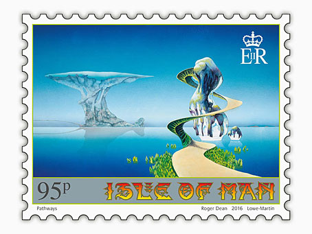
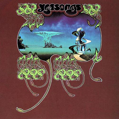
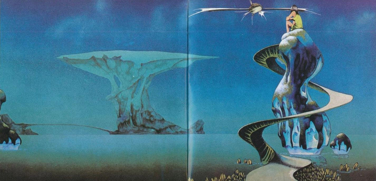
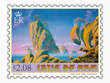
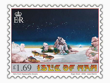
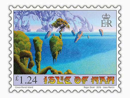
Several of the paintings on the stamps are from the covers for albums by Yes and Asia, including the one above which was used twice on the live Yessongs album in 1973. (The large version inside the gatefold had a figure of a girl and a fish spacecraft added.) The version appearing on the stamp is Dean’s recent reworking of the piece. This removed the airbrushed clouds—added to disguise the footprints of his cats which had walked over the painting when it was drying—and also smoothed the gradients and added a reflection. I’ve been familiar with the album version of this picture for decades so I prefer the rougher original as it is on the cover (and in Dean’s Views book) without the girl and spacecraft.

yessongs.jpg

yessongs2.jpg

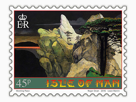
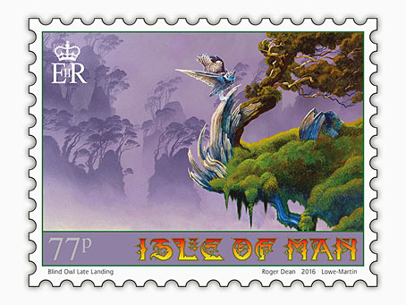
One other thing of note is Dean’s lettering design for the stamps. When I wrote about Dean’s art a few years ago I drew attention to the way his design work has been either marginalised or ignored altogether by people who dismiss him as a mere fantasy artist. All of Dean’s album covers have included unique letterforms that are immediately recognisable as his own (so too the logos and lettering he was designing for computer games in the 1980s) but I’ve yet to see this side of his work given any serious attention. (Postage stamp tip via It’s Nice That.)

dean8.jpg

dean9.jpg

dean10.jpg

dean7.jpg

dean12.jpg

Previously on { feuilleton }
Roger Dean book covers
Design as virus 17: Boris and Roger Dean
Roger Dean: artist and designer

Bulgarian Bee

bee.jpg

It’s unusual but not unprecedented for foreign publishers to use the first-edition cover art when they publish a translation of a book. One of my cover designs for Mike Shevdon’s Courts of the Fayre series was reused for a French edition published by Panini/Eclipse in 2014. This year it’s the turn of The Singular & Extraordinary Tale of Mirror & Goliath by Ishbelle Bee which appeared in a Bulgarian edition last month from Ciela. In this instance I supplied the publisher with many of the work files so that the designers were able to refashion the title using Cyrillic characters. I’m very pleased with the way they’ve done this, the task wasn’t an easy one when some of the lettering was unique to this design. If you live in Sofia (or are on holiday there) watch out for it.

Previously on { feuilleton }
The Contrary Tale of the Butterfly Girl
The Singular & Extraordinary Tale of Mirror & Goliath

Tales of the High Court

derr1.jpg

I thought I’d already written something about my cover for Megan Derr’s gay fantasy novel, The High King’s Golden Tongue, but it seems not. This appeared last year from Less Than Three Press, and the next volume in the Tales of the High Court series, Pirate of Fathoms Deep, has been published this week. My earlier omission allows me to show both covers together.

derr2.jpg

When working on the first volume I didn’t expect I’d also be working on a sequel so there was no need to consider whether the design could be carried over. The architectural frame is from a book about French architect Eugène Viollet-le-Duc, taken from one of Viollet-le-Duc’s illustrations for a study of the architecture of old France. I added the windows and curtains before colouring the stones and providing shadows and highlights. This became a problem for the second cover because my Viollet-le-Duc book only had one example of this kind of stonework. After some lengthy searches at Gallica I was able to find enough scans of other pages from the books that Viollet-le-Duc illustrated to piece together a new frame. The Gothic window frames on both covers are from another French volume, and I’ve now exhausted all those examples so a third volume in this series will no doubt present further challenges.

Weekend links 317

mucha.jpg

Alphonse Mucha’s Le Pater, a book of mystical Symbolism written, designed and illustrated by the artist, was published in a limited edition in 1899. The book has been out of print ever since but Thomas Negovan at Century Guild will be reprinting it later this year.

• “Five axioms to define Europe: the coffee house; the landscape on a traversable and human scale; these streets and squares named after the statesmen, scientists, artists, writers of the past; our twofold descent from Athens and Jerusalem; and, lastly, that apprehension of a closing chapter, of that famous Hegelian sunset, which shadowed the idea and substance of Europe even in their noon hours.” George Steiner explores his idea of Europe.

Journey To The Edge Of The Universe by Upper Astral, 43 minutes of cosmic ambience, is a cassette-only release from 1983. The album has never been reissued so secondhand copies command excessive prices but it may be downloaded here.

• Mixes of the week: Three hours of ambience by Gregg Hermetech, XLR8R Podcast 446 by [Adrian] Sherwood x Nisennenmondai, and Secret Thirteen Mix 190 by Shxcxchcxsh.

Today [Angela] Carter is well known, widely taught in schools and universities, and much of what she presaged—in terms of recycling and updating (“old wine in new bottles”, she called it), or gender role play and reversal—has become commonplace in the culture. Despite this, many critics find it difficult to situate her work properly. This is partly because Carter is so sui generis (she has literary offspring but few antecedents), and partly because many struggle with the relationship of politics and aesthetics in her writing.

Kate Webb reviews two new books about Angela Carter

• Words that will forever pursue us: Tim Page on the late Michael Herr, “rock’n’roll voice of the Vietnam War”.

• From 2015: Luigi Serafini on how and why he created an encyclopedia of an imaginary world.

James Campbell on Ginsberg, Kerouac and Burroughs: celebrating the Beats in Paris.

Fragile Beasts, an exhibition of grotesque print ornaments at Cooper Hewitt, NYC.

• Not before time, Guy Gavriel Kay wants to see an end to the plague of writing tips.

• David Bowie and Buster Keaton by Steve Schapiro.

Tom Charity on the films of Michael Cimino.

Alison Goldfrapp: photographer.

Golem Mecanique

European Man (1981) by Landscape | Europe After The Rain (1981) by John Foxx | Trans Europe Express (1994) by The One You Love

Essex House book covers

essex01.jpg

I’ve known the name of American publisher Essex House for many years but the books they published, all of which appeared in a frenzy of activity from 1968 to 1969, have never been easy to find in the UK. The company is chiefly of note today for having three original Philip José Farmer novels on their list, all works of fantasy with the erotic side more dominant than in Farmer’s previous work. Erotic fiction with a generic slant was the Essex House speciality, and while the Farmer covers have appeared here before, I’d not seen any other Essex House covers until the discovery of this page which collects 38 of the 42 published titles.

essex13.jpg

It’s immediately evident looking down the list that the (uncredited) designer managed to forge a distinctive identity for the books at a time when any cover would suffice if the written material was sufficiently pornographic. Many of the covers borrow (or mutate) pre-existing artworks, while others emulate the watered-down psychedelic style that by the late 60s was visible everywhere in the US and much of Europe. These aren’t all great pieces of design but the graphics on erotic titles in the 60s either played safe by favouring text-only covers or sported technically crude emulations of paperback illustration. (For an example of just how technically crude, see this post about some of the many gay pulps on sale in the US.)

essex33.jpg

Essex House may not have been around for long but they seemed to be attempting something different, at least where the covers were concerned. I’ve only read the Farmer books so I can’t vouch for the other titles but the Encyclopedia of Science Fiction writes that

…about half the 42 titles published by Essex House were sf/fantasy; they included novels by Philip José Farmer, Richard E Geis, David Meltzer (perhaps the most distinguished), Michael Perkins and Hank Stine…of which a number were ambitious, some literary, and most somewhat joyless—even emetic—and redolent of 1960s radicalism.

Pornography as a tool of radical politics had a brief vogue in the late 60s and early 70s, something that’s particularly evident in the underground magazines of the period. The results may be “joyless” to some but then I find a lot of the alleged classics of science fiction joyless so it’s all a matter of taste. There was no equivalent of Essex House in the UK but in the 1970s France had the Chute Libre imprint which not only published all of the Essex House Farmer titles but did so with a collection of equally striking (or “joyless”) cover designs.

essex23.jpg

Artwork is a solarised version of Le Bout du monde (1949) by Leonor Fini.

Continue reading “Essex House book covers”