Weekend links 511

marber.jpg

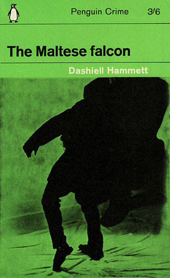
Design by Romek Marber, 1963.

• The death of Polish composer Krzysztof Penderecki prompted so many “Shining composer” headlines you have to wonder what kind of notices he might have received if his early work hadn’t been purloined by Hollywood. György Ligeti always seemed ambivalent about having his music used as cinematic illustration (Kubrick annoyed him by altering some of it without permission) but Penderecki worked as a composer for Polish films in the 1960s, not only providing a score for The Saragossa Manuscript (1965) but also (surprisingly) writing music for a number of short animations. I’ve been listening to his music for almost 40 years, after a chance discovery of the stunning Threnody For The Victims Of Hiroshima led me to seek out more. I have to admit that the appeal of his recordings lay in their ability to thrill and terrify—qualities that musicologists seldom address—and I’ve never paid any attention to Penderecki’s later work which was less of an assault on the senses. At The Quietus James Martin argues for listening to the entire oeuvre, not just the early works. For more about the composer’s life and work, Culture.pl has a number of good articles, eg: Mazes, Notes & Dali: The Extraordinary Life of Krzysztof Penderecki, and Music Is Not for Everyone: An Interview with Krzysztof Penderecki.

• The late Romek Marber (1925–2020) was a designer/illustrator whose name is familiar to collectors of Penguin books via the Marber Grid, the template he created in the early 1960s for the Penguin Crime series, and which was later extended across the entire paperback range. Marber talked about this period of his work in Penguin by Illustrators in 2009. Elsewhere: Rick Poyner on Marber’s design, and a suggestion for how the Marber Grid was designed.

• “…you’ll see Lego and children’s toys, but also Rawlplugs, tile spacers, Monopoly houses, cigarillo tips, curtain hooks, biofilters, Smarties tube lids, fishing beads, broken security seals, razor parts, bits of toothbrushes, roofing screw caps, medical lancets, golf tees, false teeth, plastic soldiers, posties’ rubber bands, bungs and stoppers.” Beachcomber Tracey Williams talks to Andrew Male about the undying ubiquity of plastic waste.

• “Thanks to Bookshop, there is no reason to buy books on Amazon anymore,” says Alex Lauer. The caveat is that the service is limited to the USA. I order books direct from publishers or from eBay and Abe; the latter may be Amazon-owned but you’re still paying most of the money to the individual sellers.

• Mixes of the week: Radio Belbury 19: Family Fun Time, and Through A Landscape Of Mirrors Vol. VII – France IV by David Colohan.

• “[Amanda Sewell’s] Wendy Carlos: A Biography is a great work of scholarship,” says Geeta Dayal.

• “Part of me expects to go on forever.” David Barnett on Michael Moorcock at 80.

• “What is the point of a critic if not to tell the truth?” asks Rachel Cooke.

John Boardley on medieval road-trips and the invention of print.

Anna Bogutskaya on where to begin with the Weird West.

• Inside Tove Jansson’s private universe by Sheila Heti.

• Memory Of Hiroshima (1973) by Stomu Yamash’ta’s Red Buddha Theatre | Hiroshima Mon Amour (1977) by Ultravox! | Hiroshima (1982) by Borsig

Hazardous design

watts16.jpg

Cover design by Elizabeth Story.

Our present viral moment reminded me that I hadn’t written anything about Peter Watts is an Angry Sentient Tumor, a collection of essays by Canadian science-fiction writer Peter Watts whose interiors I designed for Tachyon last autumn. Watts has a special interest in biology, and several of the pieces in the collection are partly or wholly concerned with pandemics; needless to say, when I was adding a biohazard symbol to one of these pages six months ago I didn’t expect such a situation to be the event that defined the coming year, although for anyone who’s read enough SF (or horror, for that matter), potentialities like this tend to lurk in the back of your mind. Watts’ essays are mostly blog entries—much more substantial ones than the brief things I usually file here—together with a few articles from print sources. The contents range from polemics about police violence and the creeping surveillance state to personal entries covering his late brother, his father’s closeted sexuality, his beloved cats, and a near-fatal experience with a flesh-eating virus. There are also film reviews, scientific speculations and musings/warnings about global calamities, especially the climate variety. His writing is consistently witty, engaging and thought-provoking. The book was a pleasure to read as well as work on.

watts14.jpg

As with other interiors I’ve designed for Tachyon, I took the design cues from the cover, which in this case was the work of Elizabeth Story. The internal graphics are a combination of writhing tentacles and hazard/warning signs, the latter being taken unaltered from public information sets or adapted to suit the content of the piece. In a way they’re a sequel to the Tarot symbols I designed in 2006 based on graphics from the international symbols commonly used in public buildings. The bespoke designs were fun to create, and required some ingenuity in places: how do you show global warming in a simple, wordless symbol? My solution was to put a globe in a frying pan. There are 50 essays in all so the examples shown here represent a fifth of the book.

For an idea of Watts’ writing together with his thoughts about the pandemic, his most recent post is here. He’s not the only person who’s been saying we should expect more events like this one in the future.

watts02.jpg

watts04.jpg

watts05.jpg

Continue reading “Hazardous design”

Weekend links 507

plone.jpg

The next release on the Ghost Box label will be Puzzlewood by Plone, “unironically joyful and melodic electronica; informed by library music, music for children’s TV and a deep passion for the history of music technology”. The album will be available in April. Design, as always, is by Julian House.

• “With his panting breath and dripping sweat infused in each page of his memoir, Patrick Cowley describes himself on his knees, bending over and ‘worshipping Phallus.'” Maxwell Shand on Dark Entries‘ “holy trinity” of Patrick Cowley’s Mechanical Fantasy Box, Hot Rod To Hell by Roy Garrett & Man Parrish, and Maxx Mann’s gay synth-pop.

• “We’re gonna do economic activity—without money!”: Inside the criminal glamour of the San Francisco Diggers with Kent Minault. The third installment of a verbal history of the hippie anarchists by Jay Babcock.

• “Susanna Hoffs and friends remember David Roback, who stayed creative, and enigmatic, to the end.” By Randall Roberts.

My connection with [raga] was not to be able to duplicate or emulate it but to learn from it. I combined it with the electronics and the harmonizer and things like that. But I would have a line that was being drawn. You’re thinking about it like a shape that’s being drawn on a canvas. It’s a line that’s being drawn and another. You’re holding three pencils at once while you’re drawing on the wall. So, you’re able to get the shapes. This was my thing with it, because I was into the harmony that it would make. So, it was an easy and natural thing to do, was to go and move into the electronics. Then we had equipment that was doing transposition and all that kind of thing. So that’s one little part of it.

Jon Hassell talking to Aquarium Drunkard about his first album, Vernal Equinox, which is reissued later this month

• Published next month by Strange Attractor Press: Rated SavX: The Savage Pencil Skratchbook.

• They came from outer Finland: the town where everyone saw UFOs, as photographed by Maria Lax.

• Mix of the week: Through A Landscape Of Mirrors Vol. VI – Sweden II by David Colohan.

Moonstrips Empire News (1967) by Eduardo Paolozzi.

• At Dennis Cooper’s: Shelley Duvall Day.

Graham Massey‘s favourite albums.

Phallus Dei (1969) by Amon Düül II | Wrong Eye (1990) by Coil | Red Scratch (1994) by ELpH

The ceramic art of Eduard Stellmacher

stellmacher01.jpg

The Art Nouveau style is seldom more grotesque than in these vases and amphorae designed around the turn of the century by Eduard Stellmacher (1868–1945) for his father’s company, Amphora, in the Tur-Teplitz region of Bohemia. Art Nouveau (or Jugendstil as it was in Germany and Austria) emerged in Europe in the 1890s, and though its development ran parallel to the Decadence of the fin de siècle it wasn’t really a Decadent form in the literary sense of a dwelling on the perverse, the morbid or the blasphemous. The sinuous curves of Art Nouveau are too suggestive of vigorous life and energy to appear corrupt; Alphonse Mucha’s femmes are too healthy to be fatale, they’re nothing like the dissolute, hollow-eyed sirens seen in the drawings of Félicien Rops, an artist who wasn’t Nouveau (he died in 1898) but who was thoroughly Decadent.

stellmacher02.jpg

Stellmacher and co. created their share of delightful ceramic figures with Mucha-like tresses and flowing garments but Eduard’s designs around this time were preoccupied with ferocious creatures: bats, fish, lizards, octopuses, and a profusion of fire-breathing dragons. Even the plant forms have a diseased, unhealthy aspect. The designs may not have been intended as Decadent but they embody the quality more than anything used as vase decoration before or after this period. Art Deco also favoured predatory animals (snakes and leopards especially) but only in forms that were suitably sleek and abstracted.

stellmacher03.jpg

stellmacher04.jpg

stellmacher05.jpg

Continue reading “The ceramic art of Eduard Stellmacher”

The poster art of Josef Vyleťal

vyletal11.jpg

The Hero is Afraid (1965).

Film posters by Czech artist Josef Vyleťal (1940-1989) have appeared here in the past, but after watching Juraj Herz’s gloomily Gothic Beauty and the Beast (1978) at the weekend—a film for which Vyleťal not only created a poster but also provided the title sequence and paintings seen within the film—I thought the artist deserved a post of his own.

Josef Vyleťal was a prolific poster artist and designer—the Terry Posters website states that he created 115 designs for the cinema—who also worked as a book illustrator. Between commercial assignments he produced paintings in a macabre Surrealist style that filtered into his commercial work, the Herz titles included. The absence of barriers between private obsessions and commercial imperatives is what makes the film posters created by Czech and Polish artists so attractive, as well as so surprising to Anglophone viewers. There’s no sense of these works being produced by committee, of a gaggle of marketing executives fretting over details behind the scenes. Some of Vyleťal’s interpretations are so extreme and uncompromising by Hollywood standards it’s impossible to imagine even an adventurous chain like Alamo Drafthouse commissioning them, never mind a risk-averse studio. One of the designs I singled out for an earlier post is an ideal example, a poster for Alfred Hitchcock’s The Birds which dispenses with any visual reference to the film in favour of a liberal borrowing of the bird-headed figures from Max Ernst’s The Robing of the Bride. It’s a commonplace when discussing the films of Jan Švankmajer to situate the director in the history of Czech Surrealism which remained a clandestine movement during the Communist years. But Vyleťal’s paintings demonstrate a confidence that the average Czech filmgoer could accept Surrealist imagery when being tempted by the latest fare from Hollywood.

vyletal07.jpg

The Naked Eye (1966).

Given my own tastes for Surrealist imagery many of the examples shown here tend in this direction. Vyleťal was a versatile artist who utilised a number of different styles, including collage and a bold graphic style of black shapes on coloured backgrounds. In addition to borrowing from Ernst he also borrowed (or swiped) figures from Aubrey Beardsley on at least two occasions (see below). Most of the examples here are collages augmented by or combined with paint, collage being a quicker solution when faced with deadlines. Terry Posters has many more examples.

vyletal13.jpg

The Black Tulip (1967).

vyletal01.jpg

The Heart is a Lonely Hunter (1968).

vyletal12.jpg

The Trygon Factor (1968).

Continue reading “The poster art of Josef Vyleťal”