Posterized

cramps.jpg

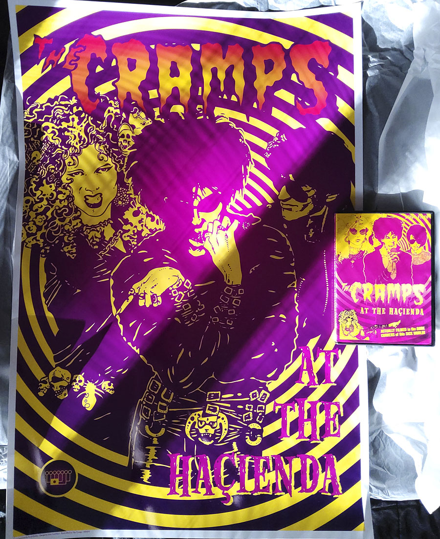
Band portraits by Kris Guidio from his original fanzine illustrations. Cramps DVD shown for scale.

I was asked recently if it was possible to have a poster made of one of the insert pages from the Cramps DVD I designed for Savoy a few years ago. This is the result, a 50.8 cm x 76.2 cm (20 x 30 inches) C-type Fuji print on heavy paper with a gloss finish. I’ve done this in part as a tentative move towards making signed prints available of my other artwork, something I mentioned when writing earlier about the website redesign. I’ve found print-on-demand services like CafePress to be increasingly unsatisfactory, and they were never very useful for poster art since their sizes are limited and they lack the options that a dedicated printer can offer.

This poster is exactly the kind of quality I was hoping for, so the next step will be to add a page to my site so that prints may be ordered via the site itself rather than emailing me with a query. In the meantime, if anyone does want a quality print made from one of my pictures or designs, get in touch.

Previously on { feuilleton }
The Cramps at the Haçienda

Litany of Dreams

litany.jpg

One of the covers I was working on during the summer months was revealed this week so here it is. Litany of Dreams by Ari Marmell is another title from games-related imprint Aconyte, and a further addition to their Lovecraft-related Arkham Horror series of games and novels:

The mysterious disappearance of a gifted student at Miskatonic University spurs his troubled roommate, Elliott Raslo, into an investigation of his own. But Elliott already struggles against the maddening allure of a ceaseless chant that only he can hear… When Elliott’s search converges with that of a Greenland Inuk’s hunt for a stolen relic, they are left with yet more questions. Could there be a connection between Elliott’s litany and the broken stone stele covered in antediluvian writings that had obsessed his friend? Learning the answers will draw them into the heart of a devilish plot to rebirth an ancient horror.

The new cover follows the form of The Last Ritual with an Art Deco style and a similar arrangement of triangular panels with an architectural focus. The building is Lovecraft’s Miskatonic University, and this is the first time I’ve attempted a proper depiction of the place. A couple of the panels in my unfinished adaptation of The Dunwich Horror showed Wilbur Whateley entering the university but the buildings there owed more to Manchester University’s Gothic facades with a pair of gateposts borrowed from Brown University in Providence. The building here is a better match, a typical Ivy League structure with added spikes. The latter are an unusual feature given the generally conservative appearance of these places but still a long way from the eccentricities of Gavin Stamp’s depictions in the George Hay Necronomicon. The faces in the corners of the cover design are based on tupilak figures carved from antlers or whale teeth by the Inuit of Greenland, figures which feature in the story.

Litany of Dreams will be published on April 6, 2021.

Elsewhere on { feuilleton }
The Lovecraft archive

Previously on { feuilleton }
The Last Ritual

Man Ray and the Marquis

manray1.jpg

Monument to D.A.F. de Sade (1933).

A slight return to the literary outlaw. Man Ray was more preoccupied by the Marquis de Sade than many of his fellow Surrealists, although he never took his interest as far as the obsessive Jean Benoît. His imaginary portraits were created after Sade scholar Maurice Heine complained that the only surviving picture of the Marquis was a drawing that could be of any other young aristocrat of the time.

manray2.jpg

Imaginary Portrait of D.A.F. de Sade (1936).

Man Ray’s portraits ran through several variations, first as drawings, then as two paintings, finally as a bronze. These always seemed to me to be more representations of Sade’s character as it comes through his writing than portraits of the writer himself. The two paintings could easily depict the villainous Duke de Blangis from The 120 Days of Sodom, with the castle of the Bastille standing for the castle where Blangis and his colleagues conduct their murderous games. An earlier photo work, Monument to D.A.F. de Sade (1933), was used by Mary Reynolds in a metal binding she created in 1935 for the first print edition of the 120 Days. Penguin used the same photo on the cover of their new translation of the book in 2016. And it would be remiss of me if I didn’t mention the gay variation designed by Peter Christopherson for the CD release of Scatology by Coil.

manray3.jpg

Imaginary Portrait of D.A.F. de Sade (1936).

manray4.jpg

Imaginary Portrait of D.A.F. de Sade (1938).

Continue reading “Man Ray and the Marquis”

Ron Cobb, 1937–2020

cobb02.jpg

The Magazine of Fantasy and Science Fiction, July 1959.

The death of American illustrator/cartoonist/designer Ron Cobb was announced yesterday. All the obituaries are concentrating on the designs he produced for Hollywood feature films so here’s an alternative view of a long and varied career.

cobb01.jpg

After Bathing At Baxter’s (1967) by Jefferson Airplane.

Cobb’s first album cover is his most famous, and probably his most familiar work outside his film designs, but there were a few more, some of which may be seen below. The San-Francisco-house-as-aircraft always reminds me of the car/plane hybrid piloted by Professor Pat Pending in the Wacky Races cartoons.

cobb04.jpg

Some Of Our Best Friends Are (1968) by Various Artists.

cobb10.jpg

Ecology symbol, October 1969.

Cobb’s copyright-free design for an ecology symbol was published in the Los Angeles Free Press in November, 1969. The “Freep” also ran Cobb’s cartoons, some of which were later collected in The Cobb Book (1975). Satire has a tendency to date very quickly but many of Cobb’s barbs are still relevant today.

cobb07.jpg

Undated cartoon.

cobb05.jpg

Doctor Druid’s Haunted Seance (1973).

Continue reading “Ron Cobb, 1937–2020”

Weekend links 535

beardsley.jpg

The Wagnerites (1894) by Aubrey Beardsley.

• “Part of my problem with influence is that the concept is too univocal; most of us are impacted by many others during our lifetimes, but often in oblique ways. So many of the most interesting bits of cultural transmission happen nonlinearly, via large groups of people, and in zigzag mutations. Assigning influence can also have the unintentional effect of stripping artists of their own originality and vision.” Geeta Dayal reviewing Wagnerism by Alex Ross.

• “Buñuel stubbornly refused to have any group affiliation whatsoever. Even though critics always tried to categorize him, he never wanted to explain the hidden meanings of any of his films and often denied that there were any.” Matt Hanson on the surreal banality of Luis Buñuel’s The Exterminating Angel.

• Next month Soul Jazz release the fourth multi-disc compilation in their Deutsche Elektronische Musik series devoted to German music from the 1970s and 80s. The third collection was the weakest of the lot so I wasn’t expecting another but this one looks like it may be better.

James Balmont chooses the five best films by Kiyoshi Kurosawa, who he calls “cinema’s master of horror”. I’ve yet to see any of these so I can’t say whether the label is warranted or not.

• At Wormwoodiana: Mark Valentine in a two-part post here and here charts the emergence of an under-examined sub-genre, the metaphysical thriller.

• Power Spots: 13 artists choose favourite pieces of music by Jon Hassell. A surprising amount of interest in his first album, Vernal Equinox.

• At Spine: George Orwell’s Animal Farm receives new cover designs for its 75th anniversary.

• “Pierre Guyotat’s work is more relevant now than ever,” says Donatien Grau.

• Mix of the week: FACT mix 775 by Sarah Davachi.

May 24th by Matthew Cardinal.

• Ry Cooder with Jon Hassell & Jim Keltner: Video Drive-By (1993) | Goose And Lucky (1993) | Totally Boxed In (1993)