Weekend links 575

barbier-gazette.jpg

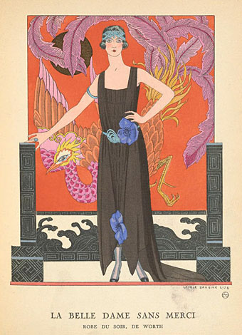
La Belle Dame Sans Merci (1921) by George Barbier.

• “Organic Music Theatre goes beyond jazz into something else entirely—an ecstatic, openhearted melding of cultures. It is the first live recording of Don and Moki’s ‘organic music’ concept, a holistic blend of the arts and education. It is an album that everyone should own, an absolute marvel.” Geeta Dayal on Don and Moki Cherry’s Organic Music Theatre: Festival de jazz de Chateauvallon 1972.

DJ Food continues his dig into the history of London’s Middle Earth venue with an account of a Magical Mystery Tour that ended up being more mystery than magic.

The Lamp Magazine is running a Christmas Ghost Story contest with a first prize of publication in the Christmas issue of the magazine, plus $1000.

Dennis Cooper‘s favourite fiction, poetry, non-fiction, film, art, and internet of 2021 so far. Thanks again for the link here!

• From sport to sex: Louis Staples on how the jockstrap became part of gay culture.

• At Wormwoodiana: Mark Valentine on the weird fiction of AE Coppard.

• “How vinyl records are trying to go green.” Trying…

• Mix of the week: XLR8R Podcast 701 by 40 Winks.

• New music: Rushes Recede by Sarah Davachi.

Lisa Gerrard‘s favourite music.

• RIP Peter Zinovieff.

Organic (1982) by Philip Glass | Core (Organic) (1995) by Main | Organic Mango (1996) by HAT

The art of John Alcorn, 1935–1992

alcorn16.jpg

Ad art for Seventeen magazine, August 1970.

Another member of the Groovy Set, John Alcorn was a very prolific illustrator and designer whose career included a period at Milton Glaser and Seymour Chwast’s Push Pin Studios. Alcorn’s art predates the groovy look, and also extends beyond it, but since I have a taste for this quasi-psychedelic style all the examples here are from the late 1960s/early 1970s. An overview of Alcorn’s career may be found in John Alcorn: Evolution by Design, a book edited by Stephen Alcorn and Marta Sironi which was featured at 50 Watts. And since I keep referring back to it, I’ve added some updates to the original groovy post.

alcorn12.jpg

The Astrology Album, 1967.

From an astrological album to astrological covers for Sydney Omarr’s books, 12 of which were published by Signet in 1969.

alcorn04.jpg

alcorn05.jpg

alcorn06.jpg

Continue reading “The art of John Alcorn, 1935–1992”

Weekend links 572

poumeyrol.jpg

L’Insolite (1980) by Jean-Marie Poumeyrol.

• “As we move down the ladder of prestige into the world of unvetted tweets, we observe an increasing difficulty, among people with very strong opinions, in exercising that basic critical competence of distinguishing between the authorial creation of a character, and the author’s affirmation of that character’s every moral trait and political view.” Justin EH Smith on the HR managers of the human soul.

• “When is a Didone not a Didone? How far must an exemplar Didone, like a Didot or a Bodoni, be altered before it loses its ‘Didoneness’?” John Boardley on the vexed question of font classification, and the need for an alternative to the present system.

• “Birds with Human Faces and Birds with Human Souls share shelf space with The Book of Owls and Expert Obedience Training for Dogs…” Joanna Moorhead visits the Casa Estudio Leonora Carrington in Mexico City.

“Indolent” is a funny way to characterize her natural state, which seems more like “incisive” to me, but I also have the unshakable sense—for myself—that writing can’t or shouldn’t look like staring into space or feel like not wanting to move from the couch. “A fraud is being perpetrated: writing is not work, it’s doing nothing,” she states in that first essay, from 1992. But she immediately counters with, “It’s not a fraud: doing nothing is what I have to do to live.” Listing a few more pertinent existential options, Diski ends with, “Or: writing is what I have to do to be my melancholy self.” The protoplasmic, chattering, melancholic “I” of these essays is, of course, the collection’s constant, its true subject. I can commiserate with her on every page even if emulation is out of reach.

Johanna Fateman on the incisive long-form criticism of Jenny Diski

• At Spine: Vyki Hendy identifies sunburst as a new trend in book cover design. I often think I overuse these things in my own cover designs which means I may be inadvertently (and fleetingly) trendy.

• At the Magnum Gallery, London: Metamorphoses, photographic studies by Herbert List of male bodies and Greek statuary.

• At Spoon & Tamago: A butterfly sipping moisture from puddles, sculpted entirely in wood by Toru Fukuda.

• At Dangerous Minds: Joseph Lanza on the easy listening side of psychedelic pop.

• At CounterPunch: Louis Proyect on thinking like an octopus.

• Mix of the week: Fact Mix 510 by Britton Powell.

Bye Bye Butterfly (1965) by Pauline Oliveros | Butterfly Mornings (2001) by Hope Sandoval & The Warm Inventions | Butterfly Caught (2003) by Massive Attack

Weekend links 571

valck.jpg

Habit d’Astrologue (c. 1700) by Gerard Valck.

• “The Appointed Cloud begins with the high-pitched, keening sound of many bagpipes noisily playing at once—and then the music slowly coalesces, approaching a peaceful, tranquil hum. This gives way to fast-paced repetitive pulses, reminiscent of the minimalist works of composers such as Terry Riley and Philip Glass. Then the bagpipes join in once more, in a ferocious swarm of energy.” Geeta Dayal on the music of Yoshi Wada.

• “How can we conceive of the time of climate change, the time of planetary death? The House on the Borderland tried to conceive of exactly this a century ago. Yes, the narrator’s acts are fruitless. He gets haplessly carted about the universe to witness the end of time, which never really ends, is always at the edge, nearing an asymptote, on the borderland.” Namwali Serpell journeys through space and time with William Hope Hodgson.

• The Bureau of Lost Culture: DJ Food hosts a podcast discussion with Tony Bennett, founder and publisher of Knockabout Comics.

• Mixes of the week: Isolated Mix 111 (plus interview) by Ian Boddy, and a Wire mix (plus interview) by Teresa Winter.

• Fantastic visions and unknown worlds: Edwin Pouncey on Van Der Graaf Generator’s sleeve art.

• At Spoon & Tamago: Sculptor Kenichi Nakaya reconfigures ubiquitous Japanese rural crafts.

• My Bloody Valentine’s Kevin Shields: “We wanted to sound like a band killing their songs.”

• At Wormwoodiana: More earth mysteries are explored in Northern Earth magazine.

• New music: Black Horses Of The Sun by Dave Bessell.

The Exotica Project: One Hundred Dreamland 45s

• At Dennis Cooper’s: Hans Richter Day.

Mdou Moctar‘s favourite music.

Earth Floor (1985) by Michael Brook | Earth Tribe (1993) by Transglobal Underground | Earth Lights (2012) by Belbury Poly

The art of Mike Hinge, 1931–2003

hinge06.jpg

Amazing Science Fiction, May 1972.

Back in March I ended my post on the psychedelia-derived art style that I think of as “the groovy look” with the words “there’s a lot more to be found.” There is indeed, and I’d neglected to include anything in the post by Mike Hinge, a New Zealand-born illustrator whose covers for American SF magazines in the 1970s brought a splash of vivid colour to the groove-deprived world of science fiction. This was a rather belated development for staid titles like Amazing and Analog whose covers in the previous decade wouldn’t have looked out of place in the Gernsback era. Opening the door to someone like Mike Hinge, a graphic designer as well as a general illustrator, was probably a result of both magazines having undergone recent changes of editorship. Hinge approached SF art in the same way that Jim Steranko approached comic-book art in the late 1960s, importing trends that had been flourishing outside the medium. (And Steranko liked Hinge’s art enough to publish a portfolio of black-and-white drawings, The Mike Hinge Experience, in 1973.) This kind of graphic style was increasingly outmoded by the mid-70s but some of Hinge’s compositions are audacious in context: the Algol cover with one of his robots seen in a water reflection (and those ripples that defy perspective), the Analog cover that works both vertically and horizontally.

For this post I’ve favoured Hinge’s groovy look over other covers, especially those from the late 70s when his cover art shifted to a painted style which is less distinctive, and less interesting as a result. It’s the distinctive style that people still prefer today. There’s more to be seen at Tenth Letter of the Alphabet and Onyx Cube.

hinge21.jpg

Undated drawing (probably mid-60s).

Something else you can always find more of is Aubrey Beardsley borrowings. Via Tenth Letter of the Alphabet which has a couple more pieces in this style.

hinge19.jpg

Wraparound cover for Witzend #6, Spring 1969.

Witzend was a magazine of comics, fantasy stories and related art published by Wallace Wood, a complete run of which may be found here.

hinge01.jpg

Amazing Science Fiction, November 1970.

hinge02.jpg

The Leaves of Time (1971).

Continue reading “The art of Mike Hinge, 1931–2003”