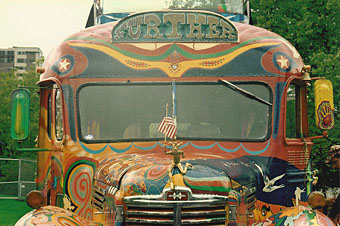
Further: the second version of Ken Kesey’s Merry Prankster bus.
The word psychedelic, like surreal before it, slipped from its original meaning through appropriation. Humphrey Osmond’s neologism was first coined in drug-related correspondence with Aldous Huxley in 1957 and was specifically intended to describe the “mind-manifesting” quality of the hallucinogenic drug experience. The drug-inspired art and music which came after the experiments of the Fifties quickly assumed a gaudy and chaotic aspect derived from the intense visual abstractions of LSD trips. Huxley in The Doors of Perception (1954) rejected these fractal visions as trivial and distracting—he was more concerned with the deeper spiritual revelations—but a new way of seeing in a new era required a new label. Art and design which is vivid, florid, multi-hued and quite often incoherent is where the term psychedelic is most commonly applied today.
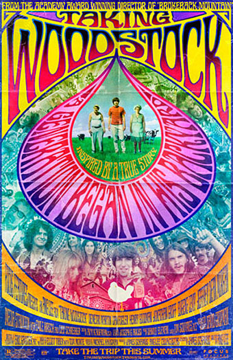
Of the three vehicles here, only Ken Kesey’s bus can be regarded as psychedelic in Osmond’s sense, this being the renovated school bus which travelled the United States in the mid-Sixties dispensing free LSD to those it met along the way. These events were recounted in Tom Wolfe’s The Electric Kool-Aid Acid Test (1968) and the creators of last year’s Milk, Gus Van Sant and Dustin Lance Black, have a film in preparation based on Wolfe’s book. Milk was a film about gay rights campaigner Harvey Milk, and Ang Lee (director of Brokeback Mountain) has a new film of his own due shortly, Taking Woodstock, which concerns Elliot Tiber, the gay organizer of the Woodstock Festival of 1969. Both stories bracket the psychedelic era. Is this coincidence or do I detect something in the air? But I digress….
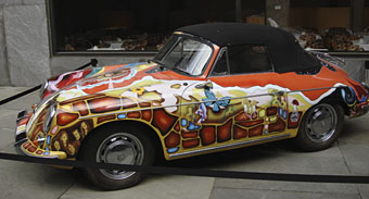
For the chaotic and decorative nature of the psychedelic style, look no further (so to speak) than Janis Joplin’s 1965 Porsche. I saw this in 2005 at Tate Liverpool when it was touring with the Summer of Love exhibition of psychedelic art. One of Joplin’s very last recordings before her death in 1970 was a birthday song for John Lennon so it’s perhaps fitting that the third vehicle here is Lennon’s lavish Rolls-Royce. His 1965 limousine came originally in black livery but two years later he decided he wanted it painted like a gypsy caravan. There’s a great page about the car here including details of its decoration, created in consultation with Marijke Koger of Dutch design group The Fool.
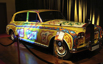
In a small way these three vehicles encapsulate the psychedelic period, from optimistic, proselytising origins following the revelations of hallucinogenic drugs to decline into a mannered, highly-commercialised graphic style. Ken Kesey died in 2001 but his second bus is still active while the cars are now museum pieces. Perhaps the real psychedelic spirit prevails after all.
See also: George Harrison’s Mini Cooper
Previously on { feuilleton }
• Dutch psychedelia
• The art of LSD