
Cover ups: Storm Thorgerson’s iconic album artwork | From the Hipgnosis days and after.
Category: {design}
Design
Louis Rhead’s peacocks
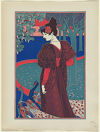
La femme au paon (Woman with peacocks): from L’Estampe Moderne (1897).
Two works by British Art Nouveau poster artist and illustrator, Louis Rhead (1858–1926). The first of these is very typical and resembles many of his magazine covers of the period. The cover illustration for The Century, meanwhile, must count as the only time I’ve seen a peacock presented as a possible Christmas dish.
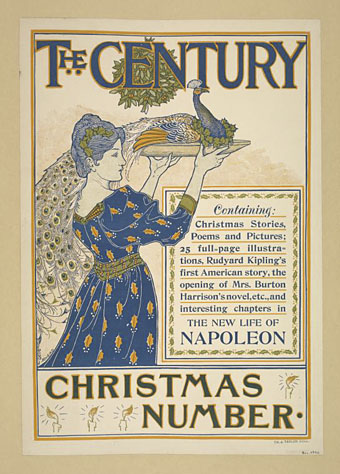
The Century Christmas Number (December 1894).
Previously on { feuilleton }
• Peacocks
• Rene Beauclair
• Whistler’s Peacock Room
• Beardsley’s Salomé
Max (The Birdman) Ernst
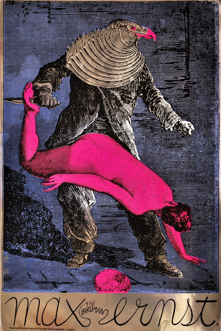
Max (The Birdman) Ernst (1967).
Psychedelia is never far away here at { feuilleton }. Yesterday’s film poster reminded me of this work from the psychedelic era by Martin Sharp, an Australian artist who moved to London and became closely-associated with Oz magazine and London’s other leading psych poster designers, Michael English and Nigel Waymouth, aka Hapshash & the Coloured Coat. Sharp’s homage to the great Max was one of a number of his designs produced on metallic foil sheets, the reflective nature of which often presents difficulties for reproduction in other media.
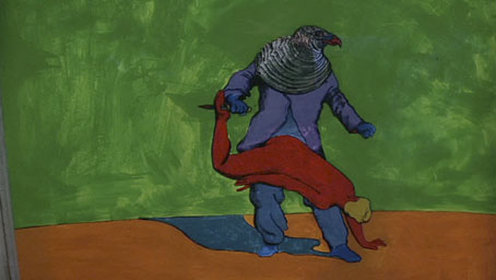
Performance (1970).
I wonder how many people who admired Sharp’s poster puzzled over the meaning of the image, one of twenty-eight similar collages from the fourth chapter of Ernst’s 1934 “collage novel” Une Semaine de Bonté. Chapter four—Wednesday; Blood—concerns the criminal travails of a series of bird-headed individuals (or possibly the same individual in different guises) which end in abduction, possible rape/murder, and suicide. This picture of Ernst’s has always struck me as a very obvious rape metaphor with the woman stretched over the birdman’s lap and the knife piercing her foot. Ernst’s dark imagination—informed by Freudian concerns, as were most of his fellow Surrealists—separates the picture from the more lightweight Art Nouveau/Beardsleyesque stylings of the other London artists. Martin Sharp was producing collages of his own during this period so it’s easy to see why he was attracted to Ernst. And the popularity of his poster may explain why the birdman turns up in a painted version in Donald Cammell & Nicolas Roeg’s Performance, seen when Pherber (Anita Pallenberg) goes to pick mushrooms in the greenhouse. Ernst’s sinister birdman suits Performance very well, a token of the film’s atmosphere of weirdness and violence. (“A heavy evil film, don’t see it on acid” warned underground newspaper International Times.)
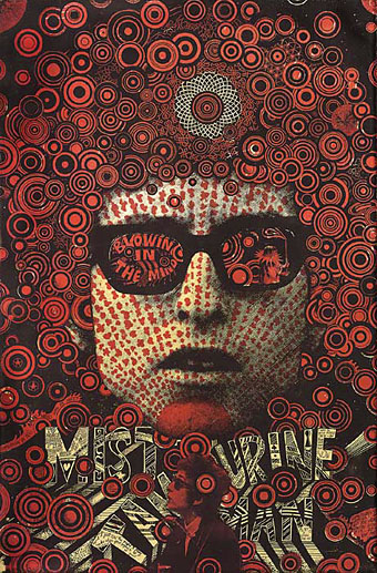
Bob Dylan: Blowing in the Mind (1967).
And to compound the connections a little more, Sharp’s famous Bob Dylan collage portrait (another foil sheet production) also turns up in Performance as part of the collage-covered screen in one of Turner’s rooms. Unlike his fellow Hapshash artists, Sharp’s work is under-documented on the web beyond pages such as this one. The same goes for Ernst’s collage novel but then the best way to experience that is to buy the Dover book edition.
Previously on { feuilleton }
• The Robing of The Birds
• Gandharva by Beaver & Krause
• The Look presents Nigel Waymouth
• The New Love Poetry
• Judex, from Feuillade to Franju
• Further back and faster
• Quite a performance
• Borges in Performance
The Robing of The Birds
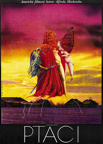
Yet another of those curious Eastern European film posters which, to our Hollywood-colonised eyes, seem to violate all the conventions of cinema marketing. This example is a painting by Josef Vyletal for a 1970 Czech release of Alfred Hitchcock’s The Birds. Surrealist art enthusiasts will immediately identify the floating figures as being cut loose from Max Ernst’s The Robing of the Bride (1940). Compared to some Czech and Polish posters, the associations here aren’t so surprising; Ernst identified his alter-ego as a bird-headed individual named Loplop. Birds and bird-headed humans recur throughout his work. Hitchcock, meanwhile, famously commissioned Salvador Dalí to design the dream sequences in Spellbound (1945). One of Ernst’s few appearances as an actor is in Hans Richter’s Dreams That Money Can Buy (1947) a very Surrealist film which also features scenes informed by Ernst’s work. It’s a shame more directors didn’t take the opportunity to employ these talents while they were still alive.
Previously on { feuilleton }
• Ballard and the painters
• Franciszek Starowieyski, 1930–2009
• Czech film posters
• Hitchcock on film
• Judex, from Feuillade to Franju
• Impressions de la Haute Mongolie revisited
• Dalí and Film
Samuel Beckett and Russell Mills
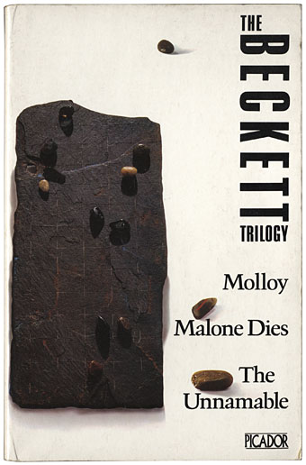
This 1979 Picador edition of The Beckett Trilogy is one of my favourite paperback cover designs. The “illustration” (as it’s described on the back) is a photograph of an artwork by artist/designer Russell Mills and the minimal credit gives no indication as to whether it was Mills who was responsible for the striking type layout. I’ve noted previously the equally striking Picador designs by the Quay Brothers who were responsible for both art and layout on their covers. Mills extended his work into graphic design later with album cover designs (and some book design) for Brian Eno, David Sylvian, David Toop and others so I’ll give him the benefit of the doubt in this case.
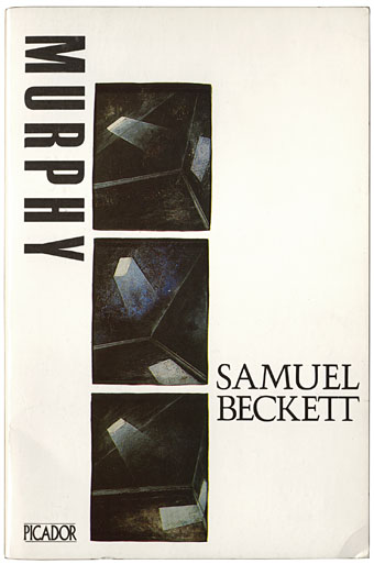
The Picador edition of Murphy was published in 1983 and comprises part of this week’s book haul. The three small Mills paintings suit the novel but I prefer his sculptural and collage works. I’ve taken to collecting more of these older Picador editions in recent years since they don’t turn up secondhand as often as they used to. As with the Quay Brothers and Italo Calvino, I wonder now how many Beckett covers Mills produced for Picador. The books list More Pricks than Kicks and Company in addition to these titles. He was still working for them up to 1986 when he and Brian Eno collaborated on the graphics for Don DeLillo’s White Noise. Unlike the world of Penguin collecting, this area lacks adequate documentation; further investigation is required.
Elsewhere on { feuilleton }
• The book covers archive
Previously on { feuilleton }
• Thursday Afternoon by Brian Eno
• Crossed destinies revisted
• Beckett directs Beckett
• Crossed destinies: when the Quays met Calvino
• The art of Shinro Ohtake
• Not I by Samuel Beckett
• Film by Samuel Beckett