Amy Sacker, book designer

sacker1.jpg

Manders: A Tale of Paris (1899) by Elwyn Barron.

Amy Sacker (1872–1965) was an American book designer, illustrator and bookplate artist, one of a number of female designers and illustrators whose careers began in the last years of the 19th century. I’ve mentioned before how women struggled at this time for acceptance in the male-dominated spheres of painting and sculpture. Those who insisted on pursuing an artistic career were encouraged to concentrate their impulses in the decorative arts with the result that women are a lot more visible in the illustration and design of this period. (See this earlier post about Margaret Armstrong, and these pages at Princeton University Library about women printers, binders and book designers.)

sacker2.jpg

The Kindred of the Wild (1902) by Charles G. D. Roberts.

The cover above is from the Amy Sacker website which features information about Ms Sacker’s bookbindings, illustrations and bookplate designs. A recent post here mentioned the Troutsdale Press collection of Amy Sacker bookplates from which the two examples below are taken. These often show people in Renaissance or medieval garb drawn in a style reminiscent of Walter Crane. More of them can be seen at the Internet Archive while the University of North Carolina archive has 120 examples of her cover designs.

sacker3.jpg

sacker4.jpg

Elsewhere on { feuilleton }
The book covers archive

Previously on { feuilleton }
Troutsdale Press bookplates
Margaret Armstrong book designs

Maps of Midtown Manhattan

manhattan1.jpg

Midtown Manhattan by Constantine A. Anderson.

Yesterday’s link to a Domus article, The importance of being axonometric, features an interview with map and chart collector Michael Stoll whose Flickr account has some wonderful samples from his archives. Among the many city charts there are several maps of New York in various axonometric projections including this example designed by Constantine A. Anderson for the Manhattan Map Corporation in 1985. Anderson’s map is like a modern equivalent of Turgot’s map of Paris, and caught my attention for possibly being the one that comic artist Dave Gibbons used for reference when he was drawing Watchmen in 1986. Gibbons and Watchmen writer Alan Moore mentioned the map in the huge round table discussion I posted here in 2006 (the discussion at this point concerns the story’s recurrent street corner location):

Dave Gibbons: I didn’t actually make a model of it, although when we first conceived it I did draw a streetmap.
Alan Moore: Well, we checked it up on a map of New York.
Fiona Jerome: It’s really there?
DG: It’s a feasible corner—I’ve got a map at home.
Steve Whittaker: I noticed you put Forbidden Planet N.Y. in there at one stage—where they’re selling all the pirate comics.
AM & DG: No, that’s Treasure Island.
DG: Which would, if you had pirate comics, be FP. At home I’ve got this brilliant map they do which is an isometric projection of New York, so not only is it a street map but it’s all the buildings standing up and it’s got all the post boxes and the trees.
AM: It’s lovely, it’s a work of art you can wander round New York in your head.
DG: It’s about this big but… you know the joke about New York people look at it and say “When’s it going to be finished?” It’s the same with this map, it’s never actually finished because as fast as they put buildings in it, other ones are torn down. There are places in it where there’s just a site with a crane or something.
[…]
DG: But that corner, l’m sure that at some time I’ve been to New York I must have walked past that corner. In fact, what I’d really like to do, the next time I go, is actually walk to that junction and see what’s there. On the isometric map there is a fairly new high rise building which could be the Institute for Extra Terrestrials, another building which looks like a cinema to me because it’s got a curved front, and there are some other, lower buildings.
SW: And a fast food chain, perhaps?
DG: That intersection is feasible, right down to the way that the sun rises. This isn’t just down to me. Alan obviously made specific provision for this in his script. The sun actually does rise in the east end sets in the west, and if you look at the thing, if it’s afternoon the shadows are going this way and in the mornings the shadows are going the other way.

I could no doubt have confirmed this by asking DG on Twitter but didn’t want to pester him. Suffice to say there can’t have been many super-detailed axonometric maps of New York being produced at this time. As Gibbons notes, city maps date very quickly: to see a century of change at work compare this equally detailed map from 1879 with Anderson’s views. Stoll has a more recent axonometric map of New York by Tadashi Ishihara but that’s now twelve years old so it’ll also be out-of-date. If we want a close view of New York’s streets today we can simply fire up Google Earth but there’s still something graceless and clunky about the 3D boxes it imposes on the city’s streets. For the moment these views, especially Anderson’s meticulous line renderings, remain hard to beat.

manhattan2.jpg

Previously on { feuilleton }
The Turgot Map of Paris
Watchmen

Aether Cola

aethercola.jpg

Another piece of work from the end of last year has now been unveiled. The brief this time was from UK company Cybercandy who asked for a steampunk-themed cola can. If this sounds like the mechanical shark has been well-and-truly vaulted then it’s necessary to note that Cybercandy specialise in novelty food products with science fiction (or similar) themes. They also import food products from other countries. The cans are small size (250 ml) for which I chose a bronze/copper metallic ink that looks great on the finished articles. The job made a welcome change from work for books or CDs.

aethercola2.jpg

Aether Cola is available from Cybercandy’s UK outlets. I’m not sure about the availability elsewhere but there’s a dedicated site for the drink here with details of their shops here.

aethercola3.jpg

Previously on { feuilleton }
Crafting steampunk illustrations
SteamPunk Magazine
Morlocks, airships and curious cabinets
The Steampunk Bible
Steampunk Reloaded
Steampunk overloaded!
More Steampunk and the Crawling Chaos
Steampunk Redux
Steampunk framed
Steampunk Horror Shortcuts

Pleasure of Ruins

beny01.jpg

The ideas ruins evoke in me are grand. Everything comes to nothing, everything perishes, everything passes, only the world remains, only time endures. How old is this world! I walk between two eternities.

Denis Diderot, 1767

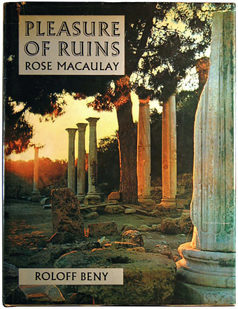
Ruins, as Diderot observed, are the memento mori of civilisations, a reminder that the apparent permanence of architecture is illusory: this too shall pass. Rose Macaulay explored the melancholy pleasure inspired by this contemplation in Pleasure of Ruins (1953), a book I was reminded of on two separate occasions this weekend. Before I get to those I can’t resist showing something of my own copy of Macaulay’s study, a heavyweight volume (286 pp, 346mm x 260mm) published by Thames & Hudson in 1964. This was the third book by Canadian photographer Roloff Beny who made a habit of photographing ancient ruins. Here he visits Angkor, Tintern Abbey, Persepolis, Petra, Baalbek, Leptis Magna, Chichen Itza, Machu Picchu and elsewhere to embellish Macaulay’s text with 160 photogravure pages, 12 tipped-in colour plates, and maps of the locations on fold-out spreads. Beny also designed the book which even in my rather scuffed and damp-afflicted copy is an impressive example of the mass-produced edition as work-of-art.

beny02.jpg

Metallic silver printing on the endpapers.

Rick Poynor provided the first mention of Macaulay’s book in a piece of polemic justifiably disputing the pejorative term “ruin porn”, an epithet that’s appeared recently among critics of those fascinated by photos of abandoned Detroit, or Battleship Island off the coast of Japan. If photos of ruins are “ruin porn” then Roloff Beny’s books must count as hardcore, while my National Trust Book of Ruins is evidently a government-sponsored sex manual. Poynor notes the criticism being a particularly American one, and wonders whether some Americans fail to appreciate the long cultural and political history of the ruin in Europe. Plenty of European cities have ruins in their midst, whether ancient ones like London Wall and the centre of Rome, or more recent ones like the Kaiser Wilhelm Memorial Church in Berlin and Coventry Cathedral, both partially destroyed during the Second World War. An appreciation of ruins began in the 18th century and evolved in tandem with the emergence of antiquarianism. Prior to this, ancient ruins were either a nuisance or a resource to be plundered for their stones. (Or, as can be seen in some of Piranesi’s Views of Rome, a convenient support for shops and houses.)

beny03.jpg

From ruin porn to Ruin lust: our love affair with decaying buildings, an essay by Brian Dillon which covers similar ground to Poynor’s piece, and discusses Rose Macaulay’s interest in ruins, an interest that survived being bombed out of her home during the war. This is a great run through the usual suspects, from the Romantics (with a nod to Fonthill Abbey) to JG Ballard’s obsession with the remnants of the Cold War and the Space Age. Dillon mentions the painting John Soane commissioned from Joseph Gandy showing his Bank of England building as a future ruin. And he also recounts the story (which I heard repeated recently in a Robert Hughes documentary) of Hitler’s demands to Albert Speer during their planning of the future capital of the Third Reich, Germania, that the buildings should make good ruins. It’s impossible to imagine anyone today planning a building as a future ruin even though many will end up that way, if they last at all.

beny04.jpg

If it wasn’t already apparent that ruins are the thing du jour, a current exhibition at Dundee Contemporary Arts is of photographic prints by Jane and Louise Wilson showing views of abandoned Pripyat, better known as the town at the heart of the Chernobyl Exclusion Zone. Rick Poynor refers to Pripyat in his piece, and it’s also an inevitable subject of discussion in Geoff Dyer’s latest book, Zona, an exploration of Andrei Tarkovsky’s Stalker where a disused power station adds a more sinister quality to the pleasure of ruins.

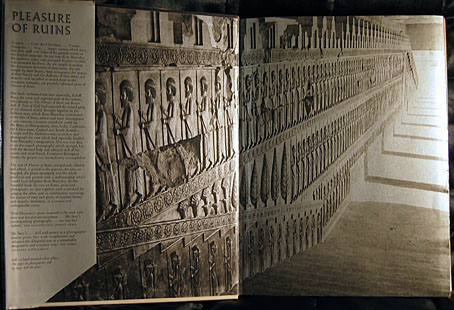
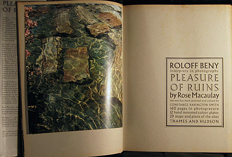
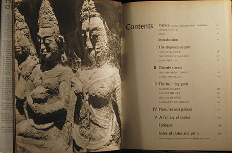
More pages from Roloff Beny’s book follow.

Continue reading “Pleasure of Ruins”

Le Grand Macabre

topor1.jpg

Yesterday I mentioned Leslie Megahey’s Ligeti film, All Clouds Are Clocks, an hour-long documentary based around an interview with György Ligeti filmed in 1976. A unique feature of that film was that Megahey returned to film Ligeti in the same room in 1991 where they discussed the composer’s work during the intervening period. Of these, Le Grand Macabre, written in the late 1970s, was the most ambitious piece.

topor2.jpg

Bartók and Ligeti share some attributes: both were Hungarian, and both were forced to flee their native country. Both composers also wrote only one opera apiece. Le Grand Macabre is Ligeti’s opus, an absurdist drama based on Michel de Ghelderode‘s 1934 play, La Balade du grand macabre. In the film Ligeti explains that he didn’t want to repeat the mid-century concept of the anti-opera but was also dissatisfied with the traditional variety, hence Le Grand Macabre‘s description as an “anti-anti-opera”, a work that combines the tradition and its reaction.

topor3.jpg

Continue reading “Le Grand Macabre”