Weekend links 143

empire.jpg

Ai No Corrida poster design by Egil Haraldsen (2001).

• “Back then, publishing an interview with Félix Guattari alongside little chats with rough trade and street walkers was unheard of — it still is for the most part.” BUTT on Kraximo, a gay Greek magazine of the 1980s.

13 books for 2013: A selection of forthcoming titles at Strange Flowers which so closely aligns with my preoccupations that I worry he’s reading my mind.

• “The Macaulay Library is the world’s largest and oldest scientific archive of biodiversity audio and video recordings.”

• A free BitTorrent Robert Anton Wilson audio and video pack. See also the RAW files at the Internet Archive.

beijing.jpg

The Pangu Building, Beijing, January 12th, 2013. Blade Runner arrives six years early.

Wired celebrates 100 years of Edward Johnston’s typeface for the London Underground.

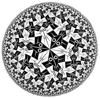
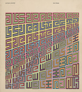
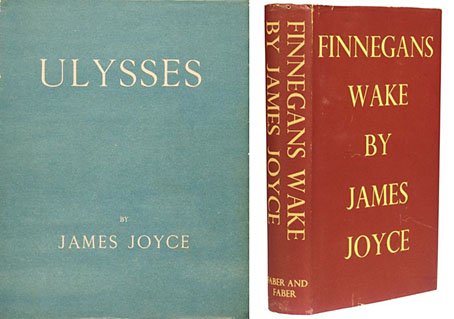
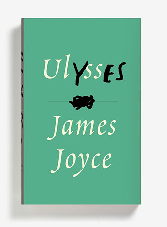
Borges’ translation of Ulysses. Or of the last page of Ulysses as a translation of Ulysses.

0181, a new album by Four Tet, can be heard in full at SoundCloud.

• The Edge question for 2013: “What should we be worried about?

JG Ballard documentaries at Ubuweb.

Unlocking Dockstader.

• RIP Nagisa Oshima.

Ai No Corrida (1980) by Quincy Jones | Empire Of The Senses (1982) by Bill Nelson | Forbidden Colours (1983) by David Sylvian & Riuichi Sakamoto

The Eighth Court

shevdon.jpg

Mid-January and here’s the first book cover design of the year, and another title for Angry Robot. This is the fourth book in Mike Shevdon‘s Courts of the Feyre series; since I’d already provided the three earlier books with a uniform design it didn’t take long to create this one. I’ve been very pleased with the reception of these covers, the positive response shows that it’s possible to design something for a fantasy series that isn’t the customary generic illustration plus florid typography. I wrote about the problems of designing fantasy covers last year with a lengthy examination of M. John Harrison’s Viriconium books.

angryrobot.jpg

Two recent Angry Robot covers: Joey HiFi‘s cover for Chuck Wendig and Amazing15‘s Pelican-styled design for Chris F. Holm.

Credit should be given to Angry Robot’s Marc Gascoigne for encouraging this direction, the company has been producing a range of very smart covers which don’t pander to the clichés of the marketplace. There’s more of an incentive for smaller publishers to do this when small press imprints and self-publishers often have terrible cover designs (sad but true) while the multinationals play safe for fear of losing readers. If you want to stand out from the crowd then it helps to look good.

Elsewhere on { feuilleton }
The book covers archive

Previously on { feuilleton }
The Courts of the Feyre

The art of Henri Caruchet

caruchet1.jpg

Byblis (1901) by Pierre Louÿs.

Henri Caruchet isn’t in George Barbier’s league, never mind that of Alphonse Mucha whose graphic style Caruchet appropriated. I’ve not been able to find details about his life either, all that turns up is examples of his book illustration on various websites. Author Pierre Louÿs is notable for his erotic works but it’s Caruchet’s illustrations for Jean de Villiot (via this site) which travel the furthest in that direction (see below), including another example of that deviant sub-genre, the woman being mauled by an octopus. If Caruchet had been a better draughtsman his illustrations might not have languished for so long.

There’s more decorative illustration by Caruchet at Gutenberg.org with an edition of Théophile Gautier’s Émaux et Camées. Two of Gautier’s poems from that volume are quoted by Oscar Wilde in The Picture of Dorian Gray.

caruchet2.jpg

Byblis (1901) by Pierre Louÿs.

caruchet3.jpg

Les Litanies de la Mer (1903) by Jean Richepin.

caruchet4.jpg

Parisienne et Peaux-Rouges (1904) by Jean de Villiot.

Continue reading “The art of Henri Caruchet”

Weekend links 142

bowie.jpg

Gratifying this week to see album cover art under discussion even if the heat-to-light ratio was as unbalanced as it usually is when pop culture is the subject. Jonathan Barnbrook, who also designed the Heathen (2002) and Reality (2003) packaging for David Bowie, wrote about the thinking behind the new cover on his blog. (And for the time being let’s note that this is still only a cover design, we don’t know what else is on its way.)

For my part I’ll point out that the artist-as-cover-image is the great cliché of album design, and the bigger the name the more the rule applies; Neville Brody complains about this in the first book of his work, as does Storm Thorgerson in the Hipgnosis books. In Bowie’s case the rule has been applied almost universally since his debut album in 1967, the only variations being illustrational ones or slight dodges like having his feet appear on the front of Lodger and his back facing the viewer on Earthling. Consequently the new design is a radical gesture from an artist who could have got away with a photo of himself du jour. By way of contrast, consider that Rod Stewart is a year older than David Bowie and presented the world with this artefact in October 2012.

Related: Hard Format responds to the cover, Chris Roberts on “Picasso resurrected in a Rolf Harris era“, and Alexis Petridis on The inside story of how David Bowie made The Next Day.

The Quicksilver typeface, designed by Dean Morris when he was only 16, bought by Letraset and now an indelible feature of pop design from the 1970s. Morris describes his experience here (“they shunned rapidographs!”) and collects examples of the print history here.

When the days are short, we are closest to the medieval world. To the avoidance of mirrors where death improves our portraits every morning with a few more lines and shadows. What would once have been a sermon, a conjuring of hellfire, a phantom slide show, is now an entertainment. But before we can begin again, we have to kick free of the embrace of our inconvenient predecessors, that compost legion of the anonymous dead. They come uninvited, requiring us to sign up for what the late Derek Raymond called the general contract: a brief turn in the light, then extinction. Eternal darkness. How to live with such knowledge? William Burroughs admired the unswerving bleakness of Beckett’s gaze, the way he reduced compensatory illusions to zero. Nowhere left to crawl. And nothing to crawl on. Last breath is last breath. Stare into the abyss and the abyss will stare right back.

Iain Sinclair reviews The Undiscovered Country: Journeys Among the Dead by Carl Watkins

Broadcast’s James Cargill on Morricone, Minidiscs and Scoring Berberian Sound Studio. Related: Melmoth the Wanderer posts a new mix, The Curious Episode of the Wizard’s Skull, and more spooky sounds are on their way from The Haxan Cloak.

• A Firm Turn Toward the Objective: Joanne Meister on meeting the great Swiss designer Josef Müller-Brockmann.

duchess.jpg

Twitter user @thisnorthernboy reworked Paul Emsley’s portrait of Kate Middleton. @barnbrook approved.

• The Beatles of Comedy: David Free on the Monty Python team.

• The history of the London Underground poster.

Impossible Architecture by Filip Dujardin.

• At Pinterest: Art Dolls & Sculpture

• Grace Jones’ Nightclubbing album has been on repeat play this week: Warm Leatherette/Walking In The Rain | I’ve Seen That Face Before (Libertango) | Demolition Man

Weekend links 141

nguyen.jpg

From the Beautiful Faces series (2012) by Tran Nguyen.

• “What possessed a generation of young European artists, and a few Americans, to suddenly suppress recognizable imagery in pictures and sculptures? Unthinkable at one moment, the strategy became practically compulsory in the next.” Peter Schjeldahl on the birth of abstraction.

• “A profanely mystical work of hyperpurple theory-porn, ObliviOnanisM is an auto-erotic intellectual fiction envisioning the phantastical unending odyssey of a young woman, Gemma, whom you will never know.”

Psychedelia—An Ancient Culture, A Modern Way of Life, a 520-page history of psychedelic culture by Patrick Lundborg. Related: Ken Kesey talks about the meaning of the Acid Tests.

[Hodges] made a convincing case that Turing’s teenage crush on a fellow schoolboy, Christopher Morcom, was an important catalyst for his lifelong preoccupation with the relationship between brain and mind. Morcom’s unexpected death at the age of eighteen was a shattering blow to Turing, who began to reflect on whether his friend’s consciousness might survive after death or whether it was simply a result of complex material processes and expired when life did. Hodges also linked the famous “Turing Test”, in which a computer attempts to pass as an intelligent human being, to Turing’s own dilemma as a gay man in a homophobic world. (Turing called his test the “imitation game”, and Hodges observed, “like any homosexual man, he was living an imitation game, not in the sense of conscious play acting, but by being accepted as a person that he was not”.)

Michael Saler reviews three books about computing pioneer Alan Turing

• Paul Gallagher at Dangerous Minds looks at Flowers, Lindsay Kemp’s theatrical staging of Genet’s Our Lady of the Flowers.

David Pearson designed a new edition of George Orwell’s Nineteen Eighty-Four for Penguin.

• Quadtone – Lumisonic Rotera: Mariska de Groot plays a light-to-sound instrument.

“Cash Mobs” Go Global—Battle Spreads Against Chain Store Dominance.

Cities and the Soul: a feast of Italo Calvino links at MetaFilter.

25 dessins d’un dormeur, Jean Cocteau, 1929.

Haunted Decor: a Flickr group.

Computer In Love (1966) by Perrey & Kingsley | Computer Love (1981) by Kraftwerk | Computer Love (1992) by The Balanescu Quartet