Max Ernst album covers

ernst01.jpg

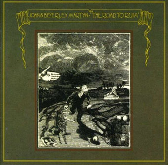
The Road To Ruin (1970) by John & Beverley Martyn. Art: Un Semaine de Bonté (1934).

Having already looked at cover art featuring the work of Salvador Dalí and René Magritte, a similar post for Max Ernst seemed inevitable. I did search for Ernst cover art after the Dalí post but at the time there were fewer examples. As usual there may be more than these since Discogs is the main search tool and they (or the albums) don’t always credit the artists. Despite having several books of Ernst’s work I’ve not been able to identify all the artwork so the Ernst-heads out there are welcome to fill in the gaps.

The Road To Ruin was John Martyn’s fourth album, and the second he recorded with wife Beverley. I’m surprised that this is the earliest example, I’d have expected a classical album or two to have predated it.

ernst02.jpg

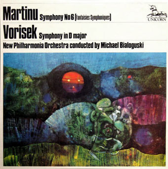
Martinu’s Symphony No. 6 (Fantaisies Symphoniques) / Vorisek’s Symphony In D Major (1971); New Philharmonia Orchestra, Michael Bialoguski. Art: Bottled Moon (1955).

ernst03.jpg

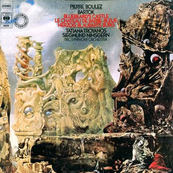
Bluebeard’s Castle by Béla Bartók (1976); Tatiana Troyanos, Siegmund Nimsgern, BBC Symphony Orchestra, Pierre Boulez. Art: The Eye of Silence (1943–44).

Bluebeard’s Castle is my favourite opera, and The Eye of Silence is my favourite Ernst painting, so this is a dream conjunction even if the match doesn’t work as well as it did for the cover of The Crystal World by JG Ballard. One to seek out.

Continue reading “Max Ernst album covers”

Bomb culture

basie.jpg

The Atomic Mr Basie (1957) by the Count Basie Orchestra.

A few more examples and this would have been part of the ongoing Design as virus thread. A recent post at MetaFilter led to this piece about the use and misuse of photos of nuclear tests. The Count Basie album above appears there, a cover I’d not seen before. This isn’t the same cover as in the post since there were several variations of this album entitled either Basie or The Atomic Mr Basie.

hood.jpg

Hood, 11:40.00.4 5 July 1957.

The photo on the cover was of “Hood”, one of the detonations from Operation Plumbbob, a series of tests that took place in the Nevada Desert during the summer of 1957.

crownofcreation.jpg

Crown of Creation (1968) by Jefferson Airplane. Design: John Van Hamersveld.

The Basie cover reminded me immediately of a similar cover for Jefferson Airplane’s Crown of Creation album a decade later. No doubt both albums chose shots of explosions against dark skies since they look a lot more fiery and dramatic than those photographed in the desert daylight. I’ve often wondered if this cover—which runs counter to the peace & love vibes of the late 60s—gave Norman Spinrad the idea for his story The Big Flash published a year later. Spinrad’s story is a twist on the usual scenario of Jesus or Satan appearing in contemporary guise: “The Four Horsemen” are a rock band who are also the actual Four Horsemen of the Apocalypse. Their popularity leads the world willingly to nuclear destruction.

fizeau.jpg

Fizeau, 16:45 14 September 1957.

The first surprise was that this isn’t a night shot. The second surprise was discovering that “Fizeau” was also a part of Operation Plumbbob. This page has more details of the complete operation in all its cancer-inducing glory.

dynamite.jpg

Dynamite (1974) by Various Artists. Artwork by Phil Richards.

There may be other albums using the Plumbbob photos but the only other example that came to mind was a painted cover which is vaguely reminiscent of the pictures above. I wouldn’t have known this one at all if I hadn’t received it as a Christmas present in December 1974. Of all the cheap compilation albums I used to play on my first record player this was easily the best one, an odd mix of glam, forgettable pop and the heavy rock that in those days made it into the charts on a regular basis. “As advertised on TV.” The Cozy Powell number, Dance With The Devil, was a drum-led instrumental based on Jimi Hendrix’s Third Stone From The Sun. It still sounds good today.

cro-mags.jpg

The Age of Quarrel (1986) by Cro-Mags.

An album by a hardcore band that uses a shot of the Romeo test from Operation Castle, 1954. Thanks to @NONPOPOCCULTURE.

Update: Added Cro-Mags.

Elsewhere on { feuilleton }
The album covers archive

The Art of Gothic by Natasha Scharf

goth01.jpg

This weekend I was at the Louder Than Words music conference in Manchester to meet Peter Bebergal, author of Season of the Witch: How the Occult Saved Rock and Roll, and Mark Pilkington of Strange Attractor. By coincidence the event was hosting a discussion about goth music and culture based around The Art of Gothic, a new art book by Natasha Scharf. As mentioned last month, this book features some of my work but I hadn’t seen a copy until now.

goth02.jpg

I’ve been fortunate recently to have my work appear in some impressive volumes but this outsize hardback takes some beating. It’s a very lavish production, 224 colour pages on heavy paper with gorgeous design by Paul Palmer-Edwards. Goth has been subject from the outset to mocking stereotypes, to a degree that many people would imagine they know exactly what a study such as this would contain. A recurrent theme of the Louder Than Words discussion was the growth of the goth subculture beyond its clichéd boundaries which is one reason my work is featured in the book. When Natasha was first in touch I thought it might be for the Cradle of Filth album covers but I’m in the chapter that examines the increasingly tangled goth/steampunk crossover. This is one development that’s come to seem almost inevitable given the roots of so much of the goth aesthetic in Victorian nightmares. Many steampunk novels tend towards the dark in their blend of science fiction and horror so the traffic goes in both directions.

goth03.jpg

Elsewhere in the book there are chapters on Futuristic Goth, Japanese Goth, and Cybergoth, all of which maintain the requisite darkness while evolving away from the top hats, lace and veils (the latter are all present and correct elsewhere, of course). It’s a beautiful book, out now in the UK from Omnibus Press, and in the US from Backbeat Books. A few more page samples follow. There’s more at Amazon UK.

• See also: 13 Things That Prove Gothic Art Is Enchanting And Beautiful

goth04.jpg

left: The Amazing Screw-On Head by Mike Mignola (2002); centre: the full-colour version of the ever-popular Steampunk Equation (2009), words by Jeff VanderMeer, graphics by John Coulthart; right: Dr Geof’s Medicine Lady, aka Steampunk Pinup #2.

goth05.jpg

The mighty Giger again. I’ve got a framed print of that picture on the wall, a fact that will surprise nobody.

Continue reading “The Art of Gothic by Natasha Scharf”

Steampunk in the Tank

tank00.jpg

Plague doctor mask by Tom Banwell.

Last month I wrote a little about the Steampunk: Art of Victorian Futurism exhibition that’s been running since the beginning of October in Beijing, this being the same event that was staged in Seoul earlier in the year. Five of my book cover designs have been featured in these shows, together with some very impressive artworks, designs and constructions by international artists. This week the organisers of the show, Artcenter IDA, sent their own photos of the event.

tank01.jpg

Locomotive Square.

As mentioned before, the venue is an exhibition space in 751 D-Park outside central Beijing, an area I’ve been told was formerly an industrial complex manufacturing armaments during the Cold War. If we occasionally find that life these days imitates the fictions of JG Ballard or Philip K Dick, 751 D-Park strikes me as a very William Gibson kind of place: Cold War industrial complex transmuted into an international art space—Beijing Design Week is hosted here each year—that on this occasion is showcasing antique science fiction. The 751 website has a map of the area with links to photos and other information. I’m rather taken with “Crached Furnace Square” and “Locomotive Square“.

tank02.jpg

Continue reading “Steampunk in the Tank”

MCMLXX

data70.jpg

Data 70, a typeface by Bob Newman.

The presence of electronic artists Data 70 in the Spatial mix at the weekend had me thinking about the preponderance of cultural items that were given “70” as a suffix in the 1960s or in the year 1970. The air of futuristic optimism in the 60s drew attention to the birth of a new decade in a manner that hadn’t really happened before, and certainly didn’t happen for 1980 by which time the optimism had been sunk by a decade of political and fuel crises, and the end of the space race.

Data 70 take their name from the “futuristic” computer-like typeface designed by Bob Newman in 1970. Newman’s typeface wasn’t the first of the Space Age designs—Colin Brignall’s Countdown appeared in 1965—but Data 70 was everywhere in the 1970s. Data 70 (the group) dedicated a piece of music to Newman.

A few more 70s follow. These are only the ones I’ve been able to remember or stumble across so I’m sure there are more. And note: to qualify for this micro-category something has to be named “70” only where the suffix signifies modernity or the future, no Expo 70 (the world’s fair in Osaka) or anything annual that happened to be labelled 70 as part of a series.

boccaccio.jpg

Boccaccio 70 (1962).

The label might imply the future but the predominant tone of these entries is sex. Boccaccio 70 set things in motion by updating the Decameron to modern Italy. Despite the claims of the poster, anthology films are nothing new, and this one has four stories directed by Vittorio De Sica, Federico Fellini, Mario Monicelli and Luchino Visconti. Italo Calvino was one of the writers.

Continue reading “MCMLXX”