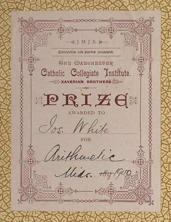
Design as virus 1: Victorian borders

bookplate.jpg

There’s nothing new about drawing attention to the viral nature of design, whether in the repeated use of motifs and styles or the way in which typefaces breed and proliferate; Jonathan Barnbrook alludes to this process directly by calling his font house Virus.

The plate above comes from a Victorian book I bought several years ago, The Pictorial Cabinet of Marvels, a reasonably lavish volume for children concerning places and things of interest around the world. Since I like playing with excessive Victorian flourishes now and then I’m always on the look out for new examples and the border here immediately caught my eye. I have a decent selection of clip art books from Dover and Pepin containing this kind of thing but nothing quite like this particular design. When I was putting the Damnation and A Day album together for Cradle of Filth I took one of the corner pieces as a starting point for a border design I used on the front and back of the booklet and the tray.

damncov.jpg

The poor old Xaverian Brothers of Manchester’s Catholic Collegiate Institute would no doubt be mortified to see part of their prize bookplate being used to decorate such a blasphemous artefact. The album was released by Sony Music in 2003 so this little border motif has travelled the world by now. I seem to recall sending the record company the border design separated from the artwork so they could make up some posters.

And so we come to what I’m assuming is its latest manifestation, a poster design for Manifest Destiny, a Los Angeles music event organised by Tee Pee Records.

tee-pee.jpg

I say “assuming” since I’ve no idea whether this example is from my design or not. But it seems a safe bet seeing as the original is from such an obscure source. Not that I mind if it is, of course. I can’t very well complain when I swiped the thing in the first place, now can I?

Update: Tee Pee designer Sarah MacKinnon writes to say her Victorian motif is from one of Dover’s clip art books. Now I know that I wouldn’t mind finding the book for my own collection. This makes the occurrence of the original more unusual, at least from my point of view, since it’s the only time I’ve spotted one of these reprinted elements in its period setting.

Previously on { feuilleton }
Masonic fonts and the designer’s dark materials

Wanna see something really scary?

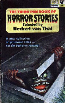
pan_horror.jpgXeni Jardin and Boing Boing readers reminisce today about the childhood traumas inspired by Sesame Street characters. Wimps, say I, although in fairness I was too old to be frightened of Muppetry by the time that stuff appeared on British TV screens.

Scariest thing in the Coulthart household, easily out-classing anything on children’s television (Doctor Who monsters included), was the cover of the third Pan Book of Horror Stories. My parents had a small collection of paperbacks from the early Sixties which included some horror and occult fiction. My sister and I found this book one day while rooting in an old suitcase and were both mortified by it. I seem to remember there being dares to go and look at it again and also have vague recollections of at least one nightmare occurring as a result. A shame there isn’t a larger scan available since I’m curious to know who the artist was.

pan_horror2.jpgA few years later I was reading the Pan series myself although I never went back to this particular one. Herbert van Thal’s selections got off to a good start, reprinting old horror classics with newer fiction, but soon degenerated into detailed and repetitive tales of dismemberment and blood-letting, the kind of stuff that makes you think “cool” when you’re a teenage boy but which is otherwise worthless. Most of the writers in the later books are unheard of elsewhere which makes me suspect they were probably hacks earning a quick couple of quid writing under pseudonyms. The strangest thing about volume three now is looking at the contents list and seeing that we had stories by William Hope Hodgson and Algernon Blackwood in the house all that time and I never knew it.

Update: The cover artist was W Francis Phillips.

Elsewhere on { feuilleton }
The book covers archive

Previously on { feuilleton }
Druillet meets Hodgson
A playlist for Halloween
Ghost Box
Le horreur cosmique

The art of Bob Pepper

pepper1.jpg

Forever Changes (1967) by Love.
Art by Bob Pepper, design by William S. Harvey.

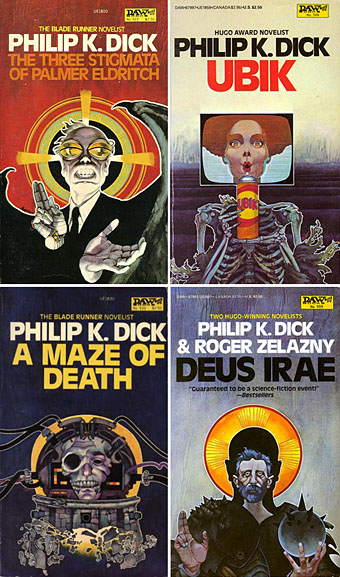
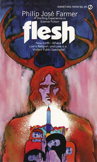
Following yesterday’s post about Philip K Dick covers (and Erik Davis’s appraisal of the DAW cover), I decided to check out Bob Pepper’s work a bit more and it quickly became obvious I should have joined the dots with this particular artist years ago. Pepper’s work not only decorates one of the recognisable record sleeves of the late Sixties (above), he was working shortly afterwards as an illustrator on the celebrated series of fantasy reprints edited by Lin Carter for Ballantine books. Pepper’s connections with Elektra Records also saw him provide sleeve art for some of the eclectic releases on their Nonesuch label. What’s surprising to me now is the realisation that I’d been seeing his work for years in a variety of places and never noticed it was the same artist. Better late than never, I suppose.

pepper2.jpg

Four more Dick covers for a series of six published in 1982 to coincide with the release of Blade Runner. As with the cover for A Scanner Darkly (in the earlier post) these paintings are all portraits.

pepper3.jpg

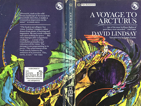
A Voyage to Arcturus (1968) by David Lindsay.

It was the success of the publication of The Lord of the Rings in America which inspired Betty Ballantine to publish a line of fantasy classics in the late Sixties. The series began its run in 1969 and continued until 1974. Lin Carter was commissioned as editor and given free reign to choose any title he thought might be suitable with the result that many of the books in the series—obscurities such as Lud-in-the-mist by Hope Mirrlees—received their first paperback publication. Carter also reprinted personal favourites which frequently shifted from fantasy to outright horror, such as the titles from HP Lovecraft and William Hope Hodgson. The range and scope of this line is what makes the series so notable today and the books have become highly-collectable as a result. Many artists were involved in producing the distinctive cover designs and Pepper’s illustrations were featured on the covers for Mervyn Peake, Lord Dunsany and James Branch Cabell, among others. Unfortunately the various pages devoted to these books aren’t very good at showing the paintings to their best advantage. For a long time Pepper’s cover for A Voyage to Arcturus was one of the few editions available that managed to show a scene from the book, rather than a generic sword-wielding barbarian.

pepper5.jpg

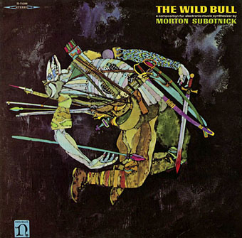
The Wild Bull (1968) by Morton Subotnick.

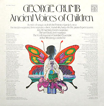
Nonesuch Records was Elektra’s subsidiary classical music label which not only produced classical recordings but also recordings from around the world in their Explorer series, and a range of original works of contemporary electronic music. I’m not positive that the sleeve above is a Pepper painting but it certainly looks like it. This is another surprise since I’ve had Morton Subnotnick‘s album on a reissue CD for years (with different artwork). The George Crumb recording below is Pepper’s work and I’ve had the original vinyl of that one for several years. The similarity between that sleeve and the one for Love is striking.

farmer.jpg

Flesh (1969) by Philip José Farmer.

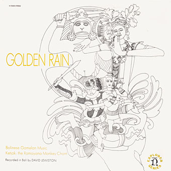
pepper6.jpg

Golden Rain – Balinese Gamelan Music – Ketjak: The Ramayana Monkey Dance (1969) by Various Artists.
Art by Bob Pepper, design by William S. Harvey.

pepper4.jpg

Ancient Voices of Children (1971) by George Crumb.
Art by Bob Pepper, design by Robert W. Zingmark.

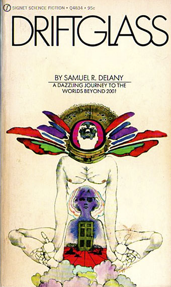
delany.jpg

Driftglass (1971) by Samuel R. Delany.

pepper7.jpg

Debussy’s Greatest Hits (1972).

pepper8.jpg

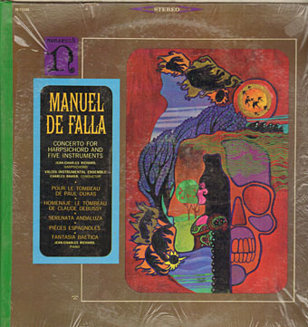
Concerto For Harpsichord And Five Instruments by Manuel De Falla (no date).

ellison.jpg

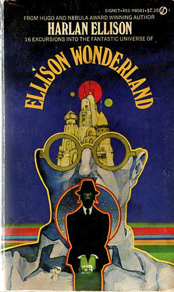
Ellison Wonderland (1974) by Harlan Ellison.

pepper9.jpg

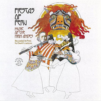
Fiestas of Peru: Music of the High Andes (1975) by Various Artists.
Art by Bob Pepper, design by Jo Ann Gruber.

japan.jpg

Flower Dance: Japanese Folk Melodies (no date) by Kofu Kikusui, The Noday Family, Nakagawa & Oishi.
Art by Bob Pepper, direction by William S. Harvey, design by Elaine Gongora.

Pepper is retired now but produced artwork for Dark Tower, a fantasy boardgame, in 1981. The game still has its enthusiasts, and this site features a short interview with the artist.

Update: more about the Ballantine covers.

Update 2: a large scan of the George Crumb cover art.

Update 3: More album and book covers added.

Elsewhere on { feuilleton }
The album covers archive
The book covers archive
The illustrators archive

Previously on { feuilleton}
Philip K Dick book covers
Masonic fonts and the designer’s dark materials

Philip K Dick book covers

scanner_covers.jpg

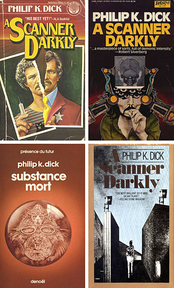
650 Philip K Dick covers here although no thumbnails for ease of browsing. Interesting seeing how many publishers have tried to bracket Dick as a typical science fiction writer when many of his books are marginal sf at best. Then there’s the curiosity of the translated title, Substance Mort for A Scanner Darkly being one example.

Update: Odd coincidence dept. (well, it’s PKD, right?), having posted the above last night I find today that Dick enthusiast Erik Davis is discussing the DAW cover (above, right) over at Total Dick Head. Thanks to this we discover that the artist is Bob Pepper who produced the classic cover art for Love’s Forever Changes album.

Update 2: Henri alerts us to his own PKD site which also includes even more cover scans (and thumbnails this time), including those from French editions.

Elsewhere on { feuilleton }
The book covers archive