Friendly Fire: Jonathan Barnbrook

barnbrook.jpg

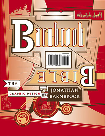
The Barnbrook Bible, out in September.

Jonathan Barnbrook at the Design Museum, 19 June–10 October 2007.

Jonathan Barnbrook has emerged in the past two decades as one of the UK’s most consistently innovative graphic designers. Pioneering graphic design with a social conscience, Barnbrook makes powerful statements about corporate culture, consumerism, war and international politics. Through his work in both commercial and non-commercial spheres he combines wit, political savvy and bitter irony in equal measures.

Friendly Fire traces Barnbrook’s career from early experiments in pure typography and pioneering motion graphics in the early 1990s, to recent work, including his latest projects with collaborators such as the anti-corporate collective Adbusters. Drawn from the designer’s own archive, the work represented will span the wide range of disciplines in which the Barnbrook studio work, including one of their most pioneering areas—typeface design.

Previously on { feuilleton }
Jonathan Barnbrook interviewed

Boys Own Books

boys_own1.jpg

boys_own2.jpg

boys_own3.jpg

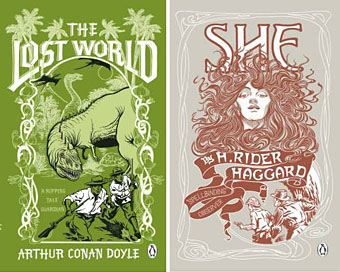
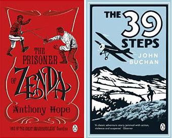
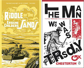
More pulp revenants come blinking back into the light. The runaway success of The Dangerous Book for Boys among fathers as well as sons has set British publishers casting about for new ways to exploit masculine nostalgia. Repackaging a few old warhorses is Penguin’s solution and a cheap one since most (all?) of these titles are out of copyright. I like these covers (and can’t find a design credit unfortunately), they’re well done, capture the right tone and look great as a set.

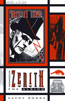
zenith.jpgThe Man Who Was Thursday seems to be the odd man out (as it were) story-wise. All the other books are typical adventure fare but in Chesterton’s novel what appears at first to be a pot-boiler turns out to be a metaphysical allegory closer to Charles Williams than John Buchan. One of Sax Rohmer‘s Fu Manchu volumes would have been more suited to this series but I suspect their “Yellow Peril” racism makes that less easy today. The Chesterton cover is curiously out-of-synch too, a pastiche of El Lissitzky/Bauhaus styles rather than the Edwardian designs the others are imitating. This isn’t a mistake, however, the fractured lettering suits a tale of anarchists with a plot full of twists and surprises. I tried a similar Modernist approach in 2001 with my jacket for Savoy’s edition of Zenith the Albino. In that instance the style was derived from Mondrian, with the colours coming from the initial description of the albino’s black clothes, white skin and red eyes. I’d venture to suggest that Anthony Skene’s thriller is a far better book than all of the above, Chesterton included, but then I am rather biased.

Update: Coralie from Penguin has the credits in the comments.

Elsewhere on { feuilleton }
The book covers archive

Finnegan begin again

joyce2.jpg

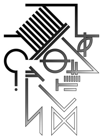
I posted an old James Joyce portrait sketch for Bloomsday a couple of days ago and today decided to rework it as a vector graphic. This is the result. I was producing a lot of sketches like this while working on Reverbstorm a decade ago, most of them post-Picasso/Bauhaus/De Stijl variations. Joyce is particularly easy to render in a semi-abstract form on account of his distinctive features and apparel: hat, glasses, nose, moustache and bow tie. The Reverbstorm series is still in the process of being reworked as a single volume so this will probably find a home there.

New York City abandoned

ial1.jpg

ial2.jpg

ial3.jpg

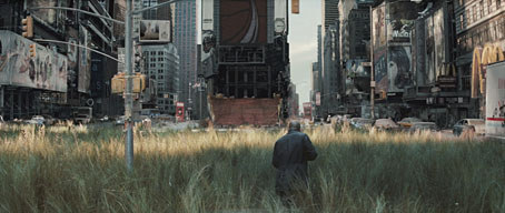
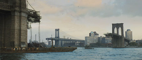
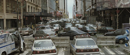
That great staple of science fiction and horror stories—the derelict city—turns up again in the trailer for the latest adaptation of Richard Matheson’s pulp classic, I Am Legend. The novel has an obvious appeal for filmmakers since Matheson was an accomplished screenwriter and an expert at crafting taught, high concept storylines. Other notable productions of his work include The Incredible Shrinking Man (one of JG Ballard’s favourite films; currently being remade), British horror thriller Night of the Eagle, Roger Corman’s Poe adaptations, the Night Stalker/Night Strangler TV movies, Steven Spielberg’s early film, Duel, and one of the most memorable episodes of The Twilight Zone, ‘Nightmare at 20,000 feet‘.
ial4.jpg

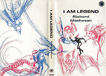
First edition jacket (1954).

The premise of I Am Legend is simple and direct: what would it be like to be the last man on earth if vampires (actually plague victims with vampire-like symptoms) had taken over the world? The book was first filmed in 1964 as The Last Man on Earth starring Vincent Price. I’ve never seen this but due to one of those copyright quirks it’s now in the public domain and can be downloaded for free here. George Romero’s 1968 Night of the Living Dead (and his subsequent zombie saga) was influenced by Matheson’s novel, then a big budget version arrived in 1972, The Omega Man, with Charlton Heston in typical gung-ho mode. I was impressed with that when I saw it as a teenager but it now seems fatuous for the most part. The new film has Will Smith as Matheson’s lone survivor in a setting that greatly benefits from judicious use of CGI to roughen the views of the abandoned city (especially good in the HD trailer). I’ve no idea yet how this will fare as an adaptation. Matheson’s novel ends on a bleak note that a director like Romero would have no problem with but which Hollywood hates so I’m inclined to be suspicious; The Omega Man changed the tone and the ending of the book substantially. The film is released in December, so we’ll find out then.

The I Am Legend Archive

Previously on { feuilleton }
Nosferatu