Conan the Adventurer aka The Barbarian (1965).
How to appraise Frank Frazetta? In November last year I wrote about this Conan portrait for an SF Signal Mind Meld feature on favourite book covers:
The covers that launched a thousand imitators. Lancer’s series of Conan books in the 1960s were the first appearance of Howard’s barbarian in paperback and came sporting cover art by Frank Frazetta. A great example of artist and subject being perfectly matched, these are the standard by which all subsequent barbarian art must be judged. Frazetta’s painting of a brooding warrior lord (which he reworked slightly for its poster edition) is for me the definitive portrait of Howard’s hero, battle scarred and proudly malevolent, with a chauvinistic blur of trophy female clinging at his feet. Other artists can do the muscles and monsters but none capture the physical presence and brute animality of Howard’s characters the way Frazetta does.
I found Frazetta’s work through the great series of fantasy art books which Pan/Ballantine published in the 1970s. I hadn’t read any Robert E Howard at the time, I only knew the diluted version of the Conan character in the Marvel comics series but Frazetta’s work was so powerful it was a spur to search out Howard, especially when I read that the writer had been a pen-pal of HP Lovecraft. I was never as interested in Frazetta’s other staple inspiration, Edgar Rice Burroughs, probably because Tarzan was too familiar from films and TV.
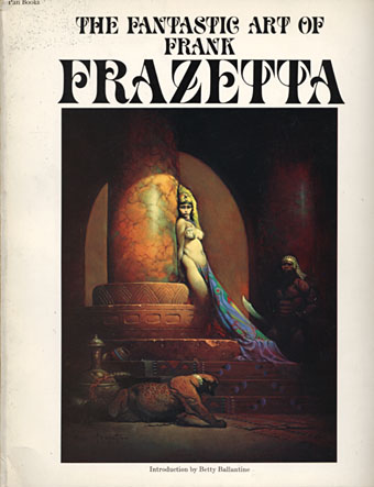
The Fantastic Art of Frank Frazetta (1975).
Both Howard and Frazetta defined a milieu which combined an intensity of vision with a projection of their own personalities into the worlds they created. (Many of Frazetta’s protagonists resemble their creator.) Both suffered from having that intensity of vision watered-down by ham-fisted imitators or the vulgarisations of films and comics. At their best, Howard’s Conan stories are a blend of heavyweight adventure story with supernatural horror; many of them were first published in Weird Tales magazine alongside other masters of the weird like Lovecraft and Clark Ashton Smith. What impressed me about Frazetta’s paintings was the way he managed to capture a sense of eldritch weirdness as well as the more obvious barbaric adventure in a manner which eluded so many of the sword and sorcery illustrators who followed. What’s even more remarkable when you read interviews is that he seemed to do all this instinctively. He’d learned from looking at earlier artists such as J Allen St John, Howard Pyle, Frank Schoonover and Roy Krenkel, and found the means to apply their painting style to his own internal aesthetics and sense of drama.

Swords of Mars (1974).
Aesthetics is one of the things I always come back to with Frazetta. I used to pore over these paintings wondering how it was that all the details of weapons and decor seemed absolutely right. Nothing was ever over-worked or too elaborate. Where did this invention come from? The other obvious feature is a raw sexiness which pervades everything. I’ve had people tell me that Frazetta must have been bisexual because of the equal care he lavished on his male and female figures. I’ve always disagreed with this. The point about Frazetta’s world is that everything is sexy: the people, the decor, the architecture, the animals, even the monsters; naturally the men are going to be as sexy as the women. In addition, he wasn’t afraid of giving his men real balls (so to speak) unlike the endless parade of costumed eunuchs filling the comic books. These figures may be dealing death but they’re filled with vigour and life when they’re doing it.

Bran Mak Morn (1969).
I said everything is sexy; I’ll make an exception for the extraordinary painting of Bran Mak Morn and his tribal horde, a picture of feral nightmarishness that goes beyond mere illustration and makes you feel the artist has shown you an atavistic glimpse of ages past. Robert E Howard would have been thrilled to see his characters brought to life with this kind of visceral intensity. For years Howard’s fiction was dismissed as pulp, now he’s a Penguin Modern Classic. And it’s as a modern classic that I’ll continue to think of Frank Frazetta.
Elsewhere on { feuilleton }
• The illustrators archive
Previously on { feuilleton }
• Frazetta: Painting with Fire
• The monstrous tome
• Men with snakes
• My pastiches
• Fantastic art from Pan Books