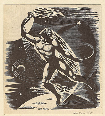
A drawing by Eric Fraser from the Radio Times, 1947. From this Flickr set.
• I helped put together the design for the Pursuit Grooves album recently. FACT magazine interviewed Vanese Smith about her work.
• One of the books whose interiors I designed last year for Tachyon was The Secret History of Science Fiction, a story collection edited by James Patrick Kelly and John Kessel. (And a book which I’ve yet to add to my web pages, I’m still behind with updates.) The LA Times has a piece about the anthology here, focusing on the Don DeLillo contribution, Human Moments in World War III.
• It’s been another week of Facebook hate; being a self-satisfied refusenik I can’t help but find this amusing. Too many good pieces to list but Gizmodo had more reasons why you should still quit Facebook, Jason Calacanis gathered lots of links to other stories on his blog while social media expert Danah Boyd got to the heart of the matter with a very cogent polemic.
• If you want an alternative to Facebook, Diaspora is “the privacy aware, personally controlled, do-it-all distributed open source social network”.
• David Toop has a new book out next month. “Sinister Resonance begins with the premise that sound is a haunting, a ghost, a presence whose location is ambiguous and whose existence is transitory. The intangibility of sound is uncanny – a phenomenal presence in the head, at its point of source and all around. The close listener is like a medium who draws out substance from that which is not entirely there.”
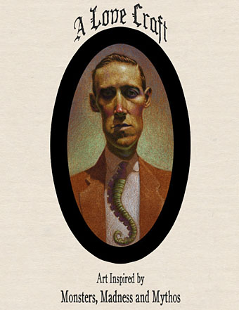
• Coilhouse looks at the late Decadent artist and designer Hans Henning Voigt (1887–1969), better known as Alastair.

come, been and gone.
• “After a sold out season at the Barbican in 2009 Michael Clark Company returns with the next instalment of his critically acclaimed production made primarily to the music of David Bowie. come, been and gone also embraces the work of Bowie’s key collaborators: Lou Reed , Iggy Pop , Brian Eno and touches on some of his influences; The Velvet Underground , Kraftwerk and Nina Simone……This production contains loud music and graphic images.” I should hope so.
• “Why should boys always be boys, and girls always be girls?” Brutal/Beautiful, photography by Austin Green.
• John Foxx, Iain Sinclair and others appear at Short Circuit 2010 next month.
• Black, Brown, and Beige: Duke Ellington’s music and race in America.
• Jane Siberry has made all her albums available as free downloads.
• Ruth Bayer photographs people after they’ve inhaled poppers.
• Swiss artist catalogues mutant insects around nuclear plants.
• Pompeii’s X-rated art will titillate a new generation.
• The Happy, Haunted Island of Poveglia, Venice.
• The Art of American Book Covers, a blog.
• Kanellos, the Greek protest dog.
• Song of the week: Twiggy Twiggy (1994) by Pizzicato Five.