Designs on Kafka

kafka.jpg

Book covers of the week are a series of new Kafka designs by Peter Mendelsund for Schocken, a set comprising eight paperbacks which will be out this summer in the US. What’s notable about these designs aside from their minimal style is the way they dispense with the visual clichés which have accumulated around Kafka’s work. So no sombre author photos, ominous shadows or views of Prague, just bold colours and simple shapes to create a beautiful collection. The script typeface is Mister K by Julia Sysmäläinen, a design based on Kafka’s handwriting. Peter Mendelsund has the rest of the covers and some words about their design on his blog. Via Coudal.

Elsewhere on { feuilleton }
The book covers archive

Previously on { feuilleton }
Kafka’s porn unveiled
A postcard from Doctor Kafka
Alexandre Alexeieff and Claire Parker
Hugo Steiner-Prag’s Golem
Steven Soderbergh’s Kafka
Kafka and Kupka

À Rebours illustrated

huysmans1.jpg

Not a comprehensive post by any means but a few items worthy of note for readers of Joris-Karl Huysmans’ Decadent classic. The Vera Bock cover is from a 1930 American edition which turned up here last year. Thanks to Jescie for drawing my attention to the presence of my Haunter of the Dark collection on the same site. Vera Bock is an unusual choice of illustrator for this particular novel, there’s more of her work and details of her career at A Journey Round My Skull.

huysmans2.jpg

Auguste Leroux’s edition (above & below) is from 1920 and can be downloaded at the Internet Archive although the copy there seems to have had many of its full-page plates stolen. The artist produced an illustrated Memoirs of Casanova a few years later and he seems here to have concentrated on the more salacious aspects of Huysmans’ story, as with this brothel scene which is missing from the scanned edition. His depiction of Des Esseintes looks too middle-aged for me but the rendering of the unfortunate jewelled tortoise could hardly be bettered.

huysmans3.jpg

huysmans4.jpg

Browsing the archives at Gallica turned up this extraordinary Art Nouveau edition from 1903 illustrated and embellished on every page by Auguste Lèpere. This would be an excessively lavish treatment for most books but for a story of aesthetic obsession it seems quite appropriate. Gallica also allows the downloading of many of their documents although that function kept failing my attempts. But this volume really does need to be seen in its entirety.

Elsewhere on { feuilleton }
The illustrators archive

Previously on { feuilleton }
Arthur Zaidenberg’s À Rebours

Weekend links 44

bradley.jpg

Poster by Will Bradley for Victor Bicycles (c. 1895).

• G. Wayne Clough, chief exective of the Smithsonian Institution, finally admits that he made a hasty decision in removing David Wojnarowicz’s video from the Hide/Seek exhibition of gay art. Related: “Finland’s cultural gifts to the world include Sibelius, the Moomins and an artist that the country has been less eager to celebrate.” The belated homecoming of Tom of Finland.

The Fiend with Twenty Faces: Jonathan Clements examines the legacy of Edogawa Rampo (Hirai Taro), the Japanese master of mystery and imagination.

• RIP Susannah York. The Guardian posted a selection of clips including one from Robert Altman’s Images (1972).

• More mixtapes: Trish Keenan’s Mind Bending Motorway Mix and a selection for Quietus by Chris & Cosey.

• “Ruin photos speak to our desperate desire to have our world re-enchanted.”

tomorrow.jpg

Promo poster by Hapshash and the Coloured Coat for My White Bicycle by Tomorrow (1967).

The Raging Peloton: Iain Sinclair on two wheels good, four wheels bad.

The unknown Jorge Luis Borges: five new anthologies reviewed.

The French house untouched for 100 years (and also here).

Electrotypes on Drugs: old chemists’ labels.

South China Sea Pishkun by Dinh Q. Lê.

Bike (1967) by Pink Floyd | My White Bicycle (1967) by Tomorrow | Trip On An Orange Bicycle (1968) by Orange Bicycle.

Historic Design in Printing

historic1.jpg

16th century binding designs.

If anyone was wondering why I keep trawling through the scanned books at the Internet Archive, let this volume stand as one of many reasons why. Historic Design in Printing was published in 1923 by the Graphic Arts Company, Boston (USA), and is edited by one Henry Lewis Johnson. The book’s subtitle, “Reproductions of book covers, borders, initials, decorations, printers’ marks and devices comprising reference material for the designer, printer, advertiser and publisher” gives an idea of the content. Many of the motifs are familiar to me from books in Dover Publications’ Pictorial Archive series while a number of the sets of initials I have as bad reproductions in a book by a French publisher. This would suggest that Historic Design in Printing has served as a resource for later collections, and a very fine resource it is too. Download it in a variety of formats here.

historic2.jpg

Title-page border, 1567.

historic3.jpg

historic4.jpg

Initial designed by Georg Heinrich Paritus, 1710.

Previously on { feuilleton }
Combinaisons Ornementales
Charles J Strong’s Book of Designs

The psychedelic art of Howard Bernstein

bernstein1.jpg

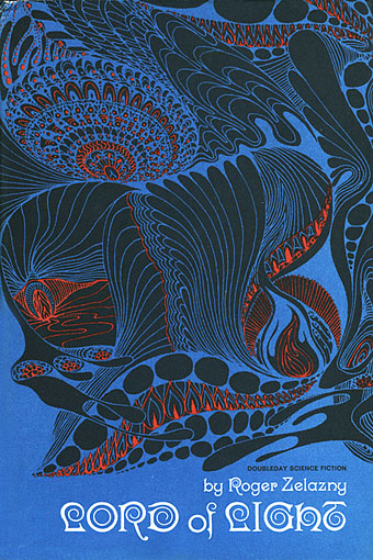
Lord of Light by Roger Zelazny (1967).

I made a post a while back about the work of Bob Pepper, an artist whose illustrations from the 1960s can also be described as psychedelic and who was equally visible in the music and book publishing worlds. Howard Bernstein (not to be confused with musician Howie B) wasn’t as prolific as Pepper but this post was prompted by the appearance at Sci-Fi-O-Rama of the swirling abstractions of his Roger Zelazny cover. Like Pepper, Bernstein produced album cover art as well as book covers although it’s possible the Zelazny piece may have been a one-off. This was the jacket of the first edition and a rather flagrant attempt by Doubleday to co-opt the trendiness of the psychedelic style for a science fiction readership. They tried something similar with the cover for Harlan Ellison’s landmark anthology Dangerous Visions in the same year, the art in that case being the work of Leo & Diane Dillon. The Zelazny cover caught my attention for another reason, the typography is a variation on the 19th century Kismet typeface by John F Cumming which I used for my two Alice in Wonderland calendars and which turns up regularly in psychedelic design. And while we’re considering conjunctions of music and science fiction, I ought to note that the Hawkwind song Lord of Light lifts its title from Zelazny’s novel.

bernstein4.jpg

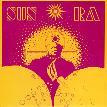
The Heliocentric Worlds Of Sun Ra, Vol. I (1965).

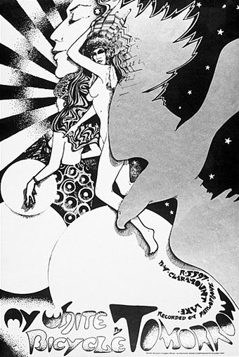
As for Bernstein’s music work, most of this appears to have been for Bernard Stollman’s eccentric ESP Disk label where the roster of artists included many free-jazz greats along with The Fugs, William Burroughs, Timothy Leary and fringe psychedelic groups such as Pearls Before Swine, Cromagnon, The Godz and others. Bernstein’s Cromagnon cover (below) exists in both monochrome and coloured versions but the monochrome one seems to be the original. In fact much of his art looks like it was drawn in black-and-white with the colours being created by separations at the print stage. His poster for The Godz is especially striking, so much so I’m surprised to find there isn’t more of his work around. Wolfgang’s Vault has a blacklight poster and there are some other blacklight works here. If anyone knows of other posters, please leave a comment although I suspect if there was much more then Wolfgang’s Vault would have the goods.

Continue reading “The psychedelic art of Howard Bernstein”