Art on film: The Medusa Touch

medusa1.jpg

Continuing an occasional series about artworks in feature films. The Medusa Touch (1978) is the kind of film I usually dislike: a supernatural horror story with a preposterous premise—a man who causes disasters to occur with the power of his mind—which is also an ITC production directed by Jack Gold with a TV-friendly gloss, all overlit interiors and zoom-happy camera work. Richard Burton plays the man with a name you only find in horror novels, “John Morlar”, whose telekinetic gift is also a curse, the Medusa touch of the title, although his affliction is never quite described as such. It’s Burton who makes this one worth watching, he burns with a misanthropic intensity in every scene he appears in, delivering his lines with a conviction that suggests he identified rather too much with Morlar and his hatred for the world. The film unfolds as a police procedural, opening with the attempted murder of Morlar by an unknown assailant, then following the investigation that reveals the victim’s history. The police business is the weakest part of the film; being a British/French co-production means that the man leading the investigation, Inspector Brunel, is a Frenchman working in London as part of an exchange programme. Brunel’s dull character is further diminished by having him played by Lino Ventura with a dubbed voice, but it’s the inspector’s quest for clues to Morlar’s past that bring us eventually to the art.

medusa2.jpg

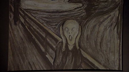
The first artwork, however, appears before all of this. The film opens in the street outside Morlar’s London home then cuts to the inside of his flat with this close view of a print of Edvard Munch’s The Scream. Munch’s most famous painting wasn’t quite the visual cliché in 1978 that it is today. Morlar’s history is recounted in a series of flashbacks which reveal him to have been a barrister whose distaste for the legal profession leads to his becoming a novelist with characters used as mouthpieces for his misanthropy. The art in his mansion flat is scrutinised by Brunel without being subjected to any discussion, leaving us to decide whether these works are the kinds of things that Morlar actually liked or exterior emblems related to his condition.

medusa3.jpg

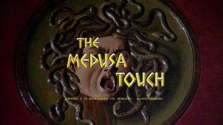
A relief based on Caravaggio’s Medusa (c.1597).

The head of Medusa pinned on Morlar’s wall suggests the latter, although the only introspective comments from Morlar come in the scenes with him and his psychiatrist, Dr Zonfeld (Lee Remick), which are mostly discussions of his calamity-filled life. Morlar and Zonfeld’s combative relationship may explain the next artwork which catches Brunel’s eye, a print of Bond of Union (1956) by MC Escher.

medusa4.jpg

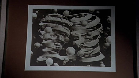
The choice is an unusual one when the print was made to celebrate Escher’s marriage which was relatively happy, unlike Morlar’s disintegrated union which ends with him willing his wife to death in a car crash. Escher was very trendy in the 1970s, collections of his work were being published for the first time and his prints were everywhere. A better match for a story of this type might have been Eye (1946), an image with greater symbolic resonance that would also complement all the moments when Jack Gold’s camera zooms into Morlar’s basilisk glare.

medusa5.jpg

munch.jpg

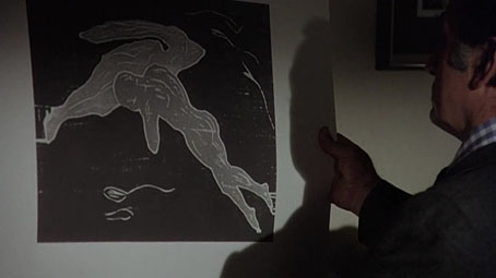
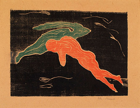
Encounter in Space (1899) by Edvard Munch.

After looking at the Escher, Brunel leafs through Morlar’s print collection, pulling out another Munch, and a very strange choice it is. This is an odd scene: the prints are all badly lit and none of them have much overt reference to either Morlar’s character or the story as a whole.

Continue reading “Art on film: The Medusa Touch”

Weekend links 756

crane.jpg

A Diver (no date) by Walter Crane.

• At Worldbuilding Agency: The first part of a long interview with Bruce Sterling concerning “the pursuit of deliberate oxymorons as a creative strategy, worldbuilding in the context of history and futurity, Berlusconi on the moon and more”. With questions from Paul Graham Raven, and my cover art for Bruce’s Robot Artists and Black Swans.

• “With its focus on the 1970s career of Leonard Rossiter and its mordant metaphysics of the moist, Sophie-Sleigh Johnson’s Code: Damp might just be the most original book yet to emerge from Repeater publishing,” says Tim Burrows.

• “A definitive guide to the work of William S Burroughs’ on screen.” It’s a guide but it’s hardly definitive when there’s no mention of the four films Burroughs made with Anthony Balch.

• A catalogue of lots at the forthcoming After Dark: Gay Art and Culture online auction. Homoerotic art, photos, etc, also historic porn and a few garments worn by Divine.

• New music: Jay recommends the high-grade motorik en espanol dance-rock of Sgt Papers; Topology Of A Quantum City by Paul Schütze; Overtones by Everyday Dust.

• This week’s obligatory Bumper Book of Magic entry: Ben Wickey at Alan Moore World talks about his work on the book’s Great Enchanters comic strips.

• At Dennis Cooper’s it’s Malcolm Le Grice’s Day. Le Grice’s death was announced earlier this month.

• At The Wire: The magazine’s contributors’ charts showing their favourite music of the past year.

• A new website for the Sanborn Fire Maps and their decorated title pages.

• Mix of the week: DreamScenes – December 2024 at Ambientblog.

• At Public Domain Review: Albert Kahn’s autochromes.

Burroughs Called The Law (1960s) by William S. Burroughs | Language Is A Virus From Outer Space (Live) (1984) by Laurie Anderson | Burroughs Don’t Play Guitar (1996) by Islamic Diggers

Three alphabets

mitelli.jpg

E is for Elefante.

Last week I was trying without success to find the origin of a calligraphic alphabet I have in a book about ornamental typography. A failed quest but the search did turn up a couple of those illustrated alphabets that were popular in the 17th and 18th centuries, including this first one which I have as poor reproductions in another book. Alfabeto in Sogno (“Dream Alphabet”), a book of etchings by Giuseppe Maria Mitelli, dates from 1683, and shows the letters of the alphabet constructed by posing human figures, some of which require props to create their letters. A common feature of the abecedary is an attempt to match one or more details in the picture to the letter in question, something which Mitelli does with a small illustration of an animal. Each of his plates also includes a few lines of verse and the less common addition of details intended to help students of drawing.

betti.jpg

E is for Endymion.

A’ dilettanti delle bell’ arti (“To the Amateurs of the Fine Arts”, 1785) by Giovanni Battista Betti opts for an easier method of depicting human-sized letterforms with a series of tableau-style caprices in which the shapes of the letters are formed by baroque curlicues or lengths of fabric arcing around the figures. Not all of these figures are human. Where Mitelli matches animals with each letter, Betti chooses characters from mythology—Bacchus, Endymion, Faunus, Ganymede and so on—or fills the space with the putti that are ubiquitous fixtures of the art of this period. You can take this as a quiz without an immediate solution: I couldn’t decipher the identities of all the non-putti characters but then my knowledge of Classical mythology isn’t very thorough.

basoli1.jpg

B is for Babylon.

The third alphabet is one that’s appeared here before, the Alfabeto Pittorico (1839) of Antonio Basoli, but the copies I linked to ten years ago were hosted on a dubious Russian site which is now defunct. No matter, all the plates may now be seen at Gallica where they should have a more permanent home. Basoli’s abecedary is my favourite of the three, being a collection of very plausible architectural designs that pastiche the building styles of different countries or eras. Once again the viewer is challenged to try and match the letter with the view in which the letter-building is situated. Some of these are very easy (the identity of H with “harem” is revealed by a sign above the door) while others are complicated by Basoli’s loose interpretation of ancient architecture. As for assignation of the ampersand below, that’s anybody’s guess.

basoli2.jpg

Elsewhere on { feuilleton }
The etching and engraving archive

Previously on { feuilleton }
Liber Artificiosus Alphabeti Maioris
Abeceda
The Royal Picture Alphabet
Giovanni Battista Pian’s Pictorial Alphabet
Antonio Basoli’s Pictorial Alphabet
Grand capitals
Paulini’s mythological alphabet

Weekend links 755

emsh.jpg

A painting by Ed Emshwiller for the cover of Fantastic Stories of Imagination, July 1962, illustrating The Singing Statues by JG Ballard .

• This week in the Bumper Book of Magic: my comments about the creation of the book’s cover and magical alphabet have been posted at Alan Moore World. At (Quasi), Smoky Man (in Italian) looks at other parts of the book, and includes my answers to his questions about the creation of The Soul, a character originally planned for a comic strip that Alan Moore and I were working on. I’ve been trying recently to find the first sketches I made of The Soul back in 2000 or 2001, without success. If I do find any of them I’ll post them here.

• New music: Juk-Shabb by Cryo Chamber Collaboration is this year’s installment in the Lovecraft-themed album series (previously) from Cryo Chamber. Also this week: Xerrox Vol. 5 by Alva Noto; Nocturne (Soundtrack for an Invisible Film) by Avi C. Engel; and Cat Location Conundrum by Moon Wiring Club.

Code: Damp: An Esoteric Guide to British Sitcoms by Sophie Sleigh-Johnson, being “an alternative occult and esoteric history of England told through one of its most popular cultural forms: the comedy sitcom”.

…the joy of art isn’t only the pleasure of an end result but also the experience of going through the process of having made it. When you go out for a walk it isn’t just (or even primarily) for the pleasure of reaching a destination, but for the process of doing the walking. For me, using AI all too often feels like I’m engaging in a socially useless process, in which I learn almost nothing and then pass on my non-learning to others. It’s like getting the postcard instead of the holiday.

Brian Eno at Boston Review

• “The typographic choices that Godard made were thematic and not only chosen for their stylistic properties.” Arijana Zeric looks inside the design world of Jean-Luc Godard.

• Coming soon from Strange Attractor: The Stammering Librarian: Essays by Timothy D’Arch Smith, edited by Edwin Pouncey & Sandy Robertson.

• At Public Domain Review: Fantastic Planet: The Microscopy Album of Marinus Pieter Filbri (1887–88).

• At the BFI: Michael Brooke offers suggestions for where to begin with Guy Maddin.

• At The Quietus: The Strange World of…Dennis Bovell.

• Mix of the week: A mix for The Wire by KMRU.

• Steven Heller’s font of the month is Gigafly.

Fantastic Cat (1996) by Takako Minekawa | Fantastic Analysis (2001) by Mouse On Mars | Fantastic Mass (2016) by Time Attendant

Lettres et Enseignes Art Nouveau

mulier1.jpg

These lettering designs were posted at Wikimedia Commons in the summer but I’ve only just noticed them this week. I’d been searching for Étienne Mulier’s designs while working on the six-part story about Miss Adeline Carr, aka “The Soul”, in the Bumper Book of Magic, the idea being to have each chapter open with the character’s name in a different Art Nouveau lettering style. If you look at enough bookselling sites you can eventually find one or two large photos of Mulier’s pages which is what I used when creating the heading for the second chapter of the story; but I still would have preferred to have had access to the whole collection. As it happens, most of the Wikimedia plates have also come from bookselling sites but they’re a slightly better collection than the ones I found.

soul.jpg

Mulier’s plates were published in 1901, presented not in book form but as a collection of loose lithographs in a card portfolio; the “Enseignes” in the title are suggestions for shop signs. Mulier also throws in a couple of less practical designs showing alphabets created by posing flamingos. The loose-leaf format is a useful one for something intended to be consulted by artists and craftspeople. Books could be awkward things in the days before digital scanning and photography if you wanted to trace something from a page which wouldn’t lie flat. The Mulier design I used for The Soul isn’t a perfect alphabet—the letters K and M could do with improving—but it’s a good example of the French approach to Art Nouveau lettering (and Art Nouveau design in general) which tends to be more loose and plant-like than equivalents from Germany or the Netherlands. The organic appearance of the letterforms suited the chapter I was illustrating which opens with a hunt for magic mushrooms.

mulier2.jpg

Mulier’s plates don’t appear to have been turned into printable fonts until the 1960s when the revival of interest in Art Nouveau prompted the creation of filmtype adaptations. Fontsinuse shows a rare print example on the cover of an album by Scottish prog band Beggar’s Opera, a version of the typeface which filled in the bi-chromatic letters and slightly altered their forms. “One of the ugliest typefaces ever created,” says Mr Hardwig. I can think of worse. More recently we have the inevitable digitisations, with Art Nouveau Caps being the closest to Mulier’s original. I was tempted to use a digitised version for the story but I find that many amateur (or semi-professional) digitisations of old typefaces are often crude things compared to the originals. I also liked the bi-chromatic effect so I ended up drawing my own copies of the letters I needed.

Previously on { feuilleton }
Bergling’s Art Alphabets
Typefaces of the occult revival