

Continuing an occasional series about artworks in feature films. The Medusa Touch (1978) is the kind of film I usually dislike: a supernatural horror story with a preposterous premise—a man who causes disasters to occur with the power of his mind—which is also an ITC production directed by Jack Gold with a TV-friendly gloss, all overlit interiors and zoom-happy camera work. Richard Burton plays the man with a name you only find in horror novels, “John Morlar”, whose telekinetic gift is also a curse, the Medusa touch of the title, although his affliction is never quite described as such. It’s Burton who makes this one worth watching, he burns with a misanthropic intensity in every scene he appears in, delivering his lines with a conviction that suggests he identified rather too much with Morlar and his hatred for the world. The film unfolds as a police procedural, opening with the attempted murder of Morlar by an unknown assailant, then following the investigation that reveals the victim’s history. The police business is the weakest part of the film; being a British/French co-production means that the man leading the investigation, Inspector Brunel, is a Frenchman working in London as part of an exchange programme. Brunel’s dull character is further diminished by having him played by Lino Ventura with a dubbed voice, but it’s the inspector’s quest for clues to Morlar’s past that bring us eventually to the art.
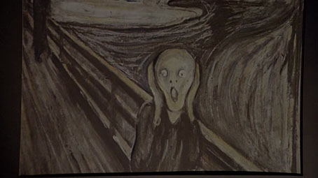
The first artwork, however, appears before all of this. The film opens in the street outside Morlar’s London home then cuts to the inside of his flat with this close view of a print of Edvard Munch’s The Scream. Munch’s most famous painting wasn’t quite the visual cliché in 1978 that it is today. Morlar’s history is recounted in a series of flashbacks which reveal him to have been a barrister whose distaste for the legal profession leads to his becoming a novelist with characters used as mouthpieces for his misanthropy. The art in his mansion flat is scrutinised by Brunel without being subjected to any discussion, leaving us to decide whether these works are the kinds of things that Morlar actually liked or exterior emblems related to his condition.
A relief based on Caravaggio’s Medusa (c.1597).
The head of Medusa pinned on Morlar’s wall suggests the latter, although the only introspective comments from Morlar come in the scenes with him and his psychiatrist, Dr Zonfeld (Lee Remick), which are mostly discussions of his calamity-filled life. Morlar and Zonfeld’s combative relationship may explain the next artwork which catches Brunel’s eye, a print of Bond of Union (1956) by MC Escher.
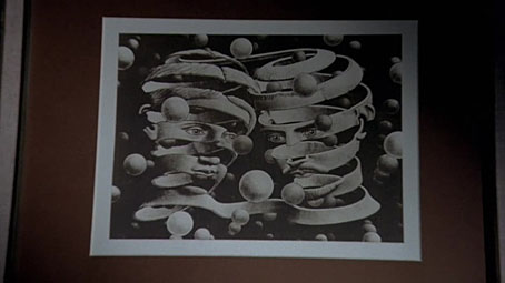
The choice is an unusual one when the print was made to celebrate Escher’s marriage which was relatively happy, unlike Morlar’s disintegrated union which ends with him willing his wife to death in a car crash. Escher was very trendy in the 1970s, collections of his work were being published for the first time and his prints were everywhere. A better match for a story of this type might have been Eye (1946), an image with greater symbolic resonance that would also complement all the moments when Jack Gold’s camera zooms into Morlar’s basilisk glare.
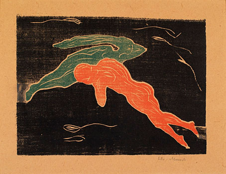
Encounter in Space (1899) by Edvard Munch.
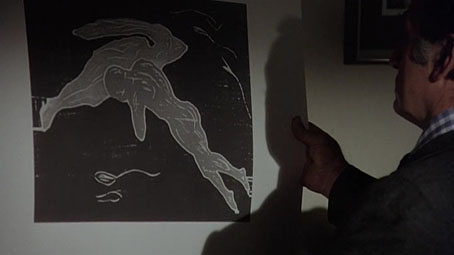
After looking at the Escher, Brunel leafs through Morlar’s print collection, pulling out another Munch, and a very strange choice it is. This is an odd scene: the prints are all badly lit and none of them have much overt reference to either Morlar’s character or the story as a whole.


Tous les jours (Every Day) (1966) by René Magritte.
Magritte was another very trendy artist in the 1970s but why choose this one of all his pictures? Goya (below) makes more sense although there’s a lot more horror to be found in other Goya prints.


A Giant Seated in a Landscape, sometimes called ‘The Colossus’ (by 1818) by Francisco Goya.


Study for the Three Witches in Macbeth (c.1783) by Henry Fuseli.
The same could be said for Fuseli, even if you set aside his all-too-familiar Nightmare painting. I’ve been wondering if the novel the film is based on might delve more into the artistic symbolism. The screenplay was co-written by the novel’s author, Peter van Greenaway, and the cover of the first edition shows a small statue of Napoleon hovering incongruously in the air next to a 747 which is crashing into an office building. Morlar is battered over the head with a statue like this at the beginning of the film yet we never discover whether Napoleon has any special significance beyond being an overused symbol for insanity or megalomania. Like the pictures in Morlar’s flat, the detail is merely another mystery to add to the lack of explanation that attends Morlar’s disaster-ridden life and his subsequent decision to deliberately cause more disasters. The novel may well hold the answers but if it does it’s not a book I’m in any hurry to read.
Previously on { feuilleton }
• Art on film: Crack-Up
• Art on film: The Dark Corner
• Art on film: Je t’aime, Je t’aime
• Art on film: Space is the Place
• Art on film: Providence
• Art on film: The Beast
Great article! I love these explorations of art used to convey (or support) meaning in film. Your viewpoint is particularly valuable because you take care to consider how the art would have been viewed at the time of the film’s making. In some cases, this will have changed over time; some pieces become overworked cliches, while other fall from easy-access cultural relevance and become more obscure. You are absolutely on target when you examine the popularity and contemporary cultural weighting of the pieces.
Thanks, Jim, it’s a pet subject of mine, obviously, but some films are more worthy of the attention than others. This one is an interesting case because there’s no clear reason why so much time is spent on pictures which nobody bothers to discuss. And they’re not all necessarily symbolic either, the way pictures or paintings often are in films. They could easily have done without them or used a few more Medusa paintings in their place.
Art trends are reflected in feature films but they’re not always commented on, people spend tend to examine trends in clothing, music and the like. Before the 1960s the art trends were generally driven by critics, with the Impressionists and Post-Impressionists being held in the highest esteem. You see a change in the 1960s when pop culture starts to focus the attention on artists like Aubrey Beardsley who had been ignored for decades. You could do a whole post about appearances of Beardsley’s art in films from the late 60s on but I’m sure I haven’t seen all the examples. Both Escher and Beardsley are referenced in Dario Argento’s Suspiria, as I noted here:
https://www.johncoulthart.com/feuilleton/2015/11/06/suspiria-details/
The reasons you give as to why you dislike this film are part of it’s appeal for me – but then, somebody or nobody would say that, wouldn’t they? However I think your assessment is sound – we just arrive at different conclusions from the same start point. Personally, I think the production just picked ‘weird’ paintings with not that much thought, as long as they suggested an alienated mindset. I am intrigued enough to want to track down a copy of the novel.
The film is really a Star-driven, post-‘Omen’ slice of overblown Burton-ploitation hogwash in which all is preamble for the spectacular destruction-climax. There’s an article to be written about these pre-punk blockbusters of the establishment fantasising it’s own destruction. ‘Death Wish’ could’ve been it’s title. See also sundry assassins and sinking ships. ‘Something will go catastrophically wrong, as is our destiny and hidden intention’.
But it’s a dog’s breakfast of unnecessary elements. Why he had to have been a barrister, for instance – it seems wrong … yes he’s an establishment figure gone rogue rather than the traditional misfit … it smacks of contrivance, just so Rich can strut his stuff …
Hi Vijj. I think that’s the most likely explanation about the pictures, their being indicative of a “weird” mindset, you get a similar thing with giving characters a taste for electronic music. They still could have found a stranger collection of pictures if this was the case. As I said, maybe the novel goes into this more.
The film itself is definitely in the disaster movie zone–the Psychotronic Encyclopedia of Film compares it to an Irwin Allen production–with The Omen being an obvious precursor for the supernatural angle and all the sequential deaths. ITC always played things safe on the commercial side, at least until they made Raise the Titanic…
Thanks for your reply. I was thinking about the cultural currency of art after reading the article yesterday and recalled the case of Gainsborough’s “Blue Boy”. I think most Americans (and no doubt all the English) must have known this painting circa the 1920’s. To the extent of recognizing merely allusive references to it. Also, see Whistler’s “Mother”. I’m not sure many of the young folks know either painting now. On the other hand, “American Gothic” by Grant Wood still lives on in parody and pastiche, at least here in the States.
Slightly off-topic: have you seen the “Dr. Phibes” films with Vincent Price? I watched them forty years ago and haven’t seen them since, but I remember some striking (to me) “art design” in them. Perhaps an early iteration of steampunk?
Yes, The Blue Boy is an odd one, I don’t know why it was so popular. It’s usually reproduction that does it, things get mass-produced then gain a life of their own detached from the artist’s other work. That’s definitely the case with Whistler’s Mother, or Arrangement in Black and Grey, No. 1 to use its proper title. I could never understand why this picture meant so much to Americans when the original was kept in France, and compared to Whistler’s other work it’s pretty dull. The answer lies in the way it became a symbol of American motherhood rather than anything to do with Whistler’s artistry or theories about painting. Constable’s The Hay Wain is the same, it’s become an emblem of the pre-industrial British countryside that overshadows all of Constable’s other works. Grant Wood’s painting is slightly different since that’s one of those artworks that has another life due to all the myriad reworkings, like Leonardo’s Last Supper.
I’ve watched the Phibes films many times, in fact I watched them both again a couple of years ago. Director Robert Fuest was a production designer so his films usually look stylish (see also The Final Programme which was made around the same time). I think the first one is the best, the second one struggles to do Egypt on a budget. Vincent Price followed his Phibes roles with Theatre of Blood which is the same kind of mass-revenge idea only with a Shakespearean actor getting his own back on the critics who dismissed him. Fuest was supposed to direct that one as well but Douglas Hickox ended up with it.