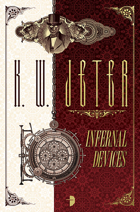
My latest covers for Angry Robot are a return to the world of steampunk, and also a return to the novels of KW Jeter, the man who not only wrote some of the pioneering novels of the sub-genre but also invented the term steampunk in the first place. Infernal Devices was one of the pioneering texts, and it’s a book that’s been very good to me in its earlier Angry Robot edition, with a cover design that’s been well-received around the world. (It still pops up regularly on the front page of Goodreads.)
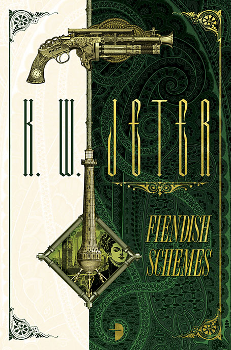
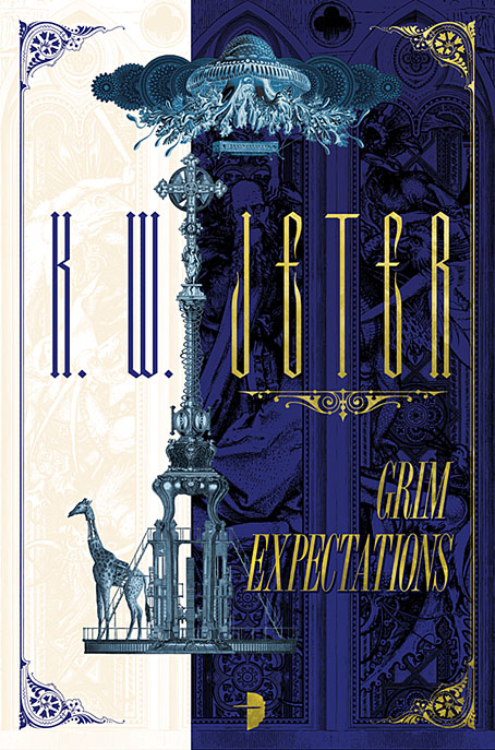
The brief for the republication was to create fresh covers for Infernal Devices and for its two sequels; the second of these, Fiendish Schemes, was first published by Tor with (at the author’s request) another cover of mine that matched the Angry Robot design. Grim Expectations is a new novel which makes George Dower’s adventures in an alternate-history Britain into a trilogy. The request for the new designs was to avoid the detailed Victoriana of the earlier editions in favour of something that would suit the content but be a little more restrained. Mention was made of the Picador covers for Italo Calvino that Gary Day-Ellison designed with the Quay Brothers in the 1980s. Those covers are personal favourites so I was happy to use a similar vertical division with small illustrative elements, the details of which relate to the stories but without being too literal. My designs are a lot more florid in comparison to the Calvinos but then the content demanded a shift of emphasis. After having created a lot of steampunk art emblazoned with cogs of all shapes and sizes the one thing I didn’t want to do was use more cogs on these covers. So the background pattern for Infernal Devices is cog-like but is actually an abstract design I found in a book of 19th-century decoration. Similarly, the circle motifs at the top of each cover are also cog-like but are more Victorian embellishments.
All three books will be published in June 2017; a long time to wait but there’s more about the new novel—and the series as a whole—at Tor.com.
Previously on { feuilleton }
• Steampunk in the Tank
• More vapour trails
• Steampunk catalogued
• Steampunk: The Art of Victorian Futurism
• Steampunk Calendar
• Words and pictures
• Nathanial Krill at the Time Node
• Fiendish Schemes
• Ghosts in Gaslight, Monsters in Steam
• Steampunk Revolution
• The Bookman Histories
• Aether Cola
• Crafting steampunk illustrations
• SteamPunk Magazine
• Morlocks, airships and curious cabinets
• The Steampunk Bible
• Steampunk Reloaded
• Steampunk overloaded!
• More Steampunk and the Crawling Chaos
• Steampunk Redux
• Steampunk framed
• Steampunk Horror Shortcuts