Two new covers

rockhill.jpg

My latest cover designs have arrived in time for Spook Month, although the first of these suits the season more by association than its appearance. Jim Rockhill’s A Mind Turned in Upon Itself is a study of the work of J. Sheridan Le Fanu, Ireland’s leading writer of ghost stories and Gothic fiction. This is another design for Swan River Press which adheres to the publisher’s preferred format of a dustjacket that wraps a small hardback with textured and illustrated boards. The brief was fairly straightforward, to present a rare photograph of Le Fanu in a suitably attractive manner. My initial idea was to create a frame that would reflect to some degree various aspects of Le Fanu’s fiction, but it quickly became apparent that the portrait photo was too tall and narrow to sit easily inside a frame that matched the ratio of the book. A better option was to look for a frame which could fit the shape of the book while also filling in the space around the photo.

dore.jpg

A page from The Workshop: a Monthly Journal Devoted to Progress of the Useful Arts.

When Le Fanu was writing in the mid-19th century book design had become very lavish, with a proliferation of presentation volumes gold-blocked and embossed on their covers and spines. The Heztel editions of Jules Verne are prime examples, as are the many editions of Gustave Doré’s books. My cover is an adaptation of a German edition of Doré’s Bible which had an unusual panel in the centre that happened to be a good size and shape to accommodate the Le Fanu photo, although I still had to extend the design a little. My version also includes a pair of small Le Fanu monograms embedded in the frame.

outline.jpg

For the board illustration I followed the form of an earlier Swan River book with an Irish theme, The Far Tower, whose boards I covered with an engraving collage. The end result, which looks like a single illustration, is a composite of two smaller illustrations from a book of views of Ireland, together with a quantity of foliage which frames the design and joins the pictures together.

ppc.jpg

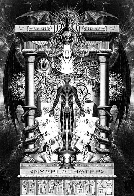
The second cover is for a book I’m working on at the moment, Lovecraft’s Brood, a sequel to Tachyon’s well-received Lovecraft’s Monsters. I was very pleased to be asked to work on this one, the earlier book is a favourite of mine from among the books I’ve done for Tachyon, and Ellen Datlow is an expert at compiling well-chosen story collections. There’s not much I can say about the cover which follows the form of the previous book. As with Lovecraft’s Monsters, the framed face will also appear as one of the interior illustrations. You’ll have to wait a while to see the results of this, however. Watch this space.

brood-cover.jpg

Meanwhile, I’ve neglected to mention another Tachyon book whose interiors I’ve designed which is available now. The Essential Horror of Joe R. Lansdale is a great introduction to the work of a master of horror fiction whose stories manage to be grim and witty in equal measure. Very grim at times; visceral horror is Lansdale’s forte. The collection includes his best-known story, Bubba Ho-Tep, and features cover art by another Swan River Press cover artist, Dave McKean.

Previously on { feuilleton }
Lovecraft’s Monsters

Elliott Dold’s Night

dold01.jpg

Looking for artwork by Elliott Dold turned up this remarkable set of illustrations for an unremarkable collection of poetry, Night, by a friend of the artist, Harold Hersey. Elliott Dold (1889–1957) was an American illustrator during the early days of the pulp magazines, best known today for drawings of huge machines which are a match for those by his more prolific contemporary, Frank R. Paul. The pulp magazines are so often filled with mediocre illustration that it’s a pleasure to find another talent lurking in their pages. But Dold was more than an illustrator of big science, as these illustrations for Hersey’s dubious poetry demonstrate.

dold02.jpg

Night is a collection of vaguely erotic poems, all of which Hersey labels “Nocturnes”. The collection was published in 1923 in a privately-printed subscriber-only edition, and every description I’ve read of it agrees that the illustrations are the best thing about it. The drawings are also radically different to Dold’s science-fiction art, to a degree that they could easily be taken for the work of a different illustrator. “What a pity the artist has to waste his time grinding out art for the pulps,” said HP Lovecraft, in a letter to Clark Ashton Smith. A pity, indeed. Dold’s illustrations are on a par with those that Wallace Smith was producing in the same year, and are close enough to Smith’s style that’s it’s tempting to accuse him of imitation. Smith’s style wasn’t unique, however; Ray Frederick Coyle was another American artist at work in the 1920s who favoured the same combination of strict black-and-white, careful linework and stylised figures. It’s curious that three books with somewhat controversial contents should have been published in the USA in 1922/23, all of them illustrated in a very similar manner: Ben Hecht’s Fantazius Malare (illustrated by Wallace Smith), James Branch Cabell’s new edition of Jurgen (illustrated by Ray Frederick Coyle), and Hersey’s Night. Rather than look for spurious influence I’d guess that this was a combination of coincidence and American literature acquiring a belated taste for Decadence which required suitably Beardsleyesque illustration. Similar trends were evident in cinema, especially in Alla Nazimova’s 1923 film adaptation of Oscar Wilde’s Salomé, where the costumes and settings were all based on Beardsley’s illustrations.

dold03.jpg

The images here are from a copy of the book at HathiTrust that’s another poor Google scan. The Hathi website isn’t as convenient for reading as the Internet Archive so I’ve downloaded all of the illustrations and, when necessary, cleaned the grey tone left by the scanner’s camera.

dold04.jpg

dold05.jpg

Continue reading “Elliott Dold’s Night”

Weekend links 798

atlantis.jpg

Atlantis (1971) by Bartolomeu Cid dos Santos.

• “Given the workaday settings of many of his movies (a hotel, a summer camp, a science fair), their mortal stakes may come as a surprise, or at least as a paradox—yet paradox is at the heart of his entire body of work.” Richard Brody explores the New Yorker roots of Wes Anderson’s The French Dispatch.

• “The power of the Kelmscott Chaucer is in how all the elements harmonise to create something visually spectacular.” Michael John Goodman on William Morris and his reinvention of book design.

• At Smithsonian Mag: “What actually sparks Will-o’-the-Wisps? A new study traces the science behind the mysterious, wandering lights“.

• At Dennis Cooper’s: A chronology of 26 things with Clive Barker’s name on them and what he thinks about that.

• At Wormwoodiana: The novels of Derek Raymond and the type of crime fiction he called “The Black Novel”.

• At Colossal: Untamed flora subsumes abandoned greenhouses in Romain Veillon’s Secret Gardens.

• At The Wire: Read an extract from James Tenney: Writings and Interviews on Experimental Music.

• The Strange World of…Mulatu Astatke.

• RIP Patricia Routledge.

The Garden (1981) by John Foxx | The Secret Garden: Main Title (1993) by Zbigniew Preisner | Secret Garden (2011) by Sussan Deyhim

Weekend links 797

robertson.jpg

Bloomsbury Roofs (no date) by J. Elspeth Robertson.

• “Lud Heat and Suicide Bridge…are only offshoots of a huge central corpus of mad experimental writing, prose and poetry and just research notes. Pages and pages and pages of this lunacy.” Iain Sinclair describing to Robert Davidson the genesis of his influential poem/book Lud Heat. Related: Serious houses: The Lud Heat Tapes.

• At Criterion Current: Deeper into Robert Altman, a look at five lesser-known films from the director’s expansive filmography. Good to see Quintet receiving some attention, a science-fiction film that’s not without flaws but is still closer to the written SF of the 1970s than the decade’s box-office hits.

• Among the new titles at Standard Ebooks, the home of free, high-quality, public-domain texts: Short Fiction, by Charles Beaumont.

• Mix of the week: Ambient Focus 26.06.21 by Kevin Richard Martin aka The Bug.

• At the BFI: Rory Doherty chooses 10 great films set in 1970s America.

• At Colossal: Frédéric Demeuse’s photos of ancient forests.

• RIP Claudia Cardinale and Danny Thompson.

• New music: If the Sun Dies by Greg Weeks.

• The Strange World of…Rafael Toral.

Silver Forest (1969) by Organisation | A Forest (1980) by The Cure | A Forest In The Sky (2024) by Hawksmoor

The art of Jean-Michel Nicollet

nicollet12.jpg

French artist Jean-Michel Nicollet isn’t really known as a comic artist but one of his strips appeared in the Métal Hurlant Lovecraft special in September, 1978, and was reprinted in the Heavy Metal Lovecraft special a year later. Nicollet’s three-page story, H.P.L., is a slight thing which you can read below but his paintings present more of the atmosphere of Lovecraft’s fictional worlds than many of the other strips in those issues, including the equally slight contribution from Moebius. Prior to this, Métal Hurlant had been using some of Nicollet’s paintings for cover art, as a result of which one of the same illustrations appeared on the cover of the very first issue of Heavy Metal magazine in 1977. The winged Lovecraft from his comic strip turned up again on the cover of a Robert Bloch story collection for French publisher Nouvelles Éditions Oswald (NéO) in 1980.

nicollet09.jpg

Nicollet seems to have retired now from cover work but during the 1970s and 80s he was a very prolific illustrator, especially for NéO. NooSFere has a gallery of his covers which are mostly for reprints of early 20th-century horror, fantasy and adventure tales, also a few detective stories. He seems to have enjoyed illustrating classic detective fiction (photos show him posing with a large Holmesian pipe) so there may well be more covers which aren’t included in the NooSFere list.

nicollet11.jpg

The selections I’ve chosen here match my own preferences for cosmic horror and weird fiction, and represent another attempt to look further afield for this type of illustration. French cover design can be unsympathetic to cover illustration, crowding the paintings with poor type choices and purposeless graphics. The uniform layouts of NéO treat the artwork with more respect.

nicollet13.jpg

nicollet14.jpg

Continue reading “The art of Jean-Michel Nicollet”