Whistler’s Peacock Room

whistler1.jpg

Random browsing this week turned up some nice high-res photos of Harmony in Blue and Gold, as James Abbott McNeill Whistler named the room he decorated for Frederick R. Leyland in 1878. Leyland had bought one of Whistler’s paintings, La Princesse du pays de la porcelaine (1864), and architect Thomas Jeckyll was concerned that the painting and furnishings would clash, hence the invitation for Whistler to help with the colour scheme.

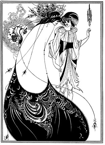
I’ve always preferred this luscious, gold-leafed design to the worthy medievalism of contemporary William Morris. Even though Whistler completed the work prior to the 1890s, the combination of Orientalism and peacocks (the signature bird of the Decadence) seems very much tied to the fin de siècle not least because of Aubrey and Mabel Beardsley’s visit to the room in 1891. Beardsley was very impressed with the painting and with the golden birds, the style of which later formed the inspiration for his famous Peacock Skirt illustration in Salomé (1894).

whistler2.jpg

There’s a good overview here of the history of the room, including details of the falling out between the combative artist and his client, and the story of the room’s removal to America and subsequent restoration.

Previously on { feuilleton }
Beardsley’s Salomé
Alla Nazimova’s Salomé

Austin Spare’s Behind the Veil

spare.jpg

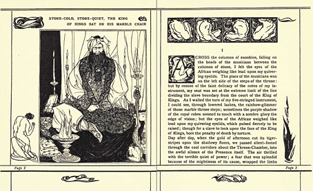
Another Internet Archive discovery, this is a scanned copy of one of Austin Spare’s first illustrated works. Behind the Veil was a small book of mystical fiction by Ethel Rolt Wheeler, published in 1906. Spare was only 20 at the time and the drawings, while accomplished, lack the finesse of his later work. They also owe a lot more to Beardsley’s style than his later drawing (with some figurative nods to Michelangelo, perhaps) which isn’t so surprising given that Beardsley’s influence, eight years after his death, was still considerable.

Also in the archives are two more Spare commissions of lesser interest: Twelve Poems (1916) and The Gold Tree (1917), both by JC Squire.

Elsewhere on { feuilleton }
The illustrators archive

Jessie M King’s Grey City of the North

advocates.jpg

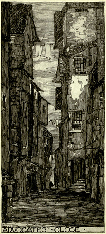
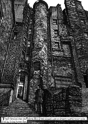
“This dark and steep alley took its name from Sir James Stewart of Goodtrees, Lord Advocate of Scotland, 1692–1713, whose mansion stood at the foot of the close. It was a fashionable quarter in the early 18th century, and here resided Andrew Crosby, the famous lawyer, the original of Scott’s ‘Andrew Pleydell,’ Lord Westhall, John Scougall, the painter of George Heriot, and many well-known people of the time.”

Another book scan from the Internet Archive, this time a title which plays to my fetish for Old Edinburgh. The illustration work of Jessie M King (1875–1949) was featured here in September with a delicate piece from A House of Pomegranates by Oscar Wilde. The Grey City of the North (1910) is quite a departure from her usual style, being a collection of monochrome views of buildings, streets and closes of the Old Town. Very nice lettering on all the plates which perhaps shows some influence from her colleague Charles Rennie Mackintosh.

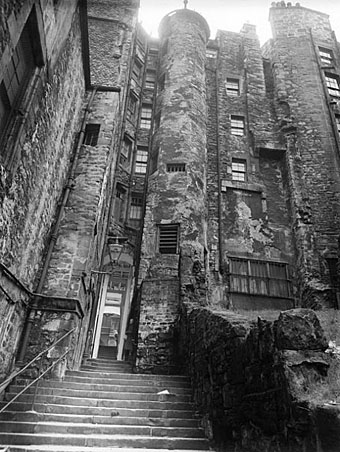
Advocates’ Close has particular significance for me since I copied a view of the alley for my adaptation of HP Lovecraft’s The Haunter of the Dark in 1986. Providence looks nothing at all like Edinburgh, of course, but I couldn’t find adequate reference at the time so used photographs of Scotland by Edwin Smith instead. You can see Smith’s photograph and my rendering of it below. Among the Internet Archive’s other Jessie King books there’s a follow-up to the Edinburgh volume, The City of the West; 24 drawings in photogravure of Old Glasgow.

advocates2.jpg

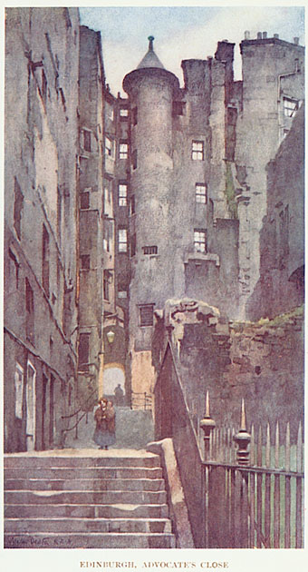
Another view of the close from Edinburgh and The Lothians by Francis Watt; illustration by Walter Dexter (1912).

advocates3.jpg

Advocates’ Close by Edwin Smith from Scotland (1955).

This book of photographs was an early Thames & Hudson title using their typically excellent photogravure reproduction. My copy was rescued from a waste bin near Manchester University and I’ve used it so much for reference over the years I’ve often wondered what I would have done without that chance encounter. You can see from my copy below (drawn with a 0.2mm Variant pen) how much detail I skimped and how much I embellished. I skimped rather more than I remember, as it happens. I think if I’d have drawn this a couple of years later I might have been more faithful to the original.

advocates4.jpg

Elsewhere on { feuilleton }
The illustrators archive

Previously on { feuilleton }
Ephemeral architecture
The Essex Street Water Gate

Harry Clarke’s The Year’s at the Spring

clarke1.jpg

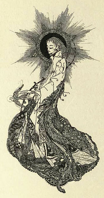
The Internet Archive seems to be improving as a resource for out-of-copyright books. Browsing there this week it’s become apparent that a number of recent additions include rare illustrated titles which can be downloaded as PDFs or scanned pages. Project Gutenberg has the quantity where free books are concerned but their quality leaves much to be desired when it comes to illustrations. The nice thing about these scans from libraries is that they copy the complete book, including covers and endpapers. In many cases the covers have been spoiled by bar code stickers and other library ephemera but they still give a good idea of the original volume.

clarke2.jpg

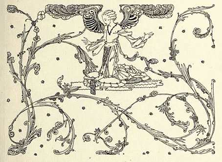
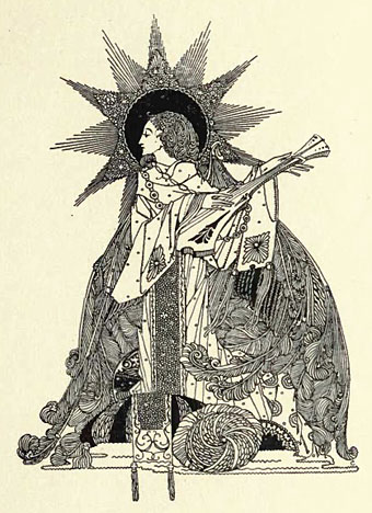
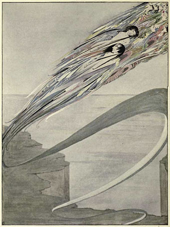
First of the discoveries is this poetry collection, The Year’s at the Spring (sic), from 1920 illustrated by the peerless Harry Clarke (1889–1931). Among the poets featured are WB Yeats, GK Chesterton, Rupert Brooke and Walter de la Mare. This really is a discovery for me since I don’t think I’ve seen any of the illustrations before. The drawings are certainly up to the standard of Clarke’s other work and the colour plates show a possible Japanese influence in some cases, as well as being reminiscent of the colour plates for his Poe volume. There are 21 full-page illustrations in all, with many vignettes.

A couple more illustration samples follow below the fold. I’ll be featuring other titles which have caught my eye over the next few days.

clarke31.jpg

clarke4.jpg

“I am born of a thousand storms, and grey with the rushing rains.”

Elsewhere on { feuilleton }
The illustrators archive

Previously on { feuilleton }
My pastiches

The art of Sascha Schneider, 1870–1927

schneider1.jpg

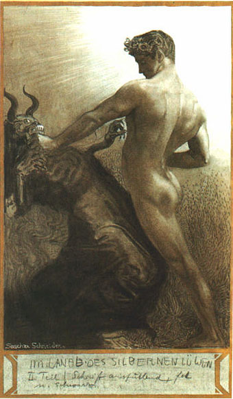
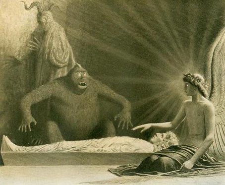
I first came across Sascha Schneider’s art some years ago when reading about German writer Karl May (1842–1912), and it was as May’s illustrator that Schneider initially gained recognition. May was one of Germany’s most popular novelists, his Western adventures about Old Shatterhand and Winnetou the Warrior sold millions of copies and numbered Albert Einstein and Adolf Hitler among their enthusiasts. Schneider’s work struck me as unusual compared to other illustrators of the period; there was a curious quality which seemed to owe more to Symbolist painting than book illustration and the few examples I saw were distinctly homoerotic at a time when homosexuality was regarded with suspicion or downright hostility. Sure enough it turns out that Schneider was openly gay and that May had no problem with this. It also transpires that the Symbolist tone which seemed so unsuited to a writer of Western pulp fiction complemented the content of some of May’s later works which weren’t Westerns at all but were Orientalist fantasies with a metaphysical inclination. The publisher wasn’t too happy with the ambivalent nature of these pictures, however, and they were replaced in later editions.

schneider14.jpg

For once I don’t have to complain about a lack of website examples, Schneider’s connections with May have at least ensured his work is still being written about even if it seems overlooked by gay art histories. This latter circumstance is unusual since he was a contributor to Der Eigene, the world’s first gay periodical, founded by Adolf Brand in 1896.

I’ve taken the liberty of posting more samples than usual here and you’ll have to forgive the lack of information about titles and dates. Many of the pictures are quite bizarre for the way they’re continually juxtaposing naked figures with angels, demons or monsters. Even the Winnetou illustrations, which should be depicting Native Americans, look more suited to the wall of a salon in fin de siècle Paris than stories of the Wild West. Links to various galleries follow.

Schneider’s Karl May frontispieces
An extensive Russian gallery
A smaller Schneider gallery

Continue reading “The art of Sascha Schneider, 1870–1927”