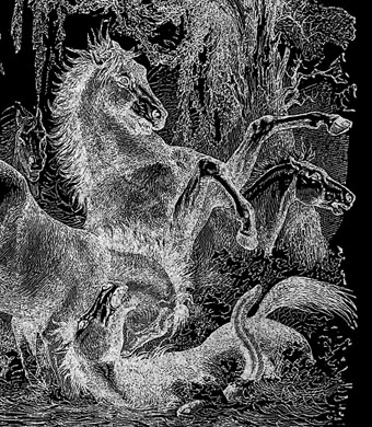
Metzengerstein by Wilfried Sätty.
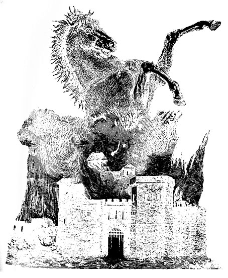
One of the horses in yesterday’s post seemed familiar until I realised it had been used by Wilfried Sätty for his final Metzengerstein illustration in The Illustrated Edgar Allan Poe (1976). This has been happening a lot since I started delving into the book scans at the Internet Archive, Sätty’s collage sources leaping abruptly from old engravings. The horse is a good example of Sätty’s evolved approach to collage which often reversed the printing of assembled artwork, or used a printing press (or PMT process) to duplicate and mirror his collage elements.
Not all Poe illustrators bother with this Gothic pastiche, and those that do don’t always provide an effective rendering of the climax when the clouds of smoke above a smouldering castle assume the form of a colossal horse. Byam Shaw’s illustration is typical, with the horse standing inertly above the flames. Sätty’s picture only occupies half a page but is much more successful, as are many of the other illustrations in a volume that remains one of the very best Poe collections, and the finest of Sätty’s books.
Previously on { feuilleton }
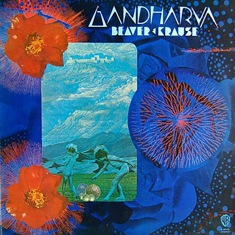
• The original Gandharva
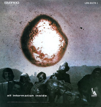
• The Occult Explosion
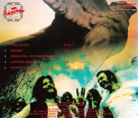
• Wilfried Sätty album covers
• Nature Boy: Jesper Ryom and Wilfried Sätty
• Wilfried Sätty: Artist of the occult
• Illustrating Poe #4: Wilfried Sätty
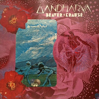
• Gandharva by Beaver & Krause