In the Shadow, a film by Fabrice Mathieu

shadow.jpg

In the Shadow is a short noirish fantasy about a shadow that frees itself from the person to whom it belongs after tiring of the man’s criminal nature. Fabrice Mathieu created his film by editing together tiny clips of feature films from the 30s and 40s (plus some more recent works) then linking them all with a voiceover and music. Dead Men Don’t Wear Plaid (1982) played similar tricks with old detective films but this is still an effective piece, although it probably works best if you’re unfamiliar with the source material. (Via MetaFilter.)

The Gods of HP Lovecraft

gods01.jpg

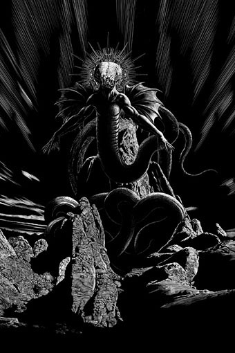
Yig for Rattled by Douglas Wynne.

Presenting one of this summer’s bigger projects, these are my drawings for The Gods of HP Lovecraft, a collection of 12 all-new stories edited by Aaron French for JournalStone. After I’d begun work I was asked whether I could illustrate all 12 stories but since I was already busy with The Monstrous it wasn’t possible. My drawings occupy the second half of the book, with the first half being filled out with suitable illustrations by Paul Carrick and Steve Santiago. The contents are as follows:

Call the Name by Adam LG Nevill (Cthulhu)
The Dark Gates by Martha Wells (Yog-Sothoth)
We Smoke the Northern Lights by Laird Barron (Azathoth)
Petohtalrayn by Bentley Little (Nyarlathotep)
The Doors that Never Close and the Doors that Are Always Open by David Liss (Shub-Niggurath)
The Apotheosis of a Rodeo Clown by Brett J. Talley (Tsathoggua)
Rattled by Douglas Wynne (Yig)
In Their Presence by Christopher Golden & James A. Moore (The Mi-Go)
Dream a Little Dream of Me by Jonathan Maberry (Nightgaunts)
In the Mad Mountains by Joe R. Lansdale (Elder Things)
A Dying of the Light by Rachel Caine (Great Race of Yith)
Down, Deep Down, Below the Waves by Seanan McGuire (The Deep Ones)

gods02.jpg

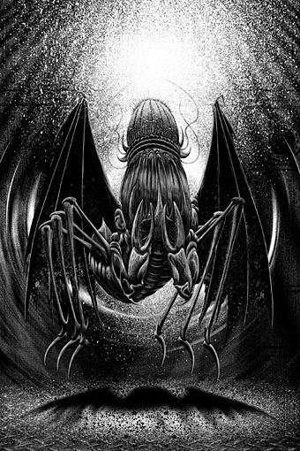
Mi-Go for In Their Presence by Christopher Golden & James A. Moore.

Despite having produced a fair amount of Lovecraft-related illlustration there’s still some areas of his work that I haven’t touched, especially where creature portraits are concerned. So this collection features my first attempts at rendering one of the Mi-Go and one of the Yithians from The Shadow Out of Time. The latter are often represented as fearsome monsters which always strikes me as erroneous when so much description in the story is devoted to their book reading and archive building. Aliens, yes, but monsters they are not. There was some concern when I delivered the artwork that the fine lines and detail might not print so well on paperback stock but the printing is excellent throughout. I recommend this collection for anyone in the mood for some new Lovecraftian fiction.

gods03.jpg

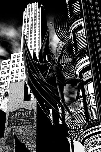
Night-Gaunt for Dream a Little Dream of Me by Jonathan Maberry.

Continue reading “The Gods of HP Lovecraft”

Orphic Egg album covers

orphic12.jpg

This is a record label I’d not come across before. According to this page Orphic Egg “was a subsidiary label for London Records which was formed in 1972 and lasted about a year. The label was formed to try to capture classical music for the counterculture youth of the time (often called ‘heads’). Liner notes were written by hip rock critics respected by the youth.” According to Discogs the first release, The Baroque Head, was 1971. The covers below follow in chronological order through to 1973. With the exception of the Edgard Varèse album all the releases are compilations of older recordings grouped by composer or theme.

orphic01.jpg

Discogs doesn’t give credits for all the cover art but the series was the work of several different illustrators with George McGinnis being responsible for the design. Jason Roberts’ cover for the Mussorgsky album is a suitably wild piece of late psychedelia for a collection that includes Night On Bald Mountain. There’s a nod there to the Chernobog from Disney’s Fantasia, while the Scriabin cover is an overt swipe from an original piece by Jean Delville. The Mussorgsky album is also notable for the bizarre and unique conjunction of music conducted by Herbert von Karajan and liner notes by Lester Bangs. I have to wonder what the haughty maestro of the Berlin Philharmonic would have made of the sleeve if he ever saw it.

orphic03.jpg

Continue reading “Orphic Egg album covers”

Shooting the Hunter: a tribute to Derek Jarman

hunter.jpg

A short film by Mark French and Richard Heslop, Shooting the Hunter was made last year to honour the 20th anniversary of Derek Jarman’s death in February, 1994. The film intercuts shots of Jarman’s gravestone and Prospect Cottage at Dungeness with footage of the same cottage when it was being used as a setting for Jarman’s The Garden in 1990. The sound design is by Fritz Catlin of 23 Skidoo, with the words of John Donne being read by Amina Bastante Pain.

Previously on { feuilleton }
Derek Jarman’s landscapes
Derek Jarman album covers
Ostia, a film by Julian Cole
Derek Jarman In The Key Of Blue
The Dream Machine
Jarman (all this maddening beauty)
Sebastiane by Derek Jarman
A Journey to Avebury by Derek Jarman
Derek Jarman’s music videos
Derek Jarman’s Neutron
Mister Jarman, Mister Moore and Doctor Dee
The Tempest illustrated
In the Shadow of the Sun by Derek Jarman
Derek Jarman at the Serpentine
The Angelic Conversation
The life and work of Derek Jarman

London: Signs and Signifiers

nico01.jpg

By coincidence, two of the projects I was working on in the summer are released this week. First up is London: Signs and Signifiers, a collection of Nico Hogg’s photographs of the streets and architecture of London’s East End. I’ve mentioned Nico’s photography before as his pictures have been used on several of the albums and singles I’ve designed for Keysound Recordings, some of which are featured in the book. This is being published as part of the Keysound catalogue, with a launch event taking place today (the 8th) at the Doomed Gallery, London. See this post for details, and a link to download a free chapter.

nico02.jpg

Nico’s work is notable for the way it avoids the stereotype of the style of urban photography that presents deprived or run-down areas in grim monochrome. Nico doesn’t avoid the decay—there are shots of burned-out flat-blocks, and a chapter devoted to the recent Tottenham riots—but the colour in his pictures shows a different side to these areas of the city.

nico03.jpg

My design for the book follows the minimal approach I’ve used on the Keysound albums, organising the information clearly and giving the photos as much room as possible. The font used for the titles and chapter headings is Transport, the typeface designed by Jock Kinneir and Margaret Calvert used on roads signs throughout the UK.

nico04.jpg

Continue reading “London: Signs and Signifiers”