One of Jonathan Andrew‘s photos of coastal bunkers and concrete defences from the Second World War. In 2006 JG Ballard looked at the way these structures embody the functional nature of Modernist architecture.
• “Utamaro, whose prints of famous courtesans were regarded as the very models of sober beauty by 19th-century Western collectors, in fact produced more Shunga books and albums than non-erotic works.” Adrian Hamilton on the Shunga: Sex and Pleasure in Japanese Art exhibition.
• “…in Samoa, as in many traditional cultures around the world, androphilic males occupy a special transgendered category.” Alice Dreger on gay male couples and evolution.
• Robert Fuest’s film of Michael Moorcock’s first Jerry Cornelius novel, The Final Programme (1973), is out on (Region 2) DVD this month.
Masked by reticence and cloaked in tweeds, [Herbert] Read was the unexpectedly ardent and frighteningly prolific champion of nearly everything that was radical in the first half of the twentieth century: Imagism, Surrealism, abstraction, the Bauhaus, Marxism, anarchism, Freud and Jung, progressive education, Gandhian nonviolent resistance. Though now somewhat dimly remembered, he was, for decades, the Victoria Station of the arts, England’s primary explainer of the modern.
Eliot Weinberger introduces Herbert Read’s strange fantasy novel, The Green Child (1935).
• KW Jeter’s steampunk novel Fiendish Schemes is published (with my cover art) by Tor on the 15th. There’s an extract here.
• Mix of the week: An early Halloween mix (and interview) from Joseph Stannard of The Outer Church.
• At Dangerous Minds: Codex Seraphinianus: A New Edition of the Strangest Book in the World.
• A trailer for the forthcoming Blu-ray release of Murnau’s Nosferatu: A Symphony of Horror.
• Kenneth Halliwell: lover, killer… artist? Philip Hoare on the collages of Joe Orton’s partner.
• Clive Hicks-Jenkins looks back at Cocteau’s La Belle et la Bête here, here and here.
• Anastasia Ivanova‘s photo portraits of lesbian couples in Russia.
• Christopher Fox on electronic music’s sound of futures past.
• At Strange Flowers: Melchior Lechter’s book designs.
• Vaughan Oliver‘s favourite 4AD album covers.
• Swinging Sixties Japanese film posters.
• John Foxx’s favourite albums
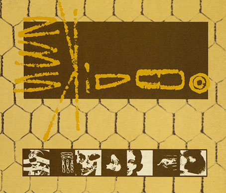
• Beauty And The Beast (1977) by David Bowie | Slow Motion (1978) by Ultravox | I Am The Green Child (2000) by Coil