The art of Ron Rodgers

rodgers1.jpg

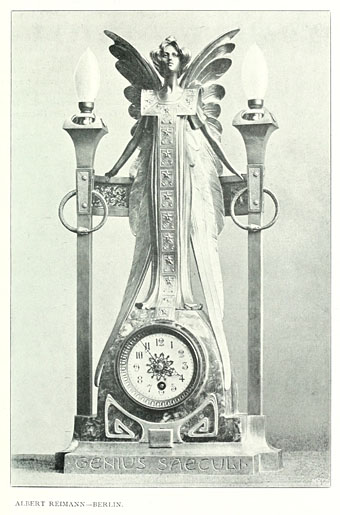
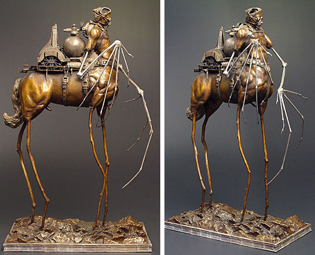
Century of Progress.

While the web has given many artists a visibility they wouldn’t have had in the past, too many artists’ sites are blighted by the dreaded “Artist’s statement” in which people who express themselves visually are forced to try and articulate for the paying customers what it is they’re doing with all this art stuff. Nowhere will you find anyone saying “I don’t know what I’m doing” or “I do this because I’m compelled to but don’t know why” or even “I do this to make a living”. All too often what you get is a rifle through the favourite jargon phrases of the social sciences where the polysyllabic words seem important but are as worn out and redundant as any of the examples George Orwell complained about sixty years ago in ‘Politics and the English Language‘.

All of which is a very long-winded and polemical way of saying I loved Ron Rodgers’ artist’s statement:

“That’s what his stare has been saying to me all this time:
‘At least I galloped – when did you?'”
– Peter Shaffer, from “Equus”

Here’s hoping more artists follow his example. There’s more of his art at the Glass Garage Gallery. Via Monsieur Thombeau who has a knack for finding good things.
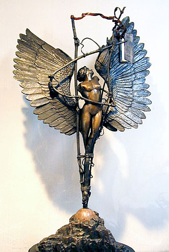
rodgers2.jpg

Phoenix.

Previously on { feuilleton }
Geoffrey Haberman’s brass insects
The art of Arnaldo Pomodoro
The art of Sergei Aparin
Sculptural collage: Eduardo Paolozzi
The art of Igor Mitoraj

Deutsche Kunst und Dekoration #8

dkd08-00.jpg

Continuing the delve into back numbers of Deutsche Kunst und Dekoration, the German periodical of art and decoration. Volume 8 covers the period from April–September 1901 and continues to use the ornamental capitals by Karl Lürtzing featured in the previous volume. In this edition the emphasis is predominately upon the Darmstadt Artists’ Colony, a remarkable venture in which many of the artists involved designed and decorated their own houses, the intention being to create living examples of the Jugendstil, or German Art Nouveau, style. This is explored in greater detail in the next volume but for now I’ve chosen a selection of work by Darmstadt artist Paul Bürck. As usual, anyone wishing to see these samples in greater detail, or the rest of the edition, is advised to download the entire volume at the Internet Archive. There’ll be more DK&D next week.

dkd08-01.jpg

These peacock border designs are uncredited but they show how flexible the ubiquitous fin de siècle bird could be. The last page gives us something unique: an ape in peacock finery.

dkd08-02.jpg

dkd08-03.jpg

Continue reading “Deutsche Kunst und Dekoration #8”

Leonardo’s warrior

leonardo.jpg

Bust of a warrior in profile (c. 1475–80) by Leonardo da Vinci.

A recent interview question reminded me of this splendid Leonardo piece when I was discussing early artistic influences. One crucial influence for me was the example of my mother who’d been an art student during the 1950s specialising in ceramics and textile design. From an early age I was fascinated by her student sketchbooks, and by one drawing in particular, a very careful copy of this work by the young Leonardo. The British Museum has the original, about which they tell us:

The drawing shows Leonardo studying the art of his teacher, Andrea Verrocchio. Giorgio Vasari’s biography of Verrocchio in his Lives of the Artists (1550 and 1568) mentions two metal reliefs with profile portraits of Alexander the Great, leader of the Greeks, and Darius, the Persian king. They were sent by Lorenzo ‘il Magnifico’ (‘the Magnificent’) de’ Medici, ruler of Florence (1469–92), as gifts to the king of Hungary. This drawing is probably based on one of these lost works by Verrocchio.

desmazieres.jpg

Casque d’apparat (1981) by Erik Desmazières.

Memories of the Leonardo drawing always follow the exaggerated logic of childhood and inflate its splendour and detail; I’d never seen anything like it and for years used to hope that Leonardo had produced many similar works. He hadn’t, of course, so it’s to other artists we have to turn for more of the same. French artist Erik Desmazières has produced a number of etchings depicting elaborately helmeted figures which are perhaps inspired by Leonardo’s warrior. Of the three in Imaginary Places, a 2007 collection of his work, the one above is my favourite. I have a feeling I’ve seen derivations by other artists but nothing is coming to mind. As usual, if anyone knows of further examples, please leave a comment. Elsewhere there’s Leonardo’s Diary (1972), a short film by Jan Svankmajer in which the haughty figure is subject to some typical Svankmajerian distortions.

• See also: Erik Desmazières at the Fitch-Febvrel Gallery.

Previously on { feuilleton }
Les lieux imaginaires d’Erik Desmazières
Jan Svankmajer: The Complete Short Films
The art of Erik Desmazières

Victorian typography

type1.jpg

“Victorian” isn’t really the correct term for the products of 19th century America but then “19th century” covers rather a lot of ground. Mr BibliOdyssey’s most recent post is a stunning collection of title pages from fire insurance maps of the late 19th and early 20th century. Rather than repost any you ought to go and see them for yourself, they’re excellent examples of the best and worst of “Victorian” graphic design, insanely and pointlessly ornate yet often very inventive in their elaborations and stylised letterforms. Being a typophile I’d often feel frustrated when looking at 19th century documents and seeing type designs in use for which there were no contemporary equivalents. There was such a profound reaction against ornamented design in the 20th century that it’s only relatively recently that typography of this period has been reappraised and, in some cases, resurrected. The book from which these examples are taken dates from 1897, and it fascinates for putting names to some of those neglected designs. This is a big catalogue of 740 pages so I’ve been sparing in my selection. Anyone wishing to see more can download the whole thing here.

type2.jpg

Despite my affection for curvilinear Art Nouveau, when it comes to typography I’m often drawn to the spikier styles. Atlanta was digitised by P22 in a style they call Victorian Gothic. Their accompanying ornament set replicated that curious shape from Victoria below.

type3.jpg

type4.jpg

This typeface, or ones which resemble it, is a common one in 19th century newspaper and advertising design but I’d never seen it given a name until now. The catalogue pages have a number of variations which is no doubt an indicator of its popularity. A bold weight of the design was digitised by Scriptorium as a font they call Mephisto.

type5.jpg

Rubens is my favourite of all the designs in this catalogue, probably because I always liked the way it looked when it enjoyed a surprising flush of popularity in the 1960s and 1970s. The narrow style made it very useful for book covers (as with the examples here) while those spiky serifs made it popular with art directors looking for a typeface that said “horror”. Wooden Type Fonts recently digitised a version of Rubens but their version lacks the elegance of the original. Anyone else want to have a go?

type6.jpg

Lastly the catalogue has many pages of clip art figures and decorations including the pointing hands which people always associate with 19th century design. I’d wondered a few times whether these jagged decorations were meant to be electrical or not. Electricity was a new thing in 1897 so these would have seemed distinctly modern.

Previously on { feuilleton }
Steampunk overloaded!
Penguin Labyrinths and the Thief’s Journal
Masonic fonts and the designer’s dark materials

The Choise of Valentines, Or the Merie Ballad of Nash His Dildo

nash.jpg

My little dilldo shall suply their kinde:
A knaue, that moues as light as leaues by winde;
That bendeth not, nor fouldeth anie deale,
But stands as stiff as he were made of steele;

A salacious post for chocolate-and-roses day. There’s a degree of confusion around this work and its author, an Elizabethan poet, playwright and pamphleteer. The poem, which was distributed privately, dates from around 1593 and has a variety of titles, while its author is variously credited as Thomas Nashe or Thomas Nash. Despite the bawdy reputation of the Elizabethan era Nash’s contemporaries were sufficiently scandalised by the poem for it to remain unpublished, with the result that it survives imperfectly in a few handwritten copies. It’s a lengthy piece so let’s go to Wikipedia for a précis:

It describes the visit of a young man named “Tomalin” to the brothel where his girlfriend Frances (“Frankie”) is employed. Having paid ten gold pieces for her favours, Tomalin is embarrassed to find that merely lifting her skirts makes him lose his erection. She perseveres in arousing him however and they make love, but to her disappointment he has an orgasm before her. Frankie then decides to take matters into her own hands: hence the informal title by which the poem was known, Nashe’s Dildo.

The Oxford English Dictionary credits Nash with the first appearance in English of the word “dildo”, a term “of obscure origin” we’re told, whose usage here predates John Florio’s Worlde of Wordes (1598), Ben Jonson’s The Alchemist (1610), and Shakespeare’s A Winter’s Tale (1611). Nash’s achievement is something of a cheat since his poem wasn’t actually published until 1899, and then in a private edition. As usual the Internet Archive has the book in question, and it’s their version which follows, albeit without the copious footnotes.

The Renaissance English Literature site has more about Thomas Nash (or Nashe), his life and his work.

Continue reading “The Choise of Valentines, Or the Merie Ballad of Nash His Dildo”