
From your eyes only
| Rouben Mamoulian’s Jekyll & Hyde.
Month: December 2008
Baroque snowflakes
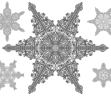
I haven’t done a seasonal card design for a couple of years, I often feel too enervated by the whole idea or else lack sufficient inspiration. But after seeing recent snowflake designs by the wonderful Marian Bantjes I thought I’d try some similar ones of my own. Looking back at her work just now I’m amused to see that she kept her designs simple and elegant while I went overboard with the detailing as usual. I created quite a few of these shapes but the ones that make up the final card are the best of the bunch. In a rare fit of generosity you’re welcome to download a high-res PDF and print it yourself. The size is A4 (210mm x 297mm) and—unlike most cards—when folded down the middle can either stand vertically or horizontally.
Previously on { feuilleton }
• Kirsten Hassenfeld’s paper sculptures
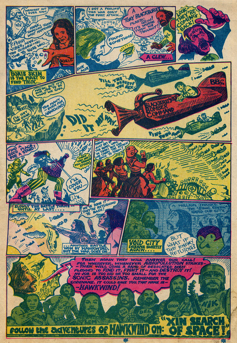
The Sonic Assassins
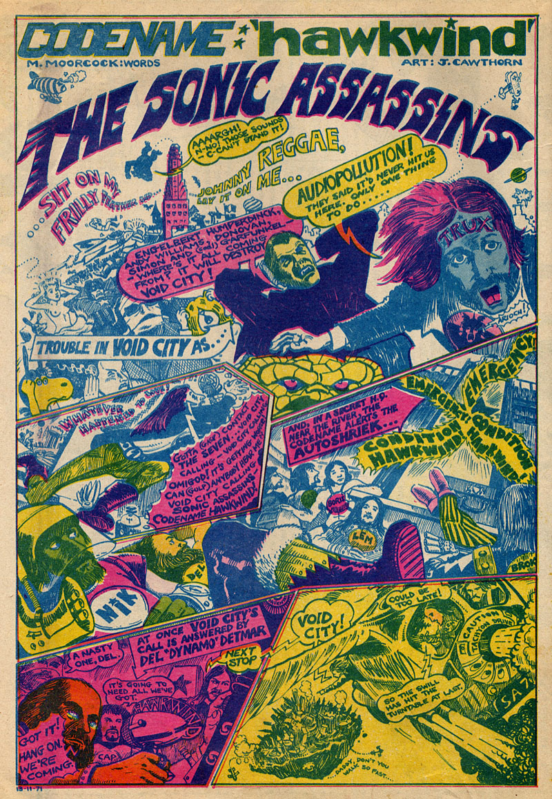
Searching through discs for scans of Jim Cawthorn art turned up this comic strip curio from a November 29th, 1971 issue of UK underground magazine Frendz. Cawthorn and writer Michael Moorcock present rock band Hawkwind as musical superheroes and although this is done largely as a promotional piece for that year’s new album, In Search of Space, the Sonic Assassins tag was one which stuck, becoming almost a secondary name for the band in later years. The name Void City also recurred later as the name of a track on the Choose Your Masques album. It may have been around this time that Cawthorn painted special T-shirt designs for Hawkwind; up to 1980 Dave Brock was still wearing his Baron Meliadus shirt on stage.
Previously on { feuilleton }
• Jim Cawthorn, 1929–2008
• Design as virus #7: eyes and triangles
• Barney Bubbles: artist and designer
Jim Cawthorn, 1929–2008
“Jim Cawthorn and I have been inseparable for over twenty-five years, sometimes to the point where I can’t remember which came first—the drawing or the story. It is his drawings of my characters which remain for me the most accurate, both in detail and in atmosphere. His interpretations in strip form will always be, for me, the best.” Michael Moorcock.
Jim Cawthorn—illustrator, comic artist and fantasy historian—died this week. Cawthorn was the first illustrator employed by Savoy Books and one of the key factors in drawing me to their doors in the early 1980s. His illustrations made their books special and his comics adaptation of Moorcock’s The Jewel in the Skull was a big influence on my early black and white work.
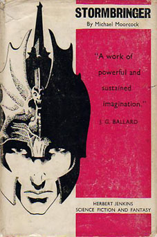
Mike Moorcock, Dave Britton and I seem to be in a minority in regarding Cawthorn as one of the finest fantasy illustrators of his generation. His carefully stipled drawings of the late Fifties and early Sixties are all miniature masterpieces and I don’t care how many artists attempt lavish paintings of Moorcock’s Elric character, for me the definitive representation remains the drawing used on the cover of the first edition of Stormbringer in 1965. Cawthorn was Moorcock’s illustrator of choice for many years and was involved with the Moorcock-edited run of New Worlds right from the start with his cover illustrating Ballard’s Equinox story. He also provided reviews for New Worlds, and his critical faculties were demonstrated to the full in 1987 with Fantasy: The 100 Best Books, an overview of the genre credited to Cawthorn and Moorcock for which Cawthorn himself wrote most of the entries.
I wrote in more detail about Cawthorn’s work for the Savoy site several years ago. For an overview of his career and influences, there’s Dave Britton’s interview from 1979.
Update: some extra pictures added.
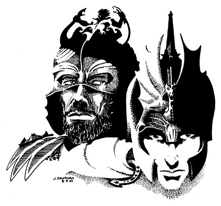
Jagreen Lern and Elric (1963).
Reasons To Be Cheerful, part 3: A Barney Bubbles exclusive
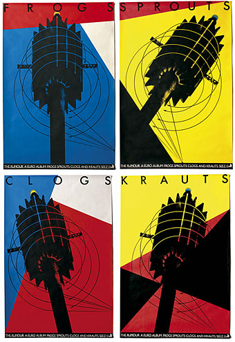
Or why Barney Bubbles rules… The Rumour were a Seventies band I never had any interest in, being part of the Stiff Records’ pub rock axis along with Nick Lowe and others; not weird or noisy enough for petulant moi. This is a shame since the Barney Bubbles design for their albums shows him at the pinnacle of his powers with an integrated, multi-media approach to packaging and advertising.
The pictures and text here have been very generously supplied by Paul Gorman whose BB monograph, Reasons To Be Cheerful: The Life & Work Of Barney Bubbles, is now on sale. This is an expanded extract from part of the book with the NME ad and Vinyl Factory graphic being exclusives to this posting. If you need to know why we keep raving about the man, simply scroll on down, bearing in mind that this was only a clutch of releases from a single band. Barney was pulling together work like this all the time for a host of different artists.
For more BB goodness there’s my original, sprawling post, further samples from Paul’s book at his site and also David Will’s blog which features all manner of rare historical material, including a feature about the Brian Griffin book referred to below.
Over to Paul…
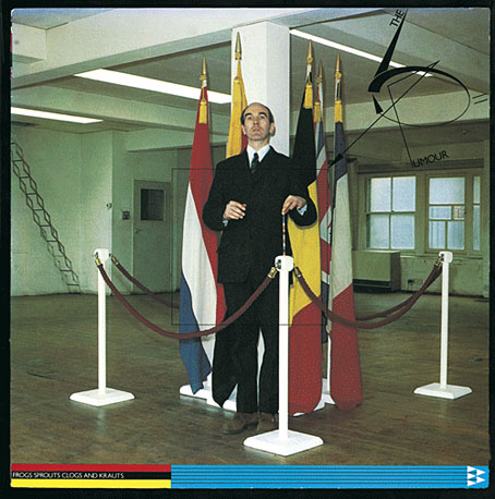
An important yet overlooked Barney Bubbles design project of the post-punk period sprang from an unlikely source: the album with the unprepossessing title Frogs Krauts Clogs And Sprouts, released by Graham Parker’s backing band The Rumour in March 1979.
The pre-PC name took its cue from the album track Euro. Bubbles chose a less prosaic route in realising a remarkable and thematically-linked design package predicated on the ceremony and colour schemes of EEC officialdom. This was very much in the news in 1979, ahead of the first European elections held that summer.
Continue reading “Reasons To Be Cheerful, part 3: A Barney Bubbles exclusive”