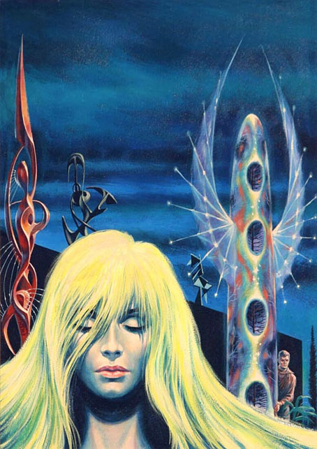
A painting by Ed Emshwiller for the cover of Fantastic Stories of Imagination, July 1962, illustrating The Singing Statues by JG Ballard .
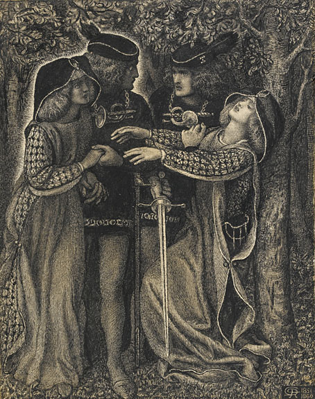
• This week in the Bumper Book of Magic: my comments about the creation of the book’s cover and magical alphabet have been posted at Alan Moore World. At (Quasi), Smoky Man (in Italian) looks at other parts of the book, and includes my answers to his questions about the creation of The Soul, a character originally planned for a comic strip that Alan Moore and I were working on. I’ve been trying recently to find the first sketches I made of The Soul back in 2000 or 2001, without success. If I do find any of them I’ll post them here.
• New music: Juk-Shabb by Cryo Chamber Collaboration is this year’s installment in the Lovecraft-themed album series (previously) from Cryo Chamber. Also this week: Xerrox Vol. 5 by Alva Noto; Nocturne (Soundtrack for an Invisible Film) by Avi C. Engel; and Cat Location Conundrum by Moon Wiring Club.
• Code: Damp: An Esoteric Guide to British Sitcoms by Sophie Sleigh-Johnson, being “an alternative occult and esoteric history of England told through one of its most popular cultural forms: the comedy sitcom”.
…the joy of art isn’t only the pleasure of an end result but also the experience of going through the process of having made it. When you go out for a walk it isn’t just (or even primarily) for the pleasure of reaching a destination, but for the process of doing the walking. For me, using AI all too often feels like I’m engaging in a socially useless process, in which I learn almost nothing and then pass on my non-learning to others. It’s like getting the postcard instead of the holiday.
Brian Eno at Boston Review
• “The typographic choices that Godard made were thematic and not only chosen for their stylistic properties.” Arijana Zeric looks inside the design world of Jean-Luc Godard.
• Coming soon from Strange Attractor: The Stammering Librarian: Essays by Timothy D’Arch Smith, edited by Edwin Pouncey & Sandy Robertson.
• At Public Domain Review: Fantastic Planet: The Microscopy Album of Marinus Pieter Filbri (1887–88).
• At the BFI: Michael Brooke offers suggestions for where to begin with Guy Maddin.
• At The Quietus: The Strange World of…Dennis Bovell.
• Mix of the week: A mix for The Wire by KMRU.
• Steven Heller’s font of the month is Gigafly.
• Fantastic Cat (1996) by Takako Minekawa | Fantastic Analysis (2001) by Mouse On Mars | Fantastic Mass (2016) by Time Attendant