Jan Parker’s witches

parker01.jpg

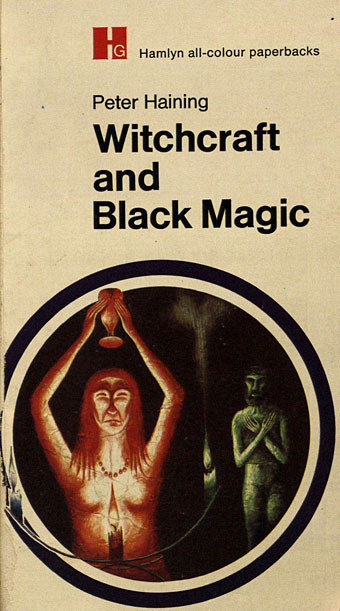
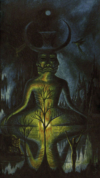
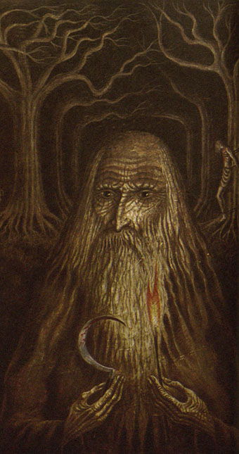
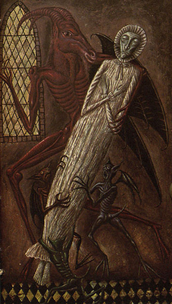
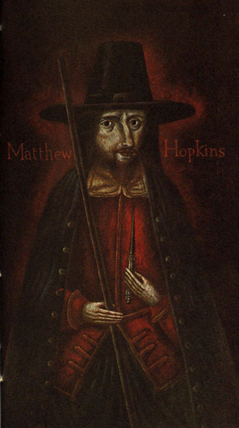
Also witch-finders, demons, magi, and a skeletal Adolf Hitler clutching a glowing crystal ball… Jan Parker is a British artist who was working as an illustrator in the early 1970s, during which time he produced a small number of covers for SF and fantasy titles. One of these, The Worlds of Frank Herbert, is a book I used to see a lot on the secondhand shelves although I never owned a copy. As with Victor Valla’s cover art, the 70s was a decade when idiosyncratic imagery of the type created by Parker and co. was a more common sight on genre covers than it is today. Witchcraft and Black Magic, published by Hamlyn in 1971, brought Parker’s brand of naïve weirdness to a Peter Haining history of the more lurid forms of occultism. This is a book that I did own for a while until someone borrowed it and never returned it, a persistent hazard for the books in my not-very-extensive occult library. Haining’s study is the kind of thing that publishers often call a pocket guide, although this suggests something you’d carry around to be used as an identification tool during chance encounters; you wouldn’t want to encounter most of the people (never mind the creatures) in these paintings.

parker02.jpg

A handful of Parker’s illustrations turned up some years ago at the now-defunct Front Free Endpaper, then were reblogged at Monster Brains and elsewhere. The copies here are from another recent upload at the Internet Archive where the book is part of a sub-archive of titles scanned from Indian libraries. The very tight binding evidently presented difficulties for the scanner, hence the appearance of fingers holding open most of the pages. It’s good to see this one again; I always valued the book more for the artwork than the text which isn’t bad but was simply another commission for the very prolific Haining, a writer who was a better anthologist than a historian. If you want a general history of the occult there are more authoritative options elsewhere.

parker03.jpg

As for the artwork, I wonder now how long it took Parker to paint all these pictures. There are about 80 original illustrations plus a number of others taken from antique books or from artists such as Frans Hals and Goya; that’s a lot of original art for a book of only 160 pages. Many of Parker’s pieces are copies of pre-existing portraits or of familiar illustrations like the perennially popular demons from de Plancy’s Dictionnaire Infernal. This makes me wonder why Hamlyn commissioned copies from Parker rather than simply paying a picture library for the original images as Marshall Cavendish were doing in 1971 with their multi-part encyclopedia, Man, Myth and Magic. Whatever the reason I’m pleased they gave Parker so much free reign. His depictions of historical figures wouldn’t be out of place in the portrait gallery in Dance of the Vampires, while some of his other pieces stray into outright Surrealism; the picture of people being menaced by flying eyeballs was used for the cover art of the US reprint from Bantam.

parker04.jpg

Haining’s book had at least one reprint in the UK before going out of print. The early 1970s saw the peak of the occult revival which had begun in the previous decade, and which made room in publishers’ lists for odd little books like this one. Secondhand copies are still floating around although they’re seldom cheap. If you do find one just be careful who you lend it to.

parker05.jpg

Continue reading “Jan Parker’s witches”

Typefaces of the occult revival

mmm.jpg

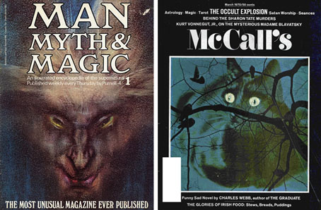
Man, Myth & Magic #1, January 1970; McCall’s, March 1970.

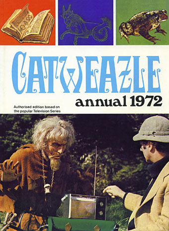
The announcement last week of the death of British character actor Geoffrey Bayldon prompted some discussion here about the typeface used for the titles of Bayldon’s TV series from the early 1970s, Catweazle. This was a humorous drama in which the actor portrayed a warlock transplanted by a time portal from the Norman era to the present day, a comic counterpart to another occult-themed series, Ace of Wands (1970–72). Being aimed at children, both Catweazle and Ace of Wands are at the lighter end of the great flourishing of occult-related media that runs in parallel with the rise and fall of psychedelic culture, a period roughly spanning the years 1965 to 1975. The two trends reflected and fed off each other; the hippie movement stimulated interest in the occult (Aleister Crowley is on the cover of Sgt Pepper) while giving to the commercial propagators of the supernatural a range of aesthetics lifted from the 19th century.
occult.jpg

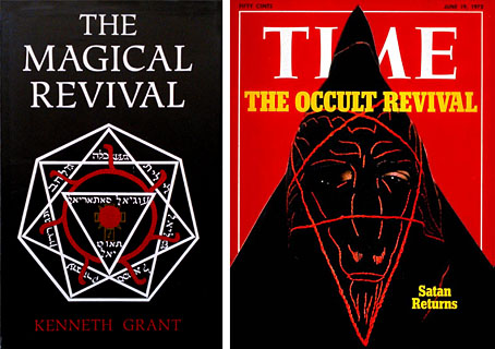
Muller, 1972; TIME, June 1972.

Among the graphic signifiers is a small collection of typefaces from the Victorian or Edwardian eras, designs which vanished from sight after 1920 only to surface 50 years later in very different settings to their previous deployment. I’m always fascinated by the way context changes the perception of a typeface; the repurposing of Art Nouveau fonts—which hadn’t previously been associated with diabolism—to signify witchcraft or sorcery is a good example of this. In the case of the occult revival this was partly opportunism: the commercial application of post-psychedelic style made the previously untouchable trendy again, decoration and elaborate stylisation was no longer taboo. But it was also a solution to the problem of signifying the sorcerous with typography when there were no off-the-peg solutions as there were for, say, Westerns or stories about the Space Race. As well as carrying with them a flavour of old books, some of the more curious letterforms were reminiscent of the glyphs of magical alphabets which no doubt explains their popularity.

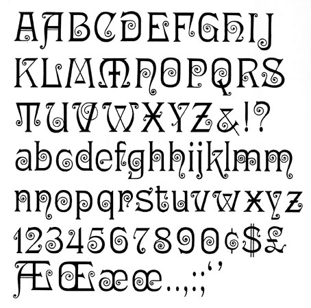
What follows is a chronological selection of the more striking examples (or my favourites…) which conveniently begins with Ringlet, the Catweazle font. With the trend being towards Art Nouveau you find popular Nouveau styles such as Arnold Bocklin also being used in the 1970s but I’ve avoided these in favour of the less common choices.


Ringlet (1882) by Hermann Ihlenburg
ringlet3.jpg

jullian08.jpg

Pall Mall, 1971.

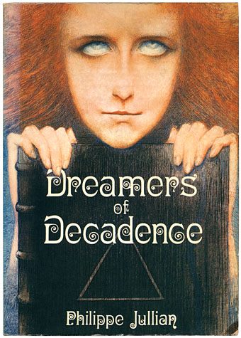
Jullian’s landmark study of the Symbolist movement isn’t an occult text but it is a great favourite of mine whose original title—Esthètes et Magiciens—puts it in the right sphere. Inside, the author touches on the spiritual concerns of many of the artists which included Theosophy and fashionable Satanism.
ringlet1.jpg

ringlet2.jpg

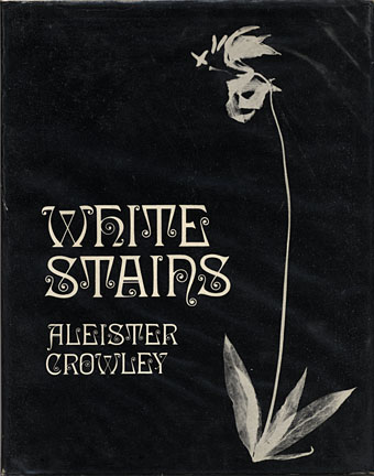
Duckworth, 1973.

Aleister Crowley is represented here with the first reprinting of his erotic poetry, produced in a limited run by the venerable London house of Duckworth.
ringlet4.jpg

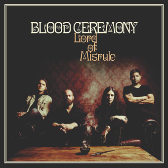
Rise Above Records, 2016.

Blood Ceremony are Canadians devoted to the occult rock of previous decades. Their presentation matches songs with titles like The Great God Pan and Morning Of The Magicians.


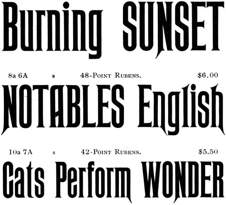
Rubens (1884) by John K. Rogers
rubens2.jpg

Rubens has long been a favourite of mine even though it gets used a great deal on horror novels and the like. Many Americans also regard it as “the Haunted Mansion font” owing to its use in Disney theme parks.

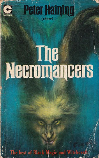
Peter Haining’s collection combined supernatural fiction with short non-fiction accounts of magical operations. The cover art is the full version of the drawing by Austin Osman Spare—The Elemental aka The Vampires are Coming—seen in detail on the cover of the first issue of Man, Myth & Magic.
rubens1.jpg

Coronet Books, 1972.


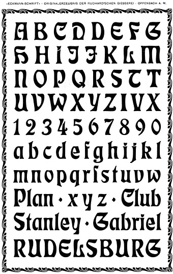
Eckmann (1900) by Otto Eckmann
eckmann2.jpg

eckmann1.jpg

Pan Books, 1969.

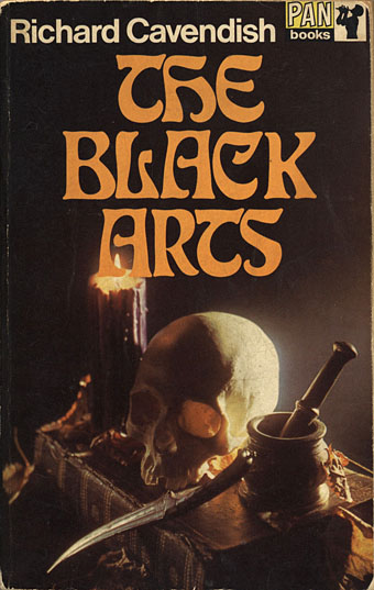
Many of the examples in this post tend towards the exploitational (see below…) but Cavendish’s overview of occult theory and history is a serious study, even if the cover does beckon to the Dennis Wheatley readership. My mother was among the latter which no doubt explains why she had a copy of this paperback; in due course it found its way into my hands. Richard Cavendish was enough of an authority to be hired by Purnell as editor-in-chief of Man, Myth & Magic.


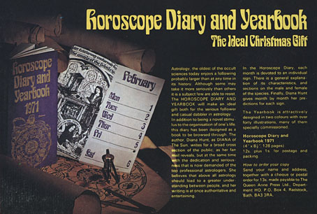
Siegfried (c. 1900) by Wilhelm Woellmer

siegfried2.jpg

And speaking of which…Purnell offered their readership a sidereal start to 1971.
siegfried1.jpg

Man, Myth and Magic, 1970.

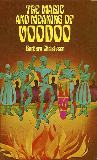
voodoo.jpg

Heinemann, 1977.


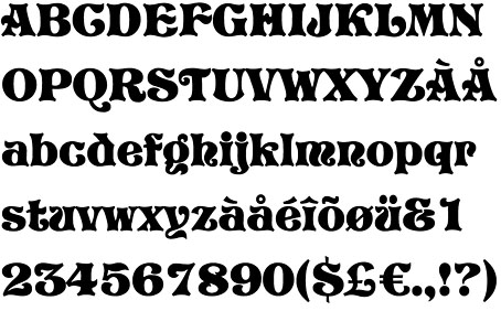
Pretorian (c. 1900) by PM Shanks & Sons
pretoria2.jpg

pretoria1.jpg

NEL, 1971.

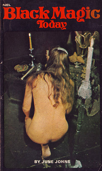
This is where things shift from anthropology, history and children’s television to Satanic exploitation and hardcore porn. “Black magic” ceremonies in previous centuries were often a kind of orgiastic cosplay so it’s no surprise to find the same thing happening in the 20th century. New English Library dominated the British book world of the 1970s with a wide range of genre novels, as well as salaciously-packaged reprints of serious occult studies by Francis King and this volume by June Johns.
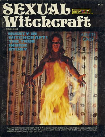
pretoria3.jpg

Undated.

Sexual Witchcraft and The Devil Made Me Do It are two works whose pornographic nature means their origin remains obscure; nobody seems to have any information about the latter title.
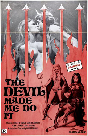
pretoria5.jpg

Undated.

pretoria6.jpg

Penguin, 1975.

pretoria4.jpg

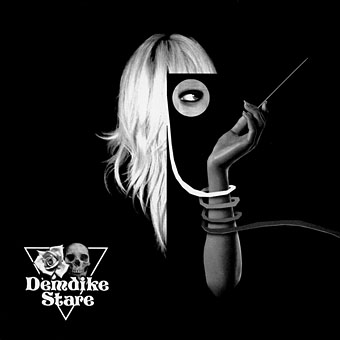
Symbiosis by Demdike Stare. Modern Love, 2009.

Mancunian duo Demdike Stare hark back to the heyday of Ouija boards and witchcraft with sinister electronics and the monochrome art and design of Andy Votel. Pretorian is used on all their early releases.


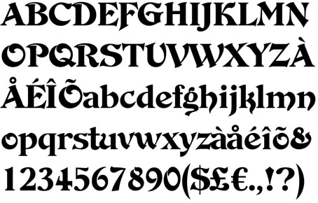
De Vinne Ornamental (1900) by Nicholas J. Werner
devinne1.jpg

devinne2.jpg

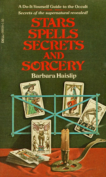
Dell, 1978.

devinne3.jpg

Holt, Rinehart and Winston, 1984.


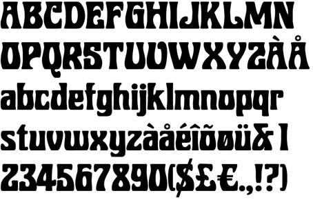
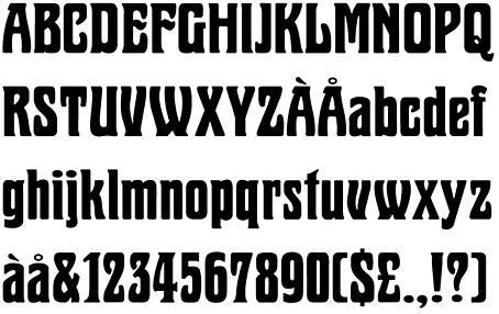
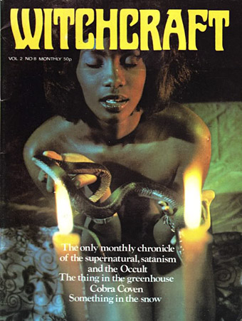
Marschall (1905) by Wilhelm Woellmer
marshall2.jpg

marshall3.jpg

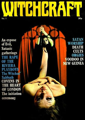
Witchcraft magazine was a UK publication (dates unknown) whose revelatory stories ran alongside many photographs of naked ladies. There was a brief fad for this kind of thing, a diabolic counterpart to all those beefcake mags pretending to be devoted to body-building. Witchcraft did at least manage more than a single issue.
marshall1.jpg


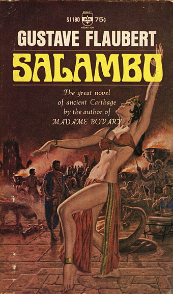
Roberta (1962) by Robert Trogman

roberta1.jpg

Trogman’s type was based on a Belgian restaurant sign so this may be another Art Nouveau derivation. Not so the use to which it was put, however. Flaubert’s novel doesn’t feature any overt occultism (although there is a whole chapter of human sacrifice) but the cover is one of the first to establish Roberta as a signifier of the exotic/erotic .
roberta4.jpg

Berkley Medallion, 1966.

roberta2.jpg

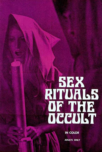
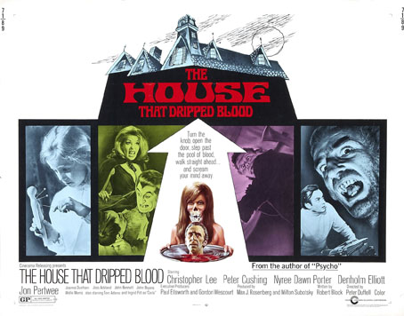
The film equivalent of Witchcraft magazine from 1970. According to this review, Sex Rituals of the Occult also features some gay sex from the male performers, a rare thing in these boob-fests.
roberta3.jpg

Amicus Productions, 1971.


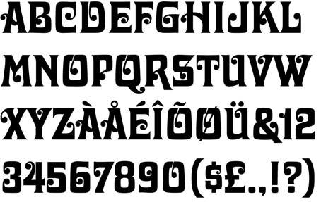
Davida (1965) by Louis Minott
davida1.jpg

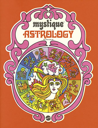
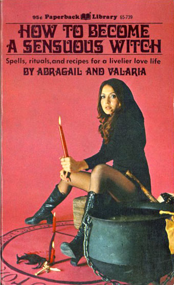
Davida is one of those typefaces from the 60s that was very popular in the following decade so it’s no surprise to find one or two occult titles using it. I’ve included it here for the way its style refers back to Ringlet, and for Abragail and Valaria’s book of recipes.
davida3.jpg

Mattel, 1969.

davida2.jpg

Coronet Communications, 1971.

Previously on { feuilleton }
MMM in IT
The Book of the Lost
The Occult Explosion
Forbidden volumes
The Sapphire Museum of Magic and Occultism
Occultism for kids

Dracula and I by Christopher Lee

dracula.jpg

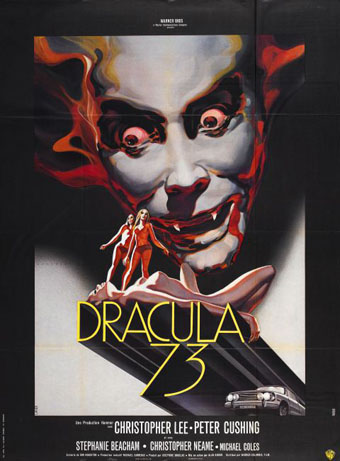
Impossible, not to say foolish, to attempt a brief summary of Christopher Lee’s incredible life and career. Rather than compete with the obituaries, here’s something you won’t find elsewhere, a short piece by Lee himself about his relationship to the role that made him famous. This is taken from The Dracula Scrapbook, a collection of Dracula and vampire-related cuttings assembled by Peter Haining for New English Library in 1976. The Lee piece was originally written for Midi Minuit Fantastique, Éric Losfeld’s film magazine which, we’re told, ceased publication in 1971. Haining dates Lee’s article as 1973 so I’ve left it undated, although it does seem to have been written around the time he was making (or had made) Dracula AD 1972. To compound the confusion, the poster above is for that very film but titled Dracula 73. Lee preferred Jesús Franco’s Count Dracula (1970) to the two final Hammer Draculas but the latter have their enthusiasts.

*

DRACULA AND I by Christopher Lee

I should certainly be pleased to play the part of Dracula again on the screen (surely it is the immortal role par excellence?), although I have many times refused to accept it. Nowadays I think the public identifies me with this part, and if I have sometimes refused it, it was for fear that, like the unfortunate Bela Lugosi, I should spend the rest of my life unable to play anything else. However I would willingly play it again, always provided that the production and scenario of this great subject satisfied me to the full. In any case, I have no intention of playing it to gain some sort of cheap publicity or for the financial benefit of a group of individuals incapable of appreciating or understanding the great power and the classical style of this great subject.

The part is one which needs to be played with respect and dignity, although one must always consider the commercial angle, which nowadays cannot be ignored.
I wrote recently that a true actor ought to be able to play a great diversity of parts. I think I have proved this as far as I am concerned, and that consequently there is no danger for me of being ‘typed’. But I am first and foremost an actor and must earn my living, and if the occasion arises again I shall he delighted to play the part of Dracula again under conditions which satisfy me.

Above all I should wish my interpretation to be more faithful to the novel of Bram Stoker. It seems to me that in the film Horror of Dracula (which, by the way, was excellent and a great success) the scenario left in the shade some aspects of the novel which, if they had been retained, would have improved the film as a whole considerably. For example, the sequences with the wolves and the capital scene with Jonathan Harker and the mirror, not to mention the boat sailing for England. The omission of Renfield was also very regrettable.

I believe that these scenes were not shot for financial reasons; they would have made the film considerably longer and therefore called for a great increase in the production budget.

It may surprise you to know that I have not seen any of the other versions of Dracula. Most of them were produced when I was very young and my age did not allow me to go to see them. But I think this is an advantage in my case, for above all I should not like to be influenced in my approach to the part by those who preceded me, even by the great Bela Lugosi. It will always be a cause for great regret to me that I never met him, whereas I know Boris Karloff very well and have a great admiration for him.

My personal idea of the interpretation of Count Dracula was of course based on the novel which I have read over and over again, and within the framework of the scenario and the production I have tried to give my personal view of its interpretation.

Bram Stoker’s grand-daughter came to see me on the set during the shooting, and was kind enough to assure me that my interpretation was excellent, and that she was sure her grandfather would have appreciated it.

Of course there was a great difference between the scenario and the novel, but I have always tried to emphasise the solitude of Evil and particularly to make it clear that however terrible the actions of Count Dracula might be, he was possessed by an occult power which was completely beyond his control. It was the Devil, holding him in his power, who drove him to commit those horrible crimes, for he had taken possession of his body from time immemorial. Yet his soul, surviving inside its carnal wrapping, was immortal and could not he destroyed by any means. All this is to explain the great sadness which I have tried to put into my interpretation.

Another problem was involved in the interpretation, a problem of a sexual nature. Blood, the symbol of virility, and the sexual attraction attached to it, has always been closely linked in the universal theme of Vampirism. I had to try to suggest this without destroying the part by clumsy over-emphasis. Above all, I have never forgotten that Count Dracula was a gentleman, a member of the upper aristocracy, and in his early life a great soldier and leader of men.

Of course it was impossible, within the limits of the scenario, to show this, but it is still possible by one’s interpretation to suggest the facts of the past without actually showing them.

As I have already told you, I am quite in favour of the idea of playing the part of Count Dracula again, always provided that the period and the Gothic atmosphere of the novel are respected.

I believe it is perfectly possible for a production of a film on this subject to be made in a modern setting, but there is only one Dracula, and his period must not be changed under any circumstances.

I have not read the whole of Bram Stoker’s work; I have only read (apart from Dracula) The Lair of the White Worm and one of his shortest stories, The Squaw. The first could not be screened, but the second in a shortened form would make an extraordinary film. The Squaw is, moreover, one of the most terrifying stories that Bram Stoker ever wrote.

The part of Count Dracula was one of the great opportunities of my career, and earned me a worldwide reputation.

It is one of the greatest parts ever created, one of the most famous and fantastic…no actor can ask more.

Midi Minuit Fantastique

Previously on { feuilleton }
The Dracula Annual
Nightmare: The Birth of Horror
Albin Grau’s Nosferatu
Count Dracula
Symbolist cinema