The Art of Gothic by Natasha Scharf

goth01.jpg

This weekend I was at the Louder Than Words music conference in Manchester to meet Peter Bebergal, author of Season of the Witch: How the Occult Saved Rock and Roll, and Mark Pilkington of Strange Attractor. By coincidence the event was hosting a discussion about goth music and culture based around The Art of Gothic, a new art book by Natasha Scharf. As mentioned last month, this book features some of my work but I hadn’t seen a copy until now.

goth02.jpg

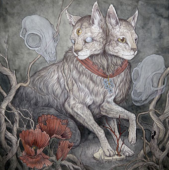
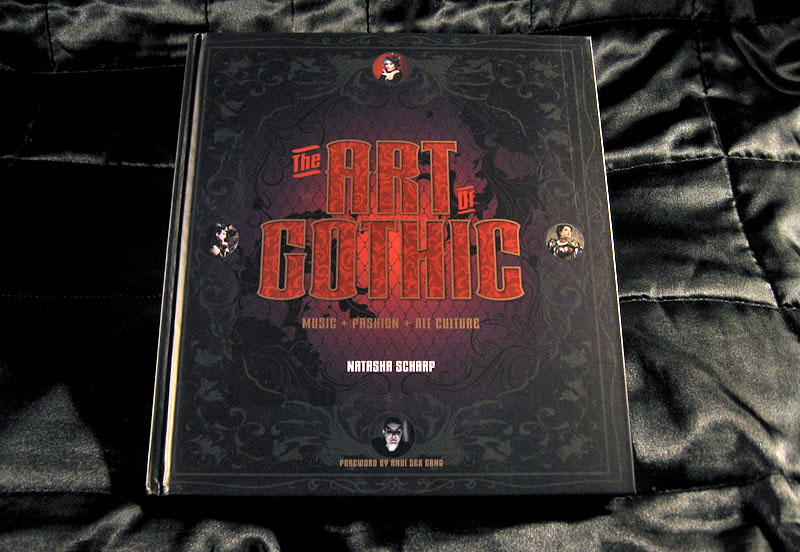
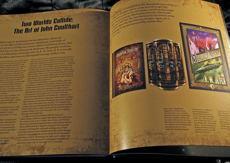
I’ve been fortunate recently to have my work appear in some impressive volumes but this outsize hardback takes some beating. It’s a very lavish production, 224 colour pages on heavy paper with gorgeous design by Paul Palmer-Edwards. Goth has been subject from the outset to mocking stereotypes, to a degree that many people would imagine they know exactly what a study such as this would contain. A recurrent theme of the Louder Than Words discussion was the growth of the goth subculture beyond its clichéd boundaries which is one reason my work is featured in the book. When Natasha was first in touch I thought it might be for the Cradle of Filth album covers but I’m in the chapter that examines the increasingly tangled goth/steampunk crossover. This is one development that’s come to seem almost inevitable given the roots of so much of the goth aesthetic in Victorian nightmares. Many steampunk novels tend towards the dark in their blend of science fiction and horror so the traffic goes in both directions.

goth03.jpg

Elsewhere in the book there are chapters on Futuristic Goth, Japanese Goth, and Cybergoth, all of which maintain the requisite darkness while evolving away from the top hats, lace and veils (the latter are all present and correct elsewhere, of course). It’s a beautiful book, out now in the UK from Omnibus Press, and in the US from Backbeat Books. A few more page samples follow. There’s more at Amazon UK.

• See also: 13 Things That Prove Gothic Art Is Enchanting And Beautiful

goth04.jpg

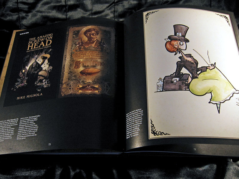
left: The Amazing Screw-On Head by Mike Mignola (2002); centre: the full-colour version of the ever-popular Steampunk Equation (2009), words by Jeff VanderMeer, graphics by John Coulthart; right: Dr Geof’s Medicine Lady, aka Steampunk Pinup #2.

goth05.jpg

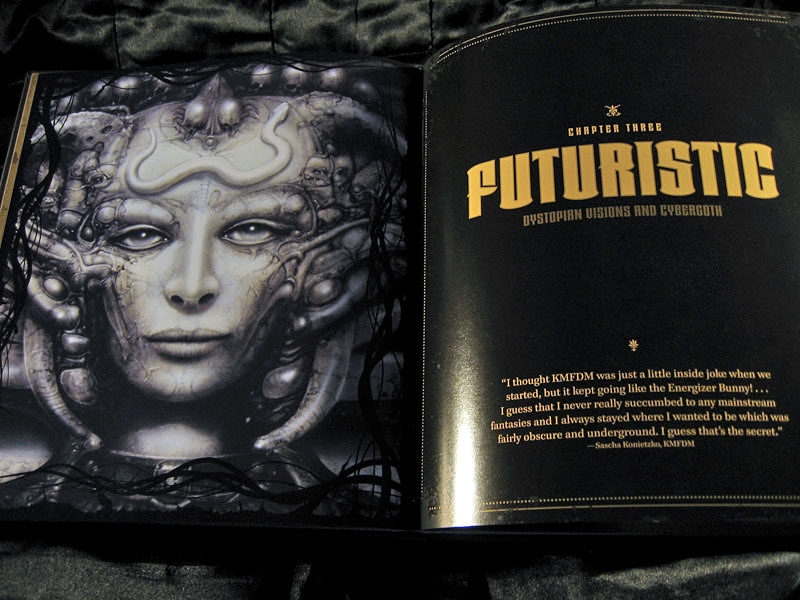
The mighty Giger again. I’ve got a framed print of that picture on the wall, a fact that will surprise nobody.

Continue reading “The Art of Gothic by Natasha Scharf”

Weekend links 232

hackett.jpg

Forget Me Not (no date) by Caitlin Hackett.

• Halloween brings out the articles about weird fiction: “No one would now write of [HP Lovecraft] as the critic Edmund Wilson did, in the New Yorker in 1945: ‘The only real horror in most of these fictions is the horror of bad taste and bad art.’ The true horror was in fact that of judging Lovecraft by the standards of a defunct literary culture,” says John Gray. At The Atlantic there’s Jeff VanderMeer on the uncanny power of weird fiction, while Matt Seidel at The Millions explores the mysteries and attractions of Robert Aickman’s “strange stories”.

The Witching Hour is a video essay by Pam Grossman “examining the many different faces of witches in film”. Pam’s video opens with a scene from Suspiria; over at FACT, Goblin’s Claudio Simonetti talks about the creation of Suspiria‘s peerless soundtrack.

• David Rudkin and Alan Clarke’s uncanny television film, Penda’s Fen, is given a 40th anniversary screening later this month at the Horse Hospital, London. For those who can’t attend (and those who haven’t already read it) there’s my post from 2010.

Nabokov sees each day’s weather as a palette: “The weather this morning was soso: dullish, but warm, a boiled milk sky, with skin – but if you pushed it aside with a teaspoon, the sun was really nice, so I wore my white trousers”. He listens carefully to the sound of the rain, which his letters brilliantly orchestrate. He provides fantastic descriptions of puddles, some of which contain shifts in perspective reminiscent of the nearly cinematic transitions found in the novel he would write shortly afterwards, King, Queen, Knave:

“I looked out of the window and saw: a red-haired housepainter caught a mouse in his wheelbarrow and killed it with the stroke of a brush, then he tossed it in a puddle. The puddle reflected the dark-blue sky, quick black upsilons (reflections of swallows flying high) and the knees of a squatting child, who was attentively studying the little grey round corpse.”

Eric Naiman on Vladimir Nabokov’s Letters to Véra

• Occult rock: Peter Bebergal talks to Expanding Minds about his new book, Season of the Witch: How the Occult Saved Rock and Roll. There’s an hour-long film of Black Sabbath saving rock and roll in Paris, 1970, here.

• Mixes of the week: Burning The Existence, “a three-hour sonic exploration of the outer fringes of Goth”, and a horror soundtrack mix by Death Waltz.

• “‘Capital loathes the old,’ [Gareth] Evans said, ‘for anchoring us in the reality of the lived.'” Iain Sinclair on London’s lost cinemas.

Desirina Boskovich, co-editor of the Steampunk Users Manual, offers “7 Reasons Why Steampunk Is Totally ‘Now'”.

• Penguin has new collage covers by Julian House for The Cut-Up Trilogy by William Burroughs.

Hear a homemade synthesizer turn weather into music.

• Grotesque doodles by William Makepeace Thackeray.

full fathom five is Thom’s new blog.

Weird Dream (1976) by Harmonia 76 | Weird Caravan (1980) by Klaus Schulze | Weird Gear (1991) by Ultramarine

More vapour trails

jeter.jpg

Those covers everyone likes. My designs for KW Jeter’s steampunk novels from Angry Robot and Tor Books.

When I wrote a brief history of steampunk for Eye magazine last year I ended by somewhat provocatively declaring that until something better appeared this was the defining aesthetic of the moment. A year later, the movement (if we can use that term) continues to evolve despite the steady drip of complaints that it’s all reactionary, historically illiterate, and so on. Much of the ire remains nonsensical, and often seems to boil down to a common disdain for people enjoying themselves in some unorthodox manner.

manual.jpg

Design by Galen Smith after the Hetzel editions of Jules Verne’s novels.

If I hadn’t got involved on the art side I would have found it difficult to avoid being attracted by steampunk in one form or another since so much of it originates in areas I was already interested in, not least HG Wells and Victorian science fiction. The rapid evolution of the past few years means we’re currently seeing an aesthetic leaving behind its origins to become an international subculture. What’s striking about this activity—and this is something that doesn’t seem to have been discussed very much—is the way the whole thing has been birthed by genre fiction rather than by pop music, as was the case for the second half of the 20th century. This piece is meant to be a news post, however, not another cultural critique, but if I happen to write any more on the subject there’s something there that’s worth exploring.

manual2.jpg

As to the news: this month finds my steampunk artwork manifesting in three very different locations in one of those odd coincidences of timing that occur now and then. First up there’s the Steampunk User’s Manual edited by Jeff VanderMeer & Desirina Boskovich, a follow-up to 2011’s Steampunk Bible. For the new volume I designed spreads for three entries by Jess Nevins from The Encyclopedia of Fantastic Victoriana: Alternative History Edition.

Continue reading “More vapour trails”

World Fantasy Awards

infernal.jpg

Presenting some of the cover art and interior illustration from 2011 which won me the World Fantasy Award for best artist in Toronto on Sunday. (The complete awards list is here.) It was a surprise to be nominated, and even more of a surprise to win since working in different areas—book, music, comics—is never a good way to get noticed for doing one particular thing. It’s also the case that sf/fantasy art awards tend to favour painters or virtuoso digital artists over people such as myself who I suppose are more illustrator-designers; that’s not a criticism, just an acknowledgement of the strength and popularity of highly-refined pictorial art in this area of the literary world. The recognition hazard works in the opposite direction: the design world often gives the most attention to graphic design alone, with the illustration quotient being regarded as secondary content.

I’m not exactly sure what the judges were looking at of my work so these examples have been chosen for being published during the year under examination. They’re also covers that people seemed to like a lot, especially KW Jeter‘s Morlock Night (even though I still prefer Infernal Devices!), and those for Mike Shevdon‘s books. The Jeter and Shevdon volumes are all published by Angry Robot who will also be publishing Lavie Tidhar‘s The Bookman Histories early next year sporting another of my covers. Lavie’s novel Osama won best novel in Toronto while Ann and Jeff VanderMeer (editors of the Lambshead book below) picked up a best anthology award for their monumental The Weird. And to add to the good company, my regular publishers Tachyon saw one of their authors, Tim Powers, gaining best story collection. Congratulations to everyone, and a big thanks to Ann for collecting my award.

I’m always using these posts to point to other artists so it’s only right that I encourage everyone to go and look at the work of the other nominees. Here they are (although Jon Foster’s site appears down at the moment):

Julie Dillon
Jon Foster
Kathleen Jennings
John Picacio

John Picacio has a rather gorgeous calendar due out soon, details here.

morlock.jpg

lambshead.jpg

Title page for The Thackery T. Lambshead Cabinet of Curiosities edited by Ann & Jeff VanderMeer (Harper Voyager).

shevdon1.jpg

Continue reading “World Fantasy Awards”

Steampunk Revolution

srev01.jpg

The “S” word again. One of the jobs from earlier this year is now available for purchase from publishers Tachyon and other outlets. Steampunk Revolution is the third in a series of steampunk story collections edited by Ann VanderMeer (Jeff VanderMeer was co-editor on the first two volumes). I designed the previous title, Steampunk Reloaded, and was working on these pages whilst also putting together the cover for Lavie Tidhar’s The Bookman Histories. Tidhar’s trilogy is a steampunk affair (and this collection features one of his Bookman stories) so there’s some slight overlap between the two designs, notably the use of a typographic “charm” I took from a Victorian printer’s catalogue. I’ve since seen that shape used elsewhere so it’s evidently more common than I thought. Bah.

The title page design above can be added to my ongoing obsession with the Exposition Universelle of 1900. Malissa Kent’s story, The Heart is the Matter, ends with a scene at the Exposition so I had an excuse to use an elaborate banner which includes an Exposition medal. (The same medal, incidentally, that you still see on the labels of Campbell’s Soup). The illustration below is adapted from one of Walter Crane’s Socialist drawings, and I feel bad now that we didn’t credit him for it. Sorry, Walter.

srev05.jpg

srev03.jpg

srev04.jpg

Continue reading “Steampunk Revolution”