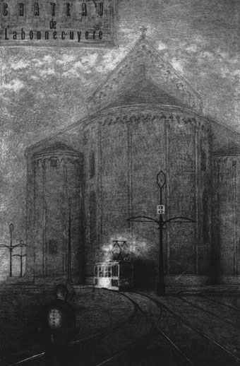
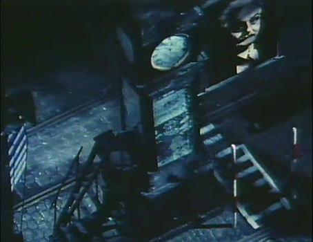
Chateau de Labonnecuyere (c. 1970s) by The Brothers Quay.
Trams are a recurrent feature in the early drawings of the Brothers Quay, and they’ve also appeared in the Quays’ earliest animated films and in some of their designs for the stage. I respond to this fetishisation on the deepest level having been born and raised on the Fylde coast of Lancashire, an area which was for many years the only place in Britain that kept its tramways after the rest of the country had given over the streets to buses and cars. Trams are so ingrained in my consciousness that I still dream about the trams of my childhood, many of which were rattling, streamlined things dating back to the 1930s. Manchester was tramless when I arrived in the city in 1982 but a few years later the council embarked on an ambitious and far-sighted scheme to return trams to the city’s streets. The first routes opened in 1991, and the network has been evolving ever since, pushing out of the centre along disused rail lines.
La Rue du Tramway (1938–1939) by Paul Delvaux.
The Quays aren’t alone in being attracted to this form of public transport. Trams haunt a certain type of oneiric European imagination, and I often wonder where the attraction lies. I think it’s something to do with their small scale and the way they remain bounded within the cities they serve. Trains have a romance and mythology of their own but are wide-ranging and far more common, as are buses whose presence on a city street is a reminder that the tram can be replaced. The Quays are Europhiles so they no doubt see the trams of the Continent as another feature of European city life that’s more arresting to American eyes. This post gathers some of the Quays’ uses together with other notable (and favourite) examples.
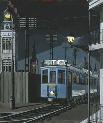
Tram nocturne (1950) by Paul Delvaux.
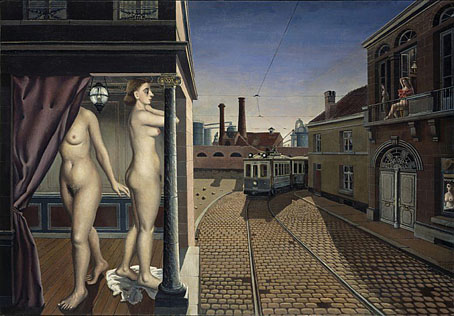
Several of the examples listed here are Belgian which either means that trams exercise the Belgian imagination more than that of other nations, or I happen to pay more attention to Belgian art. (Probably a little of both.) Paul Delvaux put trams into several paintings but seems to have been the only Surrealist to do so.
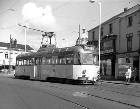
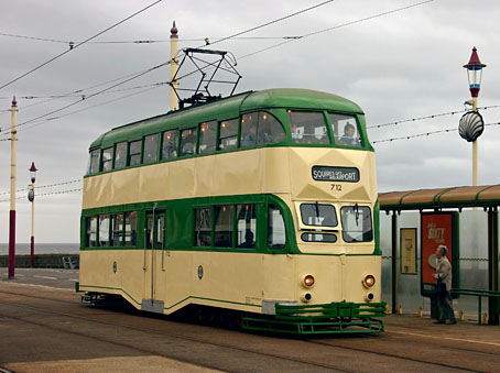
The trams that haunt my imagination are the cream-and-green vehicles that trundled for decades up and down the Fylde coast between Blackpool and Fleetwood. These machines used to run along the line at the end of the street I grew up in so there’s never been a day I can remember when I wasn’t aware of the tram—and of these vehicles in particular—as a viable mode of public transport. Looking at the websites of tram enthusiasts reveals the different names for each generation of Blackpool trams; so I now know that the bow-ended ones (which I always liked) are known as Brush Railcoaches, while the double-deckers are known as Balloons. None of these names were ever used by locals.
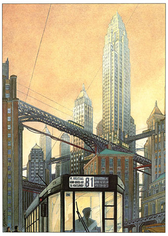
Back to Belgium, and the comics and illustrations drawn by the marvellous François Schuiten are filled with trams. I’ve written at length about the Obscure World mythos of Schuiten and Peeters so rather than repeat myself I’ll point to the mystery of Tram 81, a recurrent and unexplained presence in Schuiten’s work.
Nocturna Artificiala.
Nocturna Artificiala.
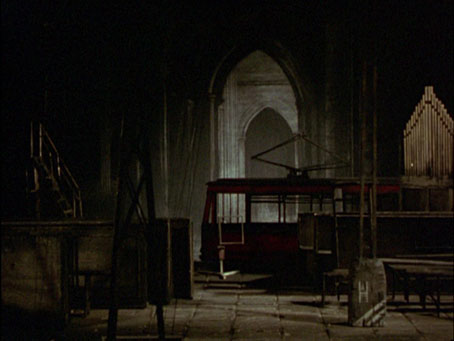
Trams for the Brothers Quay are the small European variety rather than the streetcars seen in some American cities. One of the brothers’ Black Drawings, Chateau de Labonnecuyere, features a pantographed vehicle that glides through their later animated films. The first of these, Nocturna Artificiala (1979), is a wordless masque involving the yearning relationship between the solitary puppet character and an empty, nocturnal tram. The film is an animated extension of Chateau de Labonnecuyere which not only features the drawing itself but also includes a unique moment where the tram glides through the vast cathedral seen in the background.
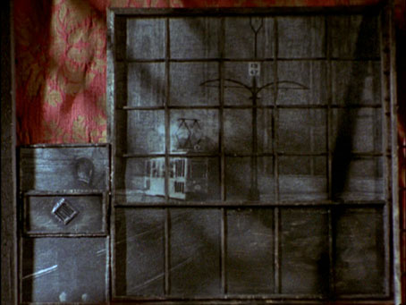
Leos Janacek: Intimate Excursions.
Leos Janacek: Intimate Excursions.
The power-line supports seen in Chateau de Labonnecuyere are a recurrent motif in the Quays’ works. They appear together with the Nocturna Artificiala tram in Leos Janacek: Intimate Excursions (1983), and may be glimpsed among the faded detritus in Street of Crocodiles (1986).
Avalon.
Avalon.
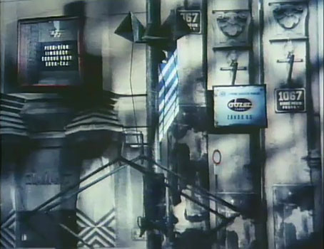
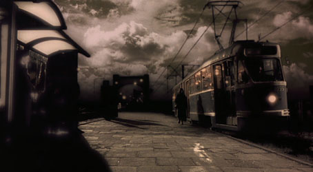
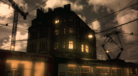
I don’t know what the Quays would make of the science-fiction scenario of Mamoru Oshii’s Avalon (2001) but the recurrent scenes of a nocturnal tram journey would probably appeal, especially since the tram in question is a Polish one. Mamoru Oshii is the director of many SF-oriented animations, not least The Ghost in the Shell (1995). Avalon was a surprise when it appeared (and then seemed to vanish all-too-quickly): a live-action drama concerning the players of a virtual reality game which can have lethal consequences for the contestants. The film was made in Poland with a Polish cast, and the scenes are heavily processed throughout, with everything given a sepia wash. Coming after The Matrix, Dark City et al, the virtual reality aspect wasn’t so much of a surprise but I loved the juxtaposition of a futuristic story in a run-down European setting. And the trams, of course. The dream-like atmosphere of the film’s mundane scenes brings everything back to Delvaux and his tram nocturnes.
I was going to add Tramway (1966) to this list, a short student film directed by Krzysztof Kieslowski, but it’s not especially mysterious. It’s worth a look if you like Kieslowski, however, and may be watched here. If anyone has suggestions for other mysterious trams then please leave a comment.
Elsewhere on { feuilleton }
• The Quay Brothers archive
Previously on { feuilleton }
• Paul Delvaux: The Sleepwalker of Saint-Idesbald