Weird ekphrasis and the Dunwich horrors

dunwich1.jpg

The Seal of Yog-Sothoth, or Old Whateley’s conception of the same. A detail from the delightful kitchen autopsy scene which you’ll find below.

My thanks to Tentaclii for bringing the following to my attention in the most recent HPLinks post. The Actual Anatomy of the Terrible: Gou Tanabe, Weird Ekphrasis, and the History of Lovecraft in Comics is a lengthy academic essay by Timothy Murphy which I doubt I would have seen otherwise. Since Lovecraftian comics is the subject, a combination of vanity and curiosity made me click the link to see whether any of my own work rated a mention. I was surprised to find much more than this, with Murphy discussing and contextualising my adaptations of The Haunter of the Dark and The Call of Cthulhu. The bulk of his essay concerns the series of doorstop adaptations that Gou Tanabe has been producing for the past decade (most of which I’ve only seen as extracts), but Murphy’s knowledge of both Lovecraft’s fiction and comics history is very thorough. Particular attention is paid to Alberto Breccia’s pioneering adaptations of the 1970s; Breccia’s version of The Dunwich Horror was the story that impressed me the most when it appeared in the Heavy Metal Lovecraft special in October 1979. Seeing someone approach Lovecraft’s fiction in a sober, realistic manner was a welcome riposte to the jokey EC formula, and very much in my mind when I decided to start adapting Lovecraft myself seven years later.

books-big.jpg

Previous hauntings: Caermaen Books (1988), Oneiros (1999), Creation Oneiros (2006).

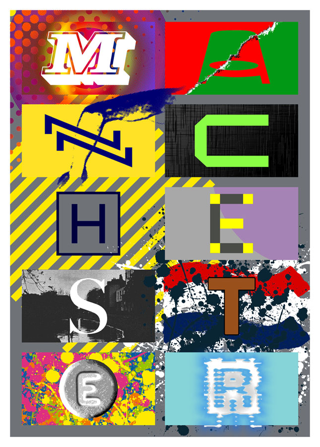
The biggest surprise in Murphy’s essay (and the reason for my writing all of this) was the end of his appraisal when he says “Lovecraft devotees may regret Coulthart’s abandonment of further adaptations…”, referring to my own version of The Dunwich Horror which stalled in late 1989 when I was asked to start working on the Lord Horror comics series from Savoy Books. A few Dunwich pages and panels were included in my Haunter of the Dark book, most of them in collage form, but the bulk of the story has never been made public. In one of those striking coincidences that often occur when you’ve embarked on a new project, I happened to have resumed work on The Dunwich Horror only a week ago, 36 years after leaving page no. 25 in its pencilled form. A few weeks prior to this I’d been scanning all of my Lovecraft comic art for the new edition of the Haunter of the Dark that I’ve been preparing since January. I’ve already mentioned reworking some of the illustrations from the first edition of the book but this process has scaled up considerably in the past two months. I’d been a little mortified to find that the artwork scans I used for the slightly upgraded edition in 2006 were the same ones I made in 1999 using a desktop scanner that wasn’t as good as those I’ve had since. Sorting through all the artwork again reminded me that my adaptation of The Dunwich Horror had been abandoned very near the end, with only the last two parts of the ten-part story left unfinished. This in turn prompted me to seriously consider finishing the story at last, an idea I’d always dismissed as being difficult if not impossible. My work on the Lord Horror comics in the 1990s led to a change in my penmanship and working methods which meant abandoning the very fine (0.2 mm) Rotring Variant pen that I’d used for drawing all the Lovecraft comics. I still have all my old Rotring pens; what I no longer have is the desire to spend months covering sheets of A3-size paper with lines like those made by an etching needle.

Continue reading “Weird ekphrasis and the Dunwich horrors”

Weekend links 775

kokoschka.jpg

The Bride of the Wind (1914) by Oskar Kokoschka.

• Among the new titles at Standard Ebooks, the home of free, high-quality, public-domain texts: Fantômas, by Pierre Souvestre and Marcel Allain (translated by Cranstoun Metcalfe).

• This week’s Bumper Book of Magic news: the Brazilian edition of the book, titled A Lua e a Serpente: Almanaque de Magia, will be published in June. It’s available for pre-order here.

• “The basis of compilations as far as I’m concerned is, ‘I like this stuff, you may like it too.’” Jon Savage on the art of the compilation album.

• At Public Domain Review: The strange story of Oskar Kokoschka, Hermine Moos, and the Alma Mahler Doll.

• At the Daily Heller: Psychedelics, Day-Glo, Hallmark and The Peculiar Manicule.

Brion Gysin’s Dreamachine, a new version for sale from Important Records.

• The Strange World of…Michael Chapman.

• At Dennis Cooper’s: Boris Karloff Day.

• RIP David Thomas of Pere Ubu.

Dream Machine (1968) by Les Sauterelles | Dream Machine (1980) by The Androids | Dream Machine (1981) by Phantom Band

Weekend links 774

jakuchu.jpg

Fish and Octopus (Colourful Realm of Living Beings) (circa 1765) by Ito Jakuchu.

• At Aeon: “Could extraterrestrial technology be lurking in our backyard—on the Moon, Mars or in the asteroid belt? We think it’s worth a look.” Ravi Kopparapu and Jacob Haqq Misra explain.

• At Smithsonian magazine: The first confirmed footage of the Colossal Squid. Only a baby one, however, so not very colossal.

• The eighth installment of Smoky Man’s exploration of The Bumper Book of Magic has been posted (in Italian) at (quasi).

Less than six months later, Lindsay signed an executive order that effectively turned the city into a movie set. The new Mayor’s Office of Film, Theatre, and Broadcasting was designed to cut through existing red tape and facilitate location filming. Script approval was centralized in a single agency. A production now needed but a single permit to shoot on the streets; a specific police unit would remain with the filmmakers as they moved from location to location. Thus, Lindsay created the necessary conditions for the tough cop films, bleak social comedies, and gritty urban fables that captured the feel of New York in the late sixties and early seventies—the cinema of Fun City.

J. Hoberman explores New York City’s popularity as a film location

• Mixes of the week: A mix for The Wire by John King; and DreamScenes – April 2025 at Ambientblog.

• At Colossal: Water droplets cling to fluorescent plant spines in Tom Leighton’s alluring photos.

• At the BFI: Alex Barrett on Carl Theodor Dreyer’s unmade film about Jesus.

• Anne Billson ranks 20 films starring Julie Christie.

Voyage To The Bottom Of The Sea (1964) by Paul Sawtell | Das Boot (1981) by Klaus Doldinger | Ambient Block (Sequenchill/Mission Control #2/Lost In The Sea) (1993) by Sequential

Weekend links 772

barbarella.jpg

Barbarella (1968) by Robert McGinnis. Not one of his best (see below) but the film is a cult item round here.

• At the Bureau of Lost Culture: Alan Moore on Magic, a recording of the three-way talk between Alan Moore, Gary Lachman and myself for last year’s launch of the Moon and Serpent Bumper Book of Magic.

• At Colossal: “Daniel Martin Diaz encodes cosmic questions into geometric paintings and prints.” And is heavily influenced by Paul Laffoley by the looks of things.

• RIP Robert McGinnis, illustrator and poster artist. Related: The Artwork Of Robert McGinnis, Part 1 | The Artwork Of Robert McGinnis, Part 2.

• At Public Domain Review: “The Form of a Demon and the Heart of a Person”: Kitagawa Utamaro’s Prints of Yamauba and Kintaro (ca. 1800).

• Coming soon from Ten Acre Films: The Quatermass Experiment: The Making of TV’s First Sci-Fi Classic by Toby Hadoke.

• New music: Lost Communications by An-Ting; UPIC Diffusion Session #23 by Haswell & Hecker.

Anti-Gravity Holiday Every Month by Robert Beatty.

Barbarella (Extended Main Title) (1968) by Bob Crewe And The Glitterhouse | Barbarella (1991) by The 69 Eyes | My Name Is Barbarella (1992) by Barbarella

M-A-N-C-H-E-S-T-E-R

manchester.jpg

Presenting a new item for sale at Redbubble. I was intending to upload this quickly then get on with other things, but after examining the artwork it became apparent that the piece would benefit from an overhaul in order to make something that worked well at poster size. The original design dates from 2004 when I was asked by friends at the Manchester District Music Archive to contribute to a limited run of postcards they were putting together based on Manchester’s music history. Since I was working for postcard size I didn’t finesse the artwork as much as I would have done had I been working for a larger printing. What you see here is a replication of the original design at a much larger size, with a couple of details adjusted and a more substantial change in the substitution of the black-and-white photo (see below).

The original postcard set appeared two years before I began writing these posts so I’ve never had the chance to compile a list of all the references. Some of these will be familiar to Mancunians (and many Britons) of a certain age but I was trying to be allusive rather than obvious while also following three simple rules:
1) Ten panels, each one of which contains a different letter of the city’s name in a different typeface.
2) Each panel referring to a different musical trend, a notable group or venue.
3) The whole design to proceed chronologically, from the 1960s to the present day.


M.jpg

The music: Psychedelia.
The type design: Decorated 035.

The first two letters are rather vague attributions since the city didn’t have much of a national musical profile until the late 1970s. Popular Manchester groups of the 1960s included The Hollies, Herman’s Hermits, and The Mind Benders but there wasn’t a discernible Manchester scene the way there was with post-Beatles Liverpool. So “M” stands for the psychedelic era in general, while Decorated 035 is one of the typical mid-century sign fonts that you would have seen around the city.


A.jpg

The venue/music: The Apollo Theatre/Punk.
The type design: Jackson.

“A” is for the Apollo Theatre in Ardwick Green, the city’s most prominent music venue in the 1970s, although I doubt that anyone would guess the attribution. The Art Deco building is a good venue but here’s never been anything distinctive about its signage, hence the choice of Jackson, another very decade-specific font which has conveniently wide letterforms. The rip refers to torn posters and punk graphics while the opposed green/red colour scheme is borrowed from one of the Virgin label designs of the late 70s, something that might also be taken as a very tenuous reference to the Virgin Megastore in Market Street.


N.jpg

The music: Buzzcocks.
The type design: A pair of Zs from the cover of Orgasm Addict.

The first Buzzcocks single featured a striking sleeve by Malcolm Garrett (design) and Linder (collage) which provide the graphics here, with the “N” being formed by two letters from the band’s name which was printed vertically on the cover.


C.jpg

The music: Joy Division.
The type design: A letter from the cover of Substance.

Substance
, the first Joy Division compilation, was released in 1988 so this is a little anachronistic but Brett Wickens’ letter is a more recognisable detail than one from the cover of Closer. The textured sleeve of the group’s debut album, Unknown Pleasures, is referred to by the panel background.

Continue reading “M-A-N-C-H-E-S-T-E-R”