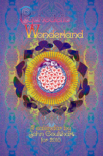
New things for April II

coc.jpg

Another work-related update. This HP Lovecraft collection is published by Barnes & Noble next month and features my colour rendering of the rising monstrosity on its cover. Nice to have something decorating an actual Lovecraft book, the second time this has happened (first time was for a French volume). B&N also sell my own book, of course (with, er…the same cover pic).

And another shout-out, for a preview of Arik Roper‘s new book, Mushroom Magick: A Visionary Field Guide, at Abrams. Read an extract from Erik Davis’s introduction here.

Via Further.

Previously on { feuilleton }
The art of Arik Roper

Taking Woodstock

taking_woodstock.jpg

I mentioned Ang Lee’s forthcoming film, Taking Woodstock, last week and this poster by Mojo makes a decent fist of capturing some of the West Coast psychedelic style. I thought at first that the rainbow hues were garish in the wrong way, the San Francisco poster artists used bold colours but limited their palette since many of them were working for screenprinting. But since this film concerns the story of a gay man, Elliot Tiber, and his attempt to provide a home for the Woodstock festival in 1969—and since the rainbow flag is now a gay symbol—it makes sense even if the overall impression is of colour clash. I like the subtle touch of making the poster look worn, something I’ve done myself on a recent book cover design which is also styled as a cinema poster. I’ll be posting that here in due course.

woodstock.jpg

That’s the film promotion; the posters for the original event can be seen at Woodstock posters. The pencil sketch on the left is an elaborate Art Nouveau-styled design intended for the festival before the original choice of venue was refused. The sheet in the centre looks like a hasty promo piece for the new venue while the poster on the right is the final version with the famous dove graphic by Arnold Skolnick. That dove came to symbolise the whole event, hence its appearance on the Taking Woodstock one-sheet.

Taking Woodstock opens in the US on August 15th, 2009, the 40th anniversary of the festival.

Previously on { feuilleton }
Over the rainbow
Dutch psychedelia
Family Dog postcards

Psychedelic vehicles

further.jpg

Further: the second version of Ken Kesey’s Merry Prankster bus.

The word psychedelic, like surreal before it, slipped from its original meaning through appropriation. Humphrey Osmond’s neologism was first coined in drug-related correspondence with Aldous Huxley in 1957 and was specifically intended to describe the “mind-manifesting” quality of the hallucinogenic drug experience. The drug-inspired art and music which came after the experiments of the Fifties quickly assumed a gaudy and chaotic aspect derived from the intense visual abstractions of LSD trips. Huxley in The Doors of Perception (1954) rejected these fractal visions as trivial and distracting—he was more concerned with the deeper spiritual revelations—but a new way of seeing in a new era required a new label. Art and design which is vivid, florid, multi-hued and quite often incoherent is where the term psychedelic is most commonly applied today.

Of the three vehicles here, only Ken Kesey’s bus can be regarded as psychedelic in Osmond’s sense, this being the renovated school bus which travelled the United States in the mid-Sixties dispensing free LSD to those it met along the way. These events were recounted in Tom Wolfe’s The Electric Kool-Aid Acid Test (1968) and the creators of last year’s Milk, Gus Van Sant and Dustin Lance Black, have a film in preparation based on Wolfe’s book. Milk was a film about gay rights campaigner Harvey Milk, and Ang Lee (director of Brokeback Mountain) has a new film of his own due shortly, Taking Woodstock, which concerns Elliot Tiber, the gay organizer of the Woodstock Festival of 1969. Both stories bracket the psychedelic era. Is this coincidence or do I detect something in the air? But I digress….

porsche.jpg

For the chaotic and decorative nature of the psychedelic style, look no further (so to speak) than Janis Joplin’s 1965 Porsche. I saw this in 2005 at Tate Liverpool when it was touring with the Summer of Love exhibition of psychedelic art. One of  Joplin’s very last recordings before her death in 1970 was a birthday song for John Lennon so it’s perhaps fitting that the third vehicle here is Lennon’s lavish Rolls-Royce. His 1965 limousine came originally in black livery but two years later he decided he wanted it painted like a gypsy caravan. There’s a great page about the car here including details of its decoration, created in consultation with Marijke Koger of Dutch design group The Fool.

rolls.jpg

In a small way these three vehicles encapsulate the psychedelic period, from optimistic, proselytising origins following the revelations of hallucinogenic drugs to decline into a mannered, highly-commercialised graphic style. Ken Kesey died in 2001 but his second bus is still active while the cars are now museum pieces. Perhaps the real psychedelic spirit prevails after all.

See also: George Harrison’s Mini Cooper

Previously on { feuilleton }
Dutch psychedelia
The art of LSD

The Strawberry Alarm Clock

strawberry.jpg

I’m on a total psychedelia groove at the moment—again—so expect more posts like this. The iTunes playlist is stuck in 1965–69 and doesn’t exclude moments of kitsch psych such as Incense and Peppermints by the Strawberry Alarm Clock, their debut single and a big hit from 1967. Thoroughly infectious and redolent enough of the era to feature in the first Austin Powers film, nothing else they produced came close. There were other soundtrack moments, a track called Pretty Song was featured in Psych-Out (1968) and the band themselves appear in Beyond the Valley of the Dolls (1970), one of many reasons to watch that lunatic movie. I always liked this sleeve design—printed in a number of variations—but even that pales next to their surfboard-shaped guitars, created specially for the band. Read more about them here.

strawberry2.jpg

Elsewhere on { feuilleton }
The album covers archive

Previously on { feuilleton }
Exotica!
The art of Bob Pepper
A splendid time is guaranteed for all
Heinz Edelmann
The L.S. Bumble Bee

Fred Tomaselli at White Cube

tomaselli.jpg

left: Summer Swell (2007); right: Big Raven (2008).

I like Fred Tomaselli’s hyper-detailed psychotropic paintings a great deal. Londoners can see an exhibition of new work at the Mason’s Yard branch of White Cube until 16 May, 2009.

Tomaselli’s new work is a departure from his earlier, more direct use of pills, hemp leaves or ornithological references. The birds are painted with greater freedom, with each flame-like brushstroke animating the feathers as if an aura were radiating from the wild creature. Big Raven is inspired by the American Gothic tradition and the poetry of Edgar Allan Poe, while Detail, with its dramatisation of the relationship between predator and prey, is a timely homage to Darwin’s Origin of the Species. The single, hypnotic gaze of Eye celebrates Tomaselli’s understanding of visual reciprocity – as if the bird were returning the artist’s affectionate stare. This reoccurs in the galaxies of multiple eyes found in his photograms, or monstrous apparitions created in direct response to front-page articles from the New York Times, through to the talismanic eye that emerges from the sea in Summer Swell, as if it were drowning in its own visual abundance.

Previously on { feuilleton }
The art of Fred Tomaselli