Weekend links 69

evans.jpg

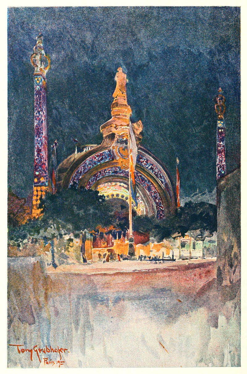
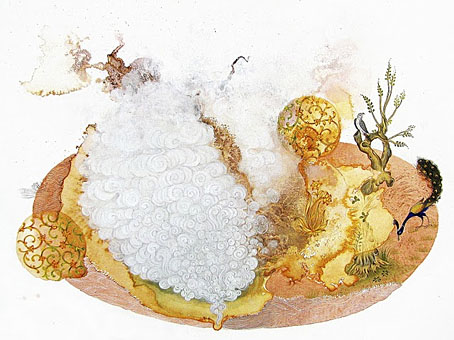
Peacock Apocalypse (detail) by Julie Evans in collaboration with Ajay Sharma.

Here at { feuilleton }, home of the curly bracket affectation, your correspondent is still surprised to find his postings the subject of a critique by Rick Poynor in the latest edition of Eye magazine, the international review of graphic design. I haven’t seen a print copy yet but you can read Mr Poynor’s appraisal here. Meanwhile, over at Design Observer this week there’s another Poynor piece about the collage illustrations of Andrzej Klimowski.

Alan Moore (yes, him again) discusses the moment when the League of Extraordinary Gentlemen gets all swinging and psychedelic. And Iain Sinclair (yes, him again) is still doing the interview rounds promoting his current book, Ghost Milk.

Ayin Acla, a short film by Anna Thew with a soundtrack by Cyclobe. The most recent Cyclobe album, Wounded Galaxies Tap at the Window, was previously vinyl-only but is now available on CD.

• Bones and beads and other things in Wren Britton’s Pure Vile clothing and accessories. Related: Patrick Veillet’s wearable bone sculptures.

Lambshead Cabinet of Curiosities Q&A: Ann & Jeff VanderMeer answer questions about their latest anthology at Fangoria.

• Being a lifelong introvert, I’m sympathetic to Four Ways Technology Can Enable Your Inner Introvert by Philip Bump.

• In an all-too-rare meeting of minds and talents, Roy Harper talks to Joanna Newsom.

Jon Macy’s Teleny and Camille is reviewed at Lambda Literary.

• Author Carol Birch tells us how best to read Finnegans Wake.

Joel Pirela’s Design Classics posters.

Each And Every Word Must Die (1999) by Cyclobe | Brightness Falls From The Air (2001) by Cyclobe | Indulge Yourselves With Our Delicious Monster (2006) by Cyclobe

Tony Grubhofer’s Exposition Universelle sketches

grubhofer01.jpg

The Exposition gateway.

In a blizzard of work this month I finished another project with a Victorian theme (not more Steampunk!) which I won’t reveal just yet as I dislike spoiling the surprise for publishers. Part of the preparation involved yet more trawling through scanned volumes at the Internet Archive, looking this time at British art magazines from the 1890s. As with the German magazines of the period, some of these are more interesting than others: The Magazine of Art, for example, has its moments but for the most part it’s a champion of the stodgily dull, conservative fare which no one would ever want to revive today. Their columnists also hated the Decadents; I found a wonderful rant against Aubrey Beardsley’s art from 1897 which suggested that the artist and others like him ought to stop poisoning the soul of the nation and emigrate to France. Poor Aubrey only had a year to live, and, as things turned out, ending up dying in that iniquitous nation. I think it’s fair to say he’s had the last laugh.

grubhofer02.jpg

The Chateau Tyrolien.

The Studio magazine, on the other hand, was very sympathetic to the Decadents and Symbolists in general, and to Beardsley in particular, who had his work featured in the first number of the magazine in 1893. The drawings in this post are a surprise find in one of the numbers for 1900, and concern that locus of everything The Magazine of Art loathed: Paris! We’re back again at the Exposition Universelle, a subject which has been explored here on so many occasions I’m surprised I keep finding anything new that’s worthy of mention.

Tony Grubhofer (1854–1935) was apparently an Austrian artist who in these drawings manages to crop his views so selectively that many of them don’t look like they’re part of an exposition in one of the world’s capital cities. Of interest for me are his watercolour of René Binet’s monumental gate, which gives an idea of how the structure would have looked at night illuminated by the novelty of electric light, and his view of Eliel Saarinen’s Finnish pavilion which he renders as though it was a provincial church. This was Saarinen’s first major commission (he was 27 at the time), and Philippe Jullian in his book about the exposition declares this design to have been the most interesting and successful of all the national pavilions that year. It’s certainly better than Edwin Lutyens’ pastiche of an Elizabethan manor for the British pavilion. Eliel Saarinen had a very successful career, as did his more well-known son, Eero Saarinen, one of the major architects of the 20th century.

Volumes 20 to 22 of The Studio can be downloaded here.

grubhofer03.jpg

The Finnish Pavilion.

Continue reading “Tony Grubhofer’s Exposition Universelle sketches”

The angels in their anguish

chj4.jpg

Equus (2009).

As an addendum to the earlier post about the Clive Hicks-Jenkins retrospective currently running at the National Library of Wales, Aberystwyth, here’s a brief look at the artist’s monograph which turned up in the post this week. Having seen much of this work only in Clive’s blog posts (many of which were day-to-day recordings of work in progress) it’s a real pleasure to see them at larger size in high-quality print. In addition to familiar works there are many sketches and smaller pieces interleaved with the text, and unlike many monographs this isn’t the work of a single author but features appreciations from Simon Callow, Damian Walford Davies, Andrew Green, Rex Harley, Kathe Koja, Anita Mills, Montserrat Prat, Jacqueline Thalmann and Marly Youmans, as well as notes and comments by the artist.

chj5.jpg

Battle Ground (2007).

Andrew Wakelin has done a great job with the book’s design, the use of Gill Sans throughout feels just right. As mentioned before, the publisher is Lund Humphries, and they have a discount for orders made through their website. A few more page samples follow.

Continue reading “The angels in their anguish”

The art of Johfra Bosschart, 1919–1998

johfra1.jpg

The Adoration of Pan triptych (1979).

The hyper-detailed paintings of this Dutch artist, who often seems to be referred to by his forename alone, were self-described as “Surrealism based on studies of psychology, religion, the Bible, astrology, antiquity, magic, witchcraft, mythology and occultism”. All bases are covered, in other words, and the work is certainly furious and intense at its best even if it’s not always to my taste. Some of Johfra’s Monsters from the Id are closer to Basil Wolverton than HR Giger which makes for unintentional comedy. As usual with detailed artwork, it’s a shame the reproductions on offer aren’t a larger size.

johfra2.jpg

Moldoror series: The Hermaphrodite (1976).

The pictures here are from one of the online numbers of Visionary Review which a biography and several galleries of work from different periods of Johfra’s career. Thanks to Thom for the reminder about this artist.

Elsewhere on { feuilleton }
The fantastic art archive

John Dee’s Monas Hieroglyphica

monas1.jpg

I swear I didn’t go hunting for this. Among the various library collections at the Internet Archive one can find The Getty Alchemy Collection, a substantial gathering of very old alchemical texts scanned in a variety of formats. John Dee’s Monas Hieroglyphica caught my eye during a random search, a third edition of his treatise from 1564 in which he describes his Monas Hieroglyphica, a glyph designed to combine symbols of the Sun, the Moon, the Elements and Fire in a single figure.

monas2.jpg

The glyph also intentionally resembles a human form, and Dee relates its individual parts to various astrological and chemical symbols. I’ve mentioned before that Dee scholar Derek Jarman deliberately based Prospero on John Dee in his 1979 film of The Tempest, giving the magus a scrying wand shaped to resemble the Monas Hieroglyphica.

monas3.jpg

I produced my own variations on the glyph in 2009 when working on the cover of Jeff VanderMeer’s novel, Finch. The symbol recurs in Jeff’s fictional city of Ambergris and I seem to recall there being some discussion about including this doorway design somewhere in the book. In the end it was incorporated into the cover design in a rather subtle fashion. I think this is the first time the design alone has appeared in public.

The Internet Archive has a few other Dee-related items, including Lists of manuscripts formerly owned by Dr. John Dee; with preface and identifications (1921), a 500-page book by antiquarian and ghost story writer MR James.

Previously on { feuilleton }
Mister Jarman, Mister Moore and Doctor Dee
Alchemically Yours
Laurie Lipton’s Splendor Solis
The Arms of the Art
Splendor Solis
Amphitheatrum Sapientiae Aeternae
The Tempest illustrated
Cabala, Speculum Artis Et Naturae In Alchymia
Digital alchemy
Designs on Doctor Dee