International Times archive

itcover.jpg

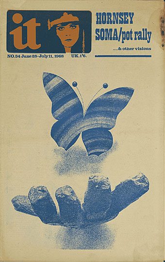
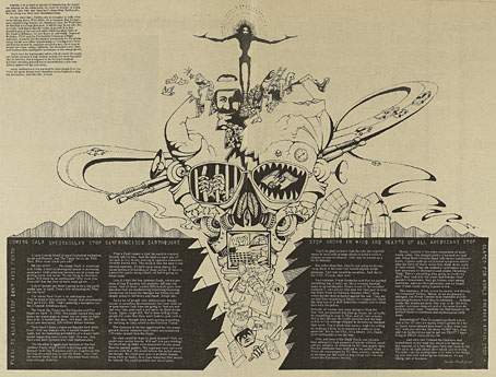
The entire run of Britain’s first underground/alternative newspaper. Incredible. IT was never as flashy as Oz but ran for longer and arguably had the better contributors, among them William Burroughs. One notable feature was an avant garde comic strip, The Adventures of Jerry Cornelius, written by Michael Moorcock and M John Harrison with artwork by Mal Dean and Richard Glyn Jones. Heavyweight contributions to magazines tend to get reprinted, however, what I enjoy seeing in archives such as this is the ephemera which can’t be found elsewhere: adverts, reviews and illustrations like the one below. The site is a bit slow and it would have been good to have individual issues as PDFs but it feels churlish to complain. More archives like this, please.

Via Jahsonic.

it.jpg

Illustration by Stanley Mouse (1969).

Previously on { feuilleton }
The Realist
Revenant volumes: Bob Haberfield, New Worlds and others
Oz magazine, 1967-73

Jaipur Observatory panoramas

jaipur1.jpg

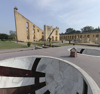
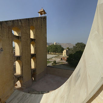
A shame I didn’t discover these 360º views of the Jaipur Observatory in January when I posted a series of panoramas from different cities. The structures at Jaipur are one of five extraordinary astronomical observatories built by the Maharajah Jai Singh II in the 18th century. Would be nice to see VR photos of the other sites at higher quality but for now there’s some spherical views of the Delhi Observatory which turn it into a futuristic skateboard park. And there’s also the Garden of Instruments.

jaipur2.jpg

Elsewhere on { feuilleton }
The panoramas archive

Previously on { feuilleton }
Carlo Scarpa’s Brion-Vega Cemetery
The Jantar Mantar

The art of Elihu Vedder, 1836–1923

vedder1.jpg

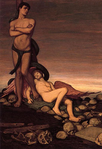
The Last Man (1886–1891).

Vedder was one of the principal American Symbolists, possibly the leading one although there wasn’t the same degree of competition in the United States as there was in Europe. Last time I was casting around the web for his work he wasn’t so visible but that’s changed recently with a dedicated website. Vedder’s 1884 edition of the The Rubáiyát of Omar Khayyám is highly-regarded and at least one of those drawings—The Cup of Death—was reworked as a painting. Compared to his Continental contemporaries he’s a particularly gloomy artist, with sombre subjects rendered in a sombre palette. The Last Man is typical as well as being curiously inexplicable; is the serpent there a Satanic presence? And why is there a dead (?) angel boy at the feet of the Last Man?

The Smithsonian American Art Museum has a set of the Rubáiyát illustrations.

vedder2.jpg

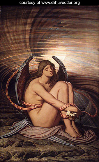
Soul in Bondage (1891–1892).

Previously on { feuilleton }
Angels 5: Angels of Death

Plates: Volume 2

plates.jpg

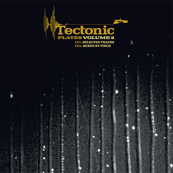
My third CD design for the Tectonic label is another piece of relative minimalism which once again features photos by Liz Eve. All the backgrounds on this occasion are microscope close-ups of vinyl records, very fitting for a double-CD collection of recent 12″ releases.

The Tectonic logo (which predates my involvement with the label) is based on the Technics logo and for this release I tidied the label logo slightly, a process which led to the discovery that the Technics design used a variant of the Clarendon typeface for its letter shapes (it’s not an exact match). This in turn led me to use Clarendon in various weights across the packaging, something which made a change from the usual sans serif or monospace font. The great Saul Bass frequently used Clarendon for his title sequences; if it’s good enough for Saul, it’s certainly good enough for me.

Tectonic main man Rob Ellis talked to Fact magazine about the new release earlier this week.

Previously on { feuilleton }
Aerial by 2562
New things for November