Searching through old emails last week reminded me that a couple of years ago I’d supplied some art for use in a steampunk-themed bar in Gran Canaria. I would have mentioned this before now but, as is often the way with freelance commissions, once the negotiations were over I dispatched the art then heard nothing more about the project.
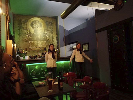
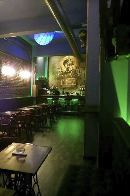
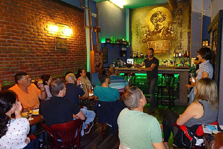
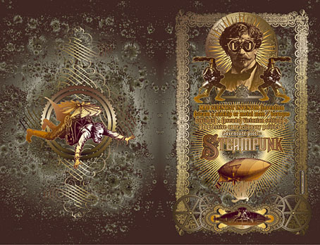
A search for the bar this week revealed a number of things: the place in question is the Tesla Steampunk Bar in Las Palmas de Gran Canaria; the artwork did indeed get used to prominent effect, with the main elements of my picture being positioned behind the bar itself; and it wasn’t immediately obvious whether the place was still open. Subsequent searching (and some Google translating of the bar’s Facebook page) further revealed that the bar has been closed but is in the process of relaunching itself.
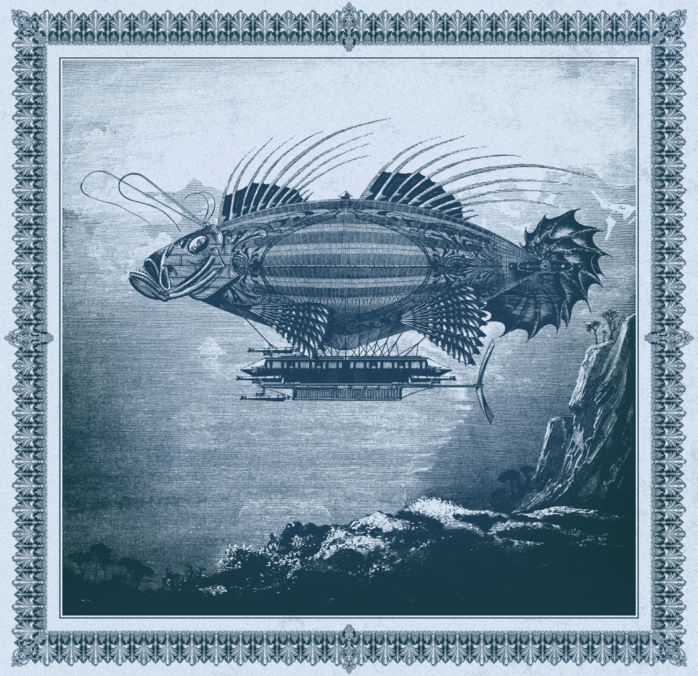
As to the artwork, this was adapted from the second version of a design I produced for Jeff VanderMeer in 2008 to illustrate a semi-serious steampunk slogan of Jeff’s devising. Ten years ago steampunk was still a very minor subgenre, and one with few visual signifiers. I quickly hacked together a piece using imagery taken from the Dover Pictorial Archive series, a collection of books which are useful but whose engraved illustrations have since been plundered endlessly for this type of work.
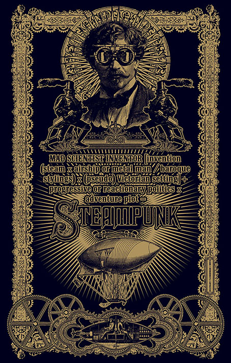
When I’m collaging things today I try and avoid using too much from the Dover books so I’ve been pained that this particular design, especially the goggle-wearing head, has proved so popular. Even when people haven’t asked to use the head itself I’ve been asked to do something similar, as was the case with the Aether Cola can I designed in 2012. The Tesla people used a stripped-down version of the colour design which I scaled to very large size. They also have a picture of the flying man on their wall but I’ve not found any good photos of him.
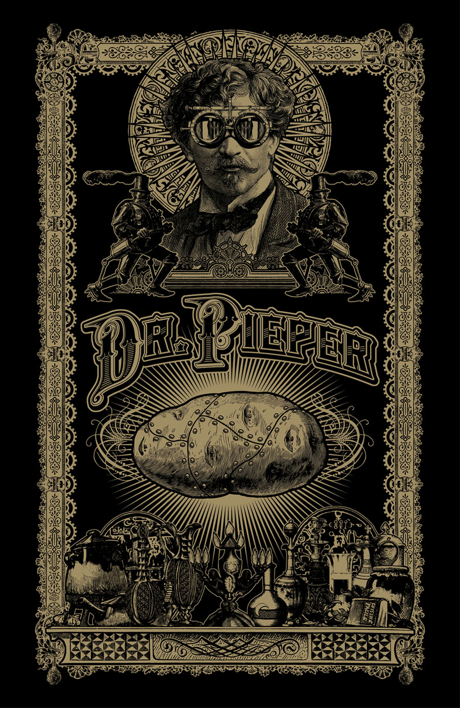
The original head, meanwhile, was used again last year in a new design for yet another business. Dr Pieper is a steampunk-themed chip shop (yes, really) in Amsterdam, a place with very nice antique decor by the looks of their Instagram page. My variant designs may be seen in the window and in their advertising graphics.
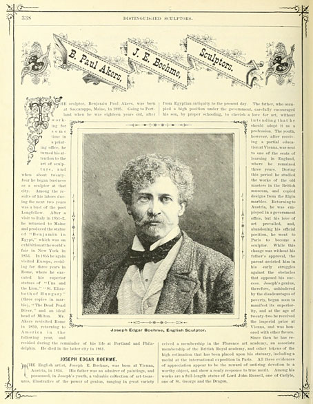
The head itself was found in Men, one of several collections of engraved illustrations edited for Dover Publications by Jim Harter. Some of Harter’s other books identify the pictures but not this one, so the identity of the portrait was unknown until, in my attempts to avoid the Dover books, I found a picture of Joseph Edgar Boehm in Hill’s Album of Biography and Art (1882). Boehm was a sculptor of a rather staid and respectable kind, being commissioned for royal portraiture among other things. I can’t imagine he’d be thrilled to find his posthumous image looking down on a drinking house and a chip shop, but sculptors often seem to be more easily forgotten than painters so he’s doing better than many of his contemporaries.
And while on the subject of steampunk, I ought to note that there’s a steampunk convention taking place in Morecambe at the beginning of June. I won’t be in attendance (they did ask) but I said I’d mention the event here.
Previously on { feuilleton }
• The George Dower Trilogy by KW Jeter
• Steampunk in the Tank
• More vapour trails
• Steampunk catalogued
• Steampunk: The Art of Victorian Futurism
• Steampunk Calendar
• Words and pictures
• Nathanial Krill at the Time Node
• Fiendish Schemes
• Ghosts in Gaslight, Monsters in Steam
• Steampunk Revolution
• The Bookman Histories
• Aether Cola
• Crafting steampunk illustrations
• SteamPunk Magazine
• Morlocks, airships and curious cabinets
• The Steampunk Bible
• Steampunk Reloaded
• Steampunk overloaded!
• More Steampunk and the Crawling Chaos
• Steampunk Redux
• Steampunk framed
• Steampunk Horror Shortcuts