The King in Green

hastur.jpg

Hastur (1999) by John Coulthart.

Going through some of my old Lovecraft art this week it occurred to me that this drawing hadn’t been made public in its original colour form. Hastur appears as a murkier black-and-white illustration in the Great Old Ones series I produced in collaboration with Alan Moore for The Haunter of the Dark. The drawing was one of several improvised pieces made using coloured pencils on tinted paper. Some people may regard this and similar works as “Gigeresque” but I only apply that label to close imitations of HR Giger’s biomechanical style. This type of improvised drawing or painting predates Giger—Max Ernst’s decalcomania paintings being familiar examples—and you see similar fields of organic or mineral forms in the work of other Surrealist or Fantastic artists. If you have some ability with a pencil or paintbrush it’s relatively easy to produce a lot of this kind of work; the challenge is to do something more than create a mass of writhing abstraction.

Elsewhere on { feuilleton }
The Lovecraft archive

The art of Aleksandr Kosteckij

ak06.jpg

This is the kind of fantastic art I like a great deal: nebulous landscapes whose vast forms may be some kind of hybrid architecture; implications of the alien and mystical that retain some ambiguity; dreamlike without slipping into post-Surrealist cliché. Monsieur Thombeau at Full Fathom Five (whose excellent eye I have to thank once again) describes the paintings of Aleksandr Kosteckij/Kostetsky (1954–2010) as being “like Gustave Moreau, Salvador Dalí, and Max Ernst put in a blender and left out in the rain.” I’d place them somewhere between Ernst Fuchs and Bruce Pennington but Moreau’s chimeras are certainly present. You’d think an artist of this calibre with a large body of work would be better known, most of the attention at the moment seems to be on Russian websites. Let’s hope that changes soon.

Update: Thanks to Joe for pointing the way to this dedicated website, something I missed in my haste.

Examples chosen from these sites:
http://vk.com/album-32941665_175452413 (139 images)
http://www.2photo.ru/en/post/18614

ak07.jpg

ak02.jpg

ak03.jpg

Continue reading “The art of Aleksandr Kosteckij”

Weekend links 262

rozich.jpg

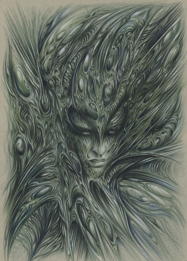
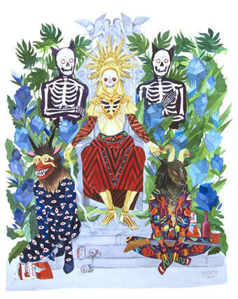
You’ll Never Be Alone, Even In Death (2014) by Stacey Rozich.

• “But the CD-R format, which eventually replaced the mix tape, turned out to be a technological letdown. ‘CD-Rs are just such an unstable format,’ Margolis says. ‘When you made 10 cassettes, the 10 cassettes generally played. If you made 10 CD-Rs, 8 of them played and 2 of ’em skipped. So that partially explains why people are going back to cassettes—it’s a cheap format that actually works.'” A huge article by Lisa Hix on the history and resilience of cassette tapes.

• “The word speculative comes from speculum, or mirror, and with speculative music the goal is to mirror the hidden processes of nature in sound.” David Metcalfe on Hawthonn, Coil and imaginal landscapes.

• Mixes of the week: FACT Mix 498 by The Cyclist, and Adventures In Sound And Music 28 May 2015 compiled by Joseph Stannard.

Nabokov was an intimate writer. His reticences, his formal estrangements, his denial of interest in any reality beyond the text all need to be measured against that. Maximum closeness: not the closeness of ostentatious empathy but the closeness of one mind addressing another in the most thrilling terms. He speaks into the ear, sometimes dripping a little poison. He contrives to have a reader identify intimately with a protagonist or narrator, but even that is not enough; the reader receives secret handshakes from the author himself, behind a narrator’s back.

Michael Dirda quoting from Nabokov in America by Robert Roper

• Books old and new: The Encyclopedia of the Dead by Danilo Kis, and Stranger Days by Rachel Kendall.

• At Dangerous Minds: Il caso Valdemar (1936), a short Italian adaptation of the Edgar Allan Poe story.

Lustpiel is “a new online magazine for gay, lustful literature”. And a fair amount of art and porn.

• “Q: Is there any subject that is never acceptable to joke about?” No, says Curtis Brown.

Machines Are Obsolete, a new piece by Pye Corner Audio for the Ghost Box label.

• Ishbelle Bee (see yesterday’s post) is interviewed at SFFWorld and Book Swoon.

Laura June on the life of Djuna Barnes, stunt reporter and shocking modernist.

• Stream the debut LP from Ghost Harmonic, a new John Foxx project.

• Portraits of the BDSM community by Natasha Gornik.

Rainer Werner Fassbinder: 10 essential films
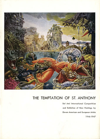
Loplop

Mirrorball (2009) by John Foxx & Robin Guthrie | Mirror (2012) by Emptyset | Mirrored (2013) by Silje Nes

Temptations

catalogue.jpg

Exhibition catalogue.

In one of the many recent features about Leonora Carrington I noticed a mention of her Temptation of St Anthony painting from 1945 (see below). This was one of eleven works on the theme submitted by different artists for a competition staged to promote Albert Lewin’s The Private Affairs of Bel Ami (1947), a film adaptation of the Guy de Maupassant novel. Carrington is often mentioned when this competition is discussed, along with the other big names, Max Ernst (the winner) and Salvador Dalí. But you seldom see mention of any of the other competitors, hence this post, an attempt to find all of the competition entries.

carrington.jpg

Leonora Carrington. St. Anthony is often shown with a pig companion but only Carrington depicted the animal for this competition. When asked why the saint had three heads, she replied “Why not?”

Albert Lewin didn’t make many films but he had a predilection for arty subjects, The Private Affairs of Bel Ami being preceded by adaptations of The Moon and Sixpence (1942) and The Picture of Dorian Gray (1945). All three films star George Sanders, and all feature special colour sequences when a painting is revealed. 1945 was the peak of America’s brief infatuation with Surrealism (Hitchcock had Dalí working on Spellbound at this time) so Lewin asked a number of Surrealists to take up the challenge. I was surprised to find that Stanley Spencer was one of the entrants, a name you almost never see in this company; less surprising was Ivan Albright whose painting of the decayed Dorian Gray is one of the highlights of Lewin’s earlier film. Leonor Fini was also asked to take part but she didn’t produce anything. The judges were Marcel Duchamp, Alfred J. Barr, Jr, director of the Museum of Modern Art, and art dealer Sidney Janis. Ernst won a cash prize variously reported as $2500–3000, while the other entrants received smaller sums. The paintings toured the USA and Britain during 1946–7.

As to the film, I can’t say what this is like because it’s one I’ve yet to see but Self-Styled Siren’s witty review goes into some detail. Hollywood apparently had problems with the adult subject matter (Sanders’ character is described as a sexually predatory social climber), and Lewin was forced to tone things down.

albright.jpg

Ivan Albright.

Albright’s contribution is so frenzied and detailed it approaches psychedelia. Best seen in this large view at Flickr.

Continue reading “Temptations”

Falk-Ulrich Rogner album covers

duul00.jpg

All The Years Round (7-inch single, 1972).

I mentioned earlier that Falk-Ulrich Rogner’s cover art for Amon Düül II was worthy of a post so here you are. Amon Düül II were slightly ahead of the pack in the German music scene of the 1970s, starting earlier and (arguably) finishing their prime period earlier. They were also closer in musical style and group ethos to the psychedelic/early prog groups in Britain and America, especially Hawkwind with whom they shared a record label and a bass player. Other German groups were often psychedelic to some degree but Amon Düül II went all-out for a German take on psych rock, with extended guitar-heavy jams played against oil-on-water projections.

Falk-Ulrich Rogner was one of the longer lasting members of the group’s shifting personnel, playing organ and electronics, writing lyrics and creating artwork that’s a perfect match for what I always think of as Amon Düül II’s Gothic Surrealism: a blend of lyrics and themes running through songs titled like Max Ernst paintings: Flesh-Coloured Anti-Aircraft Alarm, Archangel’s Thunderbird, Stumbling Over Melted Moonlight, Green Bubble Raincoated Man. The cover art is generally a collage of photographs, old paintings and other graphics, a familiar technique for psychedelic album covers. What gives Rogner’s work an edge is the way he blends multiple collages together by either photographic exposure or the photographing of projected transparencies. This has the effect of softening hard edges and transitions, and makes the resulting images all the more hallucinatory and dream-like. Effects like this are easy to achieve today with Photoshop but in the early 1970s they required a considerable effort.

duul01.jpg

Phallus Dei (1969).

At first glance the cover of the gloriously titled debut album looks like a painting but it’s a photograph of a tree silhouette juxtaposed against some vague collage business. This doesn’t really communicate the lysergic intensity of the music within which may explain why the cover was changed to something more typically psychedelic for its UK release.

duul02.jpg

The back cover inaugurates a pattern of placing the band on the back of the album, a reversal of the usual state of affairs even today.

duul03.jpg

The first CD release of Phallus Dei on the Mantra label featured what may be another Rogner photomontage, one that I’ve not seen anywhere else.

Continue reading “Falk-Ulrich Rogner album covers”