Re-release poster by Bemis Balkind.
Alien was a big deal for me when it appeared in late 1979, one of those films that seems to arrive at exactly the right moment. I’d just left school, I was eagerly reading reprints of French and Belgian comic strips in Heavy Metal magazine, and also paperback reprints of science fiction stories from New Worlds; I was listening to Hawkwind and becoming increasingly obsessed with HP Lovecraft. I was, in short, the target audience for a serious SF-themed horror film with contributions from major artists like HR Giger and Jean “Moebius” Giraud, and I went to see it three times in a row.
Watching Star Wars two years earlier (for which Dan O’Bannon created the computer displays), I’d enjoyed the special effects but been disappointed by its space-opera tone and dumb heroics. HR Giger’s large-format Necronomicon art book was published in the UK the same year and the sight of his work was a revelation for the way it pushed Dalí-esque Surrealism to a pitch of unprecedented mutation and malevolence. A year later his paintings were appearing in Omni magazine but it was Alien which exploded his popularity. Throughout 1979 you could hardly open a magazine or newspaper without finding a Giger interview or examples of his work. Alien benefited from the SF boom that Star Wars generated but Dan O’Bannon didn’t need George Lucas’s feeble mythology to point him towards science fiction, he’d already made one low-budget sf film, Dark Star, with John Carpenter, and was planning the effects for Jodorowsky’s ill-fated Dune project years before the world had heard of Luke Skywalker. Dune introduced him to Moebius, and the pair collaborated on an SF-noir strip, The Long Tomorrow, which was published in Heavy Metal in 1977. But it was Giger’s connection with the Dune project which proved crucial for Alien:
“(Dune) collapsed so badly,” O’Bannon says, “that I ended up in L.A. without any money, without an apartment, without a car, with half my belongings back in Paris and the other half in storage.”
He retreated to the sofa of a friend, screenwriter Ron Shusett, and didn’t leave it for a week. But depressed or not, O’Bannon knew he had to get back to work. He got his files and typewriter out of storage, and he and Shusett went to work on stacks and stacks of partially completed ideas.
“We pulled out one that I liked very much,” he says, “an old script called Memory that was half-finished and was basically what the first half of Alien is now. I told Ron I’d never been able to figure out the rest of the story. So he read it and said, ‘Well, you told me another idea you had once for a movie. It was the one where gremlins get onto a B-17 bomber during World War II and give the pilots a lot of trouble. So why don’t you make that the second half and put it on a spaceship?’
“That was a great idea, but then we had to figure out the monster. Well, I hadn’t been able to get Hans Rudi Giger off my mind since I left France. His paintings had a profound effect on me. I had never seen anything that was quite as horrible and at the same time as beautiful as his work. And so I ended up writing a script about a Giger monster.”
The working title was Star Beast. O’Bannon had a fortunate brainstorm late one night as he continued to write while Shusett slept. “I was writing dialogue and one of the characters said, ‘What are we going to do about the alien?’ The word came out of the page at me and I said, ‘Alien. It’s a noun and an adjective.’ So I went in the other room and shook Ron awake and told him and he said, ‘Yeah, OK,’ and went back to sleep. But I knew I had found a really hot title.”
The Book of Alien (1979) by Paul Scanlon and Michael Gross
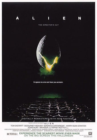
Lest we forget, it was O’Bannon who insisted that Ridley Scott look at Giger’s work during the production of the film after artist Ron Cobb failed to produce a sufficiently nightmarish creature. O’Bannon’s script was mauled by Walter Hill who removed sub-plots, and further scenes were trimmed to speed the pace, but Alien‘s unique atmosphere remains as potent today as it was in 1979. It’s ironic that O’Bannon died in the week that James Cameron’s Avatar (which happens to star Sigourney Weaver) is released. To watch all four Alien films in sequence is to witness progressively diminishing returns, and it was Cameron’s sequel which set the pattern for the later films by dropping the adjective part of the O’Bannon’s title in favour of the noun. There had been plenty of movie monsters before but it was the inhuman quality which we label “alien” that O’Bannon and Giger brought to SF cinema. It’s a quality that few have been able to deliver since, not least in Avatar which (from what I’ve seen) looks less alien than something Frank R Paul might have painted in the 1930s. O’Bannon did a lot more after Alien, of course, but it’s his first big success which will always mean the most to me. I recommend Ridley Scott’s director’s cut from 2003 which restored scenes and shots removed from the original release.
• Remembering the late, great Dan O’Bannon
• The first action heroine: Ellen Ripley and Alien, 30 years on
Previously on { feuilleton }
• Alejandro Jodorowsky’s Dune
• The monstrous tome